The University of Kansas

Inside Spencer: The KSRL Blog

Books on a shelf

Welcome to the Kenneth Spencer Research Library blog! As the special collections and archives library at the University of Kansas, Spencer is home to remarkable and diverse collections of rare and unique items. Explore the blog to learn about the work we do and the materials we collect.

Coffee Cake and Catsup: A Brief Overview and Contextualization of the Fin-de-Siècle Cook Book

September 16th, 2025

This is the first in a short series of posts highlighting students’ projects from Laura Mielke’s Spring 2025 class, “Archives in Scholarship” (ENGL 776). This week’s post was written by Joohye Oh, who graduated from KU in 2025 with a B.A. in English and Spanish. Her research interests include foodways and literacy.

Cookbooks – especially historic ones – are fascinating texts. Unlike 21st-century cookbooks that feature pictures of recipes, touching or interesting narrative asides, and use of less commonly found ingredients, older American cookbooks prioritize presenting readers and users with a no-frills approach to cooking. These cookbooks tend to be text-heavy and use ingredients more likely found in a pantry than a gourmet grocer. A wonderful example of an intriguing historical cookbook is the Fin-de-Siècle Cook Book, published in 1894, which showcases a slice of late 19th-century American foodways and the culinary literacy of the organized and ambitious women of St. John’s Episcopal Church in Parsons, Kansas. (“Fin de siècle” is a French term meaning “end of century.”)

  Hard red board with the work's title and author on a white label.         This page has text.

Left: The protective red board cover for the Fin-de-Siècle Cook Book, which is a library-created pamphlet binding. Right: The cookbook’s original cover, slightly deteriorating, with the full title. Call Number: RH B2788. Click images to enlarge.

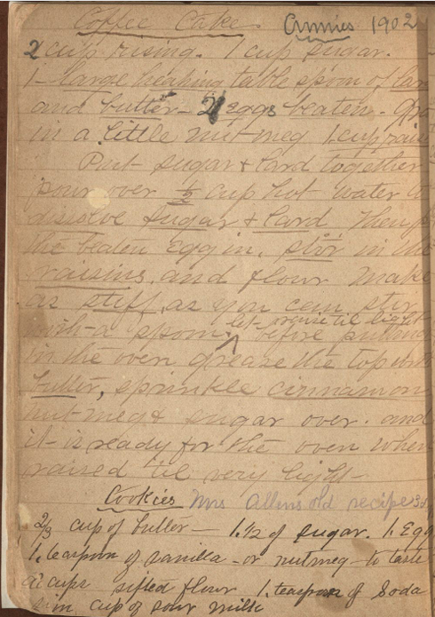
The Fin-de-Siècle Cook Book consists of two sections. First, there are 58 printed pages that include tipped-in clippings from magazines. Second, in the back, there are 11 pages of faintly lined paper that Whitney Baker, Head of Conservation Services at KU Libraries, believes were bound with the original publication and printed section. Someone, presumably a woman, filled with the blank lined pages with handwritten recipes that she selected and compiled. Instead of being completely different from the printed section, I see the handwritten section as extending the themes of women’s authorship and community while offering contemporary researchers a closer look at earlier American foodways in relation to the genre of the cookbook and literacy practices.

This image has text.
A tipped-in clipping of a cranberry pie recipe in the printed part of the cookbook. Call Number: RH B2788. Click image to enlarge.

Women’s authorship is especially central to this object. Writing this cookbook arguably opened up new avenues for authorship and empowerment for the Parsons women, like the way literary clubs did for middle-class Black women in the 1890s, as African American literature and literary studies scholar Elizabeth McHenry shows (120). Additionally, the place of authorship for both groups reflects the importance of a shared community space: a church for the Parsons women and a literary club member’s home for the Black women. One can imagine how these women – positioned as authors – selected, arranged, edited, and published these recipes (texts). This model of authorship furthers the legacy of women as authors in the cookbook genre. In fact, several of the earliest known American cookbooks – like The Virginia Housewife by Mary Randolph (1824), a text that showcases the elaborate culinary repertoire of the Southern elite (Fisher 19) – are powerful texts by knowledgeable women, two characteristics also found in the handwritten portion of the Fin-de-Siècle cookbook.

Community as an essential part of learning to read and write can also be inferred from the processes related to producing this text; in other words, these “[community] cookbooks function as literate practices of a community, sponsored by the community members who were themselves cooks, contributors, readers, organizers and editors” (Mastrangelo 73). Indeed, physical traces of this can be seen via each recipe’s attribution to a specific woman as well as the broader fact that the women in Parsons were using their social and technical skills to engage in readerly and writerly practices tied to their growing culinary literacy. To write a cohesive cookbook, they would have had to learn the characteristics of the cookbook genre as well as its subgenres like recipes and instructions. The clear grasp of these characteristics and deft culinary knowledge is present in the neat organization of the cookbook and mirrored in the handwritten recipes which give specific unit measurements for ingredients and reflect a strong awareness of effective kitchen habits. The writer of the handwritten portion continues the practice of attributing specific recipes to specific women: for example, the “Tomatoes Pickles” recipe is attributed to Mrs. Dean while the “Coffee Cake” recipe, found a few pages later, is attributed to “Annie.”

This page has handwritten text.
The first recipe on this page is a handwritten recipe for coffee cake attributed to Annie, 1902. Fin-de-Siècle Cook Book, 1894. Call Number: RH B2788. Click image to enlarge.

The diversity of recipes in the second (handwritten) section hints at the importance of homemade food in the 19th century. Specifically, as someone whose culinary practices are greatly influenced by 21st-century food systems (easy availability of ingredients, prepared foods, and new food media) it is a little surprising at times to see recipes like “Good Tomato Catsup” and the instructions for mayonnaise/aioli in a “Salad” because these are two products I associate more closely with Heinz and Hellman’s. The appearance of these two condiments seems to reflect the different food practices for a woman and her household in Parsons before the advent of supermarkets and easy availability of industrial food items.

Together, the first and second parts of the Fin-de-Siècle Cook Book offer a small glimpse into the complex and vibrant American foodways of the late 19th century and their broader historical and cultural contexts. The handwritten recipes carefully capture the specialized knowledge, skills, and dedication that the woman compiler most likely possessed while also reinforcing the idea that community and gendered authorship exist in a text often overlooked as simply being a collection of memories or a collection of delightful eating. Cookbooks and recipes, just like the small handwritten portion at the back of the Fin-de-Siècle Cook Book, are masterful representations of how literacy exists in the spaces and places sometimes overlooked because of who we consider to be authors and what we consider to be literature – even if that literature is mostly pickled green tomatoes recipes.

Joohye Oh
ENGL 776 student, Spring 2025

Acknowledgements

Thank you to Elspeth Healey, Phil Cunningham, Caitlin Klepper, Whitney Baker, and Shelby Schellenger at Spencer Research Library; English 776 peers; Professor Laura Mielke; and the ladies of Parsons who compiled this cookbook.

Works Cited

Baker, Whitney. “Re: Parsons cookbook.” Email received by Joohye Oh and Caitlin Klepper, 24 April 2025.

Fisher, Carol. The American Cookbook: A History. McFarland, 2006 (Call Number: X715 .F534 2006).

Mastrangelo, Lisa. “Community Cookbooks: Sponsors of Literacy and Community Identity.” Community Literacy Journal, vol. 10, no. 1, 2015, pp. 73–86.

McHenry, Elizabeth. Forgotten Readers: Recovering the Lost History of African American Literary Societies. Duke University Press, 2002 (Call Number: PS153.N5 M36 2002).

St. John’s Episcopal Church. Fin-de-Siècle Cook Book. Parsons, Kansas, 1894 (Call Number: RH B2788).

Cracking the Codex: Reading Medieval Latin Abbreviations

August 1st, 2025

This post was written Public Services student assistant Kit Cavazos as part of their summer internship supervised by KU English Professor Misty Schieberle and Special Collections Curator Eve Wolynes.

Although medieval manuscripts are well-known for their look and style, the act of actually reading and understanding one can be tough. The image that often comes to mind is that of their non-naturalistic drawings, and thus, a casual viewer may see the squiggles sprinkled across the text as another odd decoration. However, many serve specific and intentional functions, acting as contractions, substitutions, or abbreviations of words or parts of words. Scribes often chose this practice because it saved on ink and parchment space, since both these materials were quite expensive.

This image has handwritten text in Latin.
Homiliae in Evangelia by Pope Gregory I, recto (detail), 1100–1115 CE. Call Number: MS 9/1:A1. Click image to enlarge.

The first and most prominent thing to note about manuscript notation is the dashes that are most often placed over vowels. Most of the time, these indicate a missing letter N or M. For example, “terram” shortens to “terrā.” The page above has quite a few examples in the first line: “qua[m],” “lapide[m],” and “lapide[m].”

This image has handwritten text in Latin.
Breviary, verso (detail), 1100-1199 CE. Call Number: MS 9/1:A6. Click image to enlarge.

Dashes can often have other meanings when interacting with a consonant, either by hovering above or crossing the letter. The incipit line of the above page has a quite recognizable first word, which substitutes an I for a J. This letter difference is generally because Latin, as a language, does not use the letter J, meaning our first word is “Judea.” Thus it is easier to understand part of the next noun, which has a letter L with a dash intersecting it, with the result resembling a stylized letter T. Picking out when a letter is a T or an L is made easy by way of comparison, as the page’s script will always have a style that differentiates letter that could be confused.

Thus, this L with an intersecting dash in the spine could represent a few similar letter clumps: “ler…,” “…ul,” “lor…,” or “al…,” among others. Despite knowing exactly what variations the letter could stand for, it still introduces a new wrinkle into the fold, as none of the suggested meanings for the substitutions seem to make the word wholly understandable. “Jerlerm,” “Jerulm,” “Jerlorm,” and “Jeralm” are not proper words, and thus, the contraction demonstrates how common words (such as proper nouns) could have more of an abstract contraction. When examining this word in context, it might be a bit easier to understand that this contraction represents the city named “Jerusalem.”

This image has handwritten text in Latin.
Homily fragment, recto (detail), 1250-1299 CE. Call Number: MS 9/1:A7. Click image to enlarge.

Another common symbol is this: , which often represents a “rum,” “ram,  or “rem” sort of ending. The above example has multiple instances of its use within the first line, all taking the first possible ending. The line, when uncontracted, would read “verbi salutaris ac miraculorum suorum dulcidine” (“by the sweetness of his saving word and miracles”). These textual changes – both contractions and substitutions – indicate that both scribes and readers needed to have not only a deep understanding of what each symbol represented, but also a sense of the language. You could either look at the Latin and parse some words, or you could understand how to complete the words but have their meaning completely lost on you. This afforded the literate members of the population some form of exclusivity from everyone else. These manuscripts often contain important information about plants, animals, or other general encyclopedic knowledge.

This image has handwritten text in Latin.
Bible fragment of I Kings, recto (detail), 1240-1260 CE. Call Number: MS 9/1:A8. Click image to enlarge.

Another important aspect of a manuscript is additions that enhance a reader’s understanding of the text. The most obvious would be the fingers pointing to specific lines. These are manicules, and they are meant to emphasize important parts of the text. Another detail does something similar on the above page. The red lines highlighting specific letters are forms of rubrication, and they have a very similar function to manicules. In this instance, they mean to indicate and emphasize the capital letters in the line.

In other instances, rubrication notates significant parts of the text and frequently has a moralizing meaning. This means it can also come in textual form – often called the rubric – and it can add, emphasize, or reiterate important information to the reader. The term rubrication comes from the Latin word “ruber” (“red”), but important elements to a manuscript are not restricted solely to one color. Red often sees the most use, but blue and occasionally green can also be used for emphasis or decoration.

This image has handwritten text in Latin.
Leaf Containing the Service of the First Tuesday in Lent, Missal, recto (detail), 1400-1499 CE. Call Number: MS 9:2.30. Click image to enlarge.

With these basic understandings of common aspects of a medieval text (at least within the Spencer collection), reading a manuscript for the first time may be less daunting. The above page, for example, has several features already discussed. Most prominently, the rubrication stands out from the rest of the content, especially in the rubricated initial letters A and I, which have blue decoration that appears to mimic a lace design. The first rubricated word of the text is in the incipit line, which has the same L with an intersecting dash as before. Thus, we know the word would be something like “pp[ul]m” or something similar. If you don’t have a book on contractions easily to hand, sometimes sounding out what letters you do have can help make sense of the word – “populum,” in this instance. Thus, reading through the incipit line, it would say something like “Absol[v]e q[uaesumu]s D[omine] p[o]p[u]l[um] n[ostr]o[rum] vincula peccato[rum]” (“we beseech you, O Lord, to absolve our people from the bonds of their sins”). From even just this first line, we can understand that the reader is meant to focus on the people or population about whom it is speaking.

Reading through a medieval text can be difficult; even just reading one line without translation can take hours, depending on how many contractions or abbreviations there are, as well as how obscure each one may be. The result, though, is quite often rewarding, as it means modern readers can understand how information was relayed and what information medieval writers saw as needing to be relayed. An online resource for information on specific abbreviations is Cappelli’s Latin Abbreviations, which has been incredibly helpful for research and compiling the transcription of these lines.

Kit Cavazos
Public Services student assistant

July Exhibit: Sigillum: Seals and the Making of Medieval Authority

July 17th, 2025

Kenneth Spencer Research Library’s current short-term exhibit explores some choice items from the library’s collection of medieval seals. This is a collaborative project put together by myself – Kaya Taylor – and my collaborator Eli Kumin, both of us long-time student workers here at the library.

Photograph of documents and labels in a glass enclosed exhibit case.
A view of the exhibit. Click image to enlarge.

Eli and I have cultivated a particular interest in medieval wax seals, spurred on by our work on a Sanders Scholar research project under the supervision of Dr. John McEwan. Beginning in September 2024, we spent the project exploring the Abbey Dore collection (Call Number: MS Q80) at Spencer, given the remarkably well-preserved seals and documents dating back from the 12th and 13th centuries. As the project came to a close in May 2025, Eli and I realized that we could memorialize our work and interests in the form of an exhibit case. Titled Sigillum, it is our way of giving others a look into these fascinating and unique pieces of history, here to be enjoyed roughly 4,000 miles away from where they originated.

The overarching narrative of the Abbey Dore collection is one of property and the interplay between royal and religious power in the medieval period. The language used in the documents points to the exchange of land for the salvation of the donors and their loved ones, e.g. “for her soul and the soul of Madoc [her husband]” (Call Number: MS Q80:13).

Visitors may notice there is one document unlike the others in the exhibit case, labeled “land conveyance of Sir Roger Lasceles to his four daughters” (Call Number: MS C150). Although separate from the Abbey Dore collection, this document is included because it’s a particular favorite of ours and it boasts several unique qualities: a chirograph edge and three intact seals with very clear impressions. We chose to include it at the starting point of the exhibit because of its eye-catching quality, pulling visitors into the discussion of further seals and documents within the case.

Large handwritten document with wavy edges and three seals attached at the bottom.
A legal agreement, dated 1301-1302, whereby the lands of Sir Roger Lasceles are divided amongst his four daughters. Call Number: MS C150. Click image to enlarge.

Although Eli and I came to know the Abbey Dore collection very well over time, we still felt a bit confused as to the relative geography of the Welsh Marches and the locations mentioned in the collection. We felt that visitors could benefit from seeing a map of the region, and so we resolved to make one that centered the relevant places and landmarks stretching across the Welsh-English border. Ultimately, we used ArcGIS software to put together the map seen in the exhibit.

Simple map showing Dore Abbey and some nearby towns in Herefordshire and Monmouthshire.
Our ArcGIS map of the Welsh-English border. Click image to enlarge.

We hope that Sigillum gives visitors a chance to appreciate not just the wax seals themselves, but the real human stories that stand behind them. We are excited to offer this glimpse into the medieval past, and grateful for the opportunity to bring these objects to light at Kenneth Spencer Research Library.

Sigillum: Seals and the Making of Medieval Authority is free and open to the public in Spencer’s North Gallery through July 31st.

Kaya Taylor and Eli Kumin
Public Services student assistants
KU Libraries Sanders Scholars 2024-2025

Architecture and the (Digital) Archives

September 25th, 2023

I was first introduced to Kenneth Spencer Research Library through my First-Year Seminar. While I thought it was a cool place, and certainly had a unique variety of materials that could keep me entertained for days, I didn’t think I would ever use it.

I started working at the library a little less than a year later, and I began to see even more of the vast selection of intriguing materials that the library hosts. One day I was working on boxing up some recycling when I came across a little souvenir booklet that had illustrations of various buildings on campus. Since it was in the recycling pile, I was allowed to keep it, and the pictures fascinated me. [Spencer librarians sometimes weed duplicates from the collection. That was the case here; the library’s copy of Miniatures of Lawrence, Kan. can be found in University Archives. The call number is RG 0/24/G 1904 photographs.]

Title and embellishments in gold against a black background.
The front cover of Miniatures of Lawrence, Kan., 1904. Photo by Corrie Bolton. Click image to enlarge.
This image has text. Publication information in gold against a black background.
The back cover of Miniatures of Lawrence, Kan., 1904. Photo by Corrie Bolton. Click image to enlarge.

Fast forward four months when my Theory of Urban Design class assigned a project titled “Now and Then.” As you might expect, the project wanted us to look at how one place had changed over the past 20 years. It was relatively simple; we just had to find an old photograph of a building/urbanized area of Lawrence, recreate it, and write a description of the differences between the photographs.

A few days before this had been assigned, I was walking behind Spooner Hall and found the remains of an old fountain. Thinking it looked cool, I snapped a photo. That fountain got me wondering about the history of the building, and this project gave me the perfect opportunity to explore it.

A fountainhead of an animal on a brick wall covered in ivy.
The fountain behind Weaver Courtyard, on the South side of Spooner Hall. Photo by Corrie Bolton. Click image to enlarge.
Color photograph of Spooner Hall.
Spooner Hall from Jayhawk Boulevard. Photo by Corrie Bolton. Click image to enlarge.

In my little book of miniatures there were two images depicting Spooner Hall.

Black-and-white oval photograph of Spooner Hall.
“Library No. 1” (Spooner Hall) in Miniatures of Lawrence, Kan., 1904. Photo by Corrie Bolton. Click image to enlarge.
Black-and-white oval photograph of Old Blake and Old Fraser halls.
View of the KU campus from the library in Miniatures of Lawrence, Kan., 1904. This photo was taken from Spooner Hall’s front porch, looking slightly to the left. On the right is Old Fraser Hall, which was located where the modern Fraser currently stands. Old Blake Hall is on the left. Photo by Corrie Bolton. Click image to enlarge.

Originally, I was just going to recreate one of those, but just in case I went online to see what other old pictures I could find. One of the first images I came across was from a Spencer blog post that depicted children sledding down the hill behind Spooner. From there I discovered dozens of other images in the University Archives Photographs digital archives that I wanted to incorporate into my project. It quickly turned from a two-page assignment into a ten-page booklet about the history of Spooner Hall.

Black-and-white photograph of children sledding down a tree-lined sidewalk behind two buildings.
A snow scene with Spooner Library, the old chancellor’s residence, and children on a sled, 1900s. University Archives Photos. Call Number: RG 0/24/1 Snow 1900s Prints: Campus: Areas and Objects (Photos). Click image to enlarge (redirect to Spencer’s digital collections).
Colored sketch of the front of Spooner Hall.
A sketch of Spooner Hall by Corrie Bolton. Click image to enlarge.

This project gave me a unique opportunity to explore campus’s past through what I now consider one of the coolest places on campus. If you ever find yourself feeling stuck on a project, come to the library; there is a lot to explore!

Corrie Bolton
Public Services student assistant

Wayback Wednesday: Allen Fieldhouse Then and Now Edition

November 25th, 2020

Each week we’ll be posting a photograph from University Archives that shows a scene from KU’s past. We’ve also scanned more than 34,800 images from KU’s University Archives and made them available online; be sure to check them out!

Who’s excited for the return of KU basketball this week?!

Photograph of the interior of Allen Fieldhouse under construction, 1954
The interior of Allen Fieldhouse under construction, 1954. University Archives Photos. Call Number: RG 0/22/1 1954: Campus: Buildings: Allen Fieldhouse (Photos). Click image to enlarge (redirect to Spencer’s digital collections).

What does that view look like today? The answer to that question comes courtesy of KU student Rick McNabb. As part of a project for HIST 348 (History of the Peoples of Kansas), Rick found the above image in University Archives and later juxtaposed it with a picture he took at the men’s basketball game against Eastern Michigan on December 29, 2018. Play the video below to see! You can also move the slider back and forth yourself by visiting Rick’s post on the re.photos website.

A video created from two juxtaposed images of Allen Fieldhouse. The first is the image above, from 1954. The second was taken from roughly the same position in 2018.

Caitlin Donnelly
Head of Public Services