The University of Kansas

Inside Spencer: The KSRL Blog

Books on a shelf

Welcome to the Kenneth Spencer Research Library blog! As the special collections and archives library at the University of Kansas, Spencer is home to remarkable and diverse collections of rare and unique items. Explore the blog to learn about the work we do and the materials we collect.

Inventory and Rehousing: A workflow for 3D objects in archives

April 14th, 2026
Lela Duncan Cardozo’s KU letter sweater is pictured. The sweater is knitted from gray wool with red capital letter K and blue capital letter U sewn on the left front.
Figure 1: Lela Duncan Cardozo’s KU letter sweater. Call number RG 66/20.

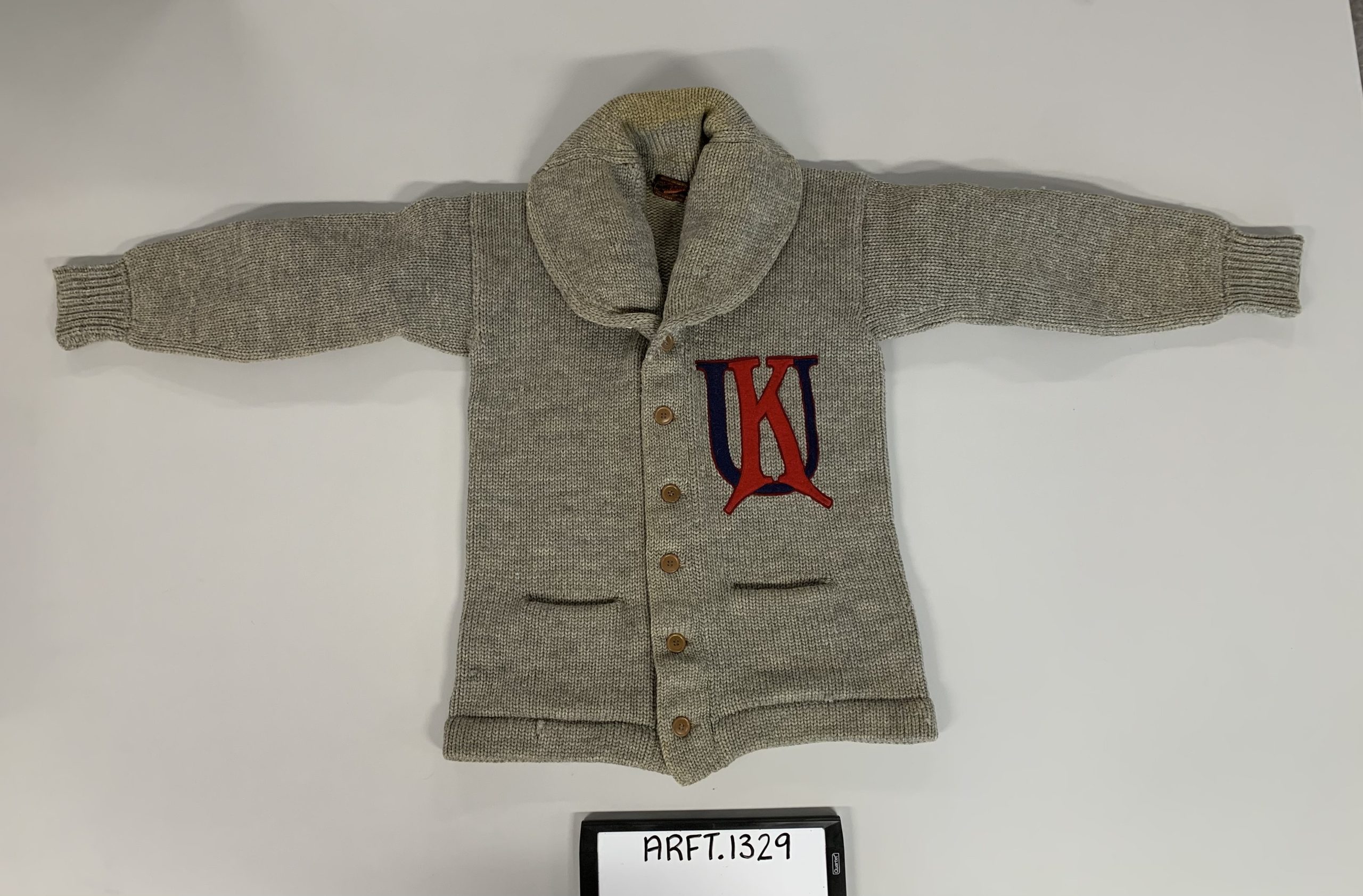
From Student Senate buttons and sports memorabilia to a vial of uranium connected to the Manhattan Project, the unexpected breadth of objects preserved by the University Archives reveals lesser-known aspects of the University of Kansas’s history. The University Archives is the official repository for all materials related to the University of Kansas. Its holdings include official records, publications, correspondence, research papers, and more. However, the University Archives contains more than just documents; it has a robust Artifact Collection that uses objects to tell the KU story.

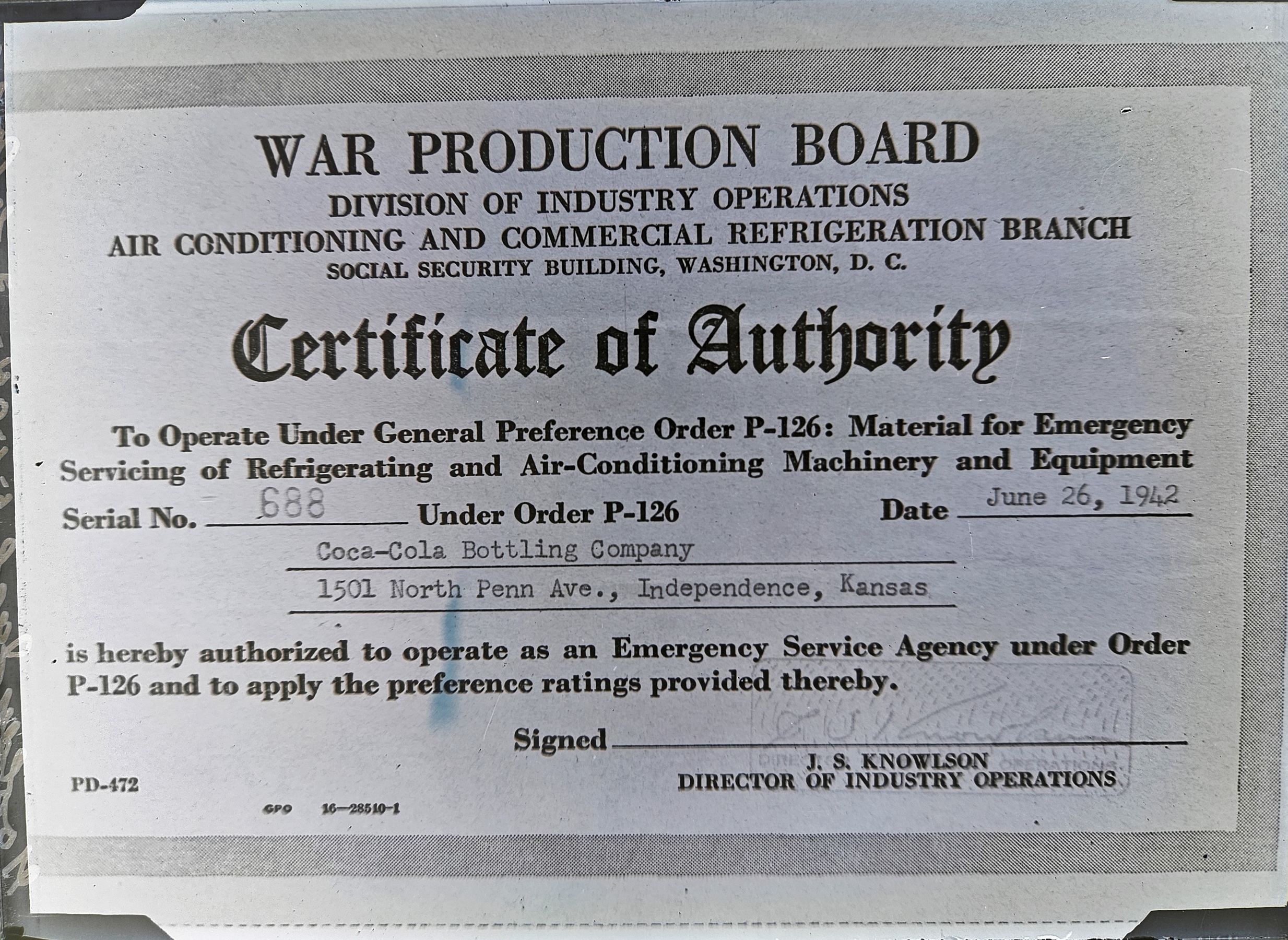
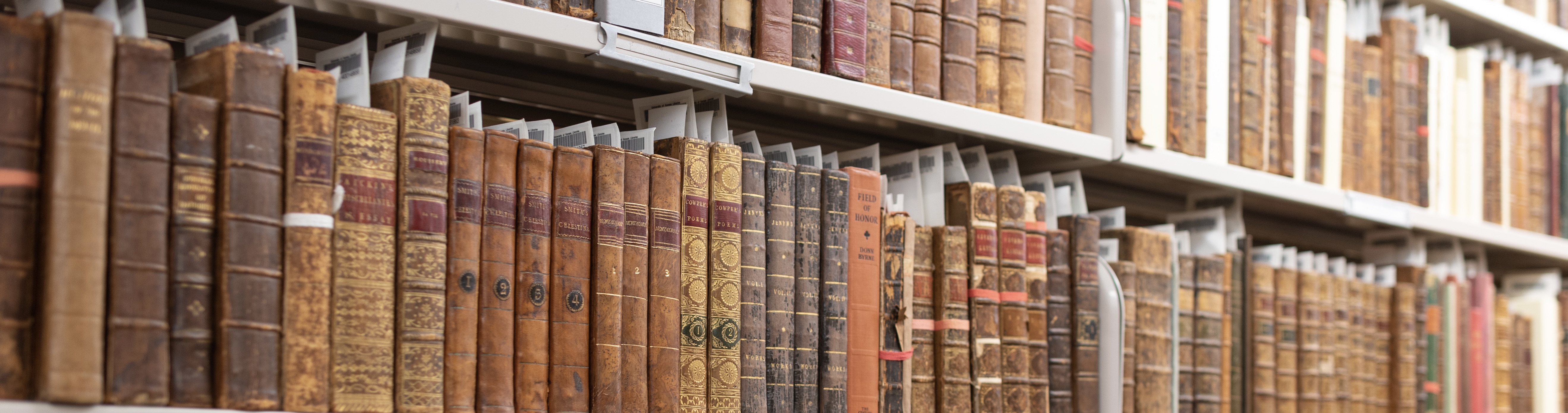
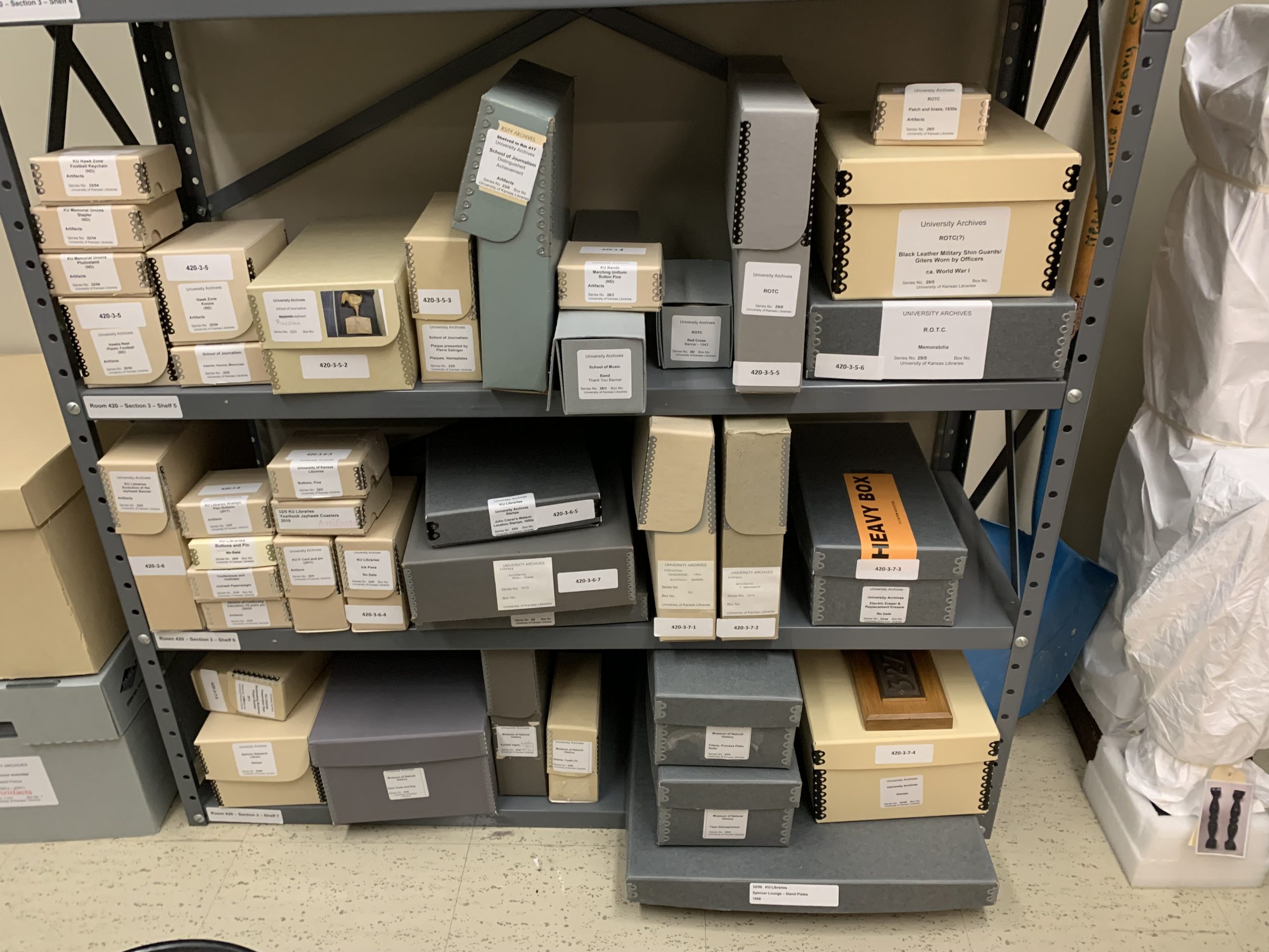
I began my Graduate Assistant position with Conservation Services in August 2025, and I quickly became familiar with the Artifact Collection and its unique challenges. The University Archives has been collecting objects for decades, but documentation and housing efforts have been largely inconsistent. When I began this project, there was no item-level inventory of the collection, and many objects were stacked precariously in mismatched or overfilled boxes (See Figure 2). Inconsistent storage practices increase the risk of physical damage, and a lack of intellectual control over the collection makes items difficult to access.

Archival artifact storage is pictured before inventory and rehousing, with many disparate sizes and shapes of boxes.
Figure 2: Inconsistent storage practices highlighted a need to standardize future storage solutions.

This project consisted of several key phases. First, I conducted a full item-level inventory of the Artifact Collection to gain a complete understanding of its contents. For each object, I assigned a unique sequential Artifact ID number (e.g. ARFT.1, ARFT.2, etc.) and recorded any label information from the exterior of the box, including associated Record Group numbers. I then created a brief title and a full description noting color, material type, and any identifiable features on the object, along with any dates indicated on the item or its housing. I documented the object’s exact measurements in centimeters, assessed and recorded its condition, and noted its current location, housing method, and any outstanding questions or comments.

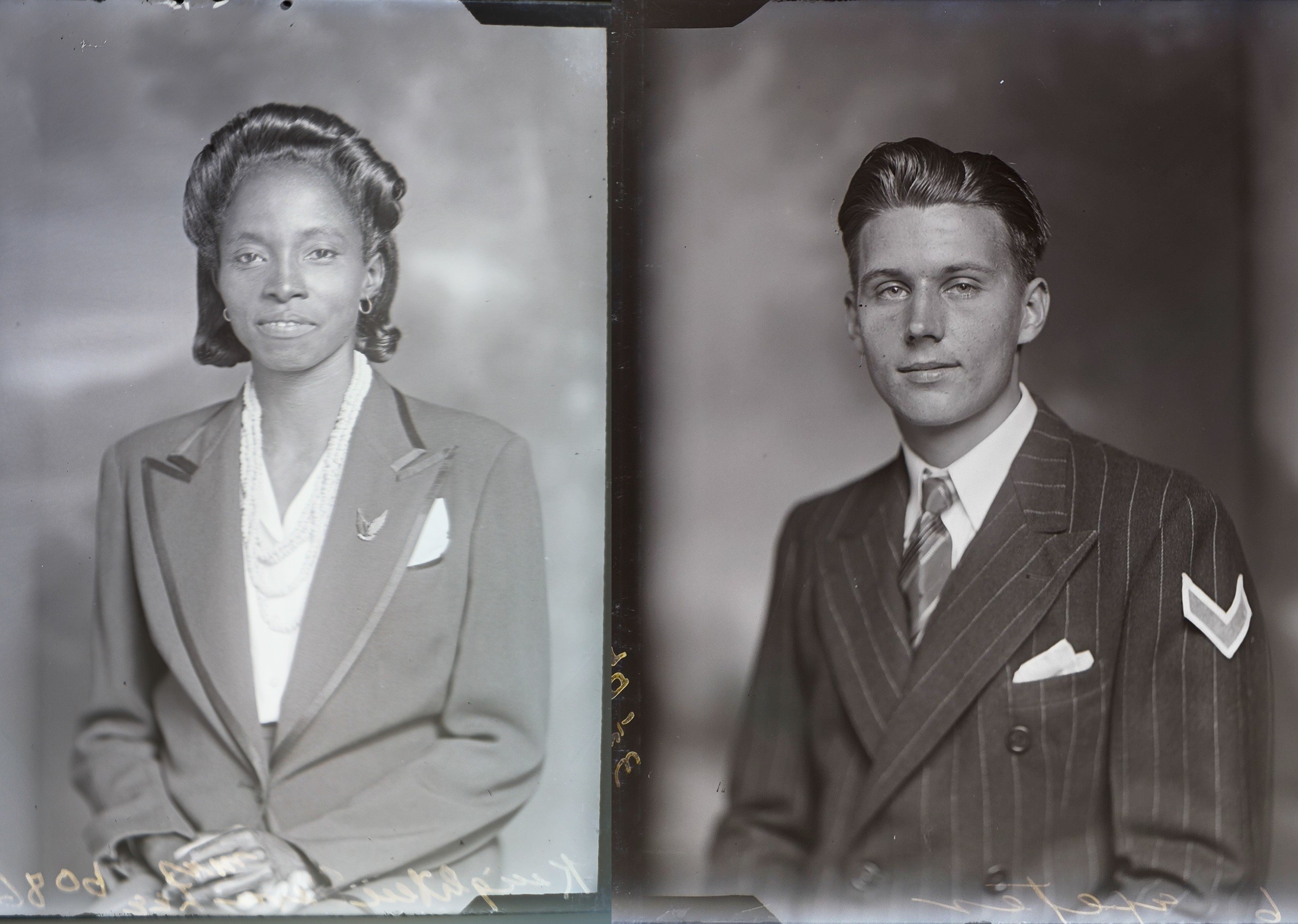
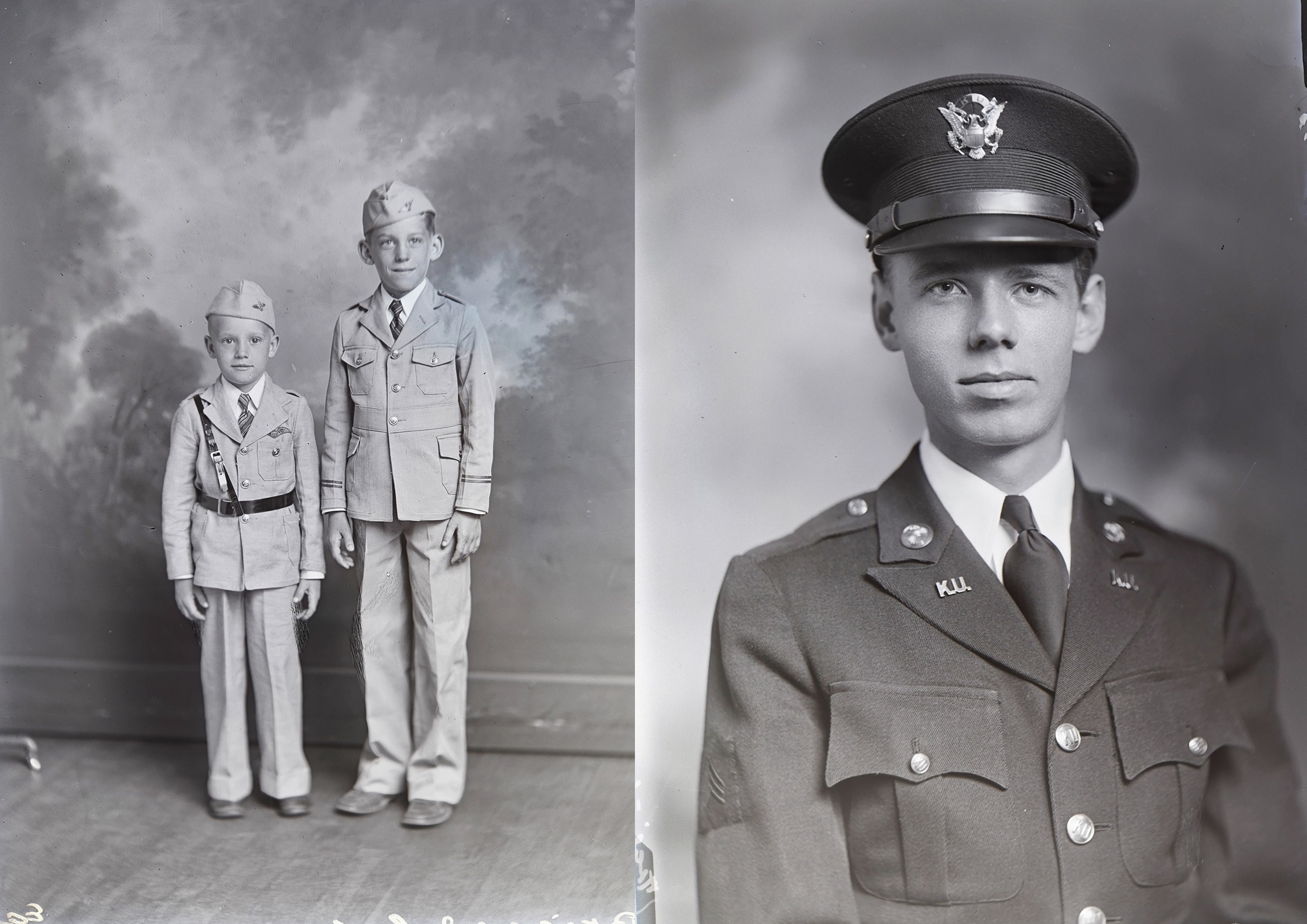
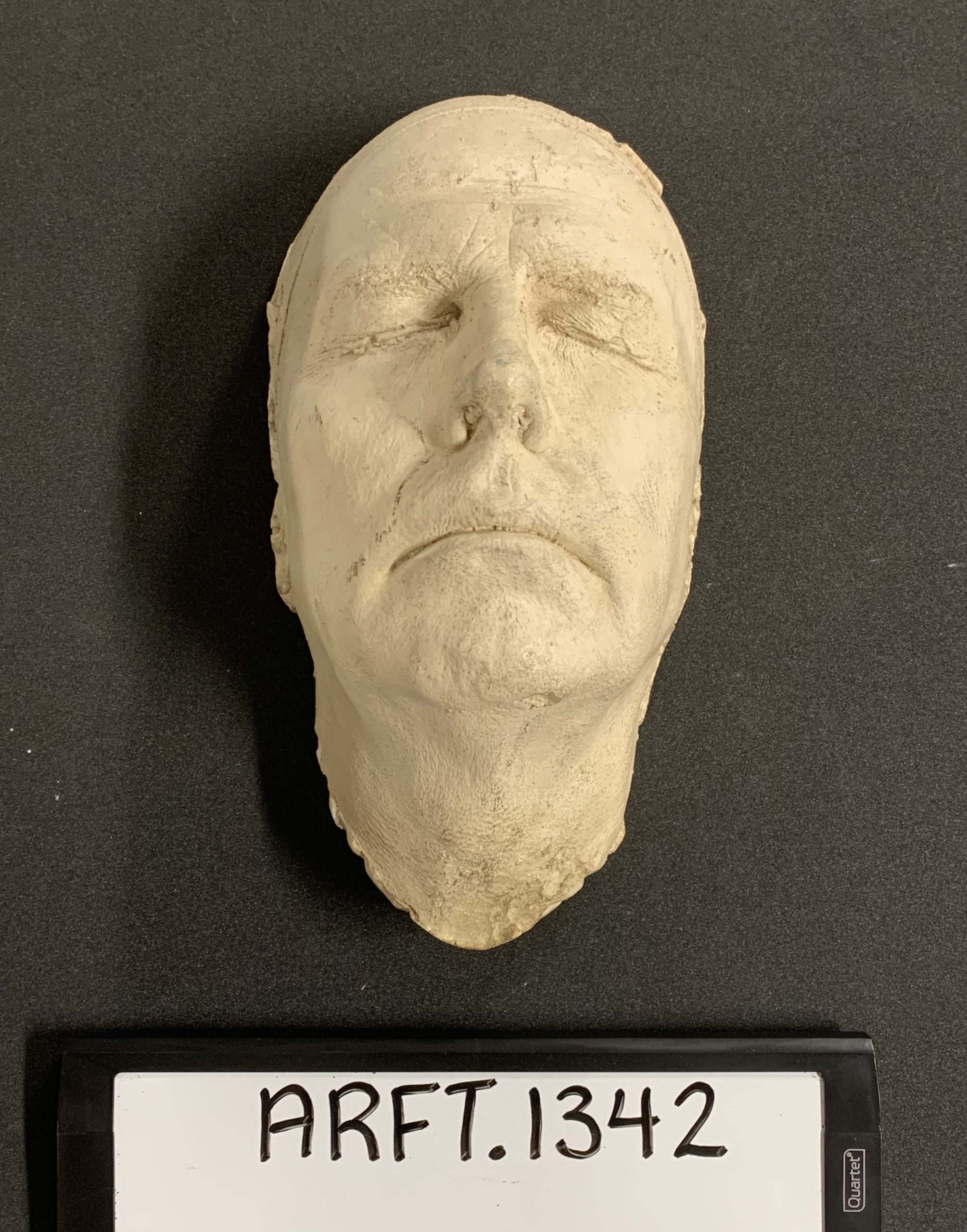
Following the written documentation, I photographed each object using a temporary photo setup consisting of a white paper background and a light-diffusing shade made from corrugated plastic. I used my iPhone to take the photographs, which were intended to provide visual documentation of the objects rather than high-quality, exhibit-ready images. Their purpose was to capture essential physical details that cannot be conveyed through text alone. In each image, I included a small dry-erase board displaying the Artifact ID number in each image to ensure consistent identification (See Figure 3).

A sample photo from the project inventory, showing the plaster mask of Chancellor Franklin Murphy, 1957.
Figure 3: A sample photo from the project inventory, showing the plaster mask of Chancellor Franklin Murphy, 1957. Call number: RG 22/12.

Finally, I attached a small, hand-cut white paper tag to each object using simple white thread and labeled it with its corresponding Artifact ID number. Instead of ordering object tags from an archival supply company, I created the tags in-house using scrap paper to conserve resources. I inventoried as many objects as possible every day, and I reserved the final half-hour of my shift to upload photos, downloading them to a shared networked drive and organizing them into folders based on the objects’ current room locations. This consistent workflow not only ensured thorough documentation but also allows future users to track the overall timeline and progress of the inventory for similar projects.

After the inventory phase, I developed a comprehensive rehousing plan for the University Archives’ Artifact Collection that focused on standardizing storage materials in order to improve the long-term safety and accessibility of the collection. Developing this rehousing plan required balancing preventive conservation best practices, archival theory, spatial limitations, and institutional realities. Organizing by size improves efficiency and reduces handling risks, while material-based grouping mitigates chemical and environmental threats. On the other hand, contextual organization preserves provenance and research value, and standardized documentation ensures continued intellectual control. Balancing all of these concepts, the rehousing plan details first steps and priorities, lists existing storage solutions to follow, and models potential storage solutions for objects whose current housings need improvement. It also provides a list of standard box sizes so that storage solutions stay consistent moving forward. Designed with flexibility in mind, the plan is meant to support future growth, ensuring the collection can evolve without compromising curatorial integrity. Following this plan, I have now begun rehousing objects.

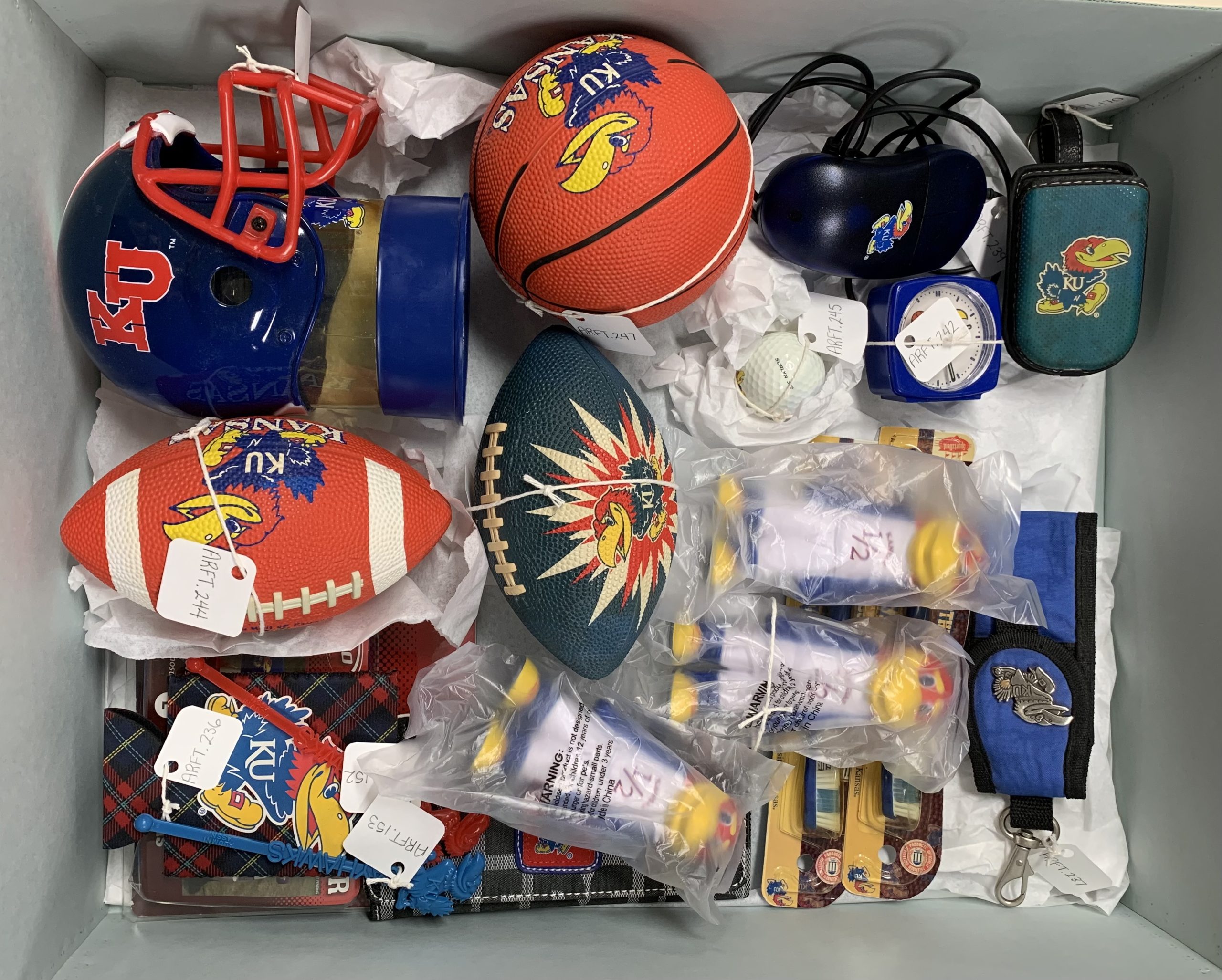
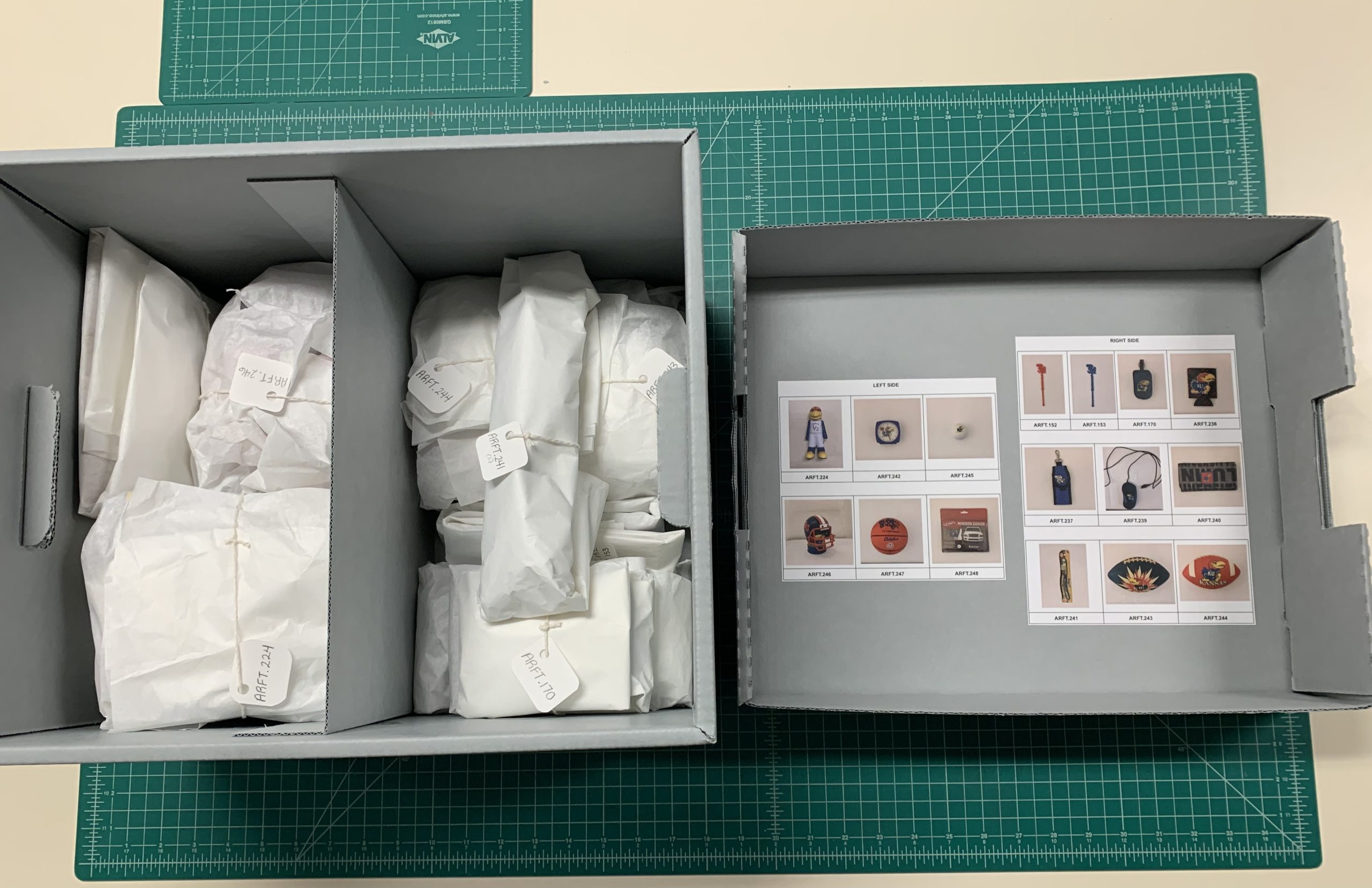
While rehousing Record Group 0/25: Jayhawks, I encountered an oversized box filled with plastic objects that were visibly deteriorating (see Figure 4). Several items exhibited yellowing and surface changes that suggested they were being affected by surrounding materials. In response, I removed all non-plastic objects from the box and rehoused them separately. The remaining plastics, particularly those showing signs of degradation, were wrapped individually in tissue and placed in a standard banker’s box designed to function as a containment unit rather than a highly customized enclosure. Photographs of each object were affixed to the lid, and labeled tags were tied to the exterior of each wrapped item to improve retrievability (see Figure 5). Because these objects possess relatively low research value, constructing individualized custom enclosures was not an efficient use of limited resources. Instead, I prioritized risk mitigation and containment. This solution reflects a central methodological principle of this project: rehousing does not aim for perfection, but for measurable improvement and increased standardization.

An assortment of off-gassing plastic artifacts are pictured together in a box before rehousing.
Figure 4: Off-gassing plastic artifacts before rehousing. Call number: RG 0/25.
Plastic artifacts pictured after rehousing, individually wrapped and numbered with a photographic key affixed to the inner lid of the box.
Figure 5: Plastic artifacts rehoused. Call number: RG 0/25.

Every storage decision reflects institutional realities, professional standards, and long-term stewardship commitments. By integrating collections management strategies with conservation principles, this project provides a flexible and sustainable framework for not only the continued care of the Artifact Collection but an example for any archive drawing on museological best practices to deal with 3D objects.

While I was able to complete an item-level inventory of the Artifact Collection, the rehousing stage of the project will likely extend beyond my time at KU. As a result, the rehousing plan developed here will serve as a guide for future staff, supporting consistent and standardized decision-making. In addition, I have outlined detailed workflows for the continued care of the collection. This project would not have been possible without the collaboration of the University Archives, Conservation Services, and Spencer’s Archival Processing Team.

A very special thanks to Letha Johnson for warmly welcoming me into the University Archives and for placing her trust in me as I engaged critically with the Artifact Collection. Her trust and collaboration were essential to the success of this project.

Brenna Hobbs, M.A. Museum Studies 2026, Graduate Assistant in Conservation Services

The Many Bookplates of William Stirling Maxwell

February 10th, 2026

In my ten years working with Spencer collections, it’s been impossible not to notice the name William Stirling Maxwell printed on a wide variety of bookplates in our Special Collections. Maxwell was a Scottish art historian, scholar, art collector, and bibliophile, a portion of whose considerable book collection found its way to Spencer’s stacks in years past.

In a flurry of activity one afternoon last fall, I set out to document as many Stirling Maxwell plates as I could find. I located an impressive 35 unique designs in all, and it’s likely there are others out there, in Spencer’s collection and in the many collections around the world across which Stirling Maxwell’s library is dispersed.

To fit this selection of bookplates into this post, I’ve grouped them together into loose categories and adjusted their sizes. The actual plates range greatly in style and in size, from just a few centimeters long to covering the entire pastedown of a folio volume. I’ve grouped these images based on the more prominently featured design elements, although many of the same motifs are repeated across multiple plates, in particular Stirling Maxwell’s heraldic devices, monograms, and personal or family mottos. Some of the plates bear the name William Stirling, while others include Maxwell, which he added after succeeding the Maxwell Baronetcy in 1865.

It’s clear that Stirling Maxwell took pride in his book collection and derived enjoyment from them; in addition to their personalized bookplates, many of the Stirling Maxwell volumes in Spencer are in fine custom bindings bearing his coat of arms and extensive decoration (another blog post for another day!). I hope you will enjoy perusing this selection (A bevy of bookplates! An excess of ex libris!) as much as I did. Remember that these and all of Spencer’s collections can be viewed in person in our reading room!

A selection of six of William Stirling Maxwell's bookplates featuring ornate heraldic imagery.
The bookplates in this group feature very ornate heraldic shields. Call numbers clockwise from upper left: Cervantes Z9; Summerfield B1248; Summerfield D261; Summerfield B1243; Summerfield A300; Summerfield E347. Click image to enlarge.
A selection of five of William Stirling Maxwell's bookplates featuring simplified heraldic imagery.
Heraldic shields again, although the designs in this group are somewhat simpler. Call numbers clockwise from upper left: E283; Summerfield E1006; Summerfield C2034; Cervantes Y31; Summerfield C635. Click image to enlarge.
A selection of three of William Stirling Maxwell's bookplates featuring angels or cherubs in the designs.
Angels and cherubs figure in the designs in this grouping. Call numbers clockwise from left to right: Summerfield C850; A1517; Summerfield D254. Click image to enlarge.
A selection of five of William Stirling Maxwell's bookplates featuring swans in the designs.
These bookplates share the swan, a symbol of nobility, as a notable design feature. Call numbers clockwise from upper left: Summerfield D145; Summerfield B1242; D340; Summerfield D210; Cervantes X36. Click image to enlarge.
A selection of three of William Stirling Maxwell's bookplates featuring knight's helmets in their designs.
The barred, sideways-facing knight’s helmet on these bookplates represents the high rank of Stirling Maxwell’s families. Call numbers from left to right: Call numbers from left to right: C1113; Summerfield A668; Summerfield A601. Click image to enlarge.
A selection of three of William Stirling Maxwell's bookplates featuring his monogram in the designs.
Monograms, from simple to ornate. Call numbers left to right: Cervantes Y4; Summerfield B882 volume 2; C9478. Click image to enlarge.
A selection of four of William Stirling Maxwell's bookplates featuring bold graphic designs.
These bold, graphic images stand out from the florid, fine-lined designs of many of Stirling Maxwell’s other bookplates. Call numbers left to right: Call numbers left to right: Cervantes Y9; Summerfield A533; C1111; Summerfield B915. Click image to enlarge.
A selection of six of William Stirling Maxwell's bookplates, distinctive for their circular shape.
Many of the same motifs are seen in these bookplates, with one big difference – the plates’ circular shape! Call numbers clockwise from upper left: Summerfield C884; Cervantes Y59; Cervantes Y20; Cervantes Y7; Summerfield B863; Cervantes Y18. Click image to enlarge.

Angela Andres
Special Collections Conservator

How to Spot a Poison Book

October 28th, 2025
Illustration of two skeletons in formal ball dress entitled "The Arsenic Waltz. The New Dance of Death. (Dedicated to the Green Wreath and Dress-Mongers.)" Punch, or The London Charivari, February 8, 1862.
“The Arsenic Waltz. The New Dance of Death. (Dedicated to the Green Wreath and Dress-Mongers.)” Punch, or The London Charivari, February 8, 1862. Call Number: AP 101. P8. Click image to enlarge.

In 1775, the chemist Carl Wilhelm Scheele developed a striking shade of green that proliferated in the Western markets, creating a cultural phenomenon that could be — and in some cases was — deadly. Scheele’s green, a brighter and cheaper pigment to produce than previously popular shades, was one of many arsenical compounds that was used in soap, clothing, wallpaper, and even food for much of the nineteenth century. But the arsenic present in Scheele’s green (and pigments like it) can still be unsafe when handled for extended periods, which means a book that contains this Victorian Era pigment could pose its own risks today.

A book covered in vibrant green, arsenic-positive paper. Die Staatsforstwirthschaftslehre. Berg, Karl. Leipzig, 1850. Call Number: Howey C1895.
A book covered in vibrant green, arsenic-positive paper. Die Staatsforstwirthschaftslehre. Berg, Karl. Leipzig, 1850. Call Number: Howey C1895. Click image to enlarge.

Step One: Publication Date

At the beginning of the nineteenth century, bookbinders began constructing their own covers separately from the main textblock of each book. This, along with the introduction of a new cover material called bookcloth, allowed Victorian Era book covers to be elaborately dyed and decorated with an array of pigments; Scheele’s green and Paris green (or emerald green, or copper acetoarsenite) being the most arsenic-rich among them. Tracking these new developments, arsenical bookbindings are most likely to be found between the years 1820 and 1880, when the pigments began to be phased out slowly and irregularly across different regions. Because of this, any green book published in the nineteenth century could be a contender.

Three volumes from various Spencer collections. Books A (green) and C (blue) tested positive for arsenic; book B (green) did not.
Three volumes from various Spencer collections. Books A and C tested positive for arsenic; book B did not. Call Numbers: Book A, Children 1256. Book B, Children 1599. Book C, B12009. Click image to enlarge.

Step Two: Pigment

Arsenical pigmentscan take many forms, but they are most associated with the vibrant, almost neon shade of green that is shown in the first image, of Die Staatsforstwirthschaftslehre. In some cases, arsenical green stands out like a poison dart frog, but in other cases it’s not so clear. Many of the arsenical titles we’ve identified in KU’s collections align with this typical green pigment, but there have also been some surprises, such as the bright blue book in the image above, or greens that appear to be Scheele’s or emerald but chemically are not. This is where X-Ray Fluorescence (XRF) technology comes in.

The conservation lab's XRF machine set up to test a 19th-century book for the presence of heavy metals.
The conservation lab’s XRF machine set up to test a 19th-century book for the presence of heavy metals. Click image to enlarge.
An arsenic-positive spectrum produced from an XRF test.
An arsenic-positive spectrum produced from an XRF test. Click image to enlarge.

Step Three: XRF Technology

Due to all these variables, the only sure way to identify a poison book is to test it. In the Spencer Research Library’s conservation lab, we’ve been using XRF technology to test KU’s 19th-century books as part of a larger effort protecting patrons against potentially toxic heavy metals. This machine produces a spectrum graph that allows us to identify which elements are present in an item. Through this process, we’ve identified a number of “poison books” which can now be properly labeled, contained, and served in the reading room with appropriate precautions assuring that the information in a potentially harmful book remains accessible while the patron handling it remains safe.

By Reece Wohlford, Heavy Metals in Bookbinding Project Student Assistant

Apparel’s Interdependence with War in Independence, Kansas: Ringle Conservation Internship

August 12th, 2025

I began the Ringle Conservation Internship during the summer of 2025. The position interested me as a Museum Studies graduate student, as a hobbyist medium-format photographer, and as someone interested in conservation/archives as a career. I would not have been able to flourish in this position without the leadership of Whitney Baker and Charissa Pincock, and the support of conservation staff members Angela Andres, Kaitlin McGrath, and the many student workers who shared the laboratory with us. Each one of these persons readily and willingly offered their knowledge throughout the process.

Over the summer of 2025, I rehoused circa 2,500 glass plate negatives from the Hannah Scott Collection in the Kenneth Spencer Research Library Conservation Laboratory. This collection encompasses thousands of negatives taken by Hannah Scott, a photographer most prolific from the 1910s through 1945 who hand-recorded the names associated with the photograph onto the plates themselves. The plates were moved from old, now acidic, slip-sleeve housing into alkaline 4-flap housing to prevent image transfer and physical damage during access. I worked chronologically after my predecessors, beginning with photos taken in early 1939 and ending with those taken in early 1944. During this process, I recorded the variations of Scott’s handwriting to make deciphering her handwriting more streamlined (pictured below).

Handwriting guide created by Richard Godsil III featuring various versions of all of the letters of the alphabet, as written by Hannah Scott. Hannah Scott Studio Collection, Kansas Collection, University of Kansas Libraries.
Handwriting guide showcasing the different examples of each letter found on plates in the Hannah Scott Collection.

Using online records resources such as FamilySearch, FindAGrave, and the Independence Public Library, I was able to match plates to missing names, and to find the first names of married persons. As I worked through the wartime years, seeing the same subjects return to Scott’s studio, I was able to witness firsthand the effect the war had on people’s lives (see below).

Photographic images from plate 6086 (Mrs. Vera Lee Knighten) and plate 6058 (John Mishler). Hannah Scott Studio Collection, Kansas Collection, University of Kansas Libraries.
Portions of plate 6086 (Mrs. Vera Lee Knighten) and plate 6058 (John Mishler). Leftmost subject is sporting a jeweled and winged “V for Victory” lapel pin; rightmost subject is wearing an inverted U.S. military chevron (usually denoting Overseas War Service or Wounded) on civilian clothing worn in their graduation photographs. Hannah Scott Collection. Glass plate negatives, inverted positive images.

Plate 5504 (John Gooldy). A Certificate of Authority issued by the U.S. War Production Board giving the Independence, Kansas Coca-Cola Bottling Company permission to operate during wartime as an emergency vendor for refrigerator/air-conditioning repair. Hannah Scott Studio Collection, Kansas Collection, University of Kansas Libraries.
Plate 5504 (John Gooldy). A Certificate of Authority issued by the U.S. War Production Board giving the Independence, Kansas Coca-Cola Bottling Company permission to operate during wartime as an emergency vendor for refrigerator/air-conditioning repair. Hannah Scott Collection. Glass plate negative, inverted positive image.

Photographic images from plate 6044 (John Briggs) and plate 5519 (Walter McVey), Hannah Scott Studio Collection, Kansas Collection, University of Kansas Libraries.
Portions of plate 6044 (John Briggs) and plate 5519 (Walter McVey Jr.). Leftmost subjects are wearing children’s versions of Royal Air Force uniforms; rightmost subject is wearing a KU uniform in the style of a US Army Officer. Hannah Scott Collection. Glass plate negatives, inverted positive images.

Whether it was business, public, or private, the war seemed to pervade all aspects of these subjects’ life. While this wartime way of life is foreign to me, it can be made familiar through studying the subjects whose lives are preserved in the valuable glass plates of Hannah Scott.

Richard David Godsil III
Summer 2025 Ringle Conservation Intern
Conservation Services

In Good Paste: Selected Paste Papers from Spencer Research Library’s Special Collections

August 5th, 2025

In the course of my work as a conservator at KU Libraries, one of my favorite bookbinding features to spot “in the wild” is paste paper. A book covered in paste paper might come to the lab for treatment, or I might catch sight of one while working in the stacks, and I always take a moment to look at them closely and enjoy the variety of colors, patterns, and styles that paste papers come in. It was no easy task to narrow down Spencer’s abundant selection of paste papers to just a few volumes that will be on view in a temporary exhibit in the North Gallery through August and September.

Paste paper is a style of decorative paper made by coating the surface of paper with a thick pigmented starch adhesive (usually wheat paste or methylcellulose) and then manipulating the wet paste mixture to create patterns. Combs, stamps, brushes, wadded paper or textiles, rollers, fingers and more could be used to create designs. Paste papers were an economical alternative to marbled papers, which required a high degree of skill and costly materials to produce. No special training or supplies were needed to make paste papers; bookbinders could create them right in their workshops with materials already at hand. 

Paste papers were most often used for book covers and endpapers and were popular from the late 16th through the 18th century. Paste papers are often seen on books from Germany and Northern Europe, although there are many lovely examples of block-printed paste papers from Italy. There was renewed interest in paste papers during the Arts & Crafts movement of the late 19th and early 20th century. Today, paste papers are still created by book artists and hobbyists, and can be seen on some fine-press editions. The examples on view represent just a fraction of the many beautiful paste papers found in Spencer’s collections and available to view in the Reading Room.

Pulled (or veined) paste papers were created by coating two sheets of paper with the colored paste, pressing the two pasted sides together, and then pulling the sheets apart, creating a unique wave-like pattern on each sheet.

Left: Cover of De Mentha piperitide commentatio botanico medica, 1780. Call Number: C9291. Right: Cover of Rules and orders of the Linnean Society of London,1788. Call Number: Linnaeana C112. Click collage image to enlarge.

Drawn paste papers (also called scraped or combed) were made by “fingerpainting” in the wet paste or dragging various implements through the paste layer. The results can range from painterly and whimsical to clean and graphic. A faux wood graining tool was used to create the pattern on Summerfield E156 (second from left).

Left: Cover of Lectionary, incomplete. [Italy, between 1101-1200]. Call Number: MS E22. Second from left: Cover of De origine et amplitudine ciuitatis Veronae, 1540. Call Number: Summerfield E156. Center: Cover of [Notes on agriculture.] Fletcher of Saltoun collection Scotland, 17–. Call Number: MS 109:4. Second from right: Cover of De ponderibus et mensuris veterum Romanorum…, 1737. Call Number: B3981. Right: Cover of Bookplates and labels by Leo Wyatt, 1988. Call Number: D3245. Click collage image to enlarge.

These are two very different examples of daubed paste papers: a boldly colored design executed in a thick layer of paste, and a subtle pattern possibly created with stiff brush bristles.

Left: Back cover of Deutschlands Beruf in der Gegenwart und Zukunft, 1841. Call Number: Howey D126. Right: Cover of Det enda nödvändiga för et rikes financer, 1792. Howey B1083. Click collage image to enlarge.

This charming stamped (or printed) design appears, appropriately, on the cover of a book about decorative papers used in bookbinding. An assortment of stamps in architectural shapes were pressed into the paste to create the pattern. Spattered (or sprinkled) papers were made by loading a brush with the colored paste mixture and striking the brush while holding it above the paper, creating a shower of drops.

Left: Cover of Decorated book papers, 1942. Call number: C6396. Right: Cover of Considerazioni sulle compagnie, 1769. Call Number: Howey B1116. Click collage image to enlarge.

Block printed paste papers used a matrix, probably carved as for a woodblock print, that was “inked” with the colored paste and stamped onto the paper. These designs can be simple or ornate and often use multiple colors. On Summerfield C1300 (at left) the binder used block printed papers in two different patterns.

Left: Cover of Anticamera di D. Pasquale, 1690. Call Number: Summerfield A866. Center: Cover of De iurisprudentia extemporali, 1628-1629. Call Number: Summerfield C1300. Right: Cover of Göttinger Taschen Calender für das Jahr 1790. Call Number: A274 1790. Click collage image to enlarge.

In these examples the makers have used a combination of techniques on a single sheet: stamped over drawn, drawn over pulled, and so on. D2763 (at right) is also an example of a paste paper created using a colored sheet of paper, instead of white or light paper, as the starting point.

Left: Endpaper of Göttinger Taschen Calender für das Jahr 1782. Call Number: A274 1782. Second from left: Cover of Hortus Celsianus i Uppsala, 1927. Call Number: Linnaeana C456. Second from right: Cover of Poems, 1768. Call Number: O’Hegarty C1129. Right: Cover of Poem to the memory of Lady Miller, 1782. Call Number: D2763. Click collage image to enlarge.

In Conservation Services we sometimes make paste papers to use in our own bookbinding models or in book making activities for colleagues or the public. Making paste papers is a fun and messy activity that invites exploration of colors, patterns, and mark-making tools. There are many online tutorials for making paste papers at home; bookbinder Erin Fletcher has a great video and written instructions on her blog. Tutorial // Paste Papers – Flash of the Hand

For more on paste papers, see Head of Conservation Services Whitney Baker’s 2012 blog post: Kenneth Spencer Research Library Blog » Historic Fingerpainting Seems More Dignified.

Angela Andres, special collections conservator