The University of Kansas

Inside Spencer: The KSRL Blog

Books on a shelf

Welcome to the Kenneth Spencer Research Library blog! As the special collections and archives library at the University of Kansas, Spencer is home to remarkable and diverse collections of rare and unique items. Explore the blog to learn about the work we do and the materials we collect.

This blog may contain archived web content. This blog may link to catalog records which no longer exist as of a software change in 2026.

Meet Our Newest Manuscript: A Luxury Book of Hours from 15th-Century Bruges

August 7th, 2026

Watch the unboxing of our newest medieval manuscript to adorn the shelves of Kenneth Spencer Research Library below!

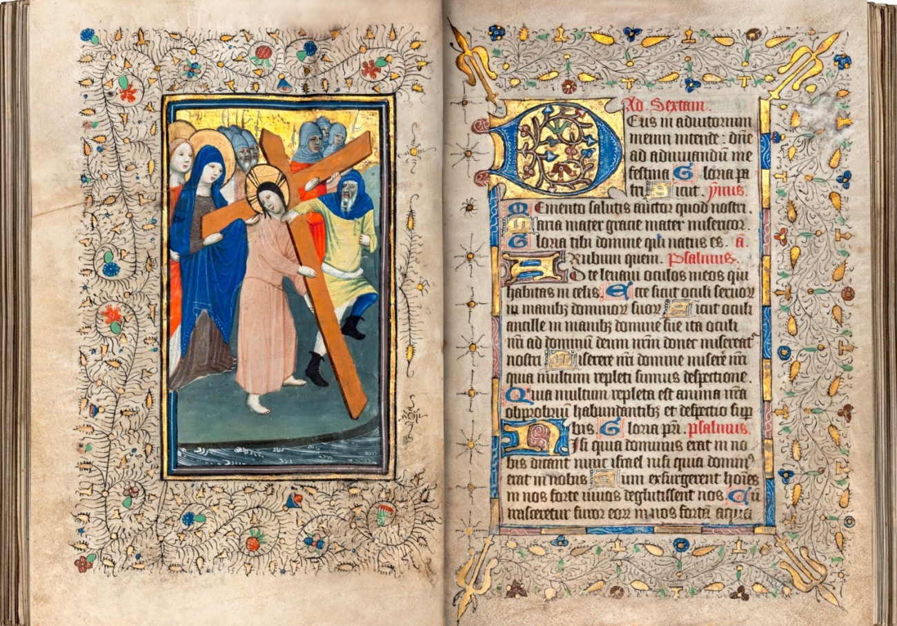
This image has handwritten text with border decorations, an embellished letter, and part of an illustration of Jesus carrying the cross.
A clipped sneak peek of KSRL’s newest medieval manuscript, folio 28v-29r. Take a gander at the whole thing, and the unboxing video, below! Call Number: Pryce MS D1. Click image to enlarge.

Every year at Kenneth Spencer Research Library, through classes, tours, and events, hundreds of undergraduates, graduate students, professors, and visitors from the public get to touch, handle, and engage with our single most popular book: the Vosper Book of Hours (Call Number: Pryce MS C1), a manuscript written painstakingly by hand in the last decades of the 15th century, gleaming with gold and vivid illustrations of medieval scenes from the Bible to accompany the hourly prayers contained within, each page crammed with flourishing decorations in the margins.

But the “verso” to those sparkling memories, if you will, is the stress that such high-touch handling can place on the single most-used book in the building. In 2025, we pulled the Vosper Hours from its cozy home in our vault thirty-four times, more than once every two weeks. In total, it was viewed by over 600 people, though directly handled by some fewer. Medieval manuscripts are often shockingly robust, made from parchment that has withstood the test of time, but even the halest of manuscripts will strain from so many hands upon its pages.
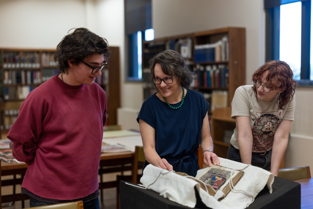
Misty Schieberle, a Professor in the Department of English at KU, explores Spencer’s Vosper Book of Hours with two students. Click image to enlarge.

And so, with an eye to continuing to preserve the longevity of our most-beloved Vosper Hours, I set about finding it a mate, something that could lighten its burden and share the yolk of labor the way the best spouse might, meeting its standards but not exceeding them, lest it simply replace the Vosper Hours as the more popular manuscript and reintroduce the risk of over-use.

The process of threading such a needle involved meeting and corresponding with various booksellers, domestic and international, who specialize in medieval manuscripts in order to get a full sense of the current market and available options. I discussed with them our goals for such an acquisition, as well as our limitations, explaining how we expected and hoped the manuscript might be used, and why we sought particular qualities. These booksellers then sent us offers of the manuscripts in their catalogs that they felt best fit our goals, and I in turn analyzed and evaluated those offerings, including corresponding with various KU teaching faculty, to gather their thoughts on the potential opportunities for instruction and research use of the manuscript. From those conversations and analyses, one candidate rose to the top.

And so, without further ado, meet our newest manuscript:

The very first moment unboxing the manuscript upon its arrival here at Kenneth Spencer Research Library!

Behold, Pryce MS D1. We’ve given her the rather lengthy title Prima dies mensis et septima truncat vt ensis, using the incipit (or the first line of the text), since most medieval manuscripts lack a formal title. Her catchier nickname will likely be the pithy “Book of Hours, Use of Sarum” to reflect that her contents are structured around the pattern of prayers for the Office of the Virgin Mary in Salisbury (or “Sarum”), England. Despite her English nickname, she hails from Bruges, Belgium, a center of book production in the fifteenth century, where she was almost certainly illuminated in a professional workshop known as the “Masters of Otto van Moerdrecht.” They are best known for their work on a manuscript of theologian Nicolaus de Lyra’s Postilla in Prophetas now held at the University of Utrecht (Ms. 252), but only twenty-six manuscripts survive today that include their art.
This image has Latin text in black and red ink, bordered on three sides by sections of gold, blue, and red. Around the text and the image on the other page are black vines with small leaves, flowers, and gold.
Christ carrying the cross, alongside the prayer for noontime/midday, or “Sext” in the Office of the Virgin Mary, folio 28v-29r. Call Number: Pryce MS D1. Click image to enlarge.

She’s more than just a pretty face, too: every unique attribute of the manuscript can reveal different aspects of history, of how we’ve used books and information over time to express ideas and identities, control trade, and more.

For example: this is an unusually hefty volume, especially for a Book of Hours. These books were designed to be easy to keep at hand so that the owner could carry it with them and pray at set hours of the day (hence “Book of Hours”). Most are small enough to fit in the palm of your hand, or perhaps a little larger. Books of Hours flourished as a genre among the laity (non-clergy) in the later Middle Ages and often became a status symbol, flaunting opulent consumption and wealth. Nobles and members of the rising merchant classes could purchase luxury Books of Hours custom designed for their personal tastes, with pigments sourced from precious gems like ultramarine, metals such as lead white and copper verdigris, and above all gold leaf.
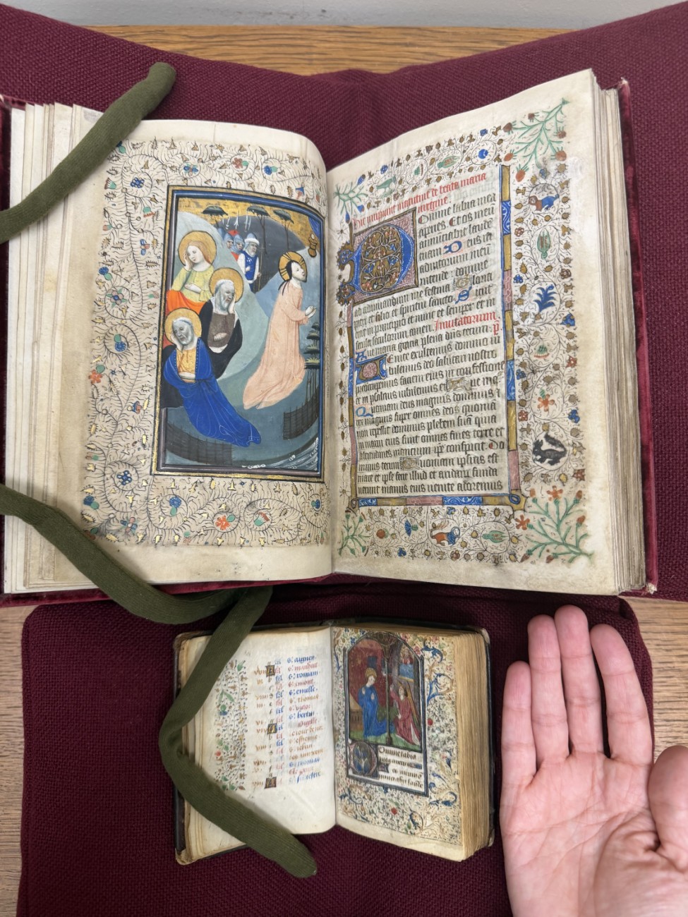
Spencer’s newly acquired Book of Hours (top) next to a more “ordinary”-sized version (bottom), with a hand for scale. Call Numbers: Pryce MS D1 and MS A6. Click image to enlarge.

Books of Hours this large are uncommon, excessive in their opulence and sacrificing any pretense of practicality. In a visiting class, we might ask students why an owner would sacrifice ease of use for the grandiosity of its size, inviting them to reflect on how books are used not only as texts, but as physical objects.

Another example: The manuscript’s international birth and ownership. Dating a manuscript and identifying its place of origin can often present a challenge, and scholars will resort to complex analyses of handwriting and art styles to justify their conclusions. Not so for this manuscript: each miniature is marked by a faint red stamp of “B” that proclaim its origins courtesy of a law implemented in 1427 that required illuminators who sold their artwork to identify it as a local product, in an effort to control the import of luxury illuminations. Meanwhile, the Masters of Otto van Moerdrecht likely left Bruges in 1436, and so we can confidently date our new manuscript down to a single decade. Those stamps testify to the vibrant ongoing trade in luxury manuscripts – and the efforts to control the production of books and art not only as information but as economic and cultural products – in the 15th century.
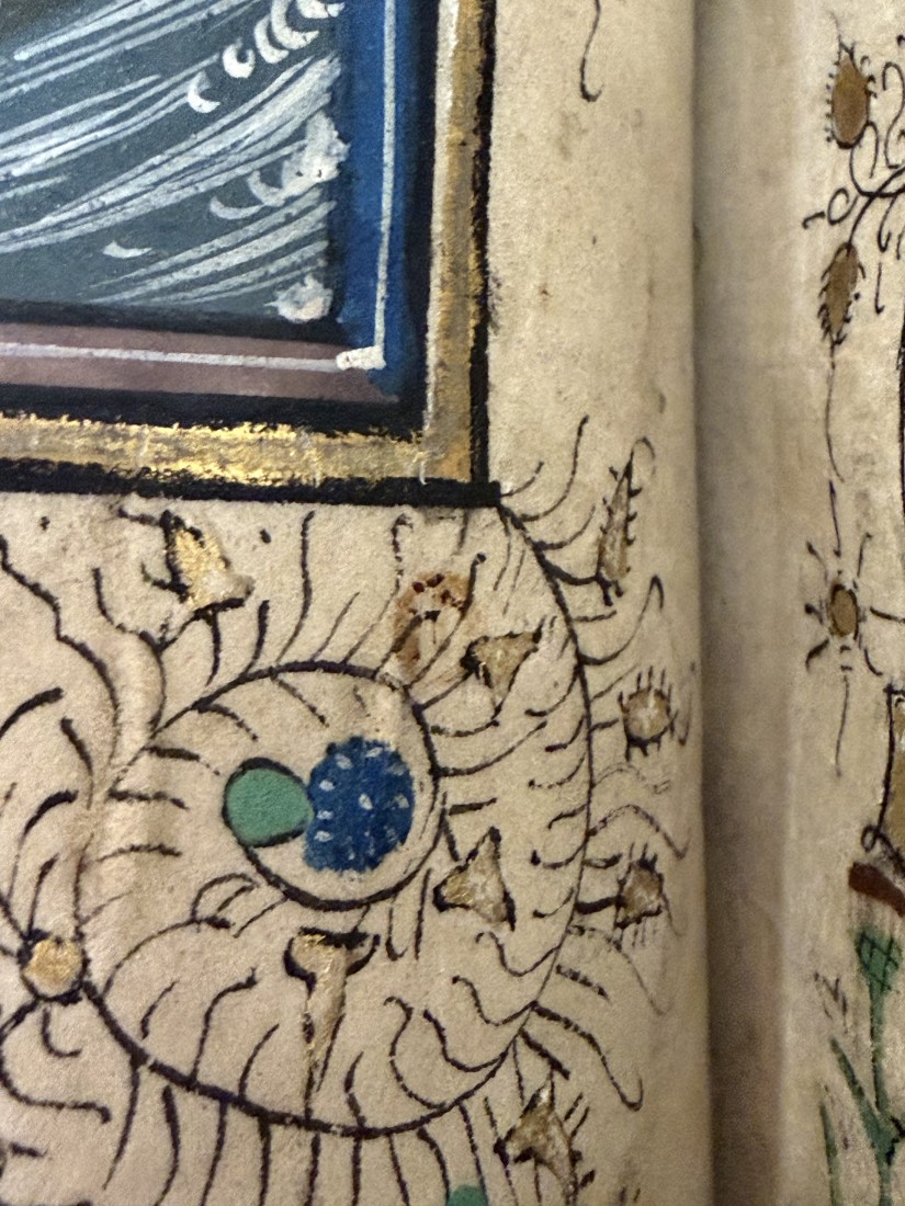
Close-up of the “b” on folio 7v, an illustration of the “Agony in the Garden.” Call Number: Pryce MS D1. Click image to enlarge.

And while the manuscript was made in Bruges, it didn’t remain there for long. Despite its Belgian origins, it was likely made with an English owner in mind, as many of the prayers included in the Book were particularly popular in England. We know that’s where it found its home: a note added in a later hand states it was gifted to John Pullan by his uncle Richard Belasyse in the 16th century, again harkening to how information and art were traded over borders for profit.

Indeed, quite a few owners took their hand to this manuscript, tweaking, correcting, fixing, and editing it to suit their tastes and preferences over the centuries. The earliest patron who originally commissioned the manuscript, most likely, went so far as to amend the miniature of Saint Mary Magdalene shown below, painting over her ointment pot and adding in a scroll that labels her instead as “Saint Anne,” hinting that the patron may have intended to give it as a gift to someone named Anne and decided to fit her patron saint into the prayers. This, in turn, reflects the popularity of Books of Hours among women in the later Middle Ages, revealing the reading habits, literacy and book ownership of women that is otherwise often hidden.

An image of Saint Anne, together with a prayer dedicated to her, folio 108v-109r. Note the repaired damage to the vellum sewn on the lower half of the page. Call Number: Pryce MS D1. Click image to enlarge.

Someone, perhaps that same Anne or her own child, added a note of the birth of Thomas Bentham on October 24, 1477, reflecting how the calendars of Saints’ Days in Books of Hours were often used to track family births since the book would be passed from parent to child over generations.

And the mark of the English Protestant Reformation is revealed through another, later owner who crossed out the names of English Catholic Saint Thomas Becket and the Pope, adding the note “vacat” (“empty” or “blank”) next to feast days. The owner either converted (or wished to appear that they had converted), or the manuscript fell into Protestant hands.

More than one hand has tried to repair damage to its pages, suggesting that the manuscript had at least one rough owner. Some holes in the vellum have been sewn together carefully with thread, but another, likely later, owner seems to have fixed cuts to some pages with an adhesive, though why or how the pages were cut is unclear. At some point the book was rebound into a lush and ostentatious velvet binding, into which William Alfred Westropp Foyle (1885-1963) added his bookplate.

All those changes and adaptations demonstrate how books rarely remain static as they’re handed down from parent to child or bought and sold and shipped this way and that. People change their books the way they change their information, adapting it to their needs, aesthetic preferences, religious devotions, and even idle whims.

Now it makes another home here on the shelves of Kenneth Spencer Research Library, and we’ve already added a touch of our own: a custom-fit box built to the best standards of conservation care. Here, it will make another life for itself and touch the hearts and imaginations of hundreds of students, visitors, and researchers while giving our Vosper Hours much-needed relief for its own use. Like all the books on our shelves, it is available for any and all to come and see in tours and showcases, in classes and instruction, and above all in our Reading Room.

Eve Wolynes
Special Collections Curator

Haunting Humanities and Early Modern Monstrosities

October 27th, 2025

What makes a monster, well, monstrous? Monsters carry the fears of the people that create them, tapping into existential dreads and cultural tensions to flay our superficial defenses and expose the weak societal organs and vulnerabilities beneath. Today, our monsters array from the cannibalistic and supernatural vampires of Sinners to Barbarian’s brutal, lonesome and pitiable Mother – and the movie’s true monster, a landlord. 

In the later Middle Ages, however, monsters sometimes played a more ambivalent role than violent antagonists. The word “monster” derives from the Latin “monēre” or “to warn, to admonish.” These monsters embodied omens or manifested God’s admonishment of human behavior, inviting conscious and deliberate analysis and contemplation on their meanings. So-called “monstrous races” were born from tales and anecdotes of human and human-like peoples born in far-off lands, repurposing anecdotal entrails from the Bible and classical authors like Pliny the Elder into haruspices of divine interpretation. They were frequent subjects of fascination and debate for their meanings, paired with prodigies and marvels as the myriad ways that God’s will manifested in nature and the real world, as well as theological debates as to whether such races possessed souls and could be converted to Christianity. 

Konrad Lykosthenes was one such interpreter, a humanist and encyclopedist who sought to sew together a comprehensive history of signs, prodigies, and portents from biblical times into his own modernity with his Prodigiorum ac ostentorvm chronicon [Chronicle of Prodigies and Signs]. He built a body of text from the limbs of other historical and contemporary sources onto which he sutured his own interpretations. These portents included everything from natural disasters like earthquakes to the appearance of mythical and monstrous creatures, as well as so-called “wonders,” “marvels,” and “monstrous” births. His work proved sensationalist and popular, a theological treatise that leaned lurid and sometimes traded on the grisly and gruesome to appeal to a wider audience. 

This image has text and six woodcut illustrations of "monsters."
An image of monstrous races from Lykosthenes’ Prodigiorum, including a “scioped” or “monopod” – a mythological one-footed race of people drawn from Greek classical literature. Lykosthenes, Konrad. Prodigiorvm ac ostentorvm chronicon. Basil: Henricvm Petri, 1557. Call Number: Summerfield E392. Click image to enlarge.

By the end of the sixteenth century, science and medicine had pierced their talons into the tender underbelly of the study of monstrosities, clawing it away from the sole purview of priests, philosophers, and theologians. With that shift, natural historians like Ulisse Aldrovandi and physicians like Fortunio Liceti dissected the meanings of monstrosities not as reflections of divine will or intent, but as natural phenomena that could be classified and analyzed under the newly invented microscope. 

Ulisse Aldrovandi sought to document all forms of nature, collecting a cabinet of curiosity with over 7,000 specimens – including an alleged and infamous dragon, likely fabricated by grafting together the stuffed carcasses of other animals. From those studies and collections he wrote over 400 volumes on everything from mollusks to metals. Monsters were a natural inclusion, and thus was wrought his Monstrorum Historia, the eleventh of a fourteen-volume encyclopedia. It bled together what we today treat as unequivocally monstrous creatures – centaurs and satyrs – with concepts that today we might conceive as mere medical conditions, such as neurofibromatosis or hypertrichosis, transplanting alien viscera of exotic monstrosity into the hollow body cavity of the reader’s imagination and understanding of nature. Aldrovandi’s amalgamation of monstrous creatures, humans, and hybrids reflected an ambition to reflect a complete and total natural history of monsters in parallel to birds, fish, and all of the natural world, rather than flensing the impossible from the plausible like extraneous fat from muscle and meat. 

Two full-page woodcut illustrations.
A “monstrous marine horse,” and a “demon-formed marine monster.” Aldrovandi, Ulisse. [Works] Monstrorum Historia [Histories of Monsters]. Bologna: Nicolaus Tebaldinus and others, 1637. Call Number: Ellis Aves E70. Click image to enlarge.

In De Monstrorum causibus [On the Causes of Monsters], Fortunio Liceti, meanwhile, purported to analyze monsters not only as a phenomena born from nature – or “nature’s mistakes” or even its jokes and pranks – rather than divine will, but also sought their causes and their taxonomic classifications a landmark in teratology – the study of monsters which today has come to mean the study of congenital birth defects. The modern conflation is no accident, as Liceti’s work treats them as one and the same: monsters were born, not made, and his work discusses everything from dog-headed humans to conjoined twins, framed in antithesis to the ideal or perfect human body that was increasingly the focus of medical study.  

Liceti described monsters not as warnings or admonishments but as “showings,” claiming that the term derived from “monstrare,” or “to demonstrate or show.” His examination of “monsters” demystified them and challenged the portentous interpretations of monstrosities that deemed them a reflection of the wrath of God upon the parent or their community writ large. This metamorphosed monstrosities into something not inherently ominous or harrowing but still oozing with interpretations. 

This image has text.
A pig with the face of a human, and a cat with a pair of human legs, in which Liceti explains the causes of monsters born with the limbs or body parts of multiple species. Liceti, Fortunio. De monstrorum caussis, natura, et differentiis libri duo… 2. ed. [On the Causes, Nature, and Differences of Monsters]. Patavii [Padua]: Apud Paulum Frambottum, 1634. Call Number: Summerfield C802. Click image to enlarge.

As we examine historical horrors, it invites a vivisection of our own insecurities and fears, to peel back the flesh of our society and examine the sinews beneath that tie together our own identities: What do we think of as monstrous, and why? When does humanity itself become monstrous? And when something goes bump in the night, what are we really afraid of? 

All of above books will be on display at this year’s Haunting Humanities event this Wednesday, October 29th, 5:30 to 9pm at Abe and Jake’s Landing (800 E. 6th Street), together with an array of horrifying, prodigious, and compelling activities, including a monstrously-themed escape room in a box, coloring pages, Rare Book Bingo, monster reviews, and more. Come contemplate the meanings of monstrosity with us and walk away with your own nightmares to divine. 

Eve Wolynes
Special Collections Curator

Travel, Tourism, and the Transmission of Knowledge in and around Japan

August 26th, 2025

How was knowledge, ranging from the scientific, pious, entrepreneurial, and artistic, to the preposterous, transmitted through the historic movement of print and manuscript material in and around Japan?

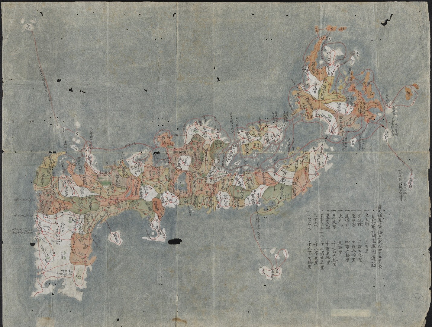
Colored manuscript map of Japan, ca. 1800.
Nihon koezu 日本古絵図 (Manuscript map of Japan). Japan, ca. 1800. Call Number: MS R5:3. Click image to enlarge

Setting out to tackle this question in Spring 2025, students in the University of Kansas History of Art Department Japanese art history seminar “Manuscripts, Maps, and Illustrated Books” had the opportunity to curate this exhibition, working with materials from The Kenneth Spencer Research Library collection. Selected works range from 1646 to 1936, including detailed cartography, woodblock-printed imagery, and religious paraphernalia. Journeying from Japan to the West and back again, this exhibition spans three centuries and five intersecting themes.

Opened on July 31, 2025, the exhibition’s five cases follow the themes given below. In addition, a special event in the gallery on Wednesday, September 3, 2025 (3:30-4:45) will feature mini presentations on selected works by each seminar student. The exhibit will remain open through January 9, 2026.

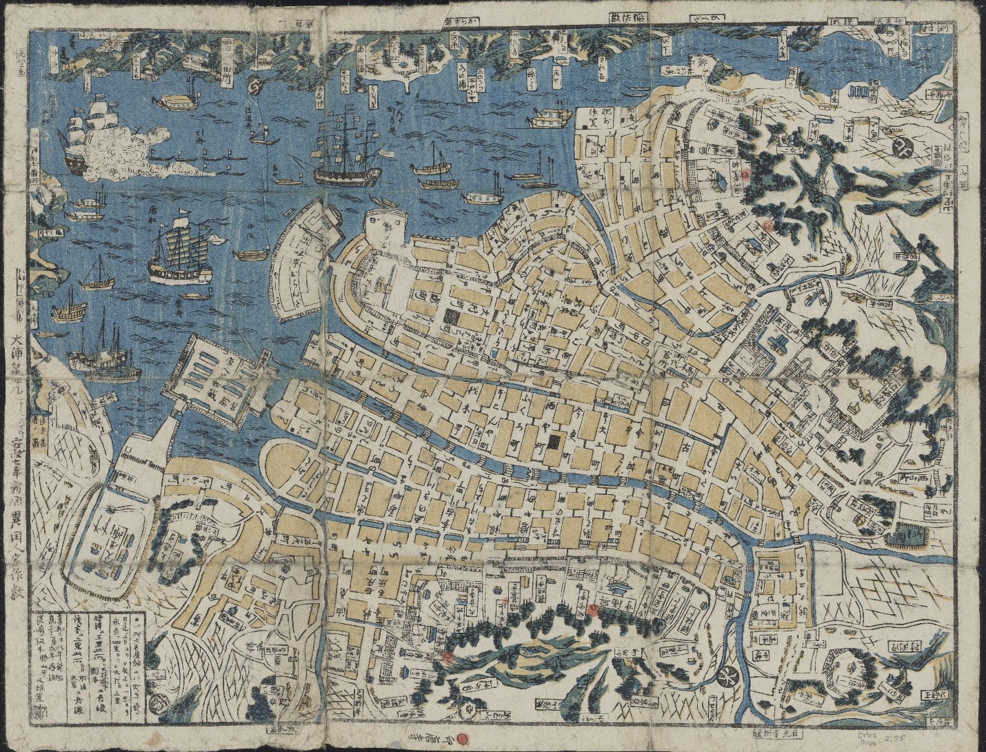
1. Mapping and Conceptions of Space demonstrates that as Japan moved toward the 19th century, its awareness of the world beyond its islands gradually increased. Interactions with foreign visitors fostered an exchange of culture and knowledge that diffused into every area of society, including Japanese cartographic practices.

Nagasaki chizu 長崎地図 (Colored map of Nagasaki with boats shown in the port), 1860
Nagasaki chizu 長崎地図 (Map of Nagasaki). Nagasaki: Bunkindō, 1860. Call Number: Orbis maps 2:75. Click image to enlarge.

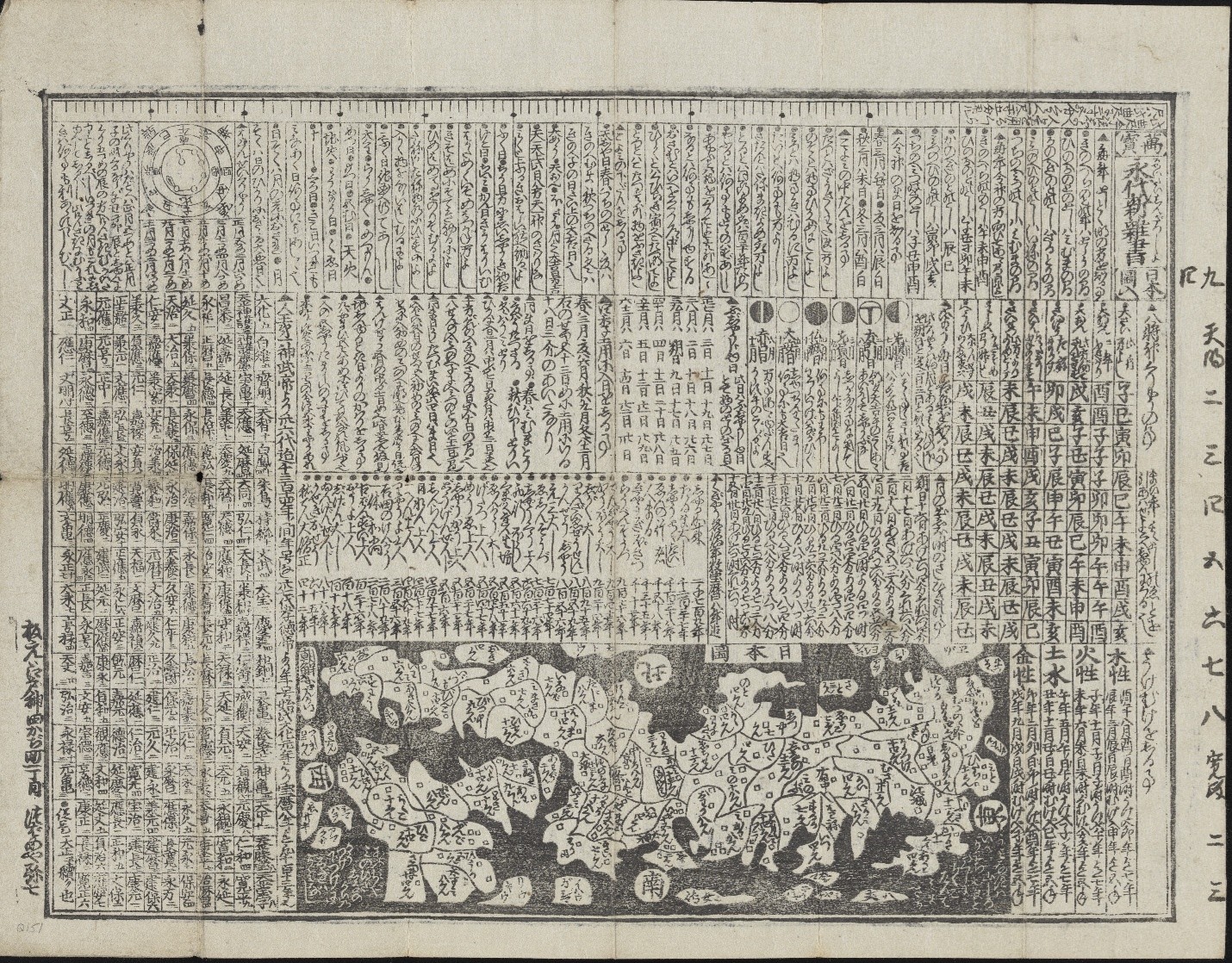
Representations of space in both image and text indicate the geographical information deemed most important. From spiritual landmarks and cosmological beliefs to political boundaries and travel logistics, these historical maps and guides reveal how users’ conceptions of East Asia were shaped at the time.

Manpō eitai shin zassho Nihonzu iri 萬寳永代新雜書日本圖入, New Miscellany of Countless Eternal Treasures, with a Map of Japan in black and white.
Manpō eitai shin zassho Nihonzu iri 萬寳永代新雜書日本圖入 (New Miscellany of Countless Eternal Treasures, with a Map of Japan). Edo (Tokyo): Ensendō Tsubameya Yashichi, ca. 1758–1760. Call Number: Q151. Click image to enlarge.

While overseas travel remained restricted throughout the 17th to 19th centuries, these materials demonstrate an expanding awareness of domestic and global geographies, depicted using both traditional Japanese mapmaking and novel observations from Western travelers.  

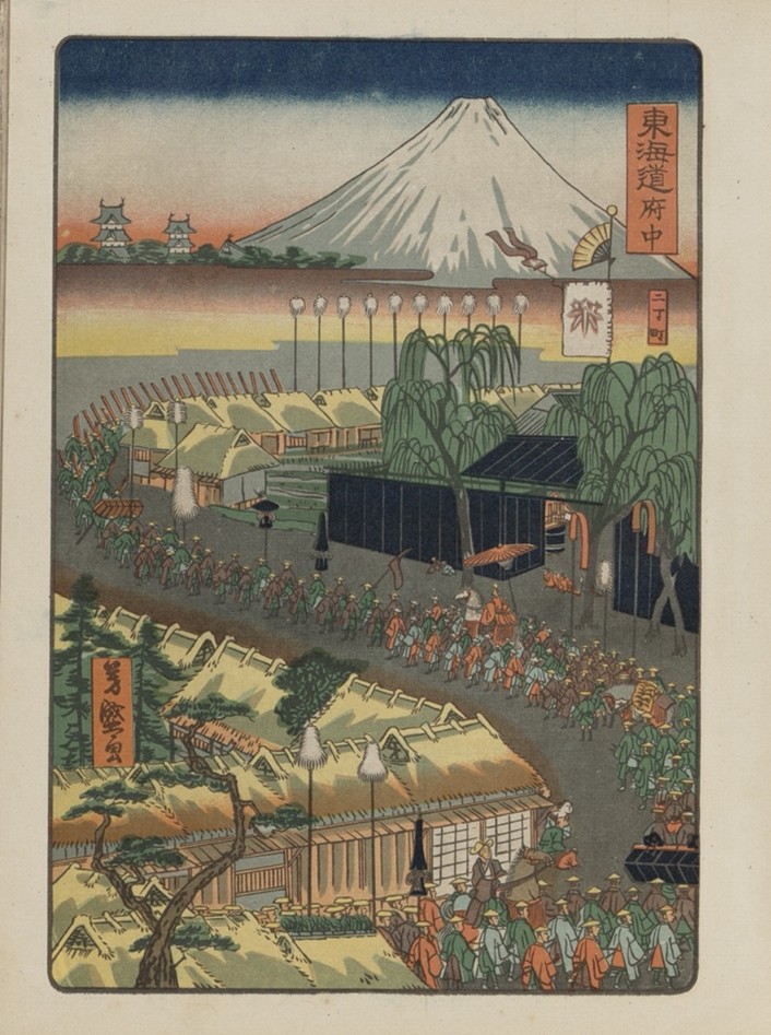
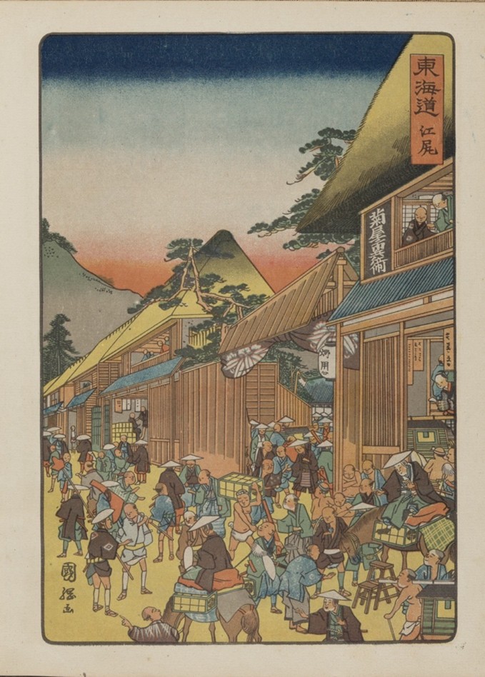
2. Tourism and Movement of People explores how travel shaped the visual culture and national identity of Japan from the seventeenth century through the turn of the 20th century. The depictions of elaborate 17th-to 19th-century processions of feudal lords evoke an earlier era of ceremonial travel and spectacle, emphasizing traditional routes and social hierarchies.

Hiroshige Toyokuni meiga hyakushu daimyō dōchū 広重豊国名画百種大名道中
(One Hundred Famous Views of a Daimyo’s Journey by Hiroshige and Toyokuni). Tokyo: Tōkōen, 1918. Call Number: E3579. Click image to enlarge.

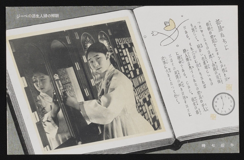
By the early 20th century, Japan’s interest in travel shifted toward promoting tourism as a tool for modernization and imperial expansion into regions such as Manchuria (Northeast China), Hokkaido and Korea. Postcards, travel guidebooks, and government-issued pamphlets offered carefully curated images and structured itineraries for both foreign and domestic travelers.

Postcard showing an open book, Chōsen no fujin seikatsu no pēji 朝鮮の婦人生活のページ (Pages of Korean Women’s Lives)
Chōsen no fujin seikatsu no pēji 朝鮮の婦人生活のページ (Pages of Korean Women’s Lives). Wakayama, Japan: Taishō Shashin Kōgeisho, 1925–1936. Personal Papers of Kate Hansen, PP 19, Box 14, postcard. Click image to enlarge.

Together, these materials illustrate changing conceptions of travel, from symbolic displays of authority to strategic assertions of national identity.

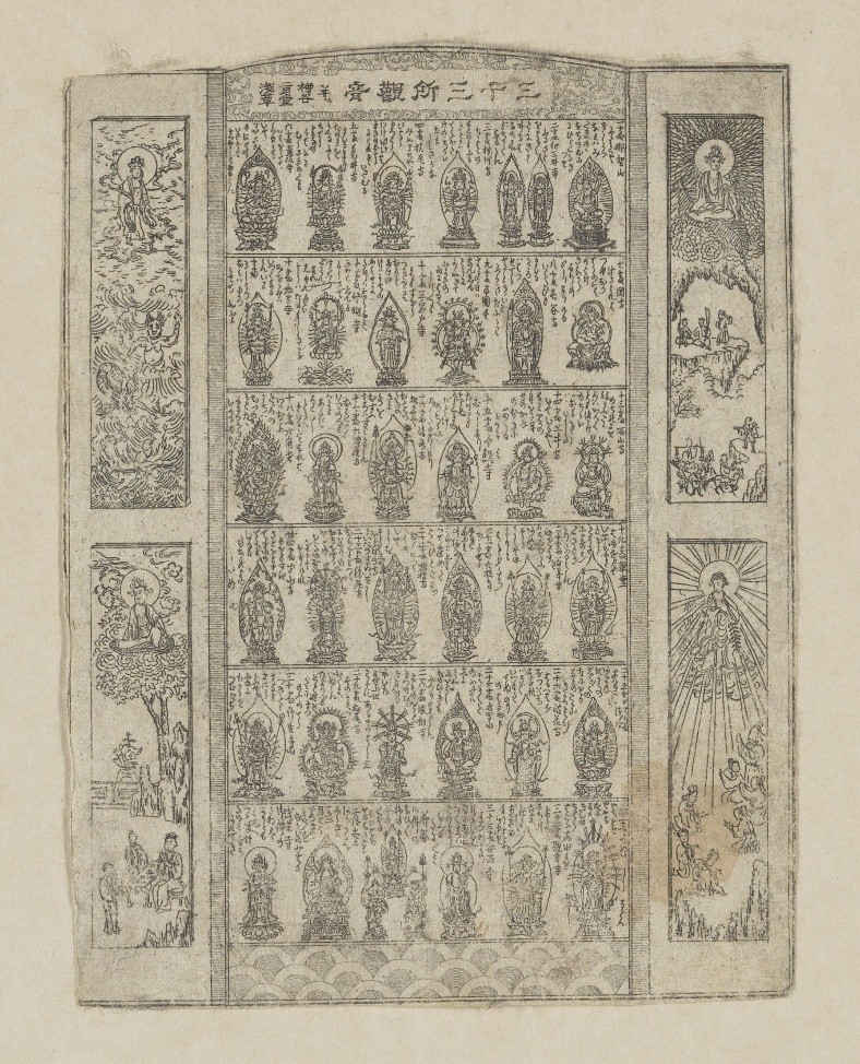
3. Pilgrimage and Movement of Religions reflects upon the spread of foreign faiths to Japan, as well as the pivotal role of bodily and spiritual journeys within religious beliefs and practices. Originating in India, Buddhism spread to Japan in the sixth century and since developed into a major religion with a profound influence on daily life. Buddhist practitioners frequently visit temples and undertake pilgrimages along designated routes, seeking face-to-face encounters with deities through their icons.

Image of Sanjūsansho Kannon narabini Yanagidani Nigatsudō Asakusa 三十三所観音 并二 柳谷二月堂浅草 (Thirty-three Kannon Pilgrimage Sites with Yanagidani, Nigatsudō, and Asakusa)
Attributed to Suiindō Takonoya 水引堂蛸室, a.k.a. Mizuhikidō Shōshitsu
Sanjūsansho Kannon narabini Yanagidani Nigatsudō Asakusa 三十三所観音 并二 柳谷二月堂浅草 (Thirty-three Kannon Pilgrimage Sites with Yanagidani, Nigatsudō, and Asakusa). Japan, ca. 1860–1868. Call Number: P363. Click image to enlarge.


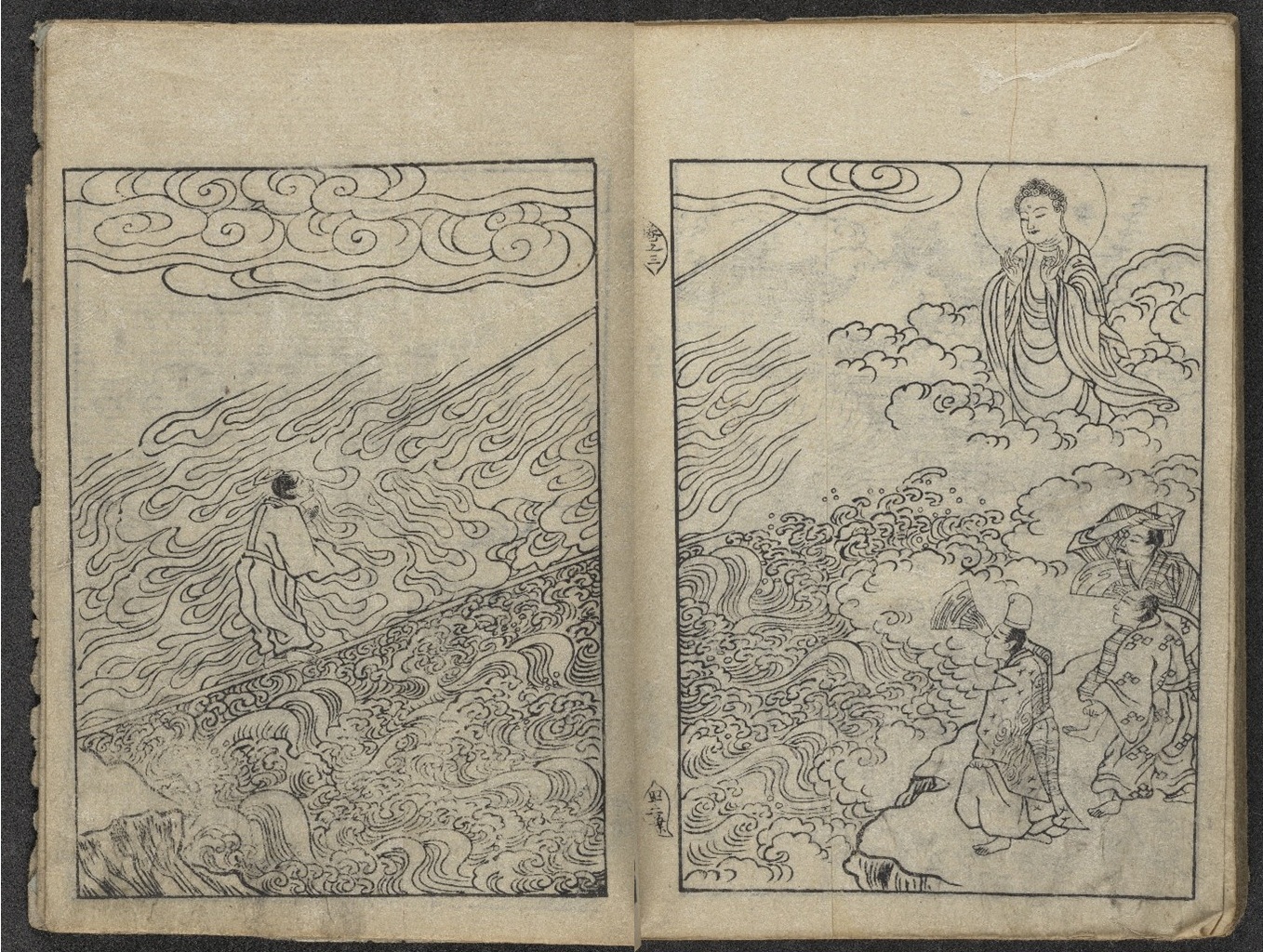
In many legends, sacred Buddhist icons demonstrate miraculous power and compassion by journeying across land and sea. Movement occurs not only across geographical spaces, but also between the earthly realm and Buddhist paradises.

Image of “The White Path between Two Rivers,” featuring a figure standing in a river with a Buddha in the sky in Senchaku hongan nenbutsu shū 選択本願念仏集
“The White Path between Two Rivers,” in Senchaku hongan nenbutsu shū 選択本願念仏集 (Passages on the Nenbutsu Selected in the Original Vow), Vol. 2, Kyoto: Akai Chōbei, late 18th–early 19th century, based on the 1744 edition. Personal Papers of Kate Hansen, PP 19, Box 11, Folder 13. Click image to enlarge.

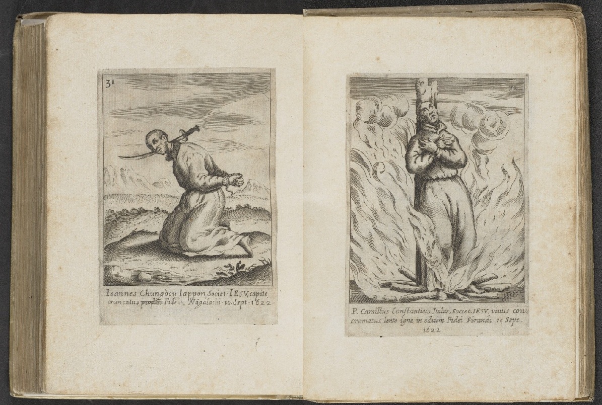
However, not all foreign religions were warmly received in Japan. A few decades after its introduction by Jesuit missionaries, Christianity faced severe persecutions in the late 16th and 17th centuries, reflecting state and local resistance to beliefs imported from distant shores.

Two images of a man tied up with a floating sword to his neck (left) and a man being burned at the stake (right) from Fasciculus e Iapponicis floribus suo adhuc madentibus sanguine (A Wreath of Japanese Flowers, Still Dripping in their Own Blood)
Antonio Francisco Cardim (1596–1659). Fasciculus e Iapponicis floribus suo adhuc madentibus sanguine (A Wreath of Japanese Flowers, Still Dripping in their Own Blood). Rome: Typis Heredum Corbelletti, 1646. Call Number: Summerfield C1234. Click image to enlarge.

4. Trade and Movement of Goods offers a window into the commercial world of Japan and the global trade networks that developed from the movement of goods. Print culture in Japan served not only to document commodities but also to shape how goods were seen, valued, and consumed. From tea catalogs to textile pattern books and beer advertisements, the objects in this case reveal how trade goods were embedded in shifting notions of taste, identity, and national power.

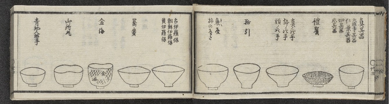
Page with text and pictures of tea bowls/cups in Kogetsu 湖月 (active 19th century). “Foreign Wares,” in Chake suikozatsu 茶家醉古襍 (Repertory of Tea Masters’ Intoxication with Antiques)
Kogetsu 湖月 (active 19th century). “Foreign Wares,” in Chake suikozatsu 茶家醉古襍 (Repertory of Tea Masters’ Intoxication with Antiques), Vol. 3. Kyoto: Ōmiya Satarō, 1843. Call Number: tK53. Click image to enlarge.
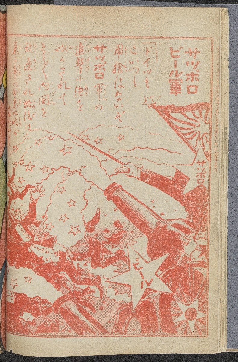
Advertisement for Sapporo Beer, showing a bottle with beer shooting out of it like a cannon in Nipponchi 日ポンチ (The Land of Japan)
“Advertisement for Sapporo Beer,” in Nipponchi 日ポンチ (The Land of Japan), Vol. 14. Tokyo: Tōyōdō, 1905. Call Number: C22350. Click image to enlarge.

Although trade across East Asia dates back millennia, commercial exchange between Japan and the West began to grow from the 17th century and intensified at the turn of the 20th century. With objects and knowledge flowing between Japan, broader Asia, and the West, print media itself became a commodity, as demand for Japanese goods expanded. These publications offer a window into the commercial world of Japan, its transnational material culture, and the global trade networks that developed from the movement of goods.

5. Virtual Travel and Fantasies of Asia examines printed materials from the 17th to the 20th century that depicted Japan’s culture and shaped Western fantasies of Asia, constructing descriptions that blurred fact and fiction.

Image of a plantlike figure representing the Buddhist deity Avalokiteshvara in Gedenkwaerdige gesantschappen der Oost-Indische maatschappy in’t Vereenigde Nederland, aan de kaisaren van Japan (Atlas Japannensis [Japanese Atlas]).
Arnoldus Montanus (ca. 1625–1683). “Buddhist deity Avalokiteshvara (J. Kannon),” in Gedenkwaerdige gesantschappen der Oost-Indische maatschappy in’t Vereenigde Nederland, aan de kaisaren van Japan (Atlas Japannensis [Japanese Atlas]). Amsterdam, Netherlands: J. Meurs, 1669. Call Number: Summerfield E238. Click image to enlarge.

Through these objects, virtual travel, the concept of journeying to another place through imagination, was made possible for Europeans and Americans alike.

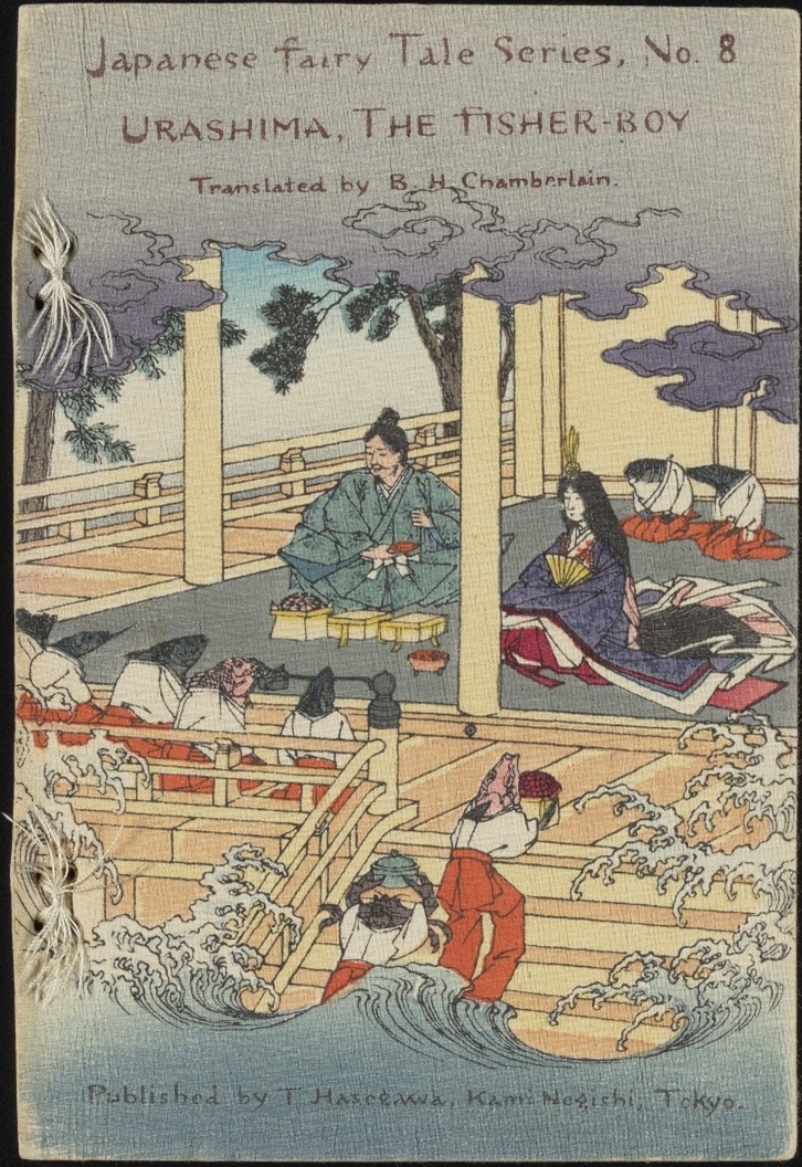
Colored front cover of Urashima, The Fisher-Boy
Hasegawa Takejirō (1835–1915); Sensai Eitaku (1843–1890). Urashima, The Fisher-Boy; Tokyo: Hasegawa Takejirō, 1886. Call Number: B17050. Click image to enlarge.

Japan also capitalized on print media, seeking to reconstruct its self-image as modern and legitimize its global relevance in the 20th century. These books, fashion plates, and inventive illustrations reveal the breadth of cultural dialogue between East and West, offering visions of Japan in which curiosity, exoticization, and national identity came together.

These treasures that traveled out of The Kenneth Spencer Research Library stacks into this exhibition represent but a fraction of the library’s holdings of Asian material, which are all available upon patron request. Notably, several of the items included were collected by Kate Hansen (18791968), a Kansan who lived in Japan as a missionary and music teacher during 19071941 and 19471951.

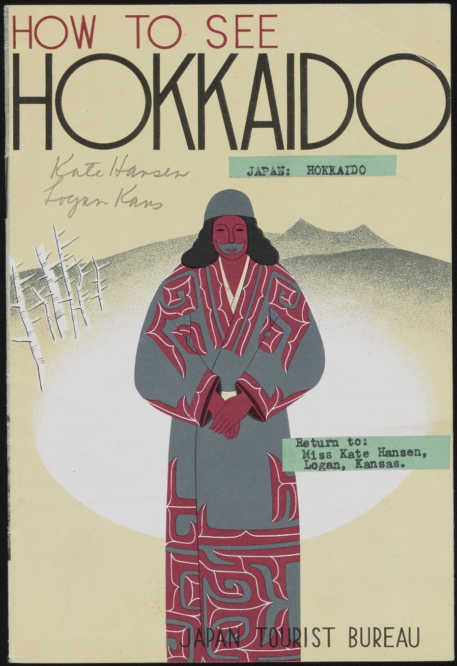
Image of the cover of How to See Hokkaido, a Japanese tourist booklet.
How to See Hokkaido. Tokyo: Japan Tourist Bureau, circa 1936. Tourist guide booklet owned by Kate Hansen and used by US Naval Intelligence during WWII. Personal Papers of Kate Hansen, PP 19, Box 5, Folder 10. Click image to enlarge.

After finalizing the exhibition details, a new acquisition was made to the library’s collection that fit the exhibition theme so well we decided to add it to a bonus case. Please come look for this wonderful mystery item. Hint: polar bears!

We hope that these displays will move viewers to appreciate how people of the past sought creative strategies that blended image with text to excite and inspire the transmission of knowledge in and around Japan.

Sherry Fowler (drawing from collaborative exhibition text)
Professor of Japanese Art History, History of Art
University of Kansas

*****

Faculty advisor: Sherry Fowler, Professor of Japanese Art History, History of Art, University of Kansas

Student curators: Yuan-Hsi Chao, Brady Cullen, Aria Diao, Shangyi Lyu, Olivia Song, Emma Smith, Rebekah Staton, Heeryun Suh, Eli Troen, and Morgan Williamson

Library advisor: Eve Wolynes, Special Collections Curator, University of Kansas Libraries

*****

Cracking the Codex: Reading Medieval Latin Abbreviations

August 1st, 2025

This post was written Public Services student assistant Kit Cavazos as part of their summer internship supervised by KU English Professor Misty Schieberle and Special Collections Curator Eve Wolynes.
Although medieval manuscripts are well-known for their look and style, the act of actually reading and understanding one can be tough. The image that often comes to mind is that of their non-naturalistic drawings, and thus, a casual viewer may see the squiggles sprinkled across the text as another odd decoration. However, many serve specific and intentional functions, acting as contractions, substitutions, or abbreviations of words or parts of words. Scribes often chose this practice because it saved on ink and parchment space, since both these materials were quite expensive.

This image has handwritten text in Latin.
Homiliae in Evangelia by Pope Gregory I, recto (detail), 1100–1115 CE. Call Number: MS 9/1:A1. Click image to enlarge.

The first and most prominent thing to note about manuscript notation is the dashes that are most often placed over vowels. Most of the time, these indicate a missing letter N or M. For example, “terram” shortens to “terrā.” The page above has quite a few examples in the first line: “qua[m],” “lapide[m],” and “lapide[m].”

This image has handwritten text in Latin.
Breviary, verso (detail), 1100-1199 CE. Call Number: MS 9/1:A6. Click image to enlarge.

Dashes can often have other meanings when interacting with a consonant, either by hovering above or crossing the letter. The incipit line of the above page has a quite recognizable first word, which substitutes an I for a J. This letter difference is generally because Latin, as a language, does not use the letter J, meaning our first word is “Judea.” Thus it is easier to understand part of the next noun, which has a letter L with a dash intersecting it, with the result resembling a stylized letter T. Picking out when a letter is a T or an L is made easy by way of comparison, as the page’s script will always have a style that differentiates letter that could be confused.

Thus, this L with an intersecting dash in the spine could represent a few similar letter clumps: “ler…,” “…ul,” “lor…,” or “al…,” among others. Despite knowing exactly what variations the letter could stand for, it still introduces a new wrinkle into the fold, as none of the suggested meanings for the substitutions seem to make the word wholly understandable. “Jerlerm,” “Jerulm,” “Jerlorm,” and “Jeralm” are not proper words, and thus, the contraction demonstrates how common words (such as proper nouns) could have more of an abstract contraction. When examining this word in context, it might be a bit easier to understand that this contraction represents the city named “Jerusalem.”

This image has handwritten text in Latin.
Homily fragment, recto (detail), 1250-1299 CE. Call Number: MS 9/1:A7. Click image to enlarge.

Another common symbol is this: , which often represents a “rum,” “ram,  or “rem” sort of ending. The above example has multiple instances of its use within the first line, all taking the first possible ending. The line, when uncontracted, would read “verbi salutaris ac miraculorum suorum dulcidine” (“by the sweetness of his saving word and miracles”). These textual changes – both contractions and substitutions – indicate that both scribes and readers needed to have not only a deep understanding of what each symbol represented, but also a sense of the language. You could either look at the Latin and parse some words, or you could understand how to complete the words but have their meaning completely lost on you. This afforded the literate members of the population some form of exclusivity from everyone else. These manuscripts often contain important information about plants, animals, or other general encyclopedic knowledge.
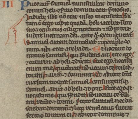
This image has handwritten text in Latin.
Bible fragment of I Kings, recto (detail), 1240-1260 CE. Call Number: MS 9/1:A8. Click image to enlarge.

Another important aspect of a manuscript is additions that enhance a reader’s understanding of the text. The most obvious would be the fingers pointing to specific lines. These are manicules, and they are meant to emphasize important parts of the text. Another detail does something similar on the above page. The red lines highlighting specific letters are forms of rubrication, and they have a very similar function to manicules. In this instance, they mean to indicate and emphasize the capital letters in the line.

In other instances, rubrication notates significant parts of the text and frequently has a moralizing meaning. This means it can also come in textual form – often called the rubric – and it can add, emphasize, or reiterate important information to the reader. The term rubrication comes from the Latin word “ruber” (“red”), but important elements to a manuscript are not restricted solely to one color. Red often sees the most use, but blue and occasionally green can also be used for emphasis or decoration.

This image has handwritten text in Latin.
Leaf Containing the Service of the First Tuesday in Lent, Missal, recto (detail), 1400-1499 CE. Call Number: MS 9:2.30. Click image to enlarge.

With these basic understandings of common aspects of a medieval text (at least within the Spencer collection), reading a manuscript for the first time may be less daunting. The above page, for example, has several features already discussed. Most prominently, the rubrication stands out from the rest of the content, especially in the rubricated initial letters A and I, which have blue decoration that appears to mimic a lace design. The first rubricated word of the text is in the incipit line, which has the same L with an intersecting dash as before. Thus, we know the word would be something like “pp[ul]m” or something similar. If you don’t have a book on contractions easily to hand, sometimes sounding out what letters you do have can help make sense of the word – “populum,” in this instance. Thus, reading through the incipit line, it would say something like “Absol[v]e q[uaesumu]s D[omine] p[o]p[u]l[um] n[ostr]o[rum] vincula peccato[rum]” (“we beseech you, O Lord, to absolve our people from the bonds of their sins”). From even just this first line, we can understand that the reader is meant to focus on the people or population about whom it is speaking.

Reading through a medieval text can be difficult; even just reading one line without translation can take hours, depending on how many contractions or abbreviations there are, as well as how obscure each one may be. The result, though, is quite often rewarding, as it means modern readers can understand how information was relayed and what information medieval writers saw as needing to be relayed. An online resource for information on specific abbreviations is Cappelli’s Latin Abbreviations, which has been incredibly helpful for research and compiling the transcription of these lines.

Kit Cavazos
Public Services student assistant

Marvelous Medieval Marginalia

March 19th, 2025

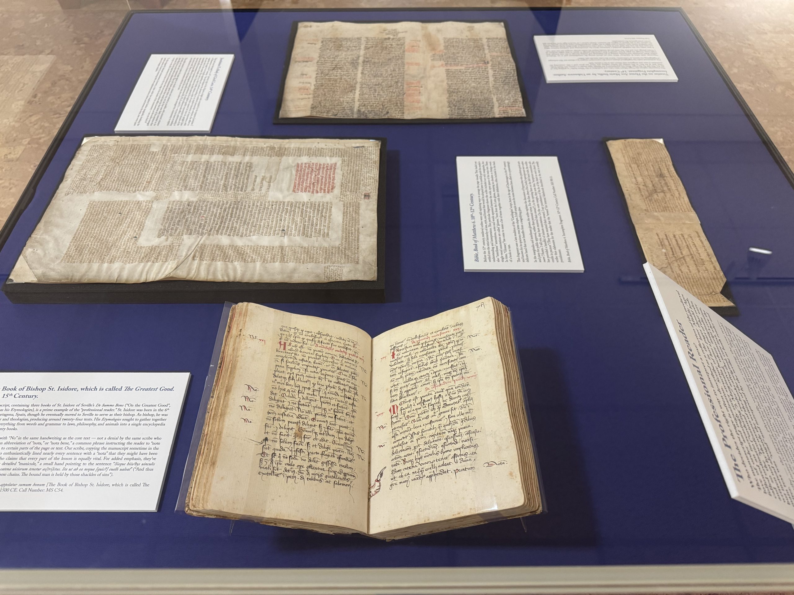
One of the most fascinating things about medieval manuscripts is that every copy is unique and individual. Because scribes wrote manuscripts by hand, no two copies are identical. On March 8th, Kenneth Spencer Research Library opened Marvelous Medieval Marginalia, an exhibit that celebrates the unique and the individual, the best parts of medieval manuscripts, and the scribes, readers, and owners who had a hand in transforming texts over time. It’s dedicated to the voices of not necessarily the great and influential authors and artists of old but to a quieter subset who aren’t always given the attention they deserve – the readers, the imaginers, and doodlers across centuries.

Exhibit case of medieval manuscripts currently on display as part of the Marvelous Medieval Marginalia exhibit
Exhibit case of medieval manuscripts currently on display as part of the Marvelous Medieval Marginalia exhibit. Click image to enlarge.

The exhibit focuses on marginalia. From the Latin for literally just “things in the margins,” marginalia can encompass many things, from formally executed illustrations meant to enhance the manuscript into a work of art to notes and annotations. We tend to think of books as static or frozen in time, but through marginalia and readers, they were often amorphous and ever-changing, shaped and reshaped by their owners over decades and centuries. Medieval readers were not merely passive consumers of manuscripts; they thought about and engaged with their texts, argued and agreed, and added their thoughts. And their relics are preserved in the notes they left behind, capturing their fleeting thoughts in amber for us to enjoy centuries later.

With annotations, we can see what people actually thought about the texts they read. They let us see where readers denied or disagreed with the original manuscript – as with this manuscript copy of Lactantius’ Divine Institutes, a defense of Christianity and a refutation of Greek and Roman polytheism.

Image of a detail from a manuscript copy of Lactantius’ Divinae Institutiones [The Divine Institutes], Italy, ca. 1400-1500 CE., with manuscript notes in the margin.
Lactantius’ Divinae Institutiones [The Divine Institutes], Italy, circa 1400-1500 CE. Call Number: MS C61. Click image to enlarge.

An early reader has added the note “falsum” or “false” while striking lines through parts of the text – potentially either disagreeing with the text itself or perhaps claiming it was spurious and misattributed. Where readers’ notes give us insight into the sometimes-critical thoughts of medieval readers, their doodles provide glimpses into the universal experience of boredom and the creativity it can allow to blossom. With doodles, “the more things change, the more they stay the same.” We doodle just as much today as people did 800 years ago, but what we doodle changes, reflecting the nuances of human culture and identity. It’s a time-honored tradition across the centuries; you’ve likely stuck at least a few notes in the margins of your class assignments or books over the years. Idle doodles encapsulate the wandering thoughts of people from the past as they were when they took quill pen to page.

Sometimes, it was the scribes themselves, the people writing and copying the manuscripts for later audiences, who added flares of fun into the margins. Copying manuscripts by hand was often a long and tedious process, taking anywhere from days to months. A certain playfulness to these marginalia emerged when the scribe’s mind and hand wandered. You wind up with texts like MS B15, a collection of Divine Offices, hymns, prayers, and devotional poetry, where the scribe has very diligently copied the text for over 700 pages, all written in the same hand so that you know this is one person scribbling page after page after page. But they’ve broken the tedium by dappling the tops and bottoms of letters with -Picasso-esque caricatures, skewed profile faces wearing silly hats, and the occasional peacock.

Image of doodles of faces in the margins of Spencer's manuscript copy of Ordinatio totius officii divini secundum usum monasterii Beatae Mariae de Belgentiaco. [A Complete Order of the Divine Offices According to the Use of the Monastery of the Blessed Mary of Beaugency.]. France, 1400-1500.
Ordinatio totius officii divini secundum usum monasterii Beatae Mariae de Belgentiaco [A Complete Order of the Divine Offices According to the Use of the Monastery of the Blessed Mary of Beaugency], France, 1400-1500. Call Number: MS B15. Click image to enlarge.

Marginalia can help reveal the silent reader’s voice and how they understood or analyzed texts – but even in the case of drawings and doodles, these weren’t all the product of an idle mind. Often, the doodles in the margins directly responded to and sometimes commented upon the text itself, creating visual commentary that shows how a scribe or reader responded to the work. These are called deliberate or communicative doodles.

Marginalia didn’t end with the advent of print, but they were unquestionably changed by it. In many ways, printing is more rigid than writing a manuscript. You work with a metal frame that limits where letters can fit, the shape of the page and its structure, and all the letters are predetermined shapes carved into small metal pieces that you then reorganize into different words. That rigidity, of course, meant that it was much easier to make literal copies of the text, nearly identical to one another.

While print stole some of the freedom and flexibility of the page and written word, readers continued to imbue their books with their agency and interpretations, even with the radical technological shift. One reader of Agostino Nifo’s A Small Commentary on the Most Accurate Signs of Weather has bestowed nearly every page with minute illustrations connected to the text, highlighting the vibrancy of weather with sketches of animals associated with certain types of weather alongside copious notes, including a doodle of a bat next to Nifo’s claim that when bats fly in a great flock in the evening, it promises a calm, serene night.

Image of manuscript marginalia, including an image of a bat, in the margins of a 1540 printed copy of De verissimis temporum signis commentariolus [A Small Commentary on the Most Accurate Signs of Weather/Seasons], by Agostino Nifo.
Detail of manuscript marginalia in De verissimis temporum signis commentariolus [A Small Commentary on the Most Accurate Signs of Weather/Seasons] by Agostino Nifo. Venice: H. Scotus, 1540. Call Number: MS B75. Click image to enlarge.

Manuscripts reflect the medieval mind. Through marginalia, we can see how they organized their thoughts and how they reacted and responded to text and information.  In the same way, when you visit an exhibit, you bring your thoughts, experiences, and analyses to the books. As you go through it, you may pick and choose different parts of the exhibit that catch your eye and interest; you may find the exhibit text insightful (or boring!). My exhibit text will tell you what I think is important about materials, but those won’t be the same things that you find interesting or important. With this exhibit, open through July, I invite you to bring your own doodles to our margins – including the exhibit wall text! You’ll see the manuscripts mentioned above, with many more, that all embody the agency and choices of their readers over the centuries. We welcome you to read, think, and doodle about the exhibit (albeit preferably not in our manuscripts). Thank you for being a reader of our exhibits here at Kenneth Spencer Research Library.

Eve Wolynes
Special Collections Curator