Welcome to the Kenneth Spencer Research Library blog! As the special collections and archives library at the University of Kansas, Spencer is home to remarkable and diverse collections of rare and unique items. Explore the blog to learn about the work we do and the materials we collect.
This blog may contain archived web content. This blog may link to catalog records which no longer exist as of a software change in 2026.
The Summerfield Collection at Kenneth Spencer Research Library consists of early-modern printed books, but the focus of a current project supervised by Special Collections Curator Eve Wolynes is to identify instances of binder’s waste and, when possible, identify their original source. Binder’s waste is a term for when parts or pages of an older, often medieval, manuscript are reused as part of the structure of a book’s binding. This could mean the boards of a book, structural support for the spine, or more decorative details like the cover, flyleaves, or similar. Many of the materials used as examples here are currently available for viewing – with a second case of materials highlighting illustrations by Edward Gorey – in Spencer’s North Gallery through May 29th.
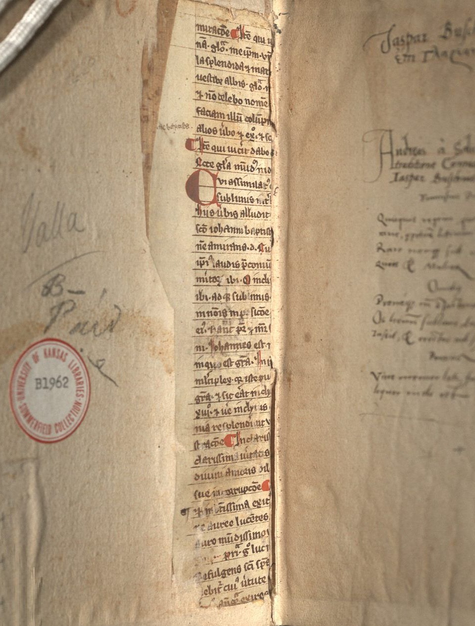
Beginning with structure, the most obvious examples of reuse can be found in the interior of a volume, generally on the boards near the spine. This kind of reuse is generally to help support either just the spine or the adherence of the boards and the spine together. Lorenzo Valla’s Elegantiae (Call Number: Summerfield B1962) has an example of this as the paper pasted on top (pastedown) has worn away enough to show some of the reuse (Fig. 1). This is clearly a medieval text, and – while it is fragmented – some of the words such as “Johannes” in the body text and “baptista” in the marginal notation among other examples illustrate that the focus of the text is on John the Baptist.
Fig. 1: Front interior detail, Elegantiae, 1540. Call Number: Summerfield B1962. Click image to enlarge.
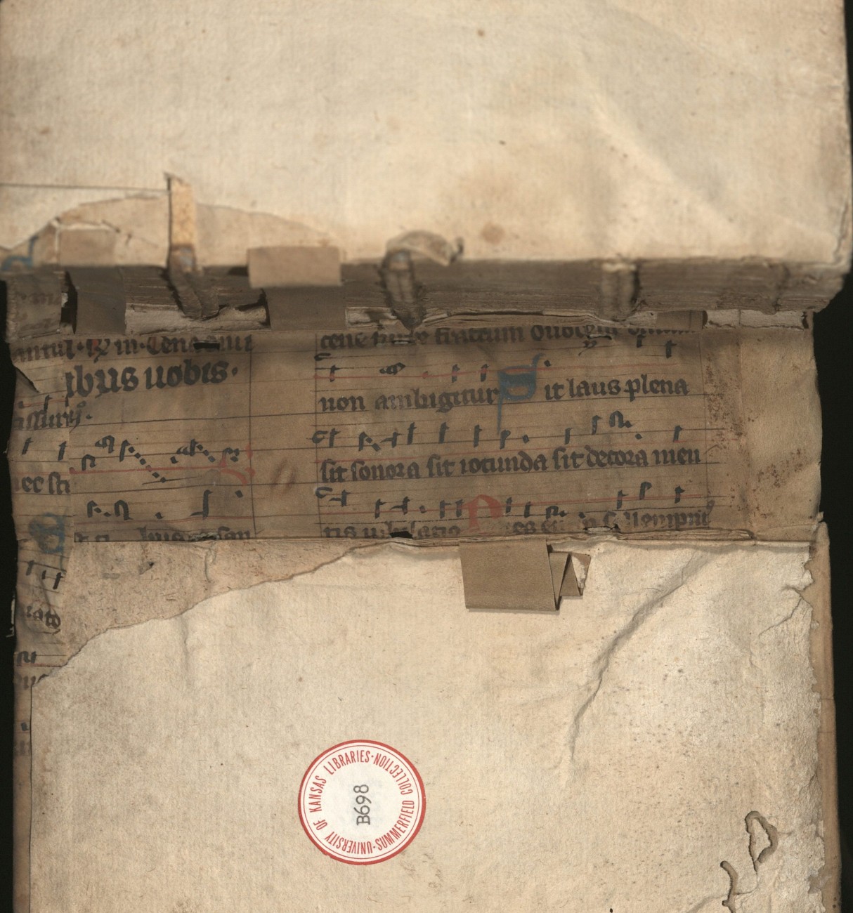
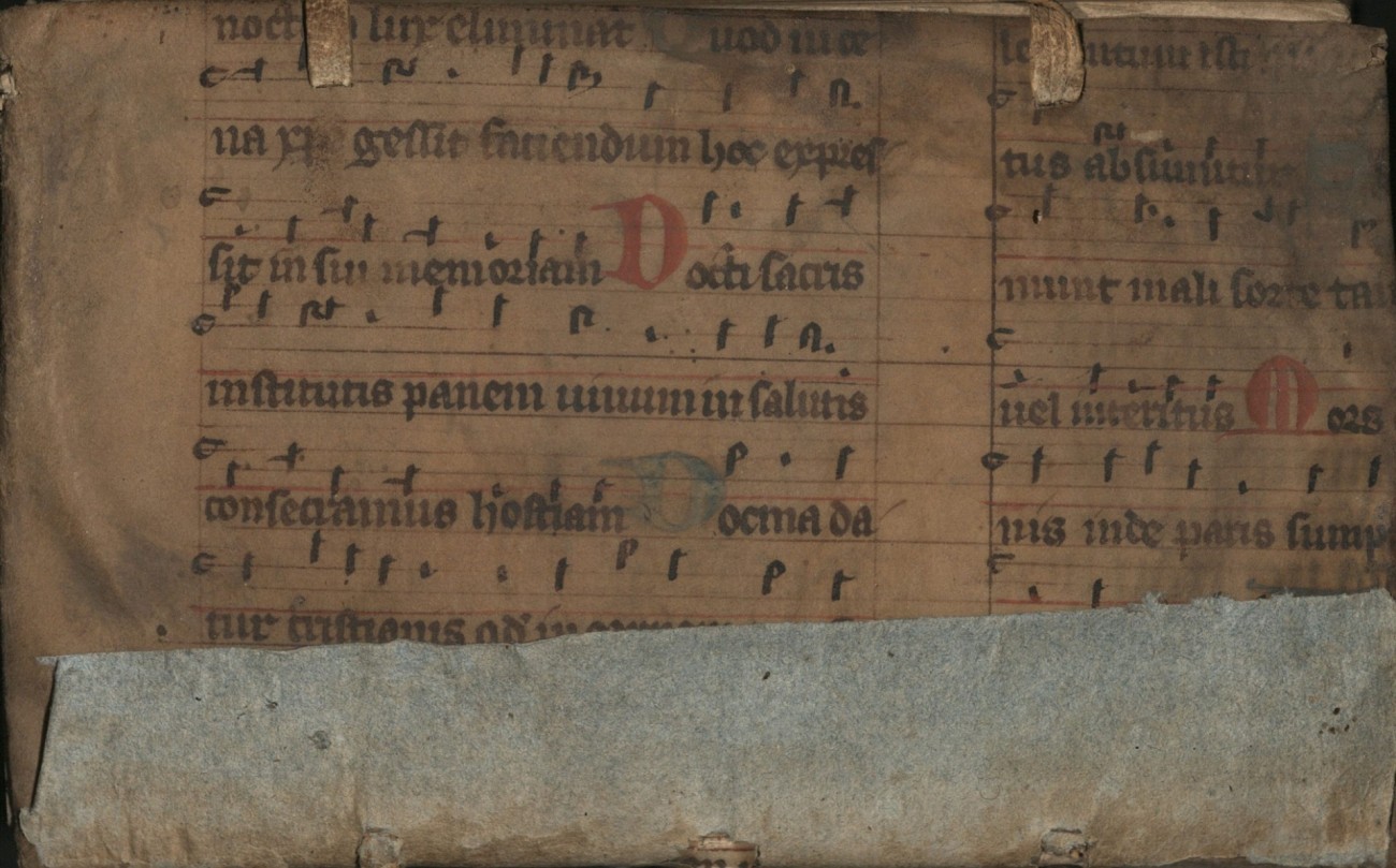
An example of more spinal support (Fig. 2.1) is seen in Analysis Logica Libri S. Lucae Qui Inscribitur Acta Apostoloru (Call Number: Summerfield B698). The strips are another method in which reuse occurs, though it can also be in longer or wider strips. The strips in this particular volume do not have any text or decoration remaining, so their exact origin cannot be certain. However, it is possible they come from the same leaf that was used to make the cover (Fig. 2.2). Based on the text visible both from the interior of the spine and the exterior cover, we can find that the lyrics to the music sheet are from “Lauda Sion,” a Christian hymn that celebrates Jesus Christ. Reuse of music sheets is fairly common within the Summerfield Collection, likely due to the rubrication and various ink colors or decoration that may accompany them.
Fig. 2.1: Spine interior detail, Analysis Logica Libri S. Lucae Qui Inscribitur Acta Apostoloru, 1597. Call Number: Summerfield B698. Click image to enlarge.
Fig. 2.2: Front cover, Analysis Logica Libri S. Lucae Qui Inscribitur Acta Apostoloru, 1597. Call Number: Summerfield B698. Click image to enlarge.
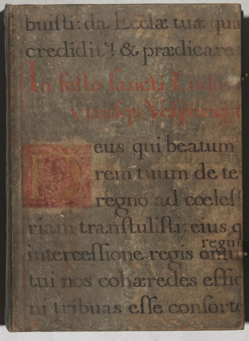
Music, although not a particularly popular feature, was not an uncommon form of reuse, either because of its wide availability or because it had some aspect of artistry and thus aesthetic interest for a cover. While actual music sheets may have been popular, texts of chant or hymnal lyrics are also quite common. A book of hours in the Summerfield Collection (Call Number: Summerfield B2890) has one such instance of reuse as the cover consists of a chant to laud St. Louis (Ludovicus in Latin), which would likely have been performed during Mass (Fig. 3).
Fig. 3: Front cover, Book of Hours, 1497. Call Number: Summerfield B2890. Click image to enlarge.
There were, of course, numerous other ways to reuse materials, but these are some of the most common examples within Spencer’s holdings. While some of the items are currently part of the temporary exhibit, the Summerfield Collection is always available for access in the Reading Room at Kenneth Spencer Research Library.
This post was written Public Services student assistant Kit Cavazos as part of their summer internship supervised by KU English Professor Misty Schieberle and Special Collections Curator Eve Wolynes.
Although medieval manuscripts are well-known for their look and style, the act of actually reading and understanding one can be tough. The image that often comes to mind is that of their non-naturalistic drawings, and thus, a casual viewer may see the squiggles sprinkled across the text as another odd decoration. However, many serve specific and intentional functions, acting as contractions, substitutions, or abbreviations of words or parts of words. Scribes often chose this practice because it saved on ink and parchment space, since both these materials were quite expensive.
Homiliae in Evangelia by Pope Gregory I, recto (detail), 1100–1115 CE. Call Number: MS 9/1:A1. Click image to enlarge.
The first and most prominent thing to note about manuscript notation is the dashes that are most often placed over vowels. Most of the time, these indicate a missing letter N or M. For example, “terram” shortens to “terrā.” The page above has quite a few examples in the first line: “qua[m],” “lapide[m],” and “lapide[m].”
Breviary, verso (detail), 1100-1199 CE. Call Number: MS 9/1:A6. Click image to enlarge.
Dashes can often have other meanings when interacting with a consonant, either by hovering above or crossing the letter. The incipit line of the above page has a quite recognizable first word, which substitutes an I for a J. This letter difference is generally because Latin, as a language, does not use the letter J, meaning our first word is “Judea.” Thus it is easier to understand part of the next noun, which has a letter L with a dash intersecting it, with the result resembling a stylized letter T. Picking out when a letter is a T or an L is made easy by way of comparison, as the page’s script will always have a style that differentiates letter that could be confused.
Thus, this L with an intersecting dash in the spine could represent a few similar letter clumps: “ler…,” “…ul,” “lor…,” or “al…,” among others. Despite knowing exactly what variations the letter could stand for, it still introduces a new wrinkle into the fold, as none of the suggested meanings for the substitutions seem to make the word wholly understandable. “Jerlerm,” “Jerulm,” “Jerlorm,” and “Jeralm” are not proper words, and thus, the contraction demonstrates how common words (such as proper nouns) could have more of an abstract contraction. When examining this word in context, it might be a bit easier to understand that this contraction represents the city named “Jerusalem.”
Homily fragment, recto (detail), 1250-1299 CE. Call Number: MS 9/1:A7. Click image to enlarge.
Another common symbol is this: , which often represents a “rum,” “ram, or “rem” sort of ending. The above example has multiple instances of its use within the first line, all taking the first possible ending. The line, when uncontracted, would read “verbi salutaris ac miraculorum suorum dulcidine” (“by the sweetness of his saving word and miracles”). These textual changes – both contractions and substitutions – indicate that both scribes and readers needed to have not only a deep understanding of what each symbol represented, but also a sense of the language. You could either look at the Latin and parse some words, or you could understand how to complete the words but have their meaning completely lost on you. This afforded the literate members of the population some form of exclusivity from everyone else. These manuscripts often contain important information about plants, animals, or other general encyclopedic knowledge.
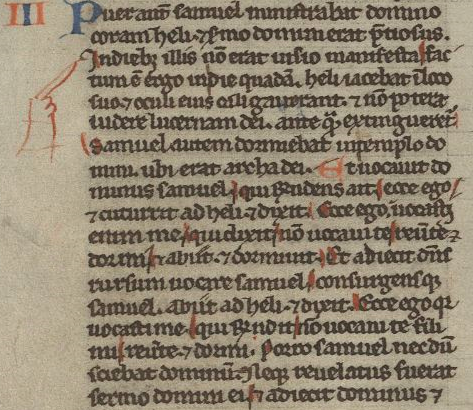
Bible fragment of I Kings, recto (detail), 1240-1260 CE. Call Number: MS 9/1:A8. Click image to enlarge.
Another important aspect of a manuscript is additions that enhance a reader’s understanding of the text. The most obvious would be the fingers pointing to specific lines. These are manicules, and they are meant to emphasize important parts of the text. Another detail does something similar on the above page. The red lines highlighting specific letters are forms of rubrication, and they have a very similar function to manicules. In this instance, they mean to indicate and emphasize the capital letters in the line.
In other instances, rubrication notates significant parts of the text and frequently has a moralizing meaning. This means it can also come in textual form – often called the rubric – and it can add, emphasize, or reiterate important information to the reader. The term rubrication comes from the Latin word “ruber” (“red”), but important elements to a manuscript are not restricted solely to one color. Red often sees the most use, but blue and occasionally green can also be used for emphasis or decoration.
Leaf Containing the Service of the First Tuesday in Lent, Missal, recto (detail), 1400-1499 CE. Call Number: MS 9:2.30. Click image to enlarge.
With these basic understandings of common aspects of a medieval text (at least within the Spencer collection), reading a manuscript for the first time may be less daunting. The above page, for example, has several features already discussed. Most prominently, the rubrication stands out from the rest of the content, especially in the rubricated initial letters A and I, which have blue decoration that appears to mimic a lace design. The first rubricated word of the text is in the incipit line, which has the same L with an intersecting dash as before. Thus, we know the word would be something like “pp[ul]m” or something similar. If you don’t have a book on contractions easily to hand, sometimes sounding out what letters you do have can help make sense of the word – “populum,” in this instance. Thus, reading through the incipit line, it would say something like “Absol[v]e q[uaesumu]s D[omine] p[o]p[u]l[um] n[ostr]o[rum] vincula peccato[rum]” (“we beseech you, O Lord, to absolve our people from the bonds of their sins”). From even just this first line, we can understand that the reader is meant to focus on the people or population about whom it is speaking.
Reading through a medieval text can be difficult; even just reading one line without translation can take hours, depending on how many contractions or abbreviations there are, as well as how obscure each one may be. The result, though, is quite often rewarding, as it means modern readers can understand how information was relayed and what information medieval writers saw as needing to be relayed. An online resource for information on specific abbreviations is Cappelli’s Latin Abbreviations, which has been incredibly helpful for research and compiling the transcription of these lines.