The University of Kansas

Inside Spencer: The KSRL Blog

Books on a shelf

Welcome to the Kenneth Spencer Research Library blog! As the special collections and archives library at the University of Kansas, Spencer is home to remarkable and diverse collections of rare and unique items. Explore the blog to learn about the work we do and the materials we collect.

This blog may contain archived web content. This blog may link to catalog records which no longer exist as of a software change in 2026.

Meet Our Newest Manuscript: A Luxury Book of Hours from 15th-Century Bruges

August 7th, 2026

Watch the unboxing of our newest medieval manuscript to adorn the shelves of Kenneth Spencer Research Library below!

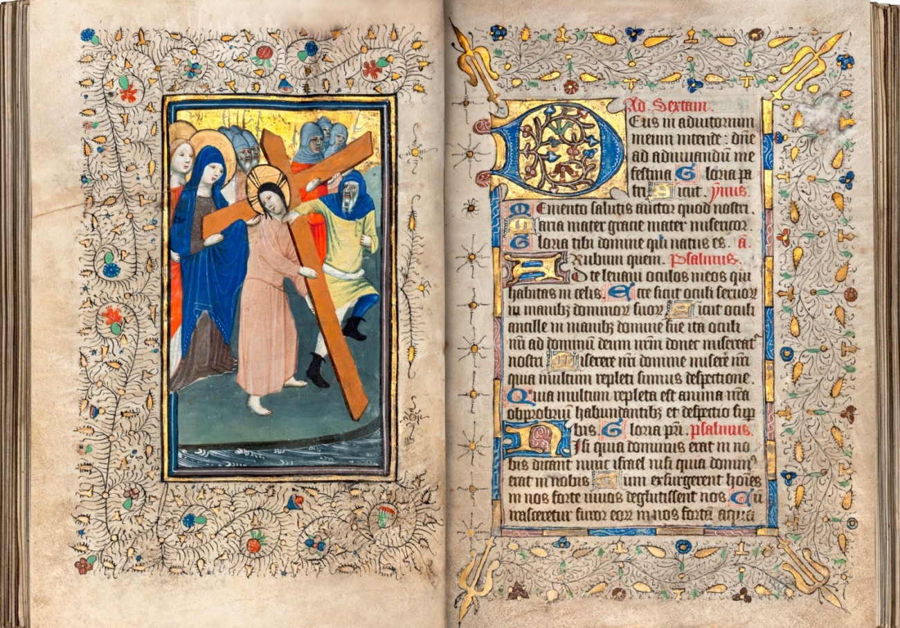
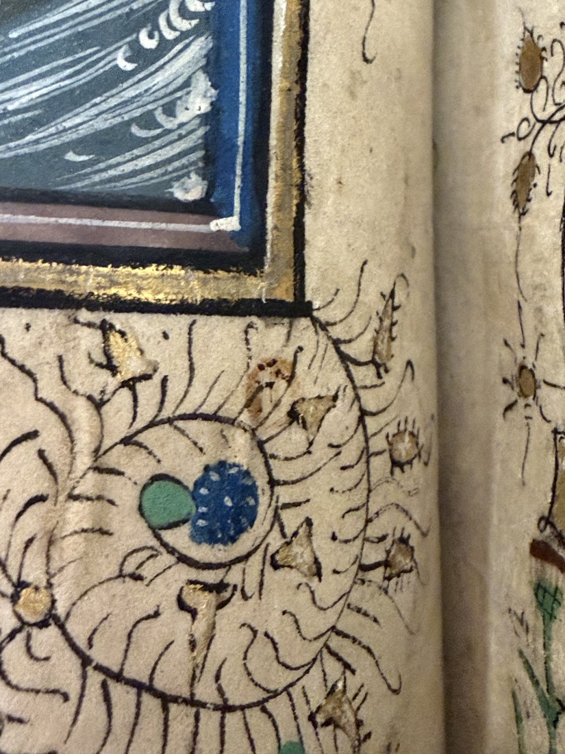
This image has handwritten text with border decorations, an embellished letter, and part of an illustration of Jesus carrying the cross.
A clipped sneak peek of KSRL’s newest medieval manuscript, folio 28v-29r. Take a gander at the whole thing, and the unboxing video, below! Call Number: Pryce MS D1. Click image to enlarge.

Every year at Kenneth Spencer Research Library, through classes, tours, and events, hundreds of undergraduates, graduate students, professors, and visitors from the public get to touch, handle, and engage with our single most popular book: the Vosper Book of Hours (Call Number: Pryce MS C1), a manuscript written painstakingly by hand in the last decades of the 15th century, gleaming with gold and vivid illustrations of medieval scenes from the Bible to accompany the hourly prayers contained within, each page crammed with flourishing decorations in the margins.

But the “verso” to those sparkling memories, if you will, is the stress that such high-touch handling can place on the single most-used book in the building. In 2025, we pulled the Vosper Hours from its cozy home in our vault thirty-four times, more than once every two weeks. In total, it was viewed by over 600 people, though directly handled by some fewer. Medieval manuscripts are often shockingly robust, made from parchment that has withstood the test of time, but even the halest of manuscripts will strain from so many hands upon its pages.
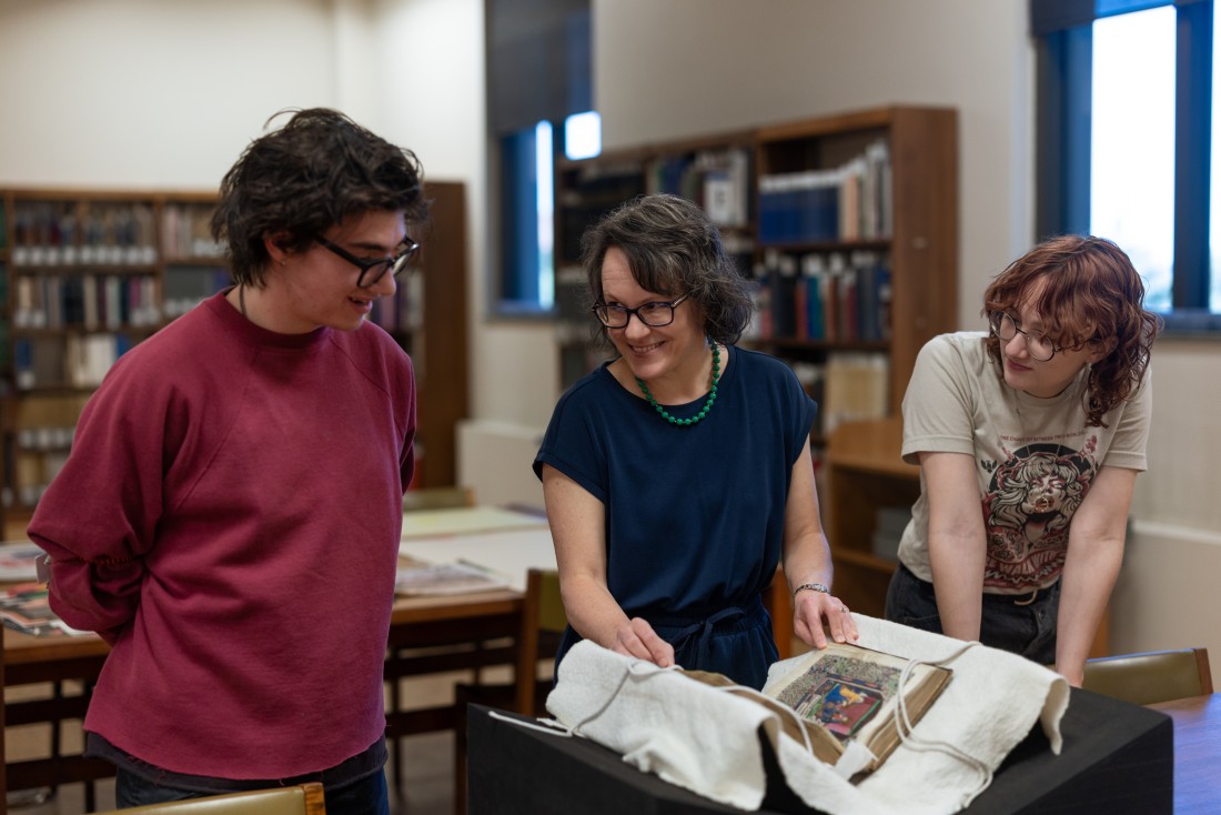
Misty Schieberle, a Professor in the Department of English at KU, explores Spencer’s Vosper Book of Hours with two students. Click image to enlarge.

And so, with an eye to continuing to preserve the longevity of our most-beloved Vosper Hours, I set about finding it a mate, something that could lighten its burden and share the yolk of labor the way the best spouse might, meeting its standards but not exceeding them, lest it simply replace the Vosper Hours as the more popular manuscript and reintroduce the risk of over-use.

The process of threading such a needle involved meeting and corresponding with various booksellers, domestic and international, who specialize in medieval manuscripts in order to get a full sense of the current market and available options. I discussed with them our goals for such an acquisition, as well as our limitations, explaining how we expected and hoped the manuscript might be used, and why we sought particular qualities. These booksellers then sent us offers of the manuscripts in their catalogs that they felt best fit our goals, and I in turn analyzed and evaluated those offerings, including corresponding with various KU teaching faculty, to gather their thoughts on the potential opportunities for instruction and research use of the manuscript. From those conversations and analyses, one candidate rose to the top.

And so, without further ado, meet our newest manuscript:

The very first moment unboxing the manuscript upon its arrival here at Kenneth Spencer Research Library!

Behold, Pryce MS D1. We’ve given her the rather lengthy title Prima dies mensis et septima truncat vt ensis, using the incipit (or the first line of the text), since most medieval manuscripts lack a formal title. Her catchier nickname will likely be the pithy “Book of Hours, Use of Sarum” to reflect that her contents are structured around the pattern of prayers for the Office of the Virgin Mary in Salisbury (or “Sarum”), England. Despite her English nickname, she hails from Bruges, Belgium, a center of book production in the fifteenth century, where she was almost certainly illuminated in a professional workshop known as the “Masters of Otto van Moerdrecht.” They are best known for their work on a manuscript of theologian Nicolaus de Lyra’s Postilla in Prophetas now held at the University of Utrecht (Ms. 252), but only twenty-six manuscripts survive today that include their art.
This image has Latin text in black and red ink, bordered on three sides by sections of gold, blue, and red. Around the text and the image on the other page are black vines with small leaves, flowers, and gold.
Christ carrying the cross, alongside the prayer for noontime/midday, or “Sext” in the Office of the Virgin Mary, folio 28v-29r. Call Number: Pryce MS D1. Click image to enlarge.

She’s more than just a pretty face, too: every unique attribute of the manuscript can reveal different aspects of history, of how we’ve used books and information over time to express ideas and identities, control trade, and more.

For example: this is an unusually hefty volume, especially for a Book of Hours. These books were designed to be easy to keep at hand so that the owner could carry it with them and pray at set hours of the day (hence “Book of Hours”). Most are small enough to fit in the palm of your hand, or perhaps a little larger. Books of Hours flourished as a genre among the laity (non-clergy) in the later Middle Ages and often became a status symbol, flaunting opulent consumption and wealth. Nobles and members of the rising merchant classes could purchase luxury Books of Hours custom designed for their personal tastes, with pigments sourced from precious gems like ultramarine, metals such as lead white and copper verdigris, and above all gold leaf.
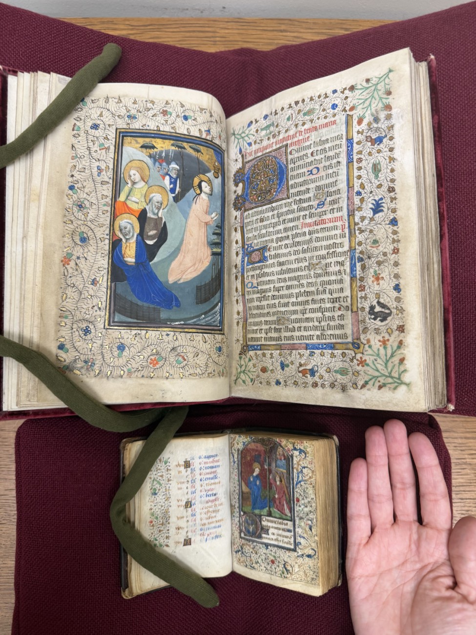
Spencer’s newly acquired Book of Hours (top) next to a more “ordinary”-sized version (bottom), with a hand for scale. Call Numbers: Pryce MS D1 and MS A6. Click image to enlarge.

Books of Hours this large are uncommon, excessive in their opulence and sacrificing any pretense of practicality. In a visiting class, we might ask students why an owner would sacrifice ease of use for the grandiosity of its size, inviting them to reflect on how books are used not only as texts, but as physical objects.

Another example: The manuscript’s international birth and ownership. Dating a manuscript and identifying its place of origin can often present a challenge, and scholars will resort to complex analyses of handwriting and art styles to justify their conclusions. Not so for this manuscript: each miniature is marked by a faint red stamp of “B” that proclaim its origins courtesy of a law implemented in 1427 that required illuminators who sold their artwork to identify it as a local product, in an effort to control the import of luxury illuminations. Meanwhile, the Masters of Otto van Moerdrecht likely left Bruges in 1436, and so we can confidently date our new manuscript down to a single decade. Those stamps testify to the vibrant ongoing trade in luxury manuscripts – and the efforts to control the production of books and art not only as information but as economic and cultural products – in the 15th century.
Close-up of the “b” on folio 7v, an illustration of the “Agony in the Garden.” Call Number: Pryce MS D1. Click image to enlarge.

And while the manuscript was made in Bruges, it didn’t remain there for long. Despite its Belgian origins, it was likely made with an English owner in mind, as many of the prayers included in the Book were particularly popular in England. We know that’s where it found its home: a note added in a later hand states it was gifted to John Pullan by his uncle Richard Belasyse in the 16th century, again harkening to how information and art were traded over borders for profit.

Indeed, quite a few owners took their hand to this manuscript, tweaking, correcting, fixing, and editing it to suit their tastes and preferences over the centuries. The earliest patron who originally commissioned the manuscript, most likely, went so far as to amend the miniature of Saint Mary Magdalene shown below, painting over her ointment pot and adding in a scroll that labels her instead as “Saint Anne,” hinting that the patron may have intended to give it as a gift to someone named Anne and decided to fit her patron saint into the prayers. This, in turn, reflects the popularity of Books of Hours among women in the later Middle Ages, revealing the reading habits, literacy and book ownership of women that is otherwise often hidden.

An image of Saint Anne, together with a prayer dedicated to her, folio 108v-109r. Note the repaired damage to the vellum sewn on the lower half of the page. Call Number: Pryce MS D1. Click image to enlarge.

Someone, perhaps that same Anne or her own child, added a note of the birth of Thomas Bentham on October 24, 1477, reflecting how the calendars of Saints’ Days in Books of Hours were often used to track family births since the book would be passed from parent to child over generations.

And the mark of the English Protestant Reformation is revealed through another, later owner who crossed out the names of English Catholic Saint Thomas Becket and the Pope, adding the note “vacat” (“empty” or “blank”) next to feast days. The owner either converted (or wished to appear that they had converted), or the manuscript fell into Protestant hands.

More than one hand has tried to repair damage to its pages, suggesting that the manuscript had at least one rough owner. Some holes in the vellum have been sewn together carefully with thread, but another, likely later, owner seems to have fixed cuts to some pages with an adhesive, though why or how the pages were cut is unclear. At some point the book was rebound into a lush and ostentatious velvet binding, into which William Alfred Westropp Foyle (1885-1963) added his bookplate.

All those changes and adaptations demonstrate how books rarely remain static as they’re handed down from parent to child or bought and sold and shipped this way and that. People change their books the way they change their information, adapting it to their needs, aesthetic preferences, religious devotions, and even idle whims.

Now it makes another home here on the shelves of Kenneth Spencer Research Library, and we’ve already added a touch of our own: a custom-fit box built to the best standards of conservation care. Here, it will make another life for itself and touch the hearts and imaginations of hundreds of students, visitors, and researchers while giving our Vosper Hours much-needed relief for its own use. Like all the books on our shelves, it is available for any and all to come and see in tours and showcases, in classes and instruction, and above all in our Reading Room.

Eve Wolynes
Special Collections Curator

Cracking the Codex: Reading Medieval Latin Abbreviations

August 1st, 2025

This post was written Public Services student assistant Kit Cavazos as part of their summer internship supervised by KU English Professor Misty Schieberle and Special Collections Curator Eve Wolynes.

Although medieval manuscripts are well-known for their look and style, the act of actually reading and understanding one can be tough. The image that often comes to mind is that of their non-naturalistic drawings, and thus, a casual viewer may see the squiggles sprinkled across the text as another odd decoration. However, many serve specific and intentional functions, acting as contractions, substitutions, or abbreviations of words or parts of words. Scribes often chose this practice because it saved on ink and parchment space, since both these materials were quite expensive.

This image has handwritten text in Latin.
Homiliae in Evangelia by Pope Gregory I, recto (detail), 1100–1115 CE. Call Number: MS 9/1:A1. Click image to enlarge.

The first and most prominent thing to note about manuscript notation is the dashes that are most often placed over vowels. Most of the time, these indicate a missing letter N or M. For example, “terram” shortens to “terrā.” The page above has quite a few examples in the first line: “qua[m],” “lapide[m],” and “lapide[m].”

This image has handwritten text in Latin.
Breviary, verso (detail), 1100-1199 CE. Call Number: MS 9/1:A6. Click image to enlarge.

Dashes can often have other meanings when interacting with a consonant, either by hovering above or crossing the letter. The incipit line of the above page has a quite recognizable first word, which substitutes an I for a J. This letter difference is generally because Latin, as a language, does not use the letter J, meaning our first word is “Judea.” Thus it is easier to understand part of the next noun, which has a letter L with a dash intersecting it, with the result resembling a stylized letter T. Picking out when a letter is a T or an L is made easy by way of comparison, as the page’s script will always have a style that differentiates letter that could be confused.

Thus, this L with an intersecting dash in the spine could represent a few similar letter clumps: “ler…,” “…ul,” “lor…,” or “al…,” among others. Despite knowing exactly what variations the letter could stand for, it still introduces a new wrinkle into the fold, as none of the suggested meanings for the substitutions seem to make the word wholly understandable. “Jerlerm,” “Jerulm,” “Jerlorm,” and “Jeralm” are not proper words, and thus, the contraction demonstrates how common words (such as proper nouns) could have more of an abstract contraction. When examining this word in context, it might be a bit easier to understand that this contraction represents the city named “Jerusalem.”

This image has handwritten text in Latin.
Homily fragment, recto (detail), 1250-1299 CE. Call Number: MS 9/1:A7. Click image to enlarge.

Another common symbol is this: , which often represents a “rum,” “ram,  or “rem” sort of ending. The above example has multiple instances of its use within the first line, all taking the first possible ending. The line, when uncontracted, would read “verbi salutaris ac miraculorum suorum dulcidine” (“by the sweetness of his saving word and miracles”). These textual changes – both contractions and substitutions – indicate that both scribes and readers needed to have not only a deep understanding of what each symbol represented, but also a sense of the language. You could either look at the Latin and parse some words, or you could understand how to complete the words but have their meaning completely lost on you. This afforded the literate members of the population some form of exclusivity from everyone else. These manuscripts often contain important information about plants, animals, or other general encyclopedic knowledge.

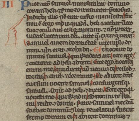
This image has handwritten text in Latin.
Bible fragment of I Kings, recto (detail), 1240-1260 CE. Call Number: MS 9/1:A8. Click image to enlarge.

Another important aspect of a manuscript is additions that enhance a reader’s understanding of the text. The most obvious would be the fingers pointing to specific lines. These are manicules, and they are meant to emphasize important parts of the text. Another detail does something similar on the above page. The red lines highlighting specific letters are forms of rubrication, and they have a very similar function to manicules. In this instance, they mean to indicate and emphasize the capital letters in the line.

In other instances, rubrication notates significant parts of the text and frequently has a moralizing meaning. This means it can also come in textual form – often called the rubric – and it can add, emphasize, or reiterate important information to the reader. The term rubrication comes from the Latin word “ruber” (“red”), but important elements to a manuscript are not restricted solely to one color. Red often sees the most use, but blue and occasionally green can also be used for emphasis or decoration.

This image has handwritten text in Latin.
Leaf Containing the Service of the First Tuesday in Lent, Missal, recto (detail), 1400-1499 CE. Call Number: MS 9:2.30. Click image to enlarge.

With these basic understandings of common aspects of a medieval text (at least within the Spencer collection), reading a manuscript for the first time may be less daunting. The above page, for example, has several features already discussed. Most prominently, the rubrication stands out from the rest of the content, especially in the rubricated initial letters A and I, which have blue decoration that appears to mimic a lace design. The first rubricated word of the text is in the incipit line, which has the same L with an intersecting dash as before. Thus, we know the word would be something like “pp[ul]m” or something similar. If you don’t have a book on contractions easily to hand, sometimes sounding out what letters you do have can help make sense of the word – “populum,” in this instance. Thus, reading through the incipit line, it would say something like “Absol[v]e q[uaesumu]s D[omine] p[o]p[u]l[um] n[ostr]o[rum] vincula peccato[rum]” (“we beseech you, O Lord, to absolve our people from the bonds of their sins”). From even just this first line, we can understand that the reader is meant to focus on the people or population about whom it is speaking.

Reading through a medieval text can be difficult; even just reading one line without translation can take hours, depending on how many contractions or abbreviations there are, as well as how obscure each one may be. The result, though, is quite often rewarding, as it means modern readers can understand how information was relayed and what information medieval writers saw as needing to be relayed. An online resource for information on specific abbreviations is Cappelli’s Latin Abbreviations, which has been incredibly helpful for research and compiling the transcription of these lines.

Kit Cavazos
Public Services student assistant

July Exhibit: Sigillum: Seals and the Making of Medieval Authority

July 17th, 2025

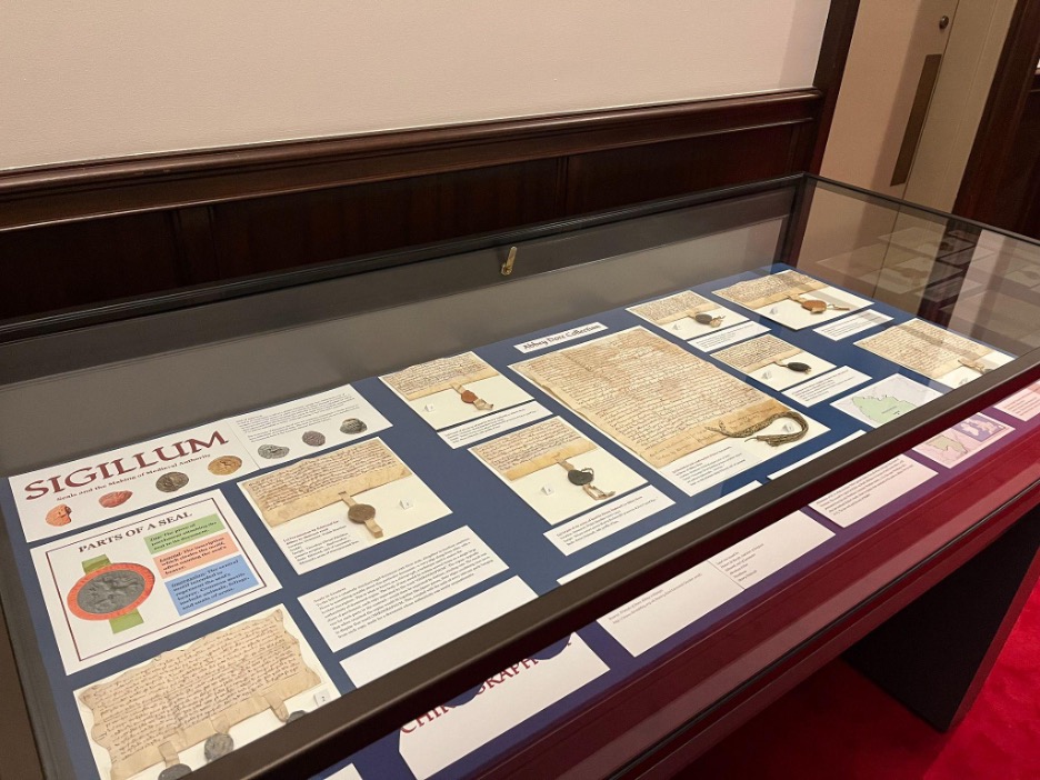
Kenneth Spencer Research Library’s current short-term exhibit explores some choice items from the library’s collection of medieval seals. This is a collaborative project put together by myself – Kaya Taylor – and my collaborator Eli Kumin, both of us long-time student workers here at the library.

Photograph of documents and labels in a glass enclosed exhibit case.
A view of the exhibit. Click image to enlarge.

Eli and I have cultivated a particular interest in medieval wax seals, spurred on by our work on a Sanders Scholar research project under the supervision of Dr. John McEwan. Beginning in September 2024, we spent the project exploring the Abbey Dore collection (Call Number: MS Q80) at Spencer, given the remarkably well-preserved seals and documents dating back from the 12th and 13th centuries. As the project came to a close in May 2025, Eli and I realized that we could memorialize our work and interests in the form of an exhibit case. Titled Sigillum, it is our way of giving others a look into these fascinating and unique pieces of history, here to be enjoyed roughly 4,000 miles away from where they originated.

The overarching narrative of the Abbey Dore collection is one of property and the interplay between royal and religious power in the medieval period. The language used in the documents points to the exchange of land for the salvation of the donors and their loved ones, e.g. “for her soul and the soul of Madoc [her husband]” (Call Number: MS Q80:13).

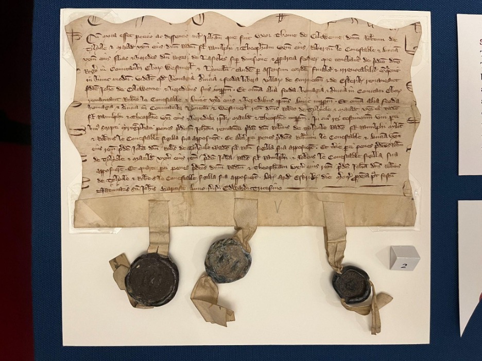
Visitors may notice there is one document unlike the others in the exhibit case, labeled “land conveyance of Sir Roger Lasceles to his four daughters” (Call Number: MS C150). Although separate from the Abbey Dore collection, this document is included because it’s a particular favorite of ours and it boasts several unique qualities: a chirograph edge and three intact seals with very clear impressions. We chose to include it at the starting point of the exhibit because of its eye-catching quality, pulling visitors into the discussion of further seals and documents within the case.

Large handwritten document with wavy edges and three seals attached at the bottom.
A legal agreement, dated 1301-1302, whereby the lands of Sir Roger Lasceles are divided amongst his four daughters. Call Number: MS C150. Click image to enlarge.

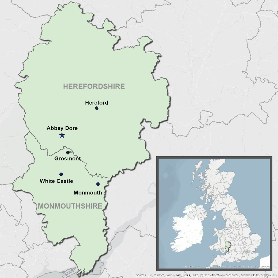
Although Eli and I came to know the Abbey Dore collection very well over time, we still felt a bit confused as to the relative geography of the Welsh Marches and the locations mentioned in the collection. We felt that visitors could benefit from seeing a map of the region, and so we resolved to make one that centered the relevant places and landmarks stretching across the Welsh-English border. Ultimately, we used ArcGIS software to put together the map seen in the exhibit.

Simple map showing Dore Abbey and some nearby towns in Herefordshire and Monmouthshire.
Our ArcGIS map of the Welsh-English border. Click image to enlarge.

We hope that Sigillum gives visitors a chance to appreciate not just the wax seals themselves, but the real human stories that stand behind them. We are excited to offer this glimpse into the medieval past, and grateful for the opportunity to bring these objects to light at Kenneth Spencer Research Library.

Sigillum: Seals and the Making of Medieval Authority is free and open to the public in Spencer’s North Gallery through July 31st.

Kaya Taylor and Eli Kumin
Public Services student assistants
KU Libraries Sanders Scholars 2024-2025

Marvelous Medieval Marginalia

March 19th, 2025

One of the most fascinating things about medieval manuscripts is that every copy is unique and individual. Because scribes wrote manuscripts by hand, no two copies are identical. On March 8th, Kenneth Spencer Research Library opened Marvelous Medieval Marginalia, an exhibit that celebrates the unique and the individual, the best parts of medieval manuscripts, and the scribes, readers, and owners who had a hand in transforming texts over time. It’s dedicated to the voices of not necessarily the great and influential authors and artists of old but to a quieter subset who aren’t always given the attention they deserve – the readers, the imaginers, and doodlers across centuries.

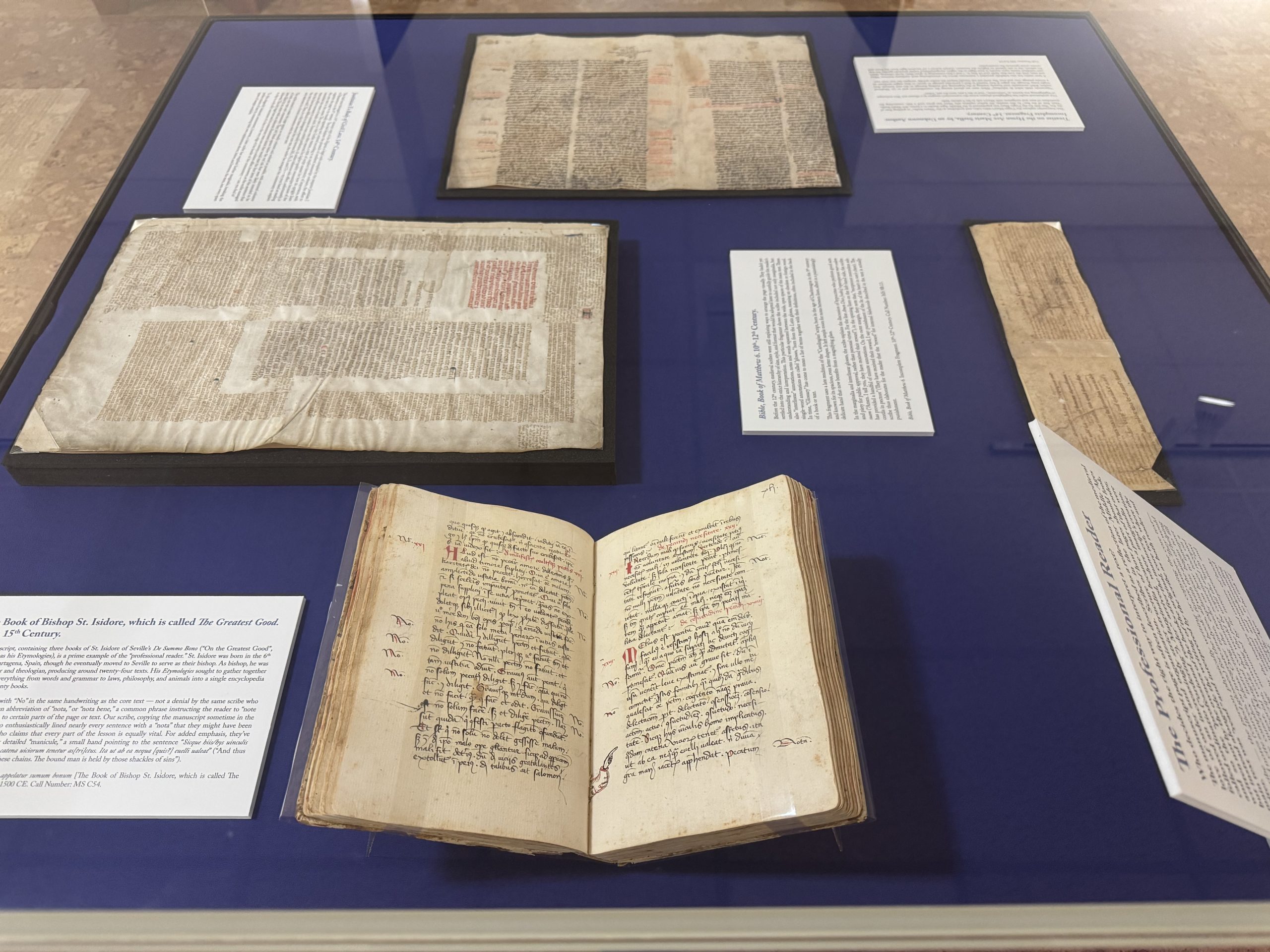
Exhibit case of medieval manuscripts currently on display as part of the Marvelous Medieval Marginalia exhibit
Exhibit case of medieval manuscripts currently on display as part of the Marvelous Medieval Marginalia exhibit. Click image to enlarge.

The exhibit focuses on marginalia. From the Latin for literally just “things in the margins,” marginalia can encompass many things, from formally executed illustrations meant to enhance the manuscript into a work of art to notes and annotations. We tend to think of books as static or frozen in time, but through marginalia and readers, they were often amorphous and ever-changing, shaped and reshaped by their owners over decades and centuries. Medieval readers were not merely passive consumers of manuscripts; they thought about and engaged with their texts, argued and agreed, and added their thoughts. And their relics are preserved in the notes they left behind, capturing their fleeting thoughts in amber for us to enjoy centuries later.

With annotations, we can see what people actually thought about the texts they read. They let us see where readers denied or disagreed with the original manuscript – as with this manuscript copy of Lactantius’ Divine Institutes, a defense of Christianity and a refutation of Greek and Roman polytheism.

Image of a detail from a manuscript copy of Lactantius’ Divinae Institutiones [The Divine Institutes], Italy, ca. 1400-1500 CE., with manuscript notes in the margin.
Lactantius’ Divinae Institutiones [The Divine Institutes], Italy, circa 1400-1500 CE. Call Number: MS C61. Click image to enlarge.

An early reader has added the note “falsum” or “false” while striking lines through parts of the text – potentially either disagreeing with the text itself or perhaps claiming it was spurious and misattributed. Where readers’ notes give us insight into the sometimes-critical thoughts of medieval readers, their doodles provide glimpses into the universal experience of boredom and the creativity it can allow to blossom. With doodles, “the more things change, the more they stay the same.” We doodle just as much today as people did 800 years ago, but what we doodle changes, reflecting the nuances of human culture and identity. It’s a time-honored tradition across the centuries; you’ve likely stuck at least a few notes in the margins of your class assignments or books over the years. Idle doodles encapsulate the wandering thoughts of people from the past as they were when they took quill pen to page.

Sometimes, it was the scribes themselves, the people writing and copying the manuscripts for later audiences, who added flares of fun into the margins. Copying manuscripts by hand was often a long and tedious process, taking anywhere from days to months. A certain playfulness to these marginalia emerged when the scribe’s mind and hand wandered. You wind up with texts like MS B15, a collection of Divine Offices, hymns, prayers, and devotional poetry, where the scribe has very diligently copied the text for over 700 pages, all written in the same hand so that you know this is one person scribbling page after page after page. But they’ve broken the tedium by dappling the tops and bottoms of letters with -Picasso-esque caricatures, skewed profile faces wearing silly hats, and the occasional peacock.

Image of doodles of faces in the margins of Spencer's manuscript copy of Ordinatio totius officii divini secundum usum monasterii Beatae Mariae de Belgentiaco. [A Complete Order of the Divine Offices According to the Use of the Monastery of the Blessed Mary of Beaugency.]. France, 1400-1500.
Ordinatio totius officii divini secundum usum monasterii Beatae Mariae de Belgentiaco [A Complete Order of the Divine Offices According to the Use of the Monastery of the Blessed Mary of Beaugency], France, 1400-1500. Call Number: MS B15. Click image to enlarge.

Marginalia can help reveal the silent reader’s voice and how they understood or analyzed texts – but even in the case of drawings and doodles, these weren’t all the product of an idle mind. Often, the doodles in the margins directly responded to and sometimes commented upon the text itself, creating visual commentary that shows how a scribe or reader responded to the work. These are called deliberate or communicative doodles.

Marginalia didn’t end with the advent of print, but they were unquestionably changed by it. In many ways, printing is more rigid than writing a manuscript. You work with a metal frame that limits where letters can fit, the shape of the page and its structure, and all the letters are predetermined shapes carved into small metal pieces that you then reorganize into different words. That rigidity, of course, meant that it was much easier to make literal copies of the text, nearly identical to one another.

While print stole some of the freedom and flexibility of the page and written word, readers continued to imbue their books with their agency and interpretations, even with the radical technological shift. One reader of Agostino Nifo’s A Small Commentary on the Most Accurate Signs of Weather has bestowed nearly every page with minute illustrations connected to the text, highlighting the vibrancy of weather with sketches of animals associated with certain types of weather alongside copious notes, including a doodle of a bat next to Nifo’s claim that when bats fly in a great flock in the evening, it promises a calm, serene night.

Image of manuscript marginalia, including an image of a bat, in the margins of a 1540 printed copy of De verissimis temporum signis commentariolus [A Small Commentary on the Most Accurate Signs of Weather/Seasons], by Agostino Nifo.
Detail of manuscript marginalia in De verissimis temporum signis commentariolus [A Small Commentary on the Most Accurate Signs of Weather/Seasons] by Agostino Nifo. Venice: H. Scotus, 1540. Call Number: MS B75. Click image to enlarge.

Manuscripts reflect the medieval mind. Through marginalia, we can see how they organized their thoughts and how they reacted and responded to text and information.  In the same way, when you visit an exhibit, you bring your thoughts, experiences, and analyses to the books. As you go through it, you may pick and choose different parts of the exhibit that catch your eye and interest; you may find the exhibit text insightful (or boring!). My exhibit text will tell you what I think is important about materials, but those won’t be the same things that you find interesting or important. With this exhibit, open through July, I invite you to bring your own doodles to our margins – including the exhibit wall text! You’ll see the manuscripts mentioned above, with many more, that all embody the agency and choices of their readers over the centuries. We welcome you to read, think, and doodle about the exhibit (albeit preferably not in our manuscripts). Thank you for being a reader of our exhibits here at Kenneth Spencer Research Library.

Eve Wolynes
Special Collections Curator

Manuscript of the Month: Manuscript Waste Not, or a Case in Fragmentology

August 31st, 2021

N. Kıvılcım Yavuz is conducting research on pre-1600 manuscripts at the Kenneth Spencer Research Library. Each month she will be writing about a manuscript she has worked with and the current KU Library catalog records will be updated in accordance with her findings.

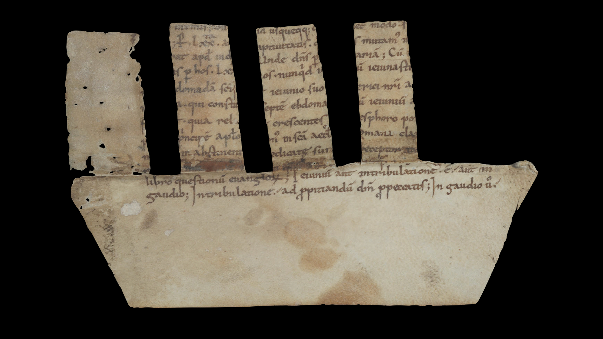
Kenneth Spencer Research Library MS 9/2:31 is one of the fragments in the “Paleographical Teaching Set” that was gradually put together in the second half of the twentieth century for facilitating teaching and learning of Greek and Latin paleography at the University of Kansas. We do not have any information about the origin or the history of the fragment, and the Latin text it contains had not been identified until now (no surprise, perhaps, given the largely illegible and mutilated nature of the parchment). The manuscript has been known at the Spencer Library as the “gaudio fragment.” The reason for this is that the word “gaudio” [joy], which is repeated twice on one side of the fragment, is one of the few easily legible words. Without the identification of the text it contains, this became a practical way to refer to MS 9/2:31.

Careful investigation now has revealed that MS 9/2:31 contains part of the first chapter of the first book of the De ecclesiasticis officiis libri quatuor [Four Books on Ecclesiastical Offices] by Amalarius of Metz (approximately 780–850). Amalarius was employed at the courts of both Charlemagne (748–814) and his son and successor Louis the Pious (778–840). He was the bishop of Trier (812–813) and Lyon (835–838), and in 813 was sent as the Frankish ambassador to the Byzantine Empire, to Constantinople (modern day Istanbul, Turkey). Written between the years 820 and 832, the De ecclesiasticis officiis was dedicated to Louis the Pious.

Picture of a manuscript fragment from from Amalarius of Metz's De ecclesiasticis officiis libri quatuor used as a comb spine binding (recto side, formerly designated as verso), Germany?, around 900. Call # MS 9/2:31.
Amalarius of Metz, De ecclesiasticis officiis libri quatuor. Recto side, formerly designated as verso. Germany?, around 900. Call # MS 9/2:31. Click image to enlarge.
Picture of a manuscript fragment from from Amalarius of Metz's De ecclesiasticis officiis libri quatuor used as a comb spine binding (verso side, formerly designated as recto), Germany?, around 900. Call # MS 9/2:31
Amalarius of Metz, De ecclesiasticis officiis libri quatuor. Verso side, formerly designated as recto. Germany?, around 900. Call # MS 9/2:31. Click image to enlarge.

Since the text was previously unidentified, the sides of MS 9/2:31 were also misattributed, with the text beginning on what is thought to be the verso side and continuing some fifteen lines later on the other side. As it stands, MS 9/2:31 is less than half of the original leaf. It measures approximately 100 x 170 mm, with 12 lines of text remaining, of which only 2 lines are fully visible on each side. Although the fragment contains an early witness to the De ecclesiasticis officiis by Amalarius of Metz, its later use as a binding component is more interesting for book history.

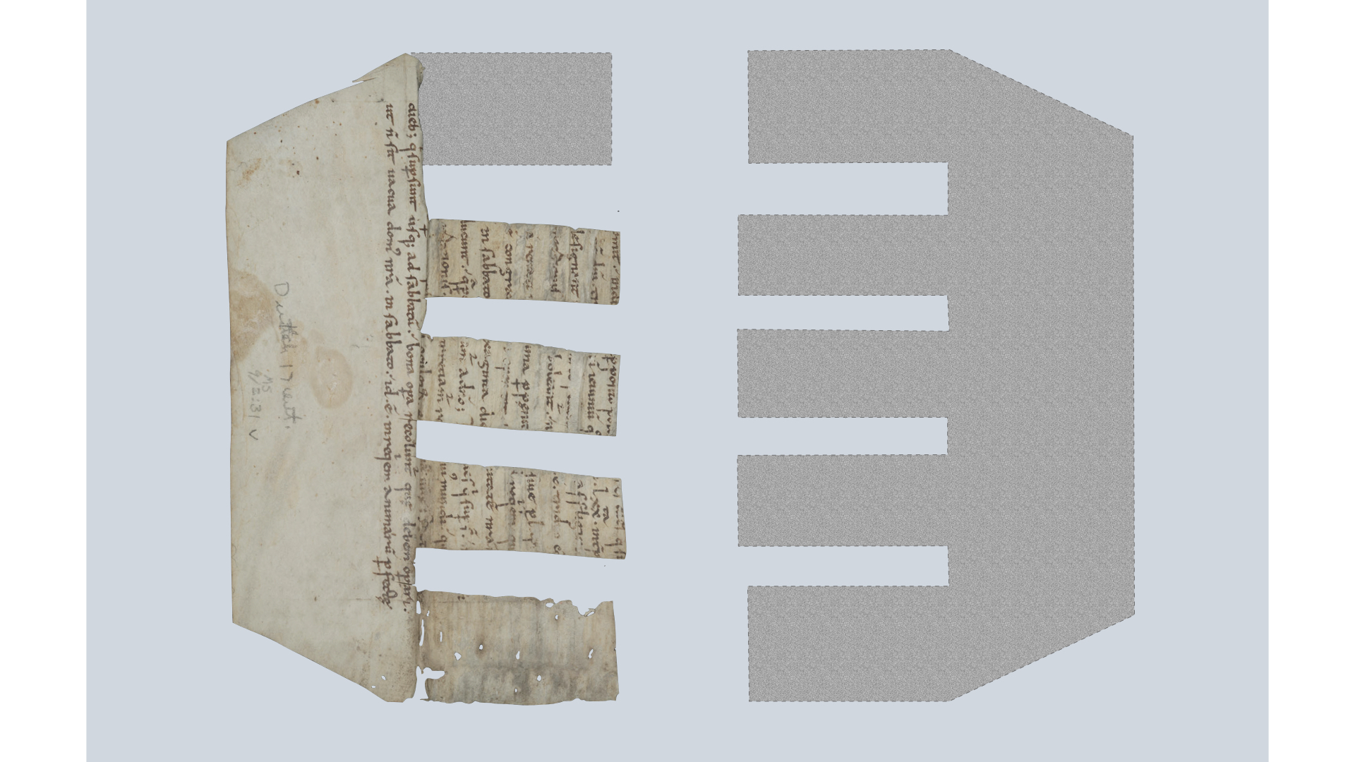
The peculiar shape of MS 9/2:31 is due to the fact that it was repurposed at some point in its later history; the leaf was cut to shape and used as a spine lining of another codex. It was then detached from this codex before it was incorporated into the collections of the Spencer Library. Until recently, it was common for repurposed fragments to be removed from their bindings, either by booksellers or by the holding institutions, and to be inventoried (or sold) separately. There are annotations in pencil in a modern hand in the lower margin of the recto side of MS 9/2:31: “Dutch,” or more likely “Deutsch [German]” and “17th cent.” This inscription probably refers to the codex from which the fragment came, perhaps a manuscript written (or a book printed) in the seventeenth century in Germany (or the Netherlands). This specific type of lining is called comb spine lining, which takes its name from its appearance of a comb with wide teeth due to the slots along one of the edges of the parchment.

Reconstruction of MS 9/2:31 as a comb spine lining.
Reconstruction of MS 9/2:31 as a comb spine lining. Click image to enlarge.

As a comb spine lining, MS 9/2:31 would have been used vertically and it would have had another tooth, which is now missing, as seen in the reconstruction above. Furthermore, it probably had a counterpart as comb spine linings usually consist of two parchment (rarely paper) parts. A similar example of a comb spine lining, also detached from the codex in which it was found, is Cambridge, Trinity College, R.11.2/21. In this case, both parts of the lining survive, and not only that, they are made from the same leaf. So, it is more than likely that the other half of the original leaf of MS 9/2:31 was used as its counterpart in the comb spine lining.

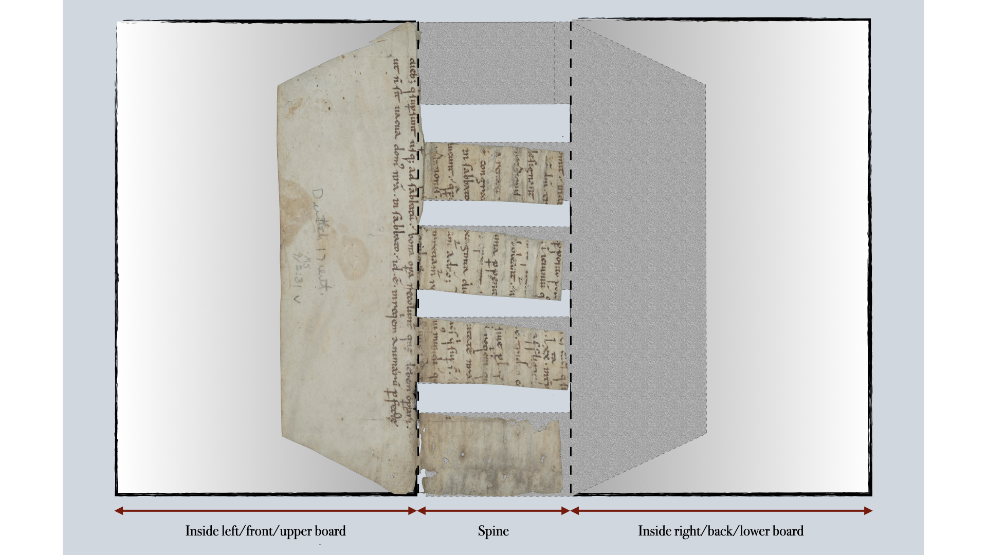
Image of a a reconstruction of MS 9/2:31 employed as a comb spine lining inside a codex.
Reconstruction of MS 9/2:31 employed as a comb spine lining inside a codex. Click image to enlarge.

In the codex, the teeth of the two parts of the comb spine lining would have lain over each other in the spine panel. The outer halves of each lining (the parts that are not slotted), which are called lining extensions, probably would have been adhered to the inside of the boards of the codex. From this reconstruction we can tell that the codex for which the spine lining was used was approximately 170 mm in height and had four sewing supports, which would have corresponded to the empty slots created by the teeth of the spine lining. Comb spine linings were used from the later Middle Ages onwards in continental Europe, most notably in Germany, Italy and France. The survival of fragments such as MS 9/2:31 is significant not only because of the texts they contain; they also enable scholars to study and understand medieval and early modern book structures, and in some cases localize and date manuscripts. Although often called “manuscript waste” in scholarship because the original manuscripts were discarded for whatever reason, these repurposed fragments clearly did not go to waste and there is still much we can learn from them.

N. Kıvılcım Yavuz
Ann Hyde Postdoctoral Researcher

Follow the account “Manuscripts &c.” on Twitter and Instagram for postings about manuscripts from the Kenneth Spencer Research Library.