Welcome to the Kenneth Spencer Research Library blog! As the special collections and archives library at the University of Kansas, Spencer is home to remarkable and diverse collections of rare and unique items. Explore the blog to learn about the work we do and the materials we collect.
This blog may contain archived web content. This blog may link to catalog records which no longer exist as of a software change in 2026.
If you’re a fan of soccer in general or Team Algeria in particular, be sure to stop by Spencer Research Library this summer and check out our small exhibit in honor of this year’s FIFA World Cup.
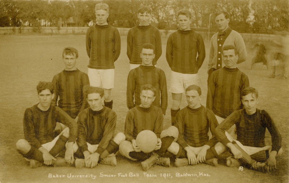
A photograph of the Baker University soccer team in Baldwin City, Kansas, 1911. Leonard Hollmann Photograph Collection. Call Number: RH PH 536. Click image to enlarge.
One case features materials documenting the history of soccer locally and internationally. For example, Matthew Concanen’s 1721 work A Match at Foot-Ball; Or the Irish Champions: A Mock-Heroick Poem, in Three Canto’s (Call Number: B519) is a very early account of “foot-ball,” a precursor to modern Association Football (soccer), Rugby, and Gaelic Football, which were not codified separately until the mid-1800s.
The other case in this display highlights items about the history of Algeria, whose national soccer team is based in Lawrence during the tournament. The exhibited items span more than four centuries and reveal both European and Algerian perspectives toward the North African country.
An illustration of the Algerian capital Algiers in Description de l’Afrique [Description of Africa] by Olfert Dapper, 1686. Heavily defended under Ottoman rule during the 1500s and 1600s, Algiers was protected by the series of fortifications, walls, and gates seen in this image. Call Number: Summerfield E1118. Click image to enlarge.
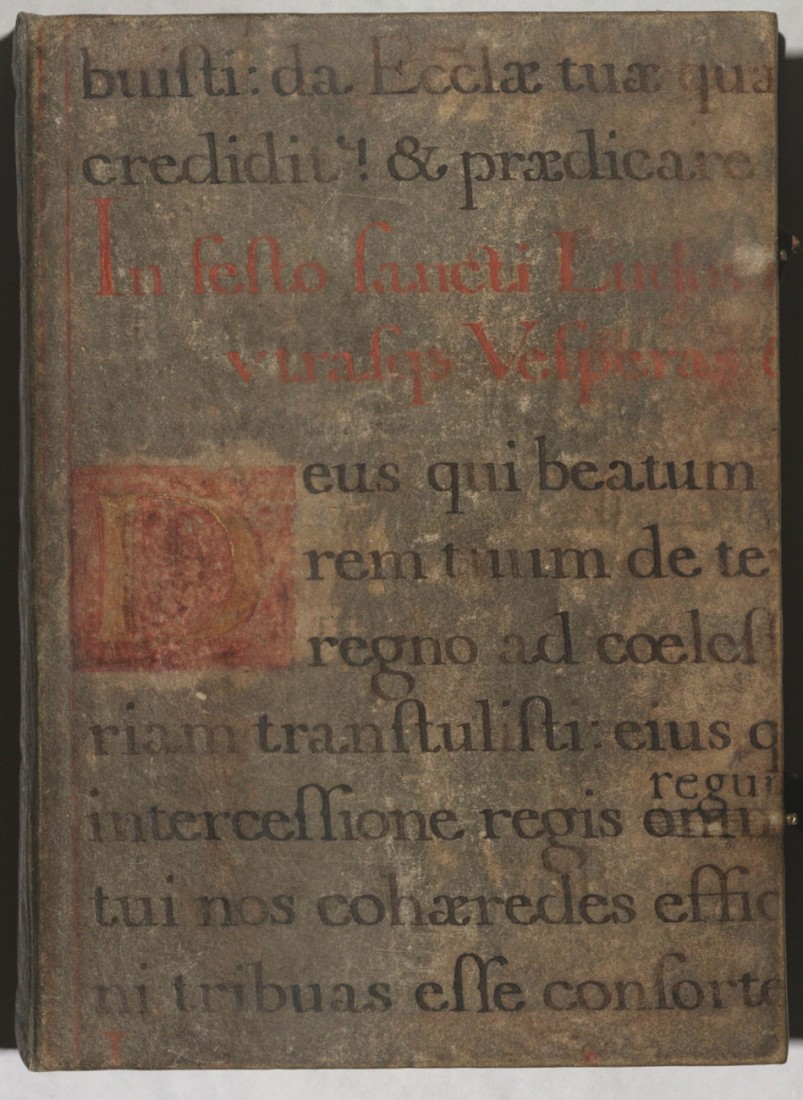
The Summerfield Collection at Kenneth Spencer Research Library consists of early-modern printed books, but the focus of a current project supervised by Special Collections Curator Eve Wolynes is to identify instances of binder’s waste and, when possible, identify their original source. Binder’s waste is a term for when parts or pages of an older, often medieval, manuscript are reused as part of the structure of a book’s binding. This could mean the boards of a book, structural support for the spine, or more decorative details like the cover, flyleaves, or similar. Many of the materials used as examples here are currently available for viewing – with a second case of materials highlighting illustrations by Edward Gorey – in Spencer’s North Gallery through May 29th.
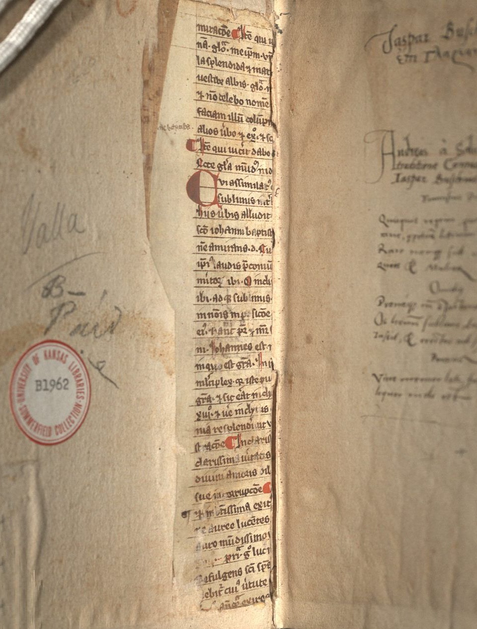
Beginning with structure, the most obvious examples of reuse can be found in the interior of a volume, generally on the boards near the spine. This kind of reuse is generally to help support either just the spine or the adherence of the boards and the spine together. Lorenzo Valla’s Elegantiae (Call Number: Summerfield B1962) has an example of this as the paper pasted on top (pastedown) has worn away enough to show some of the reuse (Fig. 1). This is clearly a medieval text, and – while it is fragmented – some of the words such as “Johannes” in the body text and “baptista” in the marginal notation among other examples illustrate that the focus of the text is on John the Baptist.
Fig. 1: Front interior detail, Elegantiae, 1540. Call Number: Summerfield B1962. Click image to enlarge.
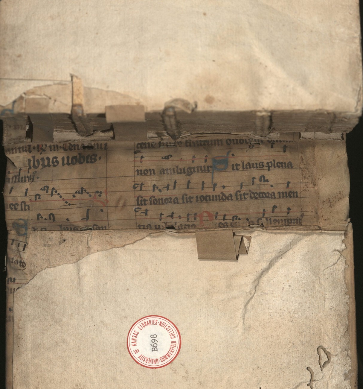
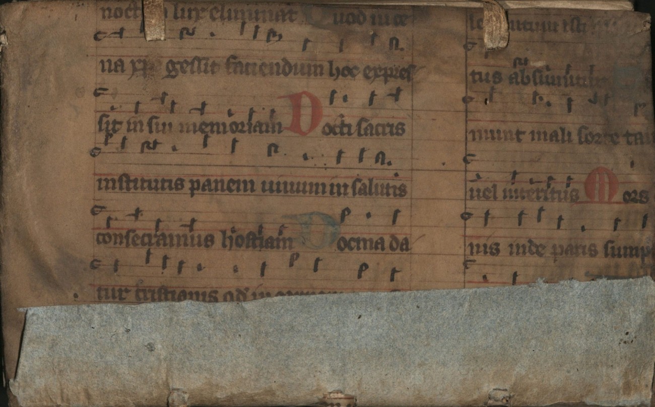
An example of more spinal support (Fig. 2.1) is seen in Analysis Logica Libri S. Lucae Qui Inscribitur Acta Apostoloru (Call Number: Summerfield B698). The strips are another method in which reuse occurs, though it can also be in longer or wider strips. The strips in this particular volume do not have any text or decoration remaining, so their exact origin cannot be certain. However, it is possible they come from the same leaf that was used to make the cover (Fig. 2.2). Based on the text visible both from the interior of the spine and the exterior cover, we can find that the lyrics to the music sheet are from “Lauda Sion,” a Christian hymn that celebrates Jesus Christ. Reuse of music sheets is fairly common within the Summerfield Collection, likely due to the rubrication and various ink colors or decoration that may accompany them.
Fig. 2.1: Spine interior detail, Analysis Logica Libri S. Lucae Qui Inscribitur Acta Apostoloru, 1597. Call Number: Summerfield B698. Click image to enlarge.
Fig. 2.2: Front cover, Analysis Logica Libri S. Lucae Qui Inscribitur Acta Apostoloru, 1597. Call Number: Summerfield B698. Click image to enlarge.
Music, although not a particularly popular feature, was not an uncommon form of reuse, either because of its wide availability or because it had some aspect of artistry and thus aesthetic interest for a cover. While actual music sheets may have been popular, texts of chant or hymnal lyrics are also quite common. A book of hours in the Summerfield Collection (Call Number: Summerfield B2890) has one such instance of reuse as the cover consists of a chant to laud St. Louis (Ludovicus in Latin), which would likely have been performed during Mass (Fig. 3).
Fig. 3: Front cover, Book of Hours, 1497. Call Number: Summerfield B2890. Click image to enlarge.
There were, of course, numerous other ways to reuse materials, but these are some of the most common examples within Spencer’s holdings. While some of the items are currently part of the temporary exhibit, the Summerfield Collection is always available for access in the Reading Room at Kenneth Spencer Research Library.
During Fall of 2025, my Dean in KU’s School of Social Welfare forwarded an announcement to our faculty from Kenneth Spencer Research Library, calling for submissions to the newly established Bergeron-Souza Exhibit Program. At the time, I had only visited the library once for a special event and had come away with some mild curiosity about what other archival materials one might access there.
I immediately had an idea about using this guest curation opportunity to showcase artwork from a digital archive I had been managing for several years, the Untold Stories of Aging exhibition of aging-focused artwork from intergenerational creators. I was intrigued by the possibility of showing the work in a display setting that would focus not only on the pieces’ artistic merit, but also on their commentary on aging as a universal human experience. By putting contemporary artwork into conversation with archival materials, I envisioned bringing to life a deeper and richer narrative about the ways in which artistic representations of aging motivate us to envision our own futures in more expansive ways and inspire us to action – individual and collective – to realize those futures.
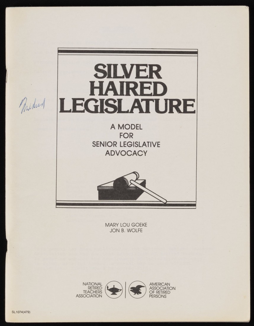
What followed was a loosely guided and ever evolving process of uncovering what the research library had to offer. I, along with my PhD Graduate Research Assistant Zhiqi Yi, perused over 100 boxes worth of material as well as dozens of individual artifacts sourced from various collections. There were the 20 or so boxes documenting the extensive efforts of long-time activist Mildred Harkness, who seemed to have her hands in all things aging within Kansas over the span of several decades. There were the seemingly endless boxes from the Jayhawk Area Agency on Aging. There were dozens of memoirs, artistic works, books, and essays penned and created by older adults that we requested, never really sure where they would lead.
Silver Haired Legislature guidebook of activist Mildred Harkness, 1981. Papers of Mildred Harkness. Call Number: RH MS 1548, Box 2, Folder 44. Click image to enlarge.
Silver Haired Legislature nametag of activist Mildred Harkness, 1981. Papers of Mildred Harkness. Call Number: RH MS 621, Box 2, Folder 18. Click image to enlarge.
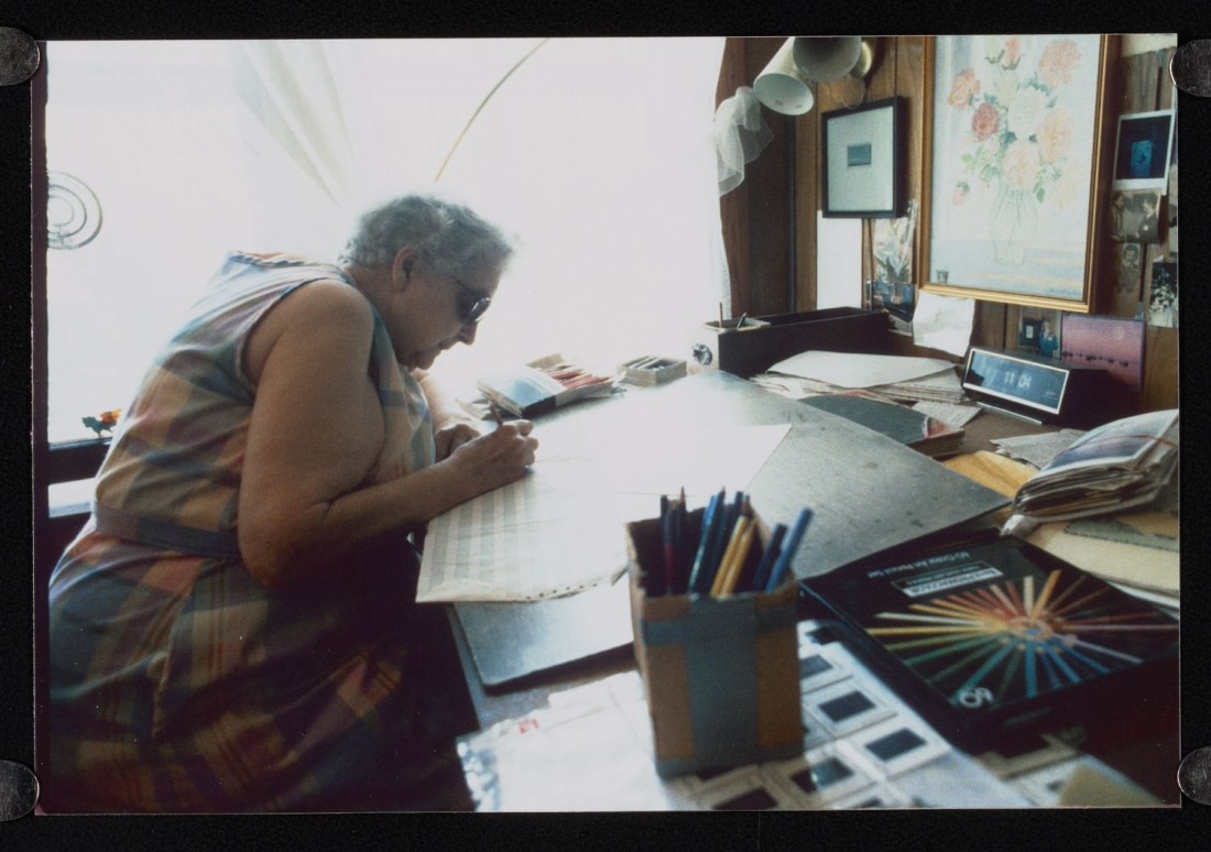
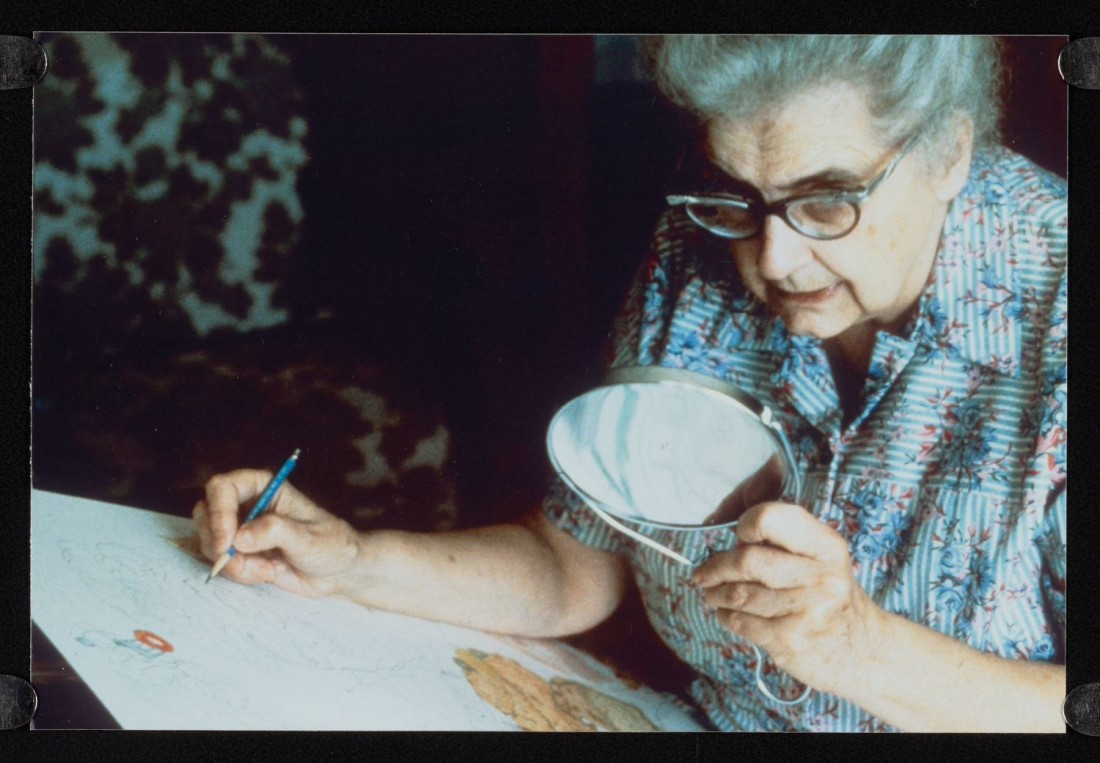
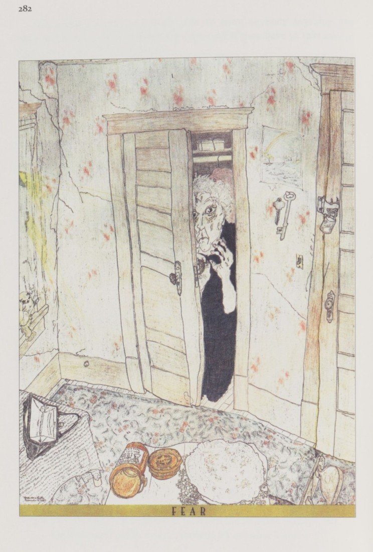
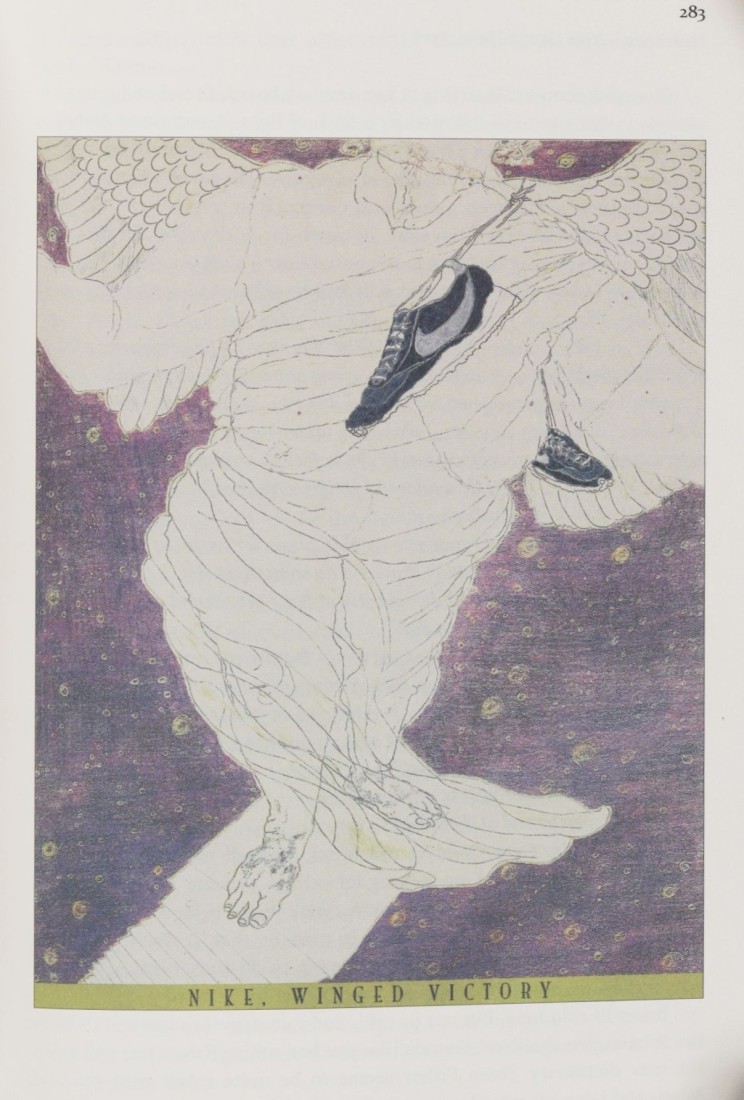
Some discoveries were more impactful than others. Having viewed the artistic drawings of Elizabeth “Grandma” Layton over the past decade, it was a tremendous joy to find that the library had archived over a dozen boxes of her personal documents, photographs, news clippings, exhibition flyers, and reprinted artwork. I read her memoir alongside her personal documentation, interweaving a rich storyline between the individual artifacts. Having begun drawing at the age of 68, Layton’s drawings document her struggles with and victory over mental illness. She often credited her discovery of blind contour drawing with having healed her life-long depression, illustrating the rich potential of artistic exploration and creation in the lives of older adults.
Photos of Elizabeth Layton, blind contour drawing in process, undated. Don Lambert Collection of Elizabeth Layton Papers. Call Number: RH MS 1538, Box 12, Folder 6. Click images to enlarge.
Drawings titled “Fear” (left) and “Nike, Winged Victory” (right) in Elizabeth Layton’s memoir Signs Along the Way, 2013. Call Number: RH C12442. Click images to enlarge.
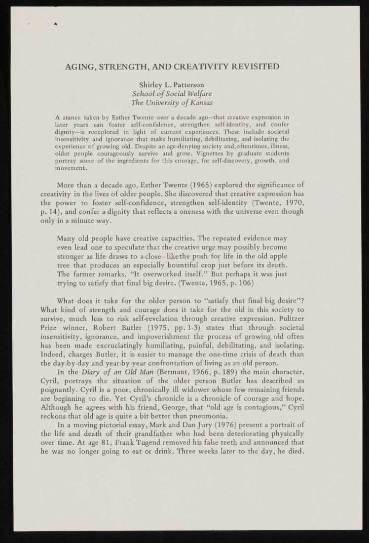
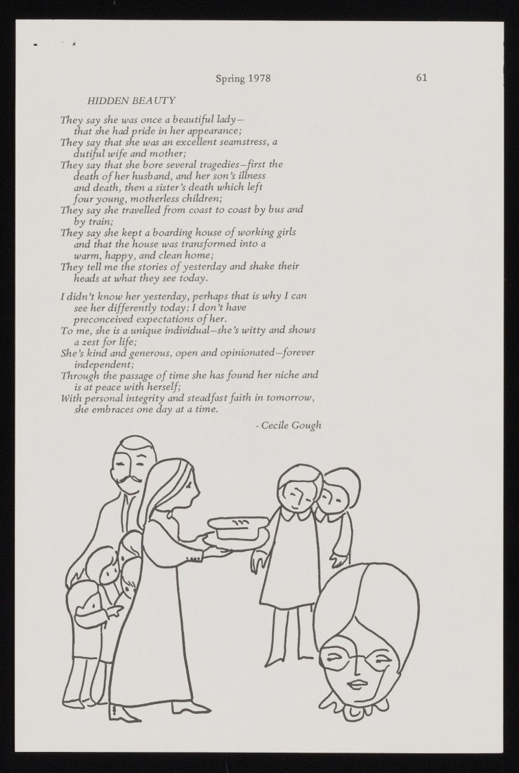
Similarly, I was delighted to stumble across several emeritus faculty who had contributed to KU’s aging-focused curricula over the years. This includes Shirley Patterson, who had her social work students interview older adults in the local community and create poems and brief essays based on their experiences. Additionally, Janet Hamburg of KU’s Department of Theatre and Dance taught “Dance for Seniors” and developed movement-based interventions for individuals living with Parkinson’s disease. These rich discoveries had to somehow be narrowed down to what could fit into a handful of display cases, and choosing amongst artifacts turned into a tall order, indeed. We will have to return to explore new topics another day!
Selected pages from “Aging, Strength, and Creativity Revisited” by Shirley Patterson, 1978. Personal Papers of Shirley L. Patterson. Call Number: PP 607, Box 2, Folder 26. Click images to enlarge.
From this year-long process, the resulting exhibition opened on February 23, 2026, and is organized into six sequential display cases of archival materials. The exhibit also includes 15 contemporary art works, both in display cases and along the exhibition walls, through which the exhibition themes are interwoven and illustrated in vibrant and moving detail.
The overarching narrative of the exhibition explores societal discourses around aging, illustrating that the ways in which we talk about a thing, person, or experience come to shape our ability to imagine and engage with the object of conversation. In this case, audience members are asked to grapple with societal conversations around aging and later life, considering the impact of how we construct and envision this universal, life-long experience and how those constructions shape our hopes and plans for our own aging present and futures. Historical discourses are captured in artifacts dating back to 1780, representing older citizens as making up a vulnerable and needy population. Documents from aging activists, creative essays, portraits, poetry, and much more provide contrasting and nuanced constructions of aging, balancing more varied images of later life based on agency, growing or evolving self-knowledge, hardships and joys brought by new phases of life, and more.
A special event next Tuesday, March 31, 2026 (5:30-7:00pm) will feature a mini-presentation on the making of the exhibition and will be attended by several of the exhibit’s contributing artists, who will mingle with attendees and informally share the meaning of their work. Come and join us to explore your own hopes for the future!
Sarah Jen Associate Professor and PhD Program Director KU School of Social Welfare
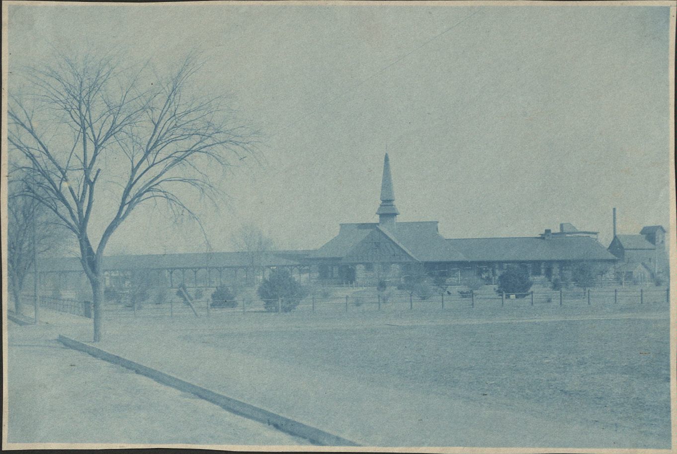
In 1984, the Union Pacific Railroad (UPR) made the decision to abandon its Union Pacific Depot in Lawrence and announced that they would demolish the building due to potential liabilities. The Depot had once been a shining gateway to Lawrence, with a tall steeple and busy railway line, but in the years prior, the passenger service had been discontinued, and the Depot building itself had fallen into disrepair.
Cyanotype photo of the Union Pacific Depot, undated [circa 1889-1930]. Lawrence, Kansas Photographs Collection. Call Number: RH PH 18, Box 1, Folder A6. Click image to enlarge.
Lawrence residents swiftly jumped into action to campaign for the preservation of the building. Citizens from the recently formed Lawrence Preservation Alliance, fresh of the success of their first project to save a historic home at 947 Louisiana St, jumped into action to preserve this Lawrence landmark. Members from the Lawrence Preservation Alliance, University of Kansas Rowing Club, and other concerned citizens banded together to form the “Save the Depot Task Force.” With the original plan to use the Depot as a headquarters for the rowing team, they were able to negotiate with the UPR to stall the demolition and began coordinating and raising funds for potential restoration.
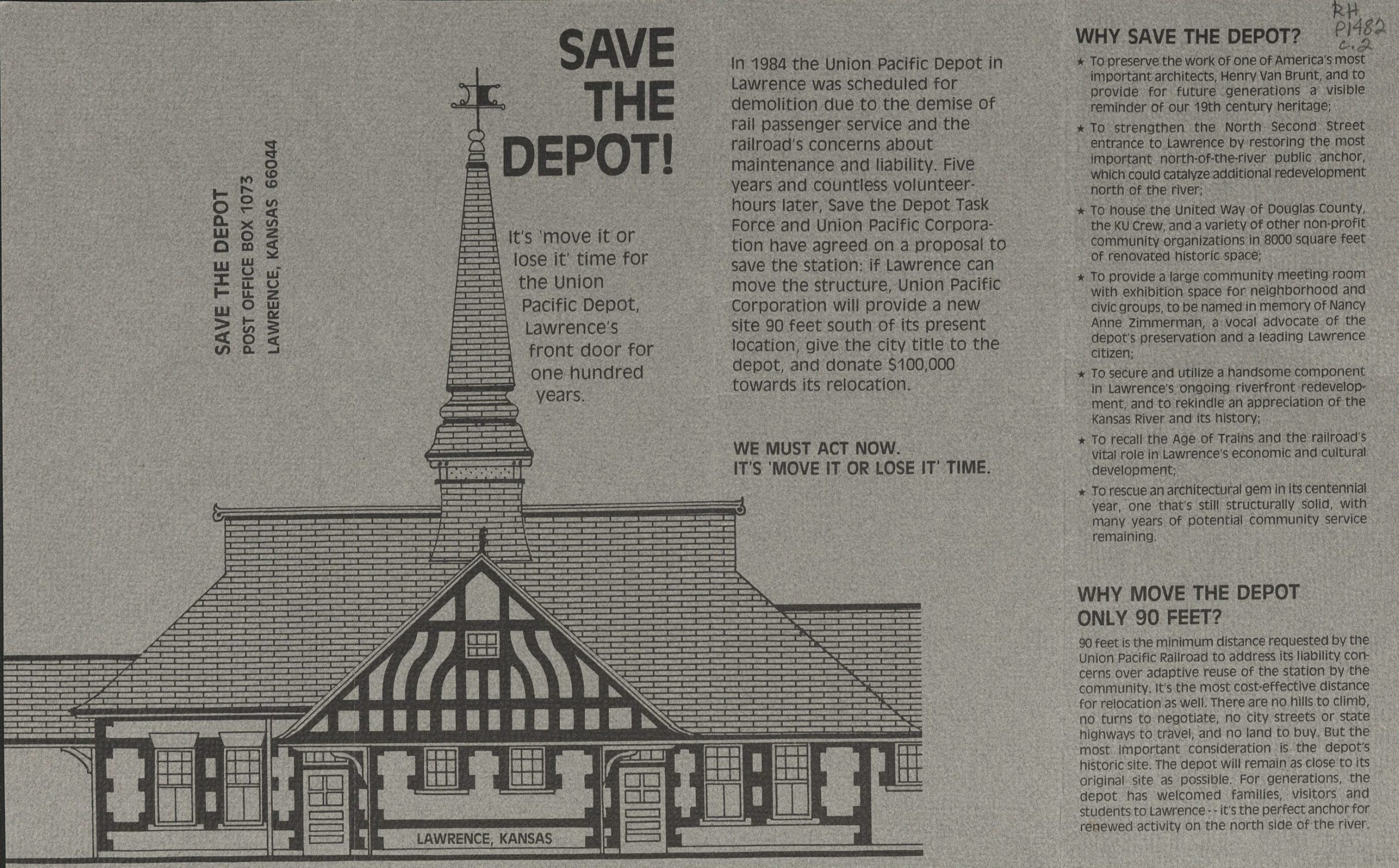
There was one sticking point: the UPR was unwilling to permit the Depot to stay in its current location due to the building’s proximity to the railway line. With no other options, the Save the Depot Task Force began its “Move It or Lose It” campaign. The group hired a contractor to conduct a study to see if it would be possible to move the entire building in either one or two pieces on a hydraulic lift to a nearby lot.
Save the Depot brochure, “Move It or Lose It,” undated [circa 1987]. Call Number: RH P1482. Click image to enlarge.
After years of negotiation and much back and forth, in 1990 the UPR agreed to let the Depot stay where it was, with the provision that the City of Lawrence would provide a protective iron fence protecting the building from the railway tracks. In the end, the UPR sold the Depot to the city for $1.
Renovations began under architect John Lee officially in 1991, with construction happening in three phases & ongoing fundraising assistance from the “Save the Depot” task force. The Union Pacific Depot was officially rededicated as a community center in 1996.
Learn more about the restoration of Lawrence’s Union Pacific Depot at our short-term exhibit in Spencer’s North Gallery! The exhibit is free and open to the public in the North Gallery through March 31, 2026.
I started working on this exhibit as part of an effort to tie Spencer materials in with this year’s KU Reads Common Book, John Green’s Anthropocene Reviewed. When I first started thinking about this exhibit, my idea was to collect things I thought people might be interested in reviewing themselves. I looked at the library’s first-edition copy of I Am Legend by Richard Matheson (Call Number: ASF B643). I looked at a gorgeous bound volume from Special Collections with binding I’d never seen before (Call Number: B10546). I even pulled and contemplated items from the Kansas State Seals collection (Call Number: RH MS Q428), wondering if there was a way I could somehow work a seal into the display.
The process of creating a display is by necessity dialectical. You might pull items with a particular theme in mind, only to discover that another theme might be more appropriate. In some ways, having the exterior guide of Green’s essays helped to eliminate some of that back and forth.
I thought that I knew what I would end up writing about with each of the items by the time I finalized my selection. With the KU Monopoly game, I thought I would write about my childhood experiences (or lack thereof) playing Monopoly. But as I was looking through the box, trying to decide how I would want to have it set up in the display, I discovered a little sticky note describing the item as a gift to the archive.
The inside lid of KU Monopoly with an attached sticky note that reads “Christmas gift from Sandy Mason to the Archives Dec 20, 2004.” Alexandra “Sandy” Mason was Spencer’s first librarian; she worked at KU from 1957 until she retired in 1999. Call Number: RG 0/Artifacts. Click image to enlarge.
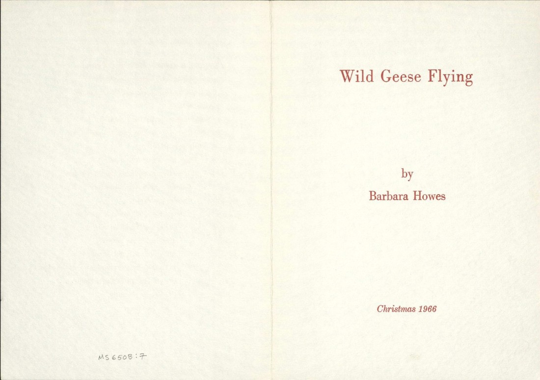
“Wild Geese Flying” (Call Number: MS P650) was sent as a Christmas card by poet Barbara Howes, and I initially thought that I would write primarily about the idea of sending a poem as a card. As I sat with the item, however, I became captivated by the poem itself. It’s more about the idea of geese than about an encounter with an individual member of goose-dom. It’s about the transience of migratory birds. It made me think about how so much of what we strive for here is permanence, or something like it, and how almost everything we keep here is vulnerable to time.
|
“Wild Geese Flying,” a poem that Barbara Howes sent as a Christmas card in 1966. Correspondence, Poems, and Reviews By and About Barbara Howes. Call Number: MS P650. Click image to enlarge.
Green says in The Anthropocene Reviewed that “there are no disinterested observers, only participants” (p. 5). I initially read this as a commentary on how the act of observing something – what we choose to give our attention to – is inherently an expression of our agency. But I think that it also speaks to the fact that it’s hard to be really, truly disinterested if you pay enough attention. Nothing is ever quite as straightforward as it seems, as this display has so aptly shown me.
The Uncommon Books exhibit will be open in Spencer’s North Gallery through December 1. The display is accompanied by a page on the Lawrence Reviews website. Feel free to stop by and write your own review!