The University of Kansas

Inside Spencer: The KSRL Blog

Books on a shelf

Welcome to the Kenneth Spencer Research Library blog! As the special collections and archives library at the University of Kansas, Spencer is home to remarkable and diverse collections of rare and unique items. Explore the blog to learn about the work we do and the materials we collect.

April-May Exhibit: Binder’s Waste in Early Modern Books

May 8th, 2026

The Summerfield Collection at Kenneth Spencer Research Library consists of early-modern printed books, but the focus of a current project supervised by Special Collections Curator Eve Wolynes is to identify instances of binder’s waste and, when possible, identify their original source. Binder’s waste is a term for when parts or pages of an older, often medieval, manuscript are reused as part of the structure of a book’s binding. This could mean the boards of a book, structural support for the spine, or more decorative details like the cover, flyleaves, or similar. Many of the materials used as examples here are currently available for viewing – with a second case of materials highlighting illustrations by Edward Gorey – in Spencer’s North Gallery through May 29th.

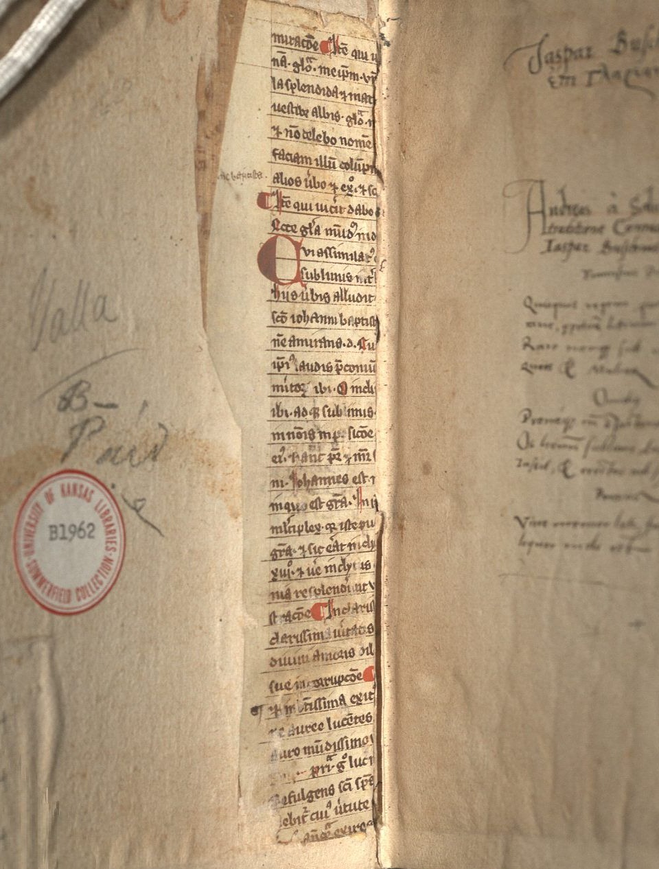
Beginning with structure, the most obvious examples of reuse can be found in the interior of a volume, generally on the boards near the spine. This kind of reuse is generally to help support either just the spine or the adherence of the boards and the spine together. Lorenzo Valla’s Elegantiae (Call Number: Summerfield B1962) has an example of this as the paper pasted on top (pastedown) has worn away enough to show some of the reuse (Fig. 1). This is clearly a medieval text, and – while it is fragmented – some of the words such as “Johannes” in the body text and “baptista” in the marginal notation among other examples illustrate that the focus of the text is on John the Baptist.

Long narrow strip of a medieval manuscript inside the front cover of an early modern book.
Fig. 1: Front interior detail, Elegantiae, 1540. Call Number: Summerfield B1962. Click image to enlarge.

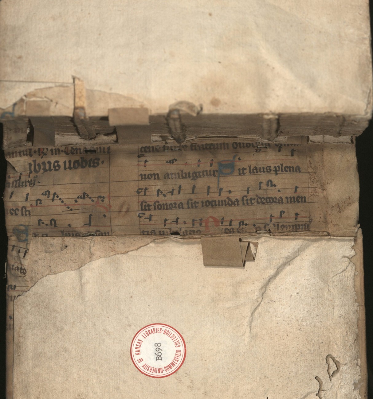
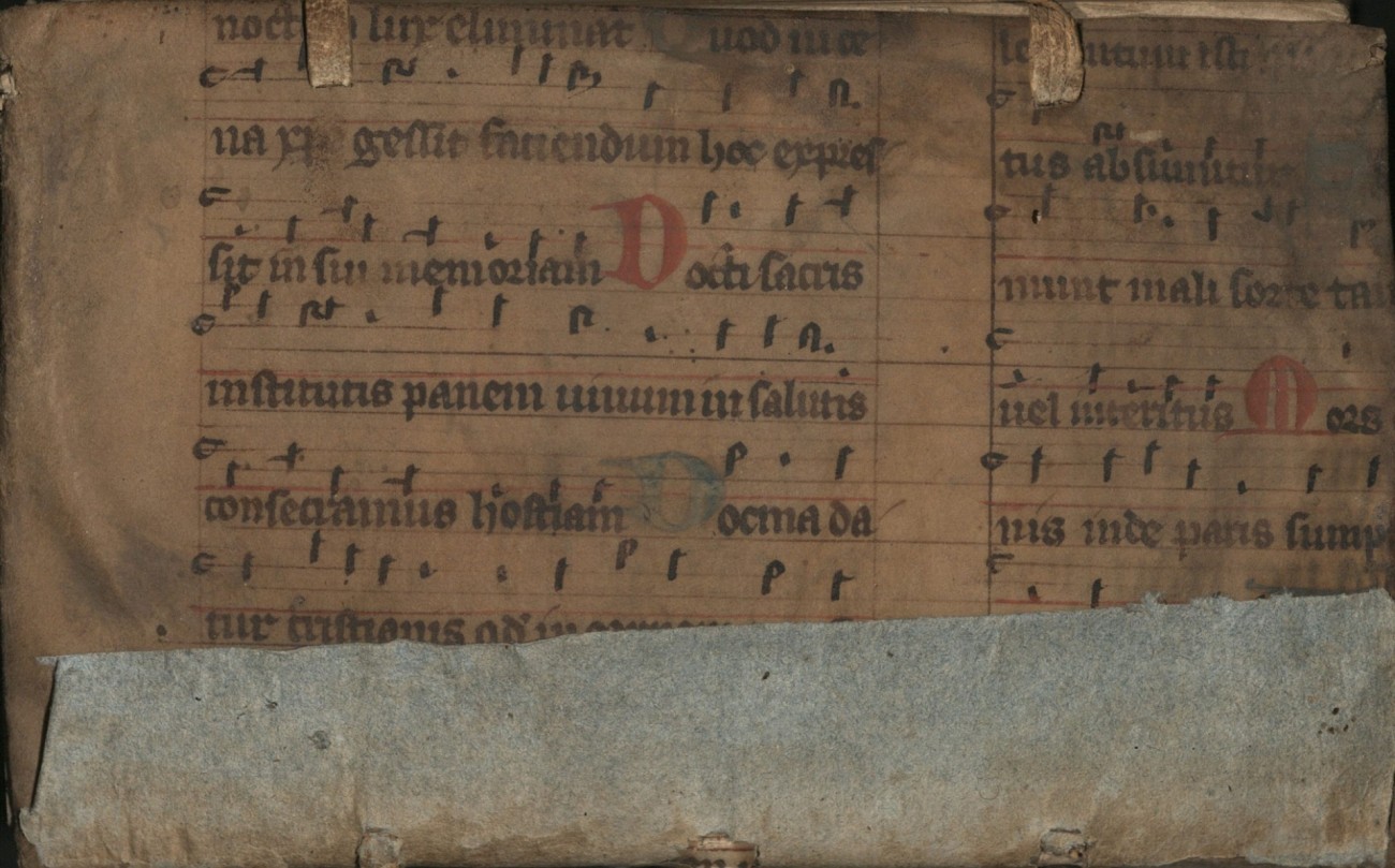
An example of more spinal support (Fig. 2.1) is seen in Analysis Logica Libri S. Lucae Qui Inscribitur Acta Apostoloru (Call Number: Summerfield B698). The strips are another method in which reuse occurs, though it can also be in longer or wider strips. The strips in this particular volume do not have any text or decoration remaining, so their exact origin cannot be certain. However, it is possible they come from the same leaf that was used to make the cover (Fig. 2.2). Based on the text visible both from the interior of the spine and the exterior cover, we can find that the lyrics to the music sheet are from “Lauda Sion,” a Christian hymn that celebrates Jesus Christ. Reuse of music sheets is fairly common within the Summerfield Collection, likely due to the rubrication and various ink colors or decoration that may accompany them.

An early modern book opened to show a piece of medieval music and small strips of unmarked paper in its spine.
Fig. 2.1: Spine interior detail, Analysis Logica Libri S. Lucae Qui Inscribitur Acta Apostoloru, 1597. Call Number: Summerfield B698. Click image to enlarge.
Piece of medieval sheet music.
Fig. 2.2: Front cover, Analysis Logica Libri S. Lucae Qui Inscribitur Acta Apostoloru, 1597. Call Number: Summerfield B698. Click image to enlarge.

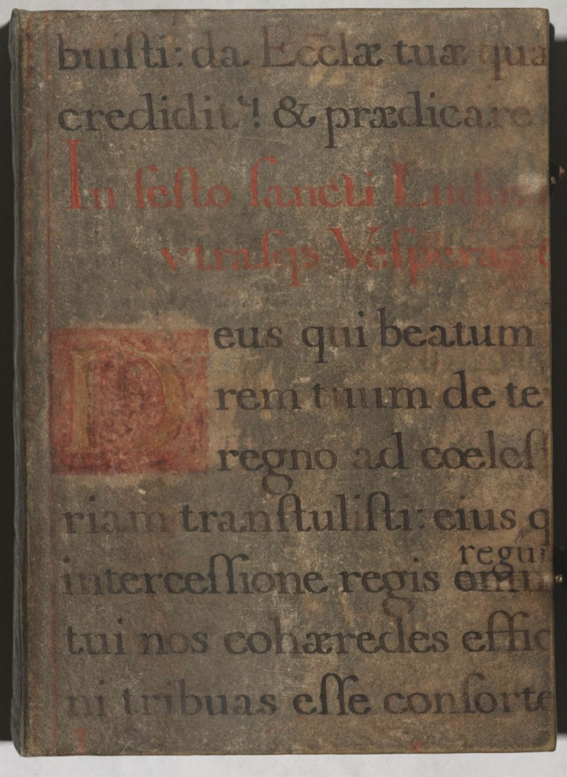
Music, although not a particularly popular feature, was not an uncommon form of reuse, either because of its wide availability or because it had some aspect of artistry and thus aesthetic interest for a cover. While actual music sheets may have been popular, texts of chant or hymnal lyrics are also quite common. A book of hours in the Summerfield Collection (Call Number: Summerfield B2890) has one such instance of reuse as the cover consists of a chant to laud St. Louis (Ludovicus in Latin), which would likely have been performed during Mass (Fig. 3).

Section of a medieval manuscript with black and red text in Latin.
Fig. 3: Front cover, Book of Hours, 1497. Call Number: Summerfield B2890. Click image to enlarge.

There were, of course, numerous other ways to reuse materials, but these are some of the most common examples within Spencer’s holdings. While some of the items are currently part of the temporary exhibit, the Summerfield Collection is always available for access in the Reading Room at Kenneth Spencer Research Library.

Kit Cavazos
Public Services student assistant

Banned Books Week: Redacted for the Inquisition

September 28th, 2017

September 24-30 is Banned Books Week, an annual event in which libraries and readers celebrate the freedom to read. With this in mind, today we feature several images from an early printed copy of The Divine Comedy by the medieval Italian poet Dante Alighieri (1265-1321). The copy in question is from a 1512 edition printed by Bernadino Stagnino in Venice, a city that served as a vibrant center for early printing and the book trade. Stagnino’s edition combines a recently re-edited version of Dante’s text (1502) with an earlier commentary on the poem by the 15th century humanist scholar Cristoforo Landino.

But wait, you ask, what does this have to do with censorship? Sometime in the decades following its printing, Spencer’s copy traveled from Venice to Spain, and in the late 1500s fell under the review of the Inquisition and Catholic clerics concerned with religious orthodoxy and the spread of heretical ideas.  A manuscript notation in Spanish on the volume’s title page reads:  “Con comisión de los S[eñor]es Inquisidores teste y borre lo prohibido deste libro” (“With commission from the Señores Inquisitors cross out and erase what is prohibited in this book”) followed by the name [E]stevan Joan Velasco Vicario de S[an]t Nicolás (Esteban Juan Velasco, vicar of San Nicolás).*

Title page of 1512 edition of Dante's Comedia, with redaction command in manuscript.

“…cross out and erase what is prohibited in this book”: the title page, with notations in Spanish, of Spencer’s copy of Opere del die vino poeta Danthe [Divina Commedia]. Venice: Bernardino Stagnino, 1512. Call #: Summerfield C1189. Click image to enlarge.

A similar notation by a different cleric appears on the verso of the volume’s final page of text: “Por lo mandado de los señores inquisidores teste y borre lo prohibido en estas comedias del dante conforme a la censura del Sto Off[ci]o [h]oy a 25 de mayo de 1585. Fray Juan Vidal” (By the order of the señores inquisitors cross out and erase what is prohibited in these comedies of Dante according to the censure of the Holy Office today, 25 May 1585 Fray Juan Vidal).*

Detail of a second notation in Spanish from the end of the volume regarding the redaction of this copy.

In paging through the volume, readers will find several redacted passages of varying lengths. Landino’s commentary receives the most expurgation, though lines from Dante’s poem are redacted on occasion as well. In some places, an offending line is simply crossed out in ink, while longer passages have been papered over so as to render them illegible. Once the prohibited passages had been redacted, the volume could be retained and consulted.

Image of passages redacted in ink and by the pasting of paper on folio 29v and 30r

Passages in Landino’s commentary that have been redacted by the addition of blank paper slips and by crossing out lines of text in ink.

A later reader appears to have succeeded in removing much of the paper that once covered some of the offending passages. Although some discoloration remains from the glue used to affix the paper slips, the text is now visible.  You can also see the censor’s original ink dash, marking the portions of text to be redacted or pasted over.

Image of redactions to the commentary for the Purgatorio (f. 319v and 320r)

Text restored?: the yellowy-brown patches indicate sections where paper slips were once glued to cover over passages judged offensive. Some remnants of the paper are visible above in the block of text at the bottom left (click image to enlarge). Dante Alighieri. Opere del die vino poeta Danthe [Divina Commedia]. Venice: Bernardino Stagnino, 1512. Call #: Summerfield C1189.

As readers of Dante know, The Divine Comedy is divided into three sections or “canticles,” one for each of the three realms of the afterlife visited by the character of Dante over the course of the poem: Inferno, Purgatorio, and Paradiso (Hell, Purgatory, and Paradise).  As one might expect, most of the redacted passages appear in the Inferno. (It can be controversial to put historical personages, including Church leaders, in Hell, and to discuss the political and theological matters that result in damnation.) However, Spencer’s copy also contains at least one censored passage in both the text and commentary of the Purgatorio and Paradiso as well.

Image of redactions to Dante's text and Landino's commentary in the Paradiso, f. 359r and f. 360r.

Trouble in Paradise: expurgated passages in Dante’s verse and Landino’s commentary toward the end of Canto IX  in the “Paradiso” section of The Divine Comedy (click image to enlarge).  Dante Alighieri. Opere del die vino poeta Danthe [Divina Commedia]. Venice: Bernardino Stagnino, 1512. Call #: Summerfield C1189. This passage, which critiques the Vatican and Church leaders, is also redacted in a copy of a 1564 edition of Dante’s work (with commentaries) held at Brandeis University.

Spencer’s expurgated copy of the Dante’s Divine Comedy offers a fascinating material example of censorship in early modern Spain.  If this brief post has whet your appetite for exploring this subject further, consider visiting He who destroyes a good booke, kills reason it selfe, an online re-issue of a notable 1955 KU Libraries exhibition catalogue on intellectual freedom. The catalogue’s section on Spain contains examples of other volumes from the library’s collections that were censored under the Inquisition, including a book on proverbs by Juan de Aranda that has been redacted with ornamented slips.

Curious about more contemporary instances of censorship and challenges to books? Take a look at the list of the top ten most challenged books of 2016, as compiled by the American Library Association Office for Intellectual Freedom. Or, if you live in Lawrence, consider visiting the Lawrence Public Library, which will be distributing a different card in its 2017 Banned Books Trading Card series each day this week.

Elspeth Healey
Special Collections Librarian

*Transcriptions and translations courtesy of Professor Luis Corteguera, with additional insight from Professors Patricia Manning and Isidro Rivera.

Click on the thumbnails below for images of additional redacted passages in Spencer’s 1512 edition of Dante’s Divine Comedy with commentary by Cristoforo Landino.

Small ink redaction to the commentary on f. 12r.  Image of Redactions to both Dante's verse (left, f84v) and Landino's commetary (right f85r)  Image of remnants of a paper-ever passage, f. 126v and 127r

Creating Authority: Printing with Anglo-Saxon Type

July 17th, 2014

This week’s post comes from Amanda Luke, a recent KU graduate and a Reference Specialist at Watson Library.  Amanda is currently working toward her Master of Library Science (MLS) degree at Emporia State University.

There is a special connection between Anglo-Saxon typeface and the religious controversy that defined late sixteenth-century England. With the Church of England only decades old and tensions between Catholics and Protestants higher than ever, church officials sought to establish ties between the new Church and earlier English history. One connection manifested itself through church manuscripts from the Middle Ages. Some of these religious texts appeared in Old English, the “vulgar” or common tongue of the Anglo-Saxons, who occupied England before the Norman conquests in the eleventh century. Matthew Parker (1504-1575), Archbishop of Canterbury, was the one of the earliest proponents of Anglo-Saxon scholarship. Parker hoped that having these Anglo-Saxon manuscripts translated and printed would lend legitimacy to the new Church through ties to early English religious doctrine.

Parker’s chief interest lay in a series of Latin and Old English texts by Ælfric, an abbot who lived circa 950 – 1010. Copies of these documents had been found at the Worcester and Canterbury cathedrals (Evenden 81). These texts, which Parker’s secretary John Joscelyn likely translated, touched on the subject of the Eucharist and seemed to challenge the Catholic belief in transubstantiation, or the literal transformation of bread and wine into the body and blood of Christ (Evenden 81). This rejection of Catholic doctrine was vital for Parker because it provided evidence that the current Catholic thinking was not always present in England.

Image of the title page of A Testimonie of Antiquitie (1566) Legend discussing Old English Characters in John Joscelyn's edition of AElfric's A Testimonie of Antiquitie (1566)

Left: Title page; Right: Old English characters explained.  From: Aelfric, Abbot of Eynsham. A Testimonie of Antiquitie
ſhewing the auncient fayth in the Church of England touching the ſacrament of the body and bloude of the Lord
[…].
London: Iohn Day, [1566?]. Call Number: Clubb A1566.1 Click images to enlarge.

To disseminate this claim he employed a London-based Protestant printer named John Day for an unprecedented task: the development of a typeface which included all of the special characters present in the Anglo-Saxon manuscripts. The development of this Anglo-Saxon type, often just called Saxon type, was an enormous financial risk for Parker. It was estimated by modern scholar Peter Lucas that the typeface would have cost the vast sum of £200 to create (Evenden 82). The typeface which Day cast was 16 point, or slightly smaller than a great primer, a 17 point type (Clement 209). It contained fourteen lower and ten upper case Old English characters not found in the Latin alphabet (see above). It is fascinating to note the several forms of the diphthong “th” in the alphabet (eth ð and thorn þ), as well as the presence of a symbol for the word “and.”

The earliest book containing the Anglo-Saxon typeface was printed by John Day in 1566 at Parker’s request. The volume was titled A Testimonie of Antiquitie ſhewing the auncient fayth in the Church of England touching the ſacrament of the body and bloude of the Lord here publikely preached, and alſo receaued in the Saxons tyme, aboue 600. yeares agoe, and was attributed to Ælfric, the author of the text that influenced Parker. As its long title suggests, this text is a translation of an Easter sermon which touches on the communion. It was especially important to Parker because it supported his mission to legitimize the doctrines of the Church of England. The creation of the Saxon typeface to accompany the translation was, according to scholar Richard Clement, a means of further legitimizing obscure texts. He writes, “Parker’s men began to examine the manuscripts and were impressed by the visual impact of the Anglo-Saxon texts which almost jumped off the page and proclaimed their antiquity and authority to the reader” (Clement 206). Use of the Saxon typeface also helped to differentiate the Old English text from the Latin and English used in the book.

Clubb_A1566_1_f35_withred

Passage on the transubstantiation (with red underlinings added). Aelfric, Abbot of Eynsham. A Testimonie of Antiquitie …].
London: Iohn Day, [1566?]. Call Number: Clubb A1566.1  Click image to enlarge.

In the image above, the volume is opened to folio 35, which contains a central moment in the Easter sermon. A printed note in the margin reads “No transubstantiation,” highlighting one of the major doctrinal connections Parker was trying to make between the historical church and the Church of England. The text in Saxon type appears on the left, and the translation appears on the right. Even if you cannot read Old English, words such as “blode” and “Christ” can be made out (see the words underlined in red).   Thus the facing page format supported the preface’s claim that everything in the translation was true and accurate.

The use of the Saxon typeface in A Testimonie of Antiquitie opened the door for the expansion of Anglo-Saxon scholarship.  To explore the subject further, visit Spencer and use its Clubb Collection of Books Printed with Anglo-Saxon Type.

Amanda Luke
KU Alumna and Reference Specialist, Watson Library

Works Cited

Clement, Richard W. “The Beginnings of Printing in Anglo-Saxon, 1565-1630.” Papers of the Bibliographical Society of America.91.2 (1997): 192-244. Print.

Evenden, Elizabeth. Patents, Pictures, and Patronage: John Day and the Tudor Book Trade. Burlington: Ashgate, 2008. Print.

Neither Fish Nor Fowl: A Printed Book of Hours

April 4th, 2014

The world of written information is changing.  We are in the midst of a major shift from print to digital culture (you are, after all, reading this online).  It seems timely, then, to look back at an artifact from another major revolution in the technology of writing — the shift from manuscript to print culture.  The first hundred years of printing offer many fascinating examples of  the overlap between the conventions of manuscript culture and the emergence of a new print culture.  One such example is this book of hours, Hore intemerate Virginis Marie secundu[m] vsum Romanum cum pluribus orationibus tam in Gallico [et] in Latino, produced in Paris circa 1505.

Image of a printed books of hours at an opening with two miniatures.

Image of an Opening featuring a miniature of the Adoration of the Magi in a Printed Book of Hours, ca. 1505.

Hore intemerate Virginis Marie secundu[m] vsum Romanum cum pluribus orationibus tam in Gallico
[et] in Latino
[Printed Book of Hours]. [Paris: G. Anabat, 1505.] Call Number: Summerfield C65

Squint and it looks like an illuminated manuscript (at least in the top image), but it is actually a printed volume, with hand-colored  illustrations and metalcut borders.  During the late medieval period, books of hours were among the most common manuscript volumes owned by laypeople (whether nobility or wealthy merchants).  Accordingly, it is not surprising that with the advent of moveable type, printers soon tried their inky hands at producing these devotional texts.  This particular volume draws upon several features of manuscript books of hours.  It is printed on vellum (treated calf skin) and contains hand-colored initials and miniatures (the latter literally painted on top of the metalcut illustrations).

Printed books of hours flourished roughly between the 1480s and 1530s, co-existing alongside their manuscript counterparts.  This volume from the Spencer Library’s collections was printed in Paris, a center for printed books of hours, by Guillaume Anabat for the bookseller Germain Hardouin and likely hand-colored in the Hardouin workshop (see the colophon pictured below).

Encountering a book like this makes one wonder which present-day artifacts will someday be seen as the products of a writing culture in transition.   In 500 years, will we look at early e-readers as strange hybrids: objects that apply the conventions of the “print world” to the digital environment?

See more….click thumbnails to enlarge.

Image of title page in printed book of hours with manuscript notations e of Almanac from a printed book of hours. Image of a printed book of hours featuring illustrations of Saint Christopher and Saint Sebastian. Image of colophon in printed book of hours

Elspeth Healey
Special Collections Librarian