Welcome to the Kenneth Spencer Research Library blog! As the special collections and archives library at the University of Kansas, Spencer is home to remarkable and diverse collections of rare and unique items. Explore the blog to learn about the work we do and the materials we collect.
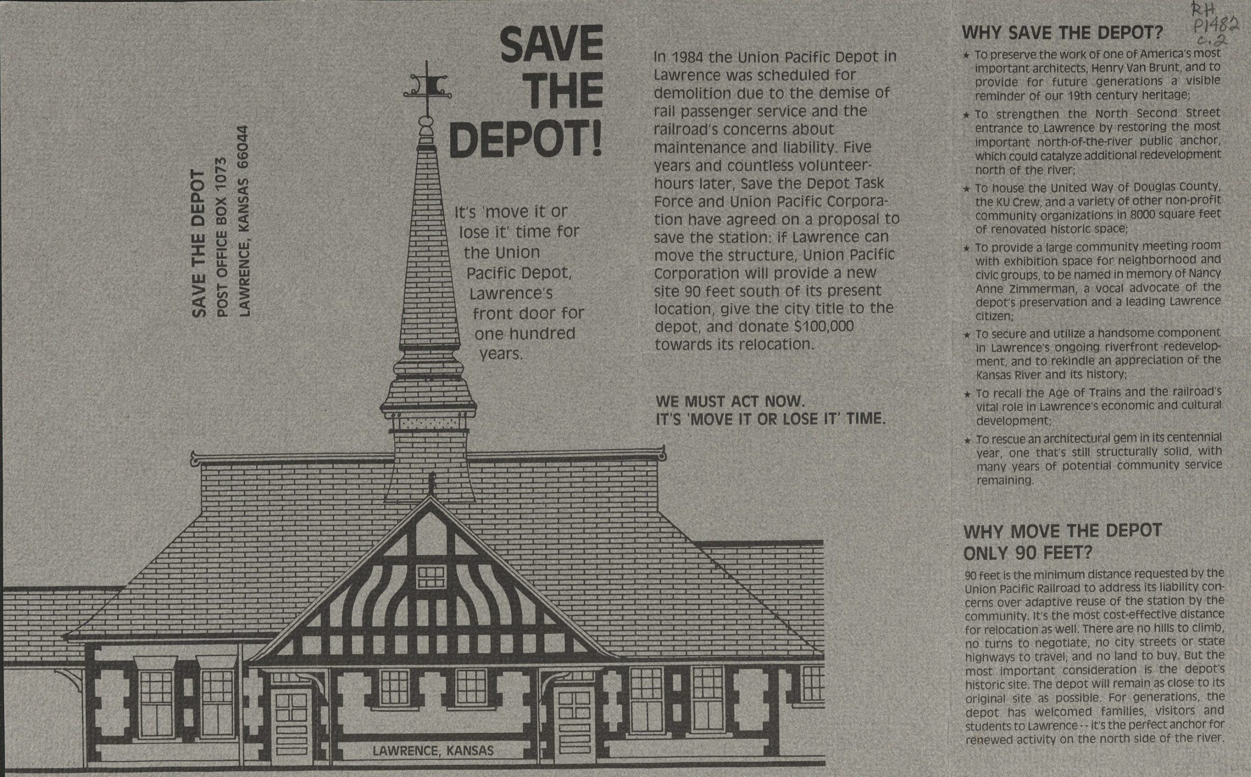
In 1984, the Union Pacific Railroad (UPR) made the decision to abandon its Union Pacific Depot in Lawrence and announced that they would demolish the building due to potential liabilities. The Depot had once been a shining gateway to Lawrence, with a tall steeple and busy railway line, but in the years prior, the passenger service had been discontinued, and the Depot building itself had fallen into disrepair.
Cyanotype photo of the Union Pacific Depot, undated [circa 1889-1930]. Lawrence, Kansas Photographs Collection. Call Number: RH PH 18, Box 1, Folder A6. Click image to enlarge.
Lawrence residents swiftly jumped into action to campaign for the preservation of the building. Citizens from the recently formed Lawrence Preservation Alliance, fresh of the success of their first project to save a historic home at 947 Louisiana St, jumped into action to preserve this Lawrence landmark. Members from the Lawrence Preservation Alliance, University of Kansas Rowing Club, and other concerned citizens banded together to form the “Save the Depot Task Force.” With the original plan to use the Depot as a headquarters for the rowing team, they were able to negotiate with the UPR to stall the demolition and began coordinating and raising funds for potential restoration.
There was one sticking point: the UPR was unwilling to permit the Depot to stay in its current location due to the building’s proximity to the railway line. With no other options, the Save the Depot Task Force began its “Move It or Lose It” campaign. The group hired a contractor to conduct a study to see if it would be possible to move the entire building in either one or two pieces on a hydraulic lift to a nearby lot.
Save the Depot brochure, “Move It or Lose It,” undated [circa 1987]. Call Number: RH P1482. Click image to enlarge.
After years of negotiation and much back and forth, in 1990 the UPR agreed to let the Depot stay where it was, with the provision that the City of Lawrence would provide a protective iron fence protecting the building from the railway tracks. In the end, the UPR sold the Depot to the city for $1.
Renovations began under architect John Lee officially in 1991, with construction happening in three phases & ongoing fundraising assistance from the “Save the Depot” task force. The Union Pacific Depot was officially rededicated as a community center in 1996.
Learn more about the restoration of Lawrence’s Union Pacific Depot at our short-term exhibit in Spencer’s North Gallery! The exhibit is free and open to the public in the North Gallery through March 31, 2026.
I started working on this exhibit as part of an effort to tie Spencer materials in with this year’s KU Reads Common Book, John Green’s Anthropocene Reviewed. When I first started thinking about this exhibit, my idea was to collect things I thought people might be interested in reviewing themselves. I looked at the library’s first-edition copy of I Am Legend by Richard Matheson (Call Number: ASF B643). I looked at a gorgeous bound volume from Special Collections with binding I’d never seen before (Call Number: B10546). I even pulled and contemplated items from the Kansas State Seals collection (Call Number: RH MS Q428), wondering if there was a way I could somehow work a seal into the display.
The process of creating a display is by necessity dialectical. You might pull items with a particular theme in mind, only to discover that another theme might be more appropriate. In some ways, having the exterior guide of Green’s essays helped to eliminate some of that back and forth.
I thought that I knew what I would end up writing about with each of the items by the time I finalized my selection. With the KU Monopoly game, I thought I would write about my childhood experiences (or lack thereof) playing Monopoly. But as I was looking through the box, trying to decide how I would want to have it set up in the display, I discovered a little sticky note describing the item as a gift to the archive.
The inside lid of KU Monopoly with an attached sticky note that reads “Christmas gift from Sandy Mason to the Archives Dec 20, 2004.” Alexandra “Sandy” Mason was Spencer’s first librarian; she worked at KU from 1957 until she retired in 1999. Call Number: RG 0/Artifacts. Click image to enlarge.
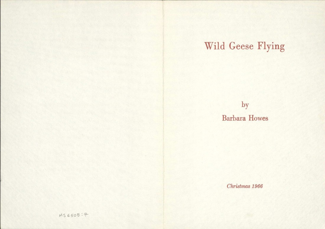
“Wild Geese Flying” (Call Number: MS P650) was sent as a Christmas card by poet Barbara Howes, and I initially thought that I would write primarily about the idea of sending a poem as a card. As I sat with the item, however, I became captivated by the poem itself. It’s more about the idea of geese than about an encounter with an individual member of goose-dom. It’s about the transience of migratory birds. It made me think about how so much of what we strive for here is permanence, or something like it, and how almost everything we keep here is vulnerable to time.
|
“Wild Geese Flying,” a poem that Barbara Howes sent as a Christmas card in 1966. Correspondence, Poems, and Reviews By and About Barbara Howes. Call Number: MS P650. Click image to enlarge.
Green says in The Anthropocene Reviewed that “there are no disinterested observers, only participants” (p. 5). I initially read this as a commentary on how the act of observing something – what we choose to give our attention to – is inherently an expression of our agency. But I think that it also speaks to the fact that it’s hard to be really, truly disinterested if you pay enough attention. Nothing is ever quite as straightforward as it seems, as this display has so aptly shown me.
The Uncommon Books exhibit will be open in Spencer’s North Gallery through December 1. The display is accompanied by a page on the Lawrence Reviews website. Feel free to stop by and write your own review!
How was knowledge, ranging from the scientific, pious, entrepreneurial, and artistic, to the preposterous, transmitted through the historic movement of print and manuscript material in and around Japan?
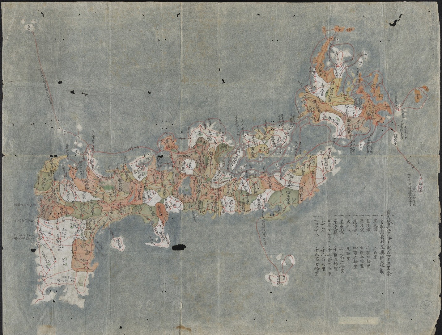
Nihon koezu 日本古絵図 (Manuscript map of Japan). Japan, ca. 1800. Call Number: MS R5:3. Click image to enlarge
Setting out to tackle this question in Spring 2025, students in the University of Kansas History of Art Department Japanese art history seminar “Manuscripts, Maps, and Illustrated Books” had the opportunity to curate this exhibition, working with materials from The Kenneth Spencer Research Library collection. Selected works range from 1646 to 1936, including detailed cartography, woodblock-printed imagery, and religious paraphernalia. Journeying from Japan to the West and back again, this exhibition spans three centuries and five intersecting themes.
Opened on July 31, 2025, the exhibition’s five cases follow the themes given below. In addition, a special event in the gallery on Wednesday, September 3, 2025 (3:30-4:45) will feature mini presentations on selected works by each seminar student. The exhibit will remain open through January 9, 2026.
1. Mapping and Conceptions of Space demonstrates that as Japan moved toward the 19th century, its awareness of the world beyond its islands gradually increased. Interactions with foreign visitors fostered an exchange of culture and knowledge that diffused into every area of society, including Japanese cartographic practices.
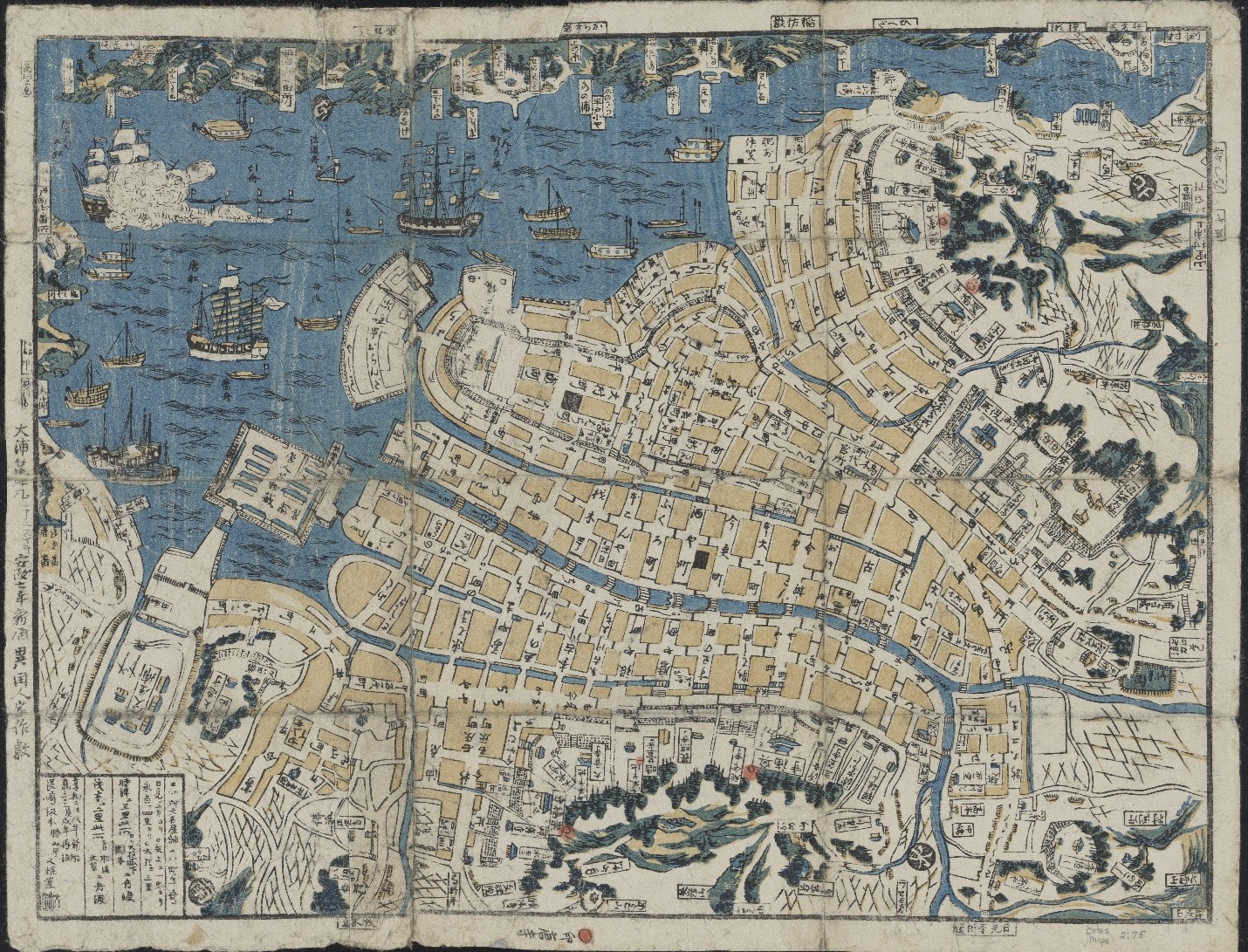
Nagasaki chizu 長崎地図 (Map of Nagasaki). Nagasaki: Bunkindō, 1860. Call Number: Orbis maps 2:75. Click image to enlarge.
Representations of space in both image and text indicate the geographical information deemed most important. From spiritual landmarks and cosmological beliefs to political boundaries and travel logistics, these historical maps and guides reveal how users’ conceptions of East Asia were shaped at the time.
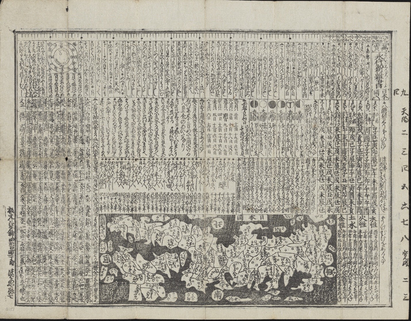
Manpō eitai shin zassho Nihonzu iri 萬寳永代新雜書日本圖入 (New Miscellany of Countless Eternal Treasures, with a Map of Japan). Edo (Tokyo): Ensendō Tsubameya Yashichi, ca. 1758–1760. Call Number: Q151. Click image to enlarge.
While overseas travel remained restricted throughout the 17th to 19th centuries, these materials demonstrate an expanding awareness of domestic and global geographies, depicted using both traditional Japanese mapmaking and novel observations from Western travelers.
2. Tourism and Movement of People explores how travel shaped the visual culture and national identity of Japan from the seventeenth century through the turn of the 20th century. The depictions of elaborate 17th-to 19th-century processions of feudal lords evoke an earlier era of ceremonial travel and spectacle, emphasizing traditional routes and social hierarchies.
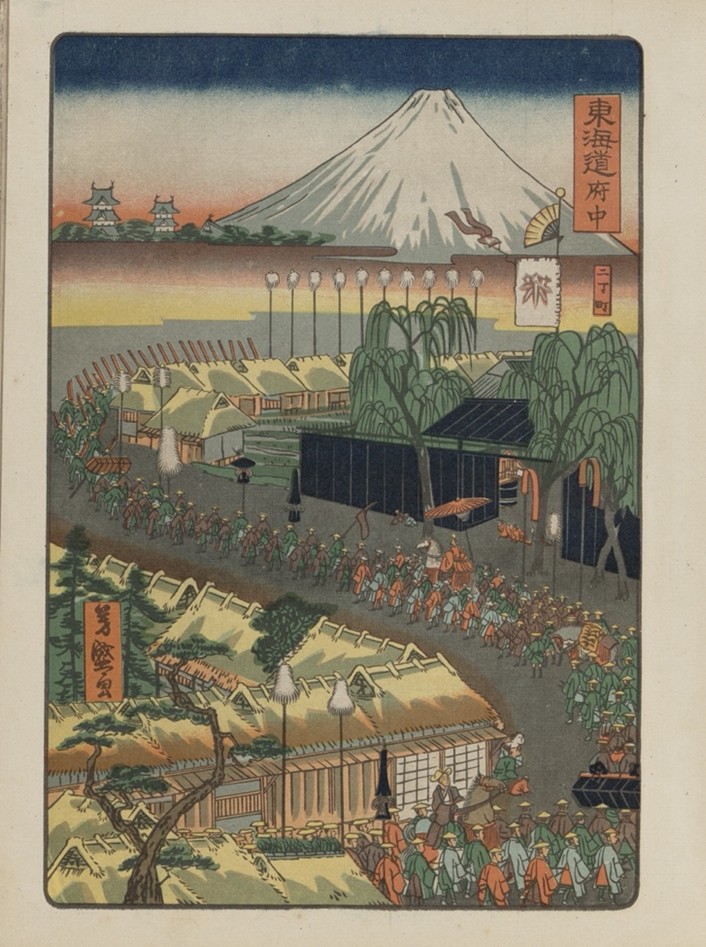
Hiroshige Toyokuni meiga hyakushu daimyō dōchū 広重豊国名画百種大名道中 (One Hundred Famous Views of a Daimyo’s Journey by Hiroshige and Toyokuni). Tokyo: Tōkōen, 1918. Call Number: E3579. Click image to enlarge.
By the early 20th century, Japan’s interest in travel shifted toward promoting tourism as a tool for modernization and imperial expansion into regions such as Manchuria (Northeast China), Hokkaido and Korea. Postcards, travel guidebooks, and government-issued pamphlets offered carefully curated images and structured itineraries for both foreign and domestic travelers.
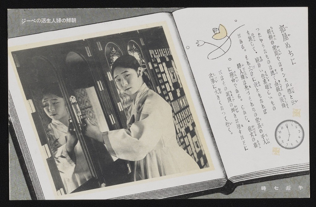
Chōsen no fujin seikatsu no pēji 朝鮮の婦人生活のページ (Pages of Korean Women’s Lives). Wakayama, Japan: Taishō Shashin Kōgeisho, 1925–1936. Personal Papers of Kate Hansen, PP 19, Box 14, postcard. Click image to enlarge.
Together, these materials illustrate changing conceptions of travel, from symbolic displays of authority to strategic assertions of national identity.
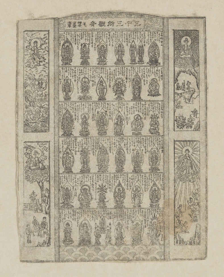
3.Pilgrimage and Movement of Religions reflects upon the spread of foreign faiths to Japan, as well as the pivotal role of bodily and spiritual journeys within religious beliefs and practices. Originating in India, Buddhism spread to Japan in the sixth century and since developed into a major religion with a profound influence on daily life. Buddhist practitioners frequently visit temples and undertake pilgrimages along designated routes, seeking face-to-face encounters with deities through their icons.
Attributed to Suiindō Takonoya 水引堂蛸室, a.k.a. Mizuhikidō Shōshitsu Sanjūsansho Kannon narabini Yanagidani Nigatsudō Asakusa 三十三所観音 并二 柳谷二月堂浅草 (Thirty-three Kannon Pilgrimage Sites with Yanagidani, Nigatsudō, and Asakusa). Japan, ca. 1860–1868. Call Number: P363. Click image to enlarge.
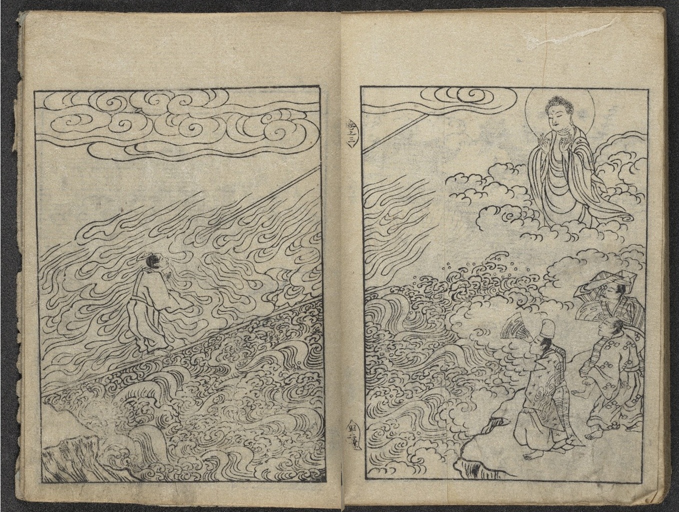
In many legends, sacred Buddhist icons demonstrate miraculous power and compassion by journeying across land and sea. Movement occurs not only across geographical spaces, but also between the earthly realm and Buddhist paradises.
“The White Path between Two Rivers,” in Senchaku hongan nenbutsu shū 選択本願念仏集 (Passages on the Nenbutsu Selected in the Original Vow), Vol. 2, Kyoto: Akai Chōbei, late 18th–early 19th century, based on the 1744 edition. Personal Papers of Kate Hansen, PP 19, Box 11, Folder 13. Click image to enlarge.
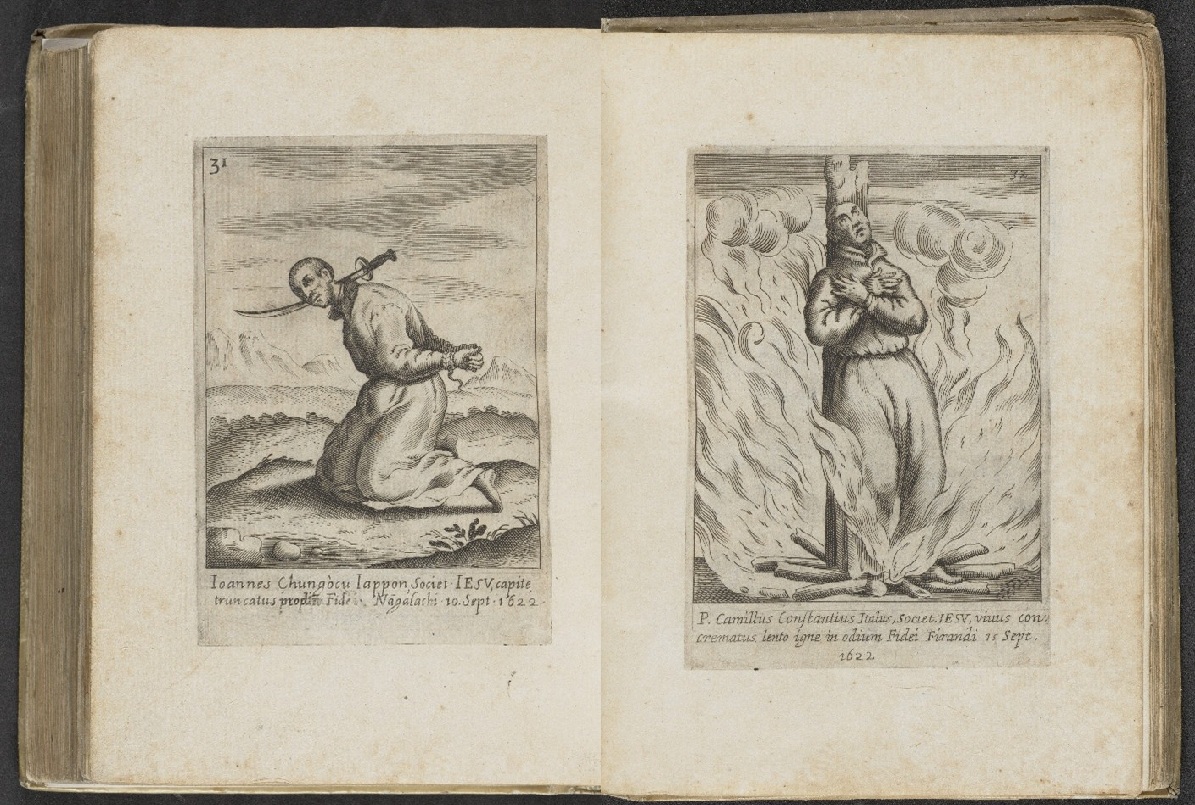
However, not all foreign religions were warmly received in Japan. A few decades after its introduction by Jesuit missionaries, Christianity faced severe persecutions in the late 16th and 17th centuries, reflecting state and local resistance to beliefs imported from distant shores.
Antonio Francisco Cardim (1596–1659). Fasciculus e Iapponicis floribus suo adhuc madentibus sanguine (A Wreath of Japanese Flowers, Still Dripping in their Own Blood). Rome: Typis Heredum Corbelletti, 1646. Call Number: Summerfield C1234. Click image to enlarge.
4.Trade and Movement of Goods offers a window into the commercial world of Japan and the global trade networks that developed from the movement of goods. Print culture in Japan served not only to document commodities but also to shape how goods were seen, valued, and consumed. From tea catalogs to textile pattern books and beer advertisements, the objects in this case reveal how trade goods were embedded in shifting notions of taste, identity, and national power.
Kogetsu 湖月 (active 19th century). “Foreign Wares,” in Chake suikozatsu 茶家醉古襍 (Repertory of Tea Masters’ Intoxication with Antiques), Vol. 3. Kyoto: Ōmiya Satarō, 1843. Call Number: tK53. Click image to enlarge.
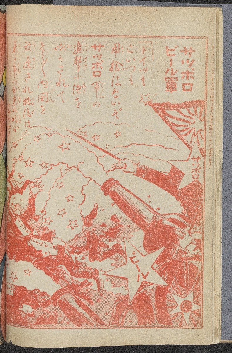
“Advertisement for Sapporo Beer,” in Nipponchi 日ポンチ (The Land of Japan), Vol. 14. Tokyo: Tōyōdō, 1905. Call Number: C22350. Click image to enlarge.
Although trade across East Asia dates back millennia, commercial exchange between Japan and the West began to grow from the 17th century and intensified at the turn of the 20th century. With objects and knowledge flowing between Japan, broader Asia, and the West, print media itself became a commodity, as demand for Japanese goods expanded. These publications offer a window into the commercial world of Japan, its transnational material culture, and the global trade networks that developed from the movement of goods.
5. Virtual Travel and Fantasies of Asia examines printed materials from the 17th to the 20th century that depicted Japan’s culture and shaped Western fantasies of Asia, constructing descriptions that blurred fact and fiction.
Arnoldus Montanus (ca. 1625–1683). “Buddhist deity Avalokiteshvara (J. Kannon),” in Gedenkwaerdige gesantschappen der Oost-Indische maatschappy in’t Vereenigde Nederland, aan de kaisaren van Japan (Atlas Japannensis [Japanese Atlas]). Amsterdam, Netherlands: J. Meurs, 1669. Call Number: Summerfield E238. Click image to enlarge.
Through these objects, virtual travel, the concept of journeying to another place through imagination, was made possible for Europeans and Americans alike.
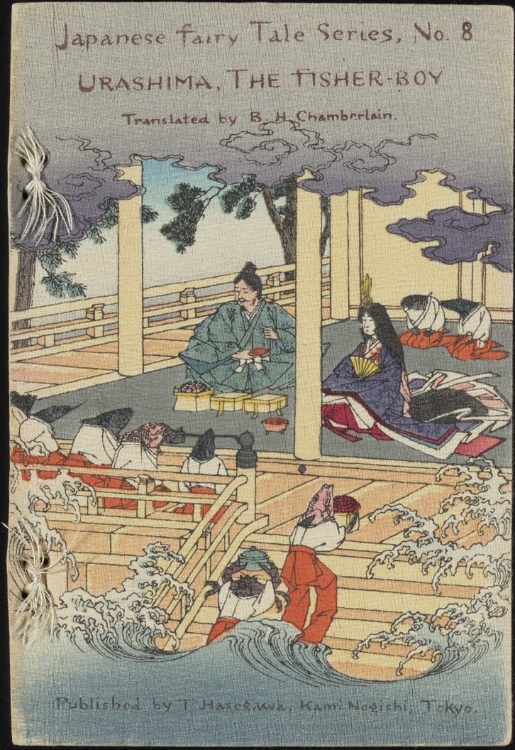
Hasegawa Takejirō (1835–1915); Sensai Eitaku (1843–1890). Urashima, The Fisher-Boy; Tokyo: Hasegawa Takejirō, 1886. Call Number: B17050. Click image to enlarge.
Japan also capitalized on print media, seeking to reconstruct its self-image as modern and legitimize its global relevance in the 20th century. These books, fashion plates, and inventive illustrations reveal the breadth of cultural dialogue between East and West, offering visions of Japan in which curiosity, exoticization, and national identity came together.
These treasures that traveled out of The Kenneth Spencer Research Library stacks into this exhibition represent but a fraction of the library’s holdings of Asian material, which are all available upon patron request. Notably, several of the items included were collected by Kate Hansen (1879–1968), a Kansan who lived in Japan as a missionary and music teacher during 1907–1941 and 1947–1951.
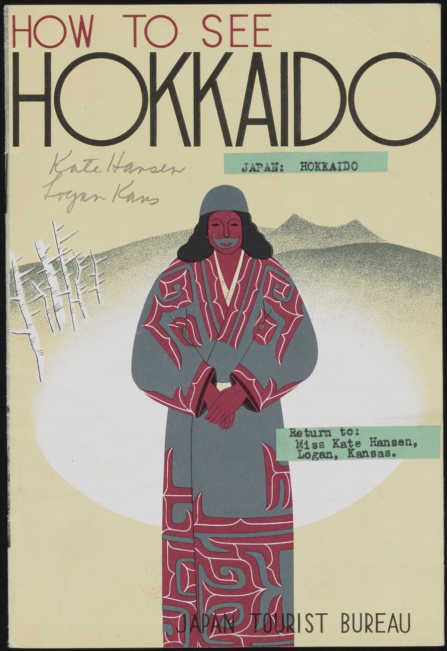
How to See Hokkaido. Tokyo: Japan Tourist Bureau, circa 1936. Tourist guide booklet owned by Kate Hansen and used by US Naval Intelligence during WWII. Personal Papers of Kate Hansen, PP 19, Box 5, Folder 10. Click image to enlarge.
After finalizing the exhibition details, a new acquisition was made to the library’s collection that fit the exhibition theme so well we decided to add it to a bonus case. Please come look for this wonderful mystery item. Hint: polar bears!
We hope that these displays will move viewers to appreciate how people of the past sought creative strategies that blended image with text to excite and inspire the transmission of knowledge in and around Japan.
Sherry Fowler (drawing from collaborative exhibition text) Professor of Japanese Art History, History of Art University of Kansas
*****
Faculty advisor: Sherry Fowler, Professor of Japanese Art History, History of Art, University of Kansas
Student curators: Yuan-Hsi Chao, Brady Cullen, Aria Diao, Shangyi Lyu, Olivia Song, Emma Smith, Rebekah Staton, Heeryun Suh, Eli Troen, and Morgan Williamson
Library advisor: Eve Wolynes, Special Collections Curator, University of Kansas Libraries
In the course of my work as a conservator at KU Libraries, one of my favorite bookbinding features to spot “in the wild” is paste paper. A book covered in paste paper might come to the lab for treatment, or I might catch sight of one while working in the stacks, and I always take a moment to look at them closely and enjoy the variety of colors, patterns, and styles that paste papers come in. It was no easy task to narrow down Spencer’s abundant selection of paste papers to just a few volumes that will be on view in a temporary exhibit in the North Gallery through August and September.
Paste paper is a style of decorative paper made by coating the surface of paper with a thick pigmented starch adhesive (usually wheat paste or methylcellulose) and then manipulating the wet paste mixture to create patterns. Combs, stamps, brushes, wadded paper or textiles, rollers, fingers and more could be used to create designs. Paste papers were an economical alternative to marbled papers, which required a high degree of skill and costly materials to produce. No special training or supplies were needed to make paste papers; bookbinders could create them right in their workshops with materials already at hand.
Paste papers were most often used for book covers and endpapers and were popular from the late 16th through the 18th century. Paste papers are often seen on books from Germany and Northern Europe, although there are many lovely examples of block-printed paste papers from Italy. There was renewed interest in paste papers during the Arts & Crafts movement of the late 19th and early 20th century. Today, paste papers are still created by book artists and hobbyists, and can be seen on some fine-press editions. The examples on view represent just a fraction of the many beautiful paste papers found in Spencer’s collections and available to view in the Reading Room.
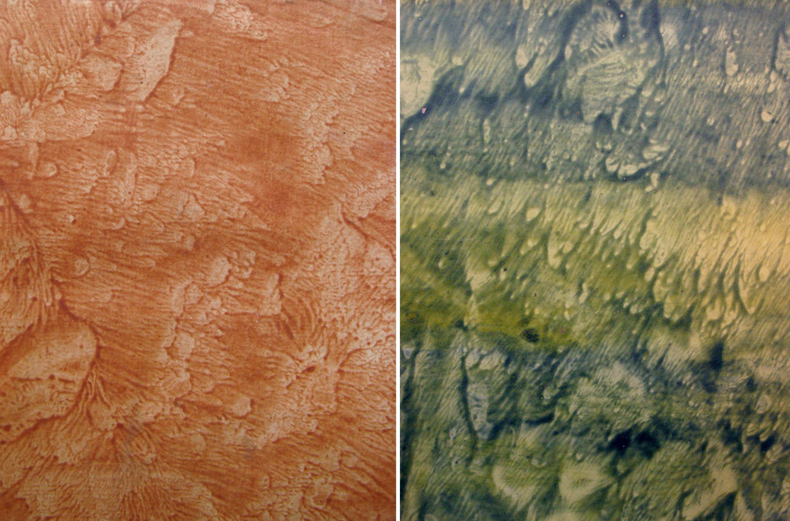
Pulled (or veined) paste papers were created by coating two sheets of paper with the colored paste, pressing the two pasted sides together, and then pulling the sheets apart, creating a unique wave-like pattern on each sheet.
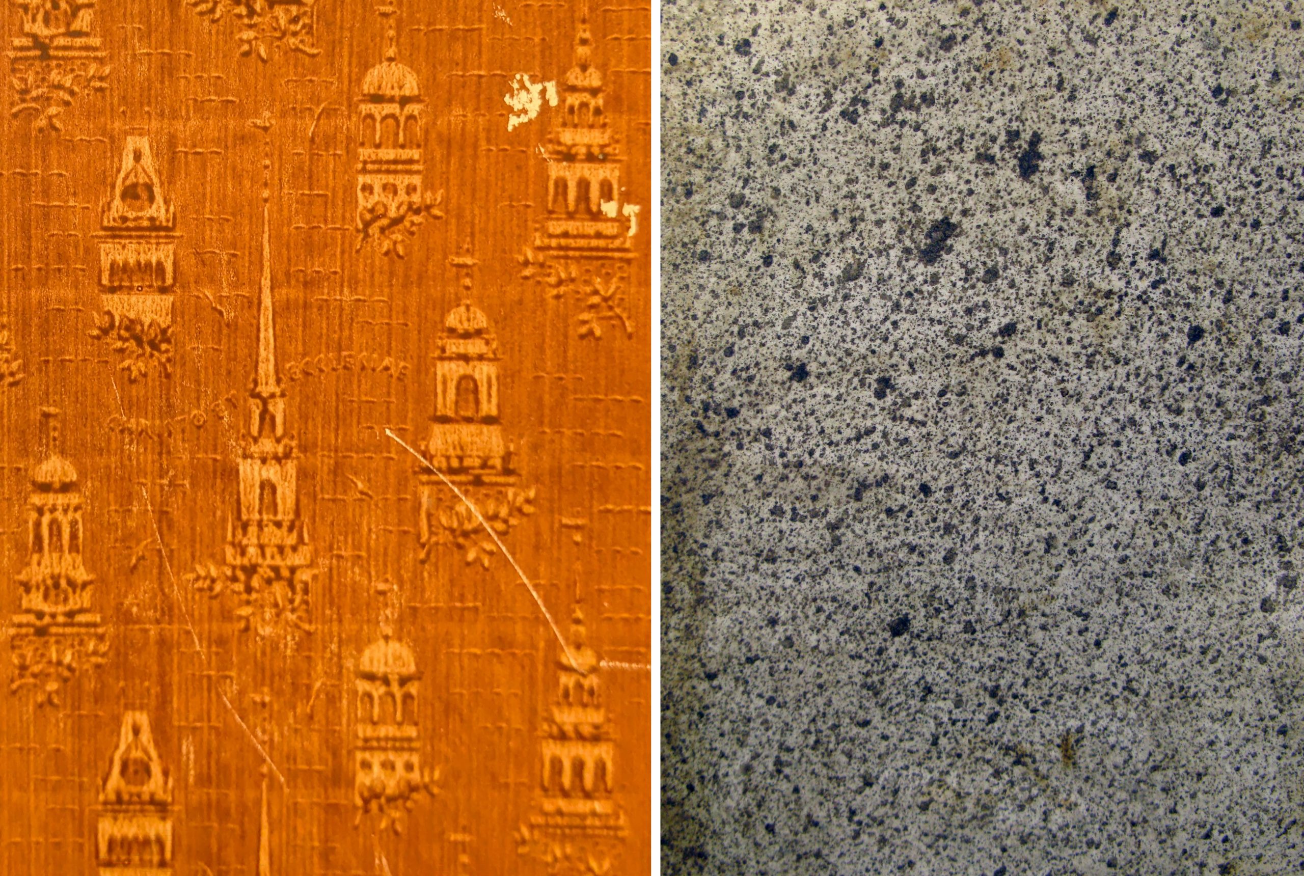
Left: Cover of De Mentha piperitide commentatio botanico medica, 1780. Call Number: C9291. Right: Cover of Rules and orders of the Linnean Society of London,1788. Call Number: Linnaeana C112. Click collage image to enlarge.
Drawn paste papers (also called scraped or combed) were made by “fingerpainting” in the wet paste or dragging various implements through the paste layer. The results can range from painterly and whimsical to clean and graphic. A faux wood graining tool was used to create the pattern on Summerfield E156 (second from left).
Left: Cover of Lectionary, incomplete. [Italy, between 1101-1200]. Call Number: MS E22. Second from left: Cover of De origine et amplitudine ciuitatis Veronae, 1540. Call Number: Summerfield E156. Center: Cover of [Notes on agriculture.] Fletcher of Saltoun collection Scotland, 17–. Call Number: MS 109:4. Second from right: Cover of De ponderibus et mensuris veterum Romanorum…, 1737. Call Number: B3981. Right: Cover of Bookplates and labels by Leo Wyatt, 1988. Call Number: D3245. Click collage image to enlarge.
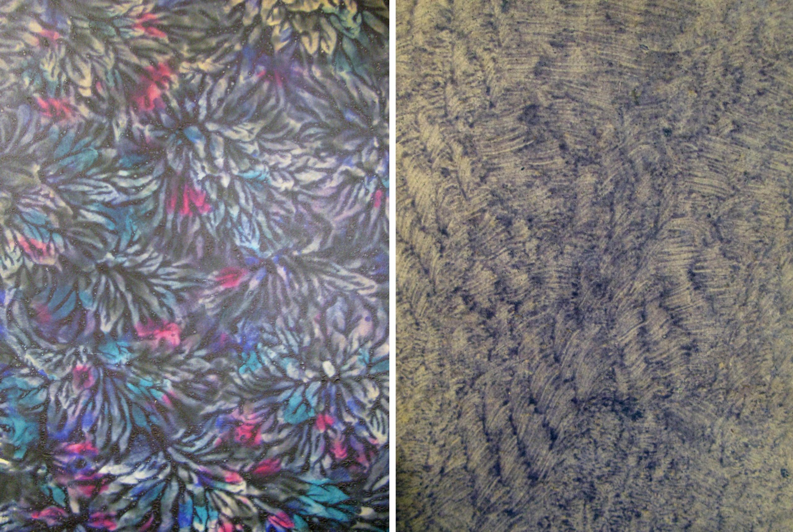
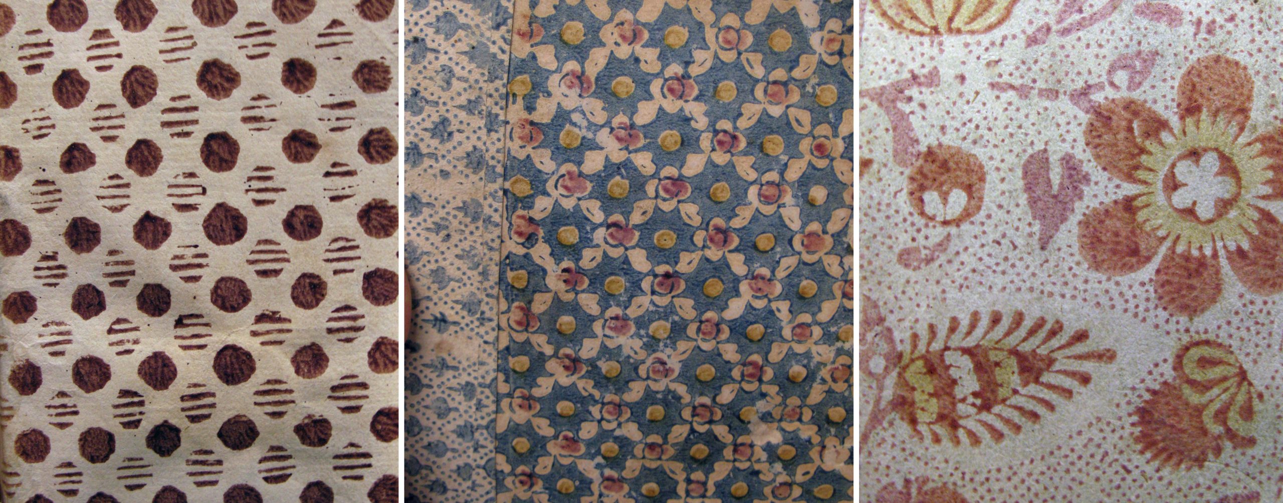
These are two very different examples of daubed paste papers: a boldly colored design executed in a thick layer of paste, and a subtle pattern possibly created with stiff brush bristles.
Left: Back cover of Deutschlands Beruf in der Gegenwart und Zukunft, 1841. Call Number: Howey D126. Right: Cover of Det enda nödvändiga för et rikes financer, 1792. Howey B1083. Click collage image to enlarge.
This charming stamped (or printed) design appears, appropriately, on the cover of a book about decorative papers used in bookbinding. An assortment of stamps in architectural shapes were pressed into the paste to create the pattern. Spattered (or sprinkled) papers were made by loading a brush with the colored paste mixture and striking the brush while holding it above the paper, creating a shower of drops.
Left: Cover of Decorated book papers, 1942. Call number: C6396. Right: Cover of Considerazioni sulle compagnie, 1769. Call Number: Howey B1116. Click collage image to enlarge.
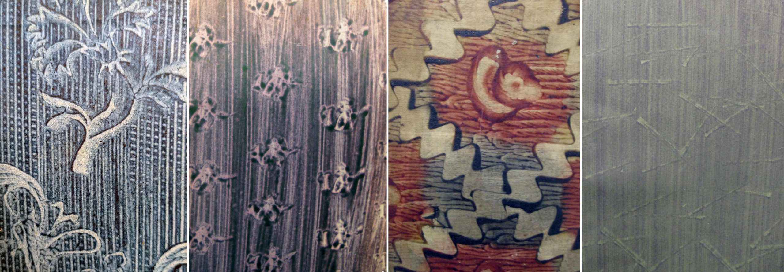
Block printed paste papers used a matrix, probably carved as for a woodblock print, that was “inked” with the colored paste and stamped onto the paper. These designs can be simple or ornate and often use multiple colors. On Summerfield C1300 (at left) the binder used block printed papers in two different patterns.
Left: Cover of Anticamera di D. Pasquale, 1690. Call Number: Summerfield A866. Center: Cover of De iurisprudentia extemporali, 1628-1629. Call Number: Summerfield C1300. Right: Cover of Göttinger Taschen Calender für das Jahr 1790. Call Number: A274 1790. Click collage image to enlarge.
In these examples the makers have used a combination of techniques on a single sheet: stamped over drawn, drawn over pulled, and so on. D2763 (at right) is also an example of a paste paper created using a colored sheet of paper, instead of white or light paper, as the starting point.
Left: Endpaper of Göttinger Taschen Calender für das Jahr 1782. Call Number: A274 1782. Second from left: Cover of Hortus Celsianus i Uppsala, 1927. Call Number: Linnaeana C456. Second from right: Cover of Poems, 1768. Call Number: O’Hegarty C1129. Right: Cover of Poem to the memory of Lady Miller, 1782. Call Number: D2763. Click collage image to enlarge.
In Conservation Services we sometimes make paste papers to use in our own bookbinding models or in book making activities for colleagues or the public. Making paste papers is a fun and messy activity that invites exploration of colors, patterns, and mark-making tools. There are many online tutorials for making paste papers at home; bookbinder Erin Fletcher has a great video and written instructions on her blog. Tutorial // Paste Papers – Flash of the Hand
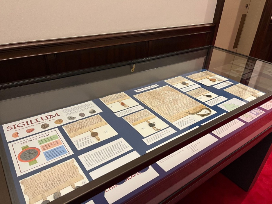
Kenneth Spencer Research Library’s current short-term exhibit explores some choice items from the library’s collection of medieval seals. This is a collaborative project put together by myself – Kaya Taylor – and my collaborator Eli Kumin, both of us long-time student workers here at the library.
A view of the exhibit. Click image to enlarge.
Eli and I have cultivated a particular interest in medieval wax seals, spurred on by our work on a Sanders Scholar research project under the supervision of Dr. John McEwan. Beginning in September 2024, we spent the project exploring the Abbey Dore collection (Call Number: MS Q80) at Spencer, given the remarkably well-preserved seals and documents dating back from the 12th and 13th centuries. As the project came to a close in May 2025, Eli and I realized that we could memorialize our work and interests in the form of an exhibit case. Titled Sigillum, it is our way of giving others a look into these fascinating and unique pieces of history, here to be enjoyed roughly 4,000 miles away from where they originated.
The overarching narrative of the Abbey Dore collection is one of property and the interplay between royal and religious power in the medieval period. The language used in the documents points to the exchange of land for the salvation of the donors and their loved ones, e.g. “for her soul and the soul of Madoc [her husband]” (Call Number: MS Q80:13).
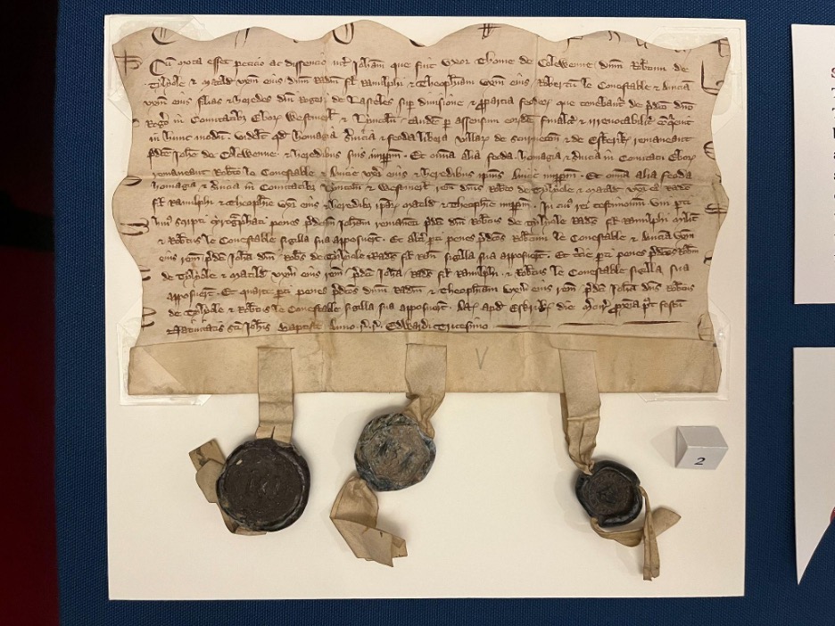
Visitors may notice there is one document unlike the others in the exhibit case, labeled “land conveyance of Sir Roger Lasceles to his four daughters” (Call Number: MS C150). Although separate from the Abbey Dore collection, this document is included because it’s a particular favorite of ours and it boasts several unique qualities: a chirograph edge and three intact seals with very clear impressions. We chose to include it at the starting point of the exhibit because of its eye-catching quality, pulling visitors into the discussion of further seals and documents within the case.
A legal agreement, dated 1301-1302, whereby the lands of Sir Roger Lasceles are divided amongst his four daughters. Call Number: MS C150. Click image to enlarge.
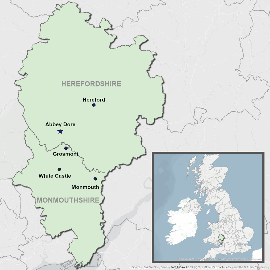
Although Eli and I came to know the Abbey Dore collection very well over time, we still felt a bit confused as to the relative geography of the Welsh Marches and the locations mentioned in the collection. We felt that visitors could benefit from seeing a map of the region, and so we resolved to make one that centered the relevant places and landmarks stretching across the Welsh-English border. Ultimately, we used ArcGIS software to put together the map seen in the exhibit.
Our ArcGIS map of the Welsh-English border. Click image to enlarge.
We hope that Sigillum gives visitors a chance to appreciate not just the wax seals themselves, but the real human stories that stand behind them. We are excited to offer this glimpse into the medieval past, and grateful for the opportunity to bring these objects to light at Kenneth Spencer Research Library.
Sigillum: Seals and the Making of Medieval Authority is free and open to the public in Spencer’s North Gallery through July 31st.
Kaya Taylor and Eli Kumin Public Services student assistants KU Libraries Sanders Scholars 2024-2025


![Image of a plantlike figure representing the Buddhist deity Avalokiteshvara in Gedenkwaerdige gesantschappen der Oost-Indische maatschappy in’t Vereenigde Nederland, aan de kaisaren van Japan (Atlas Japannensis [Japanese Atlas]).](https://blogs.lib.ku.edu/spencer/wp-content/uploads/2025/08/Picture11.jpg)