The Story of “Self-Portrait”: Spencer’s Unpublished Henry Miller Manuscript
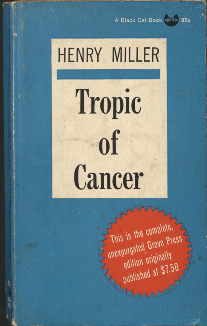
February 25th, 2026American author Henry V. Miller (1891-1980) is a divisive literary figure, one who has amassed a dedicated cult following, and yet, whose presence in scholarly discourse has traditionally been somewhat limited. Miller is most widely known for his years in Paris, which resulted in the notorious Tropic of Cancer (1934), famously banned for obscenity in the United States for nearly three decades. Despite his popular characterization as a writer who magnified the obscene and grotesque, it’s not uncommon to find Miller falling into extended, heartfelt reveries covering a profound range of subjects, a contrast that contributes to his reputation as an eclectic writer.
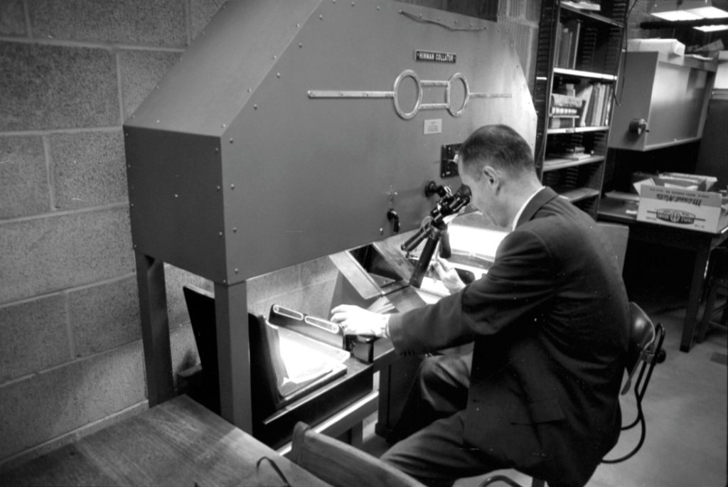
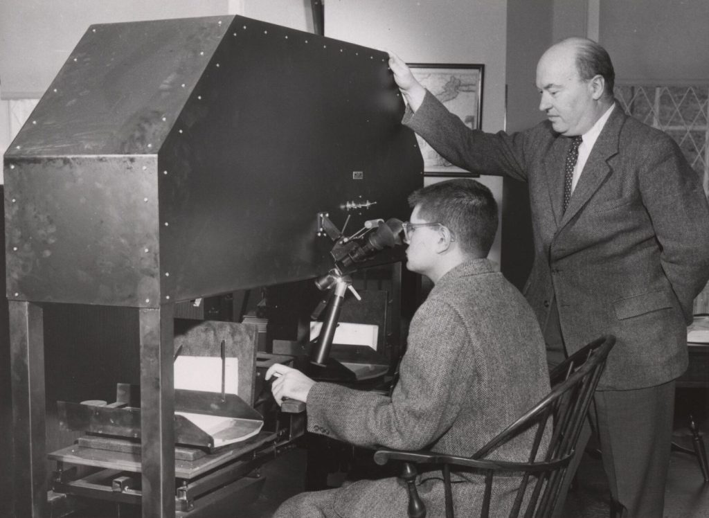
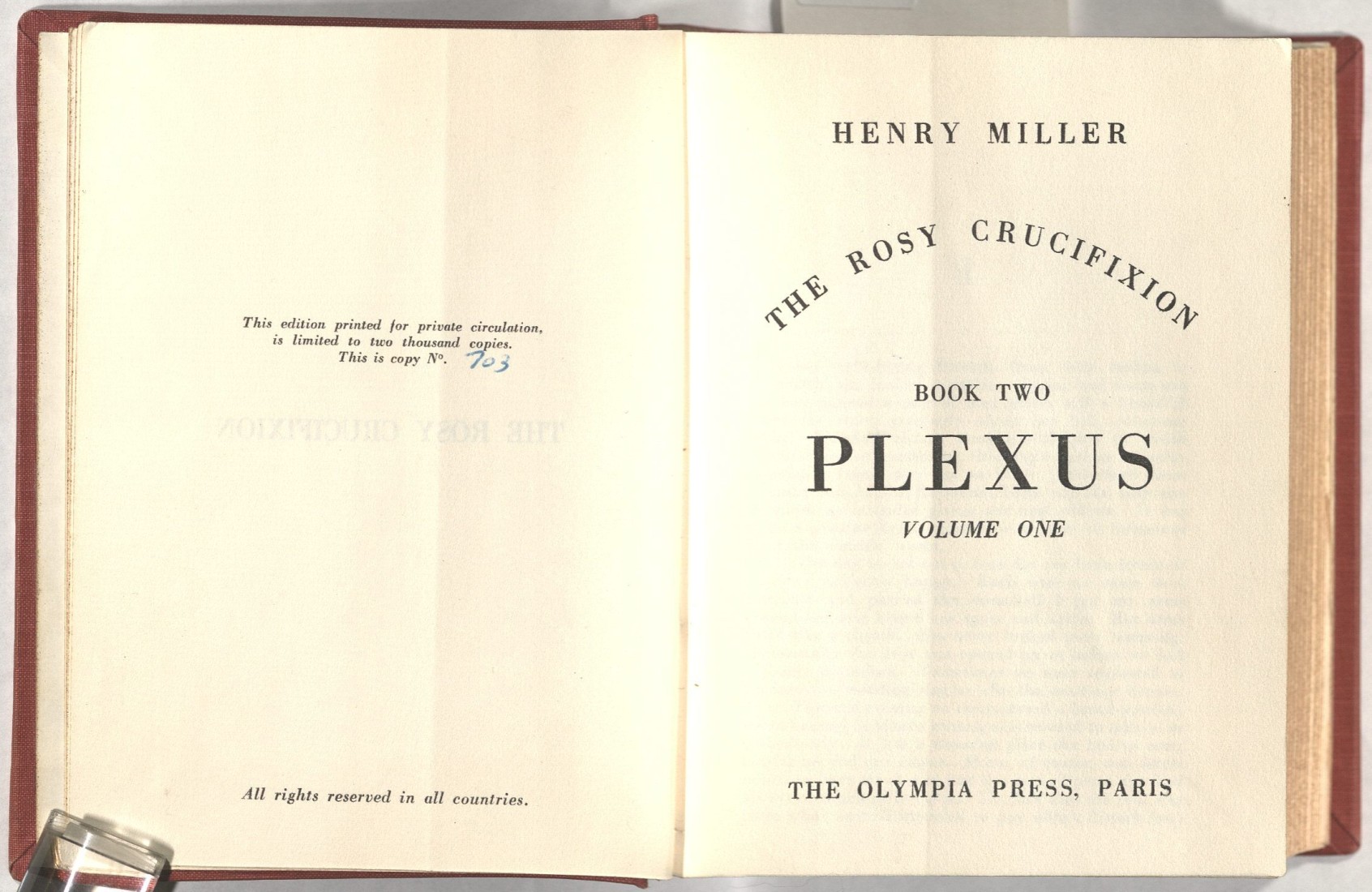
Spencer Library holds a wide range of Henry Miller’s published works, such as an edition of Plexus (1963) limited to two thousand copies. However, the item that might be of most interest to the Miller enthusiast is a small collection of his papers (Call Number: MS P216). This collection primarily consists of typewritten onionskin manuscripts dating from the 1930s, as well as handwritten letters composed during the 1950s. I found the typewritten pieces particularly intriguing; according to the online finding aid, they mostly originate from Miller’s overflowing attempts to write an essay on English novelist D. H. Lawrence.
In her biography of Miller, Mary Dearborn details how the D. H. Lawrence project, or “the Brochure” as it was initially called, developed as Miller was attempting to publish Tropic of Cancer in 1932. The only publisher whose attention he managed to get was Jack Kahane of Obelisk Press, who had misgivings about publishing the controversial contents of Tropic. Thus, Miller was asked to compose an essay on Lawrence in order to assert himself as an intellectual and gain more credibility. [1] The project was eventually published as The World of Lawrence: A Passionate Appreciation, much later in 1980.
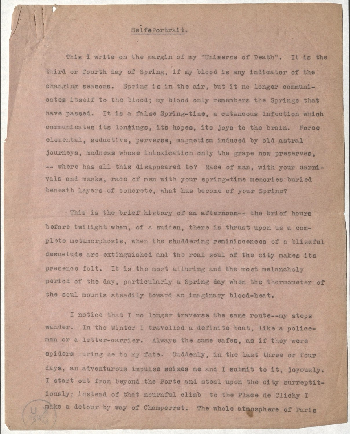
I discovered that very little of the Miller manuscripts at Spencer Library actually appear in any published form. The most perplexing was “Self-Portrait,” a four-part piece that is largely devoid of any connection to the D. H. Lawrence essay, especially in its earlier sections. Within it, Miller mentions the “Universe of Death,” a chapter within The World of Lawrence and The Cosmological Eye (1939). Yet, it bears little resemblance to the section as it appears in the book. Similarly, there is a short description of the 1933 film “Extase,” which was likewise detailed in a chapter of the same name in The Cosmological Eye, yet its appearance within “Self-Portrait” is a different piece altogether. The more I read “Self-Portrait,” the more it appeared as a familiar part of Miller rather than a focused reflection on Lawrence (hence the title). The manuscript, framed around a walk through Paris during springtime, bears many hallmarks of Henry Miller’s original style, such as ornate, unconventional prose, descriptions of sordid and lurid elements lurking underneath the quotidian, a personification of Paris, dubious biographical details and nostalgic reminiscences on his earlier days in Brooklyn, musing on favorite authors (Proust and Dostoevsky), and a meandering, abstract form.
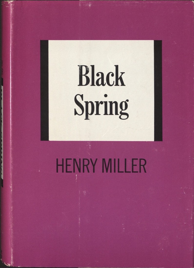
The fact that “Self-Portrait” presents itself as creative piece, rather than an analytical one, hints towards its eventual fate. Biographer Jay Martin details that, while Miller “originally regarded ‘Self-Portrait’ as a note to the ‘Universe of Death’ or a coda to ‘The World of Lawrence,’ he always planned it as a personal statement … [taking shape] by looking at himself, or portraying his experience, in a variety of ways.” [2] And Dearborn states that “Miller’s new book, tentatively called ‘Self-Portrait,’ … would eventually appear as Black Spring.” [1] This appears to be the definitive answer: “Self-Portrait,” written as a marginal addition to Miller’s project on D. H. Lawrence, became the premise for a new book entirely, and eventually grew into his collection Black Spring (1936). The process of researching Miller’s “Self-Portrait” emphasized one of the most rewarding aspects of my job here at Spencer Library: being able to uncover little-known parts of literary and cultural history.
Nile Russo
Public Services Student Assistant
[1] Dearborn, Mary V. The Happiest Man Alive: A Biography of Henry Miller. New York: Simon & Schuster, [1992]: 156-163.
[2] Martin, Jay. Always Merry and Bright: The Life of Henry Miller: An Unauthorized Biography. Santa Barbara, Calif, London: Capra Press ; Sheldon Press, [1979]: 293f.
Special thanks to Special Collections Curator Elspeth Healey for directing me towards the Dearborn and Martin biographies of Henry Miller.