Welcome to the Kenneth Spencer Research Library blog! As the special collections and archives library at the University of Kansas, Spencer is home to remarkable and diverse collections of rare and unique items. Explore the blog to learn about the work we do and the materials we collect.
This blog may contain archived web content. This blog may link to catalog records which no longer exist as of a software change in 2026.
October is American Archives Month, a nationwide effort spearheaded by the Society of American Archivists to raise public awareness about the importance of historic documents and records and the importance of archivists. Spencer Research Library has a robust schedule of special events happening this October to celebrate Archives Month. All events are free and open to the public. We hope to see you at one, or even more!
This coming Tuesday, October 6th, will see the return of Day on the Hill, KU’s storied music festival that was sponsored by Student Union Activities (SUA) from 1989 to 2007. With the newly digitized University Daily Kansas (UDK) and some artifacts and photos from University Archives, we can piece together a history of “one of the best college music festivals in the nation,” as the manager of the band Soul Coughing described Day on the Hill in 1998.
Starting in 1978, many outdoor day-long music events in spring and summer were held at KU near Allen Fieldhouse or on Campanile Hill under various names such as Day on the Green, Day on the Green Hill, Wheatstock (in homage to Woodstock), Summer on the Hill, and Jayhawk Jamboree. These events featured local or regional bands, which kept costs low and made the event free for both students and locals. By the 1980s, the Jayhawk Jamboree’s title had officially changed to its nickname to Jayhawk Jam, but it was cancelled in 1987 and 1988 because SUA did not have enough money to host it.
A poster for Wheatstock, a precursor to KU’s Day on the Hill, 1979. University Archives Records, Student Activities: Student Union Activities. Call Number: RG 71/23. Click image to enlarge.
In 1989, SUA decided to use the budget it had left over at the end of the year and teamed up with the Student Senate, the Association of University Residence Halls, and radio station KJHK to host a new all-day concert event called Day on the Hill. It was part of the Student Senate’s Celebrate Diversity program and it included cultural performances, local bands, Love Tractor from Athens, Georgia, and Too Much Joy from New York. Forty-seven local bands had sent in cassette tapes of their music to be considered by a committee from SUA and KJHK. Students were hired to work the event for $20, and 1,500 people attended.
The next year, 3,000 people attended to watch more local bands, Buffalo Tom, and Toad the Wet Sprocket with reportedly beautiful weather and buckets of fried chicken. In 1991, complaints about the lack of diversity and the selection process for local bands resulted in a bigger committee and the inclusion of hip-hop groups in the lineup for the first time.
Left: A University Daily Kansan ad for the first Day on the Hill, April 1989. Right: A UDK photo from the 1991 Day on the Hill concert. University Archives. Call Number: UA Ser 69/2/1. Click images to enlarge.
The year 1992 changed everything for Day on the Hill. In February, SUA offered the little-known band Pearl Jam $3,000 to be the headliner for the event that year on May 2nd. Their album Ten had been released the summer before, but it wasn’t until their second single “Even Flow” was released in March 1992 that the band’s popularity and album sales began to rise quickly.
The promotional poster for the 1992 Day on the Hill concert. University Archives Records, Student Activities: Student Union Activities. Call Number: RG 71/23. Click image to enlarge.
When word got out that Pearl Jam was playing a free outdoor concert at KU, high school and college students from around the region drove to Lawrence to join KU students and locals at the show. Crowd estimates range from 18,000 to 30,000; the latter number would have been Pearl Jam’s biggest show to date. A mosh pit formed in the crowd, and during an extended version of the song “Porch” singer Eddie Vedder climbed up the scaffolding of the stage, swung across the rafters, hung upside down while grabbing the mike, and finished singing the song while sitting on top of the roof, a stunt Vedder would repeat many times at outdoor shows.
Pearl Jam’s Eddie Vedder swinging across the rafters at the 1992 Day on the Hill concert. Dyche Hall is visible in the background on the left. Photo by Danny Beck, courtesy of the Pearl Jam Concert Chronology website. Click image to enlarge.
Pearl Jam’s appearance at KU became a legendary story for those lucky enough to have attended. It also, in many ways, set students’ expectations very high when it came to future Day on the Hill shows. As voiced in the UDK later in the 1990s, many students asked why SUA could not bring in bigger bands or questioned SUA’s choices when they were usually working with a budget of $20,000 to $30,000. Members of SUA had to repeatedly explain that the Pearl Jam show had been a great stroke of luck. The 1992 concert remained Day on the Hill’s highest attendance for its entire run.
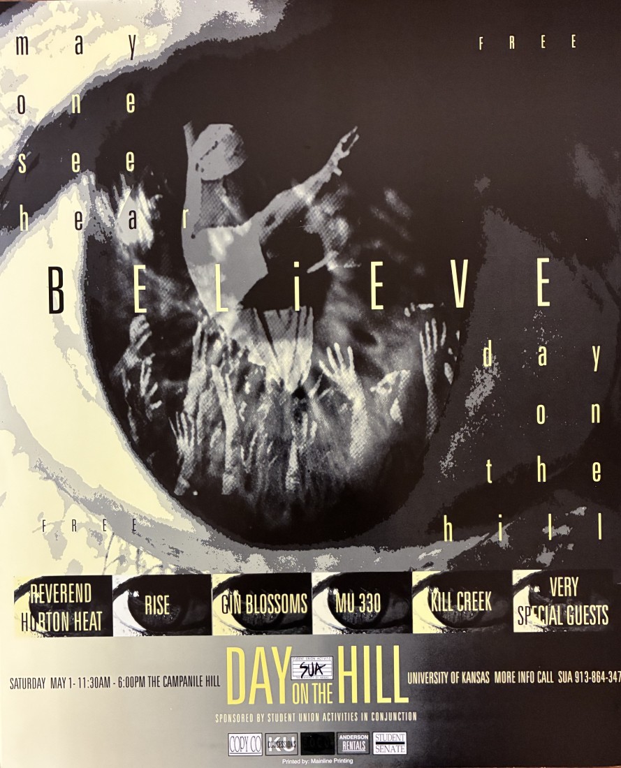
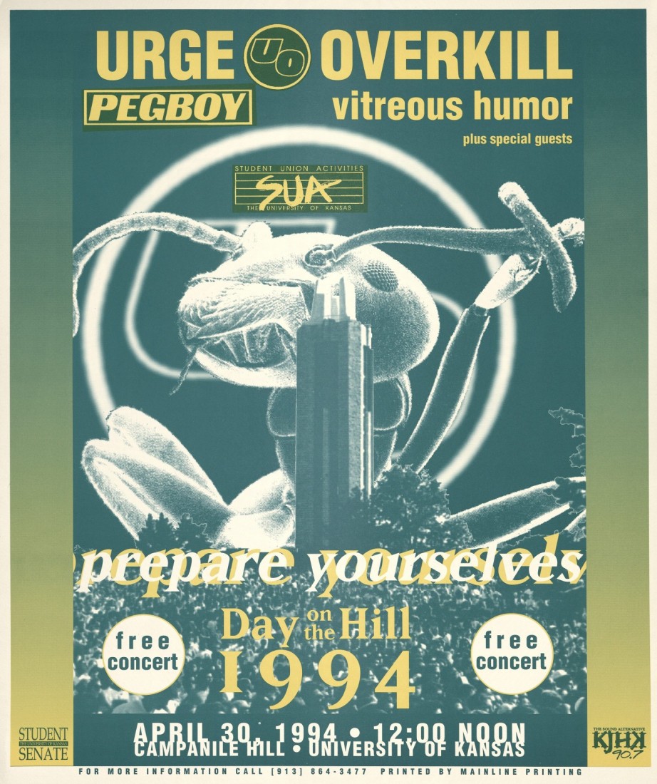
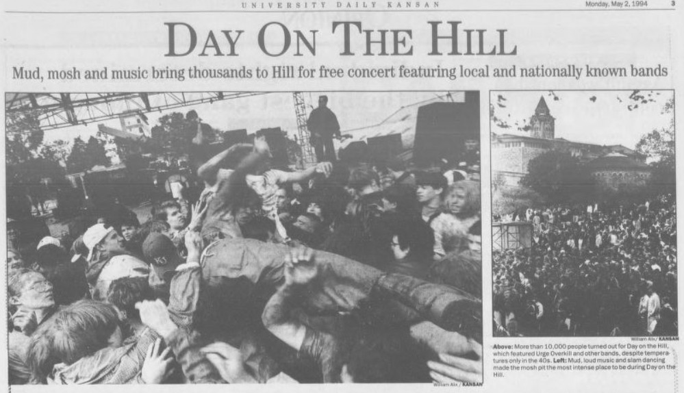
In 1993, SUA decided to host a battle of the bands to choose local performers for Day on the Hill, adding another hurdle after cassette tape submissions. The concert was called the Farmers’ Ball, and it continued throughout the 1990s. Heavy rain led to a very muddy show with headliners the Gin Blossoms and Reverend Horton Heat in 1993, and the mud came again in 1994 with Urge Overkill.
Posters from the 1993 (left) and 1994 (right) Day on the Hill shows. University Archives Records, Student Activities: Student Union Activities. Call Number: RG 71/23. Click images to enlarge.
University Daily Kansan coverage of the 1994 Day on the Hill concert. University Archives. Call Number: UA Ser 69/2/1. Click image to enlarge.
Leading up the 1995 show, someone started a hoax that the band Phish was going to be the headliner and posted fake flyers around campus, leading to disappointment when Matthew Sweet was announced as the real headliner. Also that year, a few students decided to load a couch into a truck and bring it to the hill to sit on during the event. For many years later, students brought couches and other furniture, hauling them up the hill to enjoy a comfortable view.
Students enjoying Day on the Hill from a comfy couch, 1990s. University Archives Photographs, Student Activities: Student Union Activities. Call Number: RG 71/23 1990s Prints. Click image to enlarge.
The late ’90s brought new changes including games and carnival-like activities, and the show ended at 6pm rather than at 9pm or later. Despite its budget struggles, SUA was able to book Urge Overkill, They Might Be Giants, Soul Coughing, the Urge, and HUM.
–
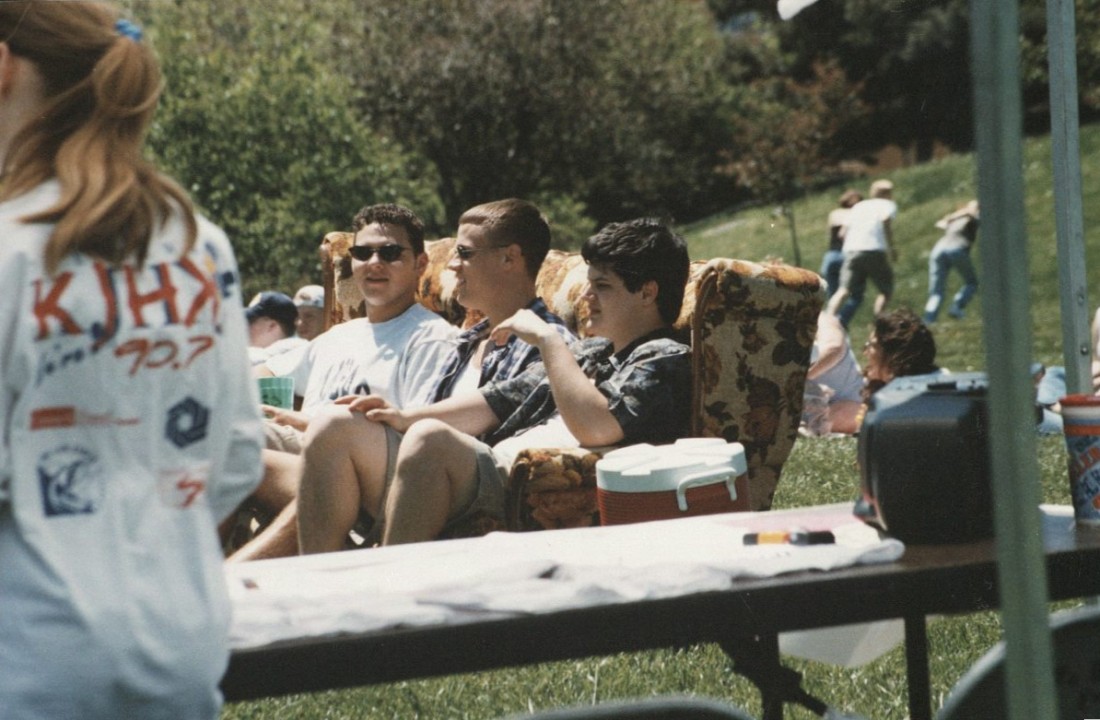
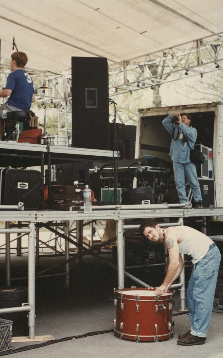
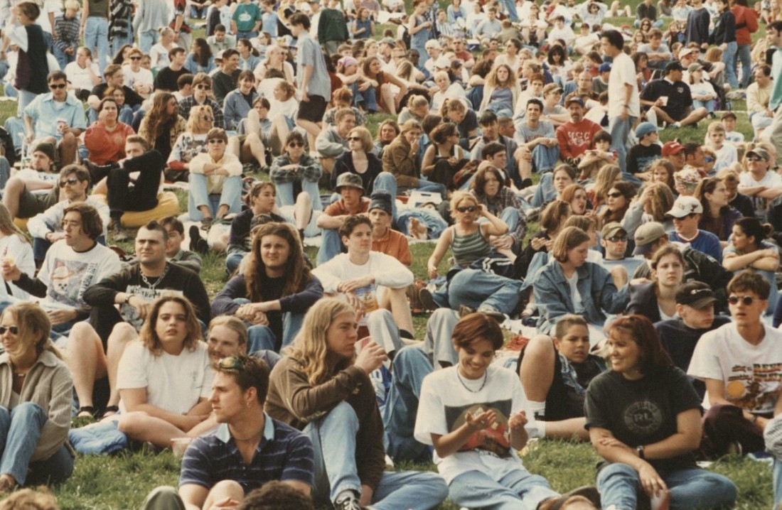
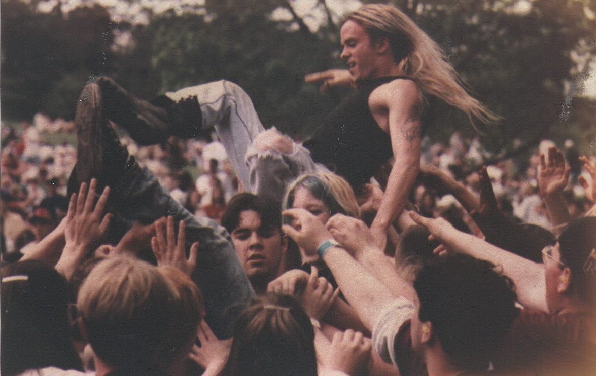
Scenes from Day on the Hill concerts, 1990s. University Archives Photographs, Student Activities: Student Union Activities. Click on images to enlarge.
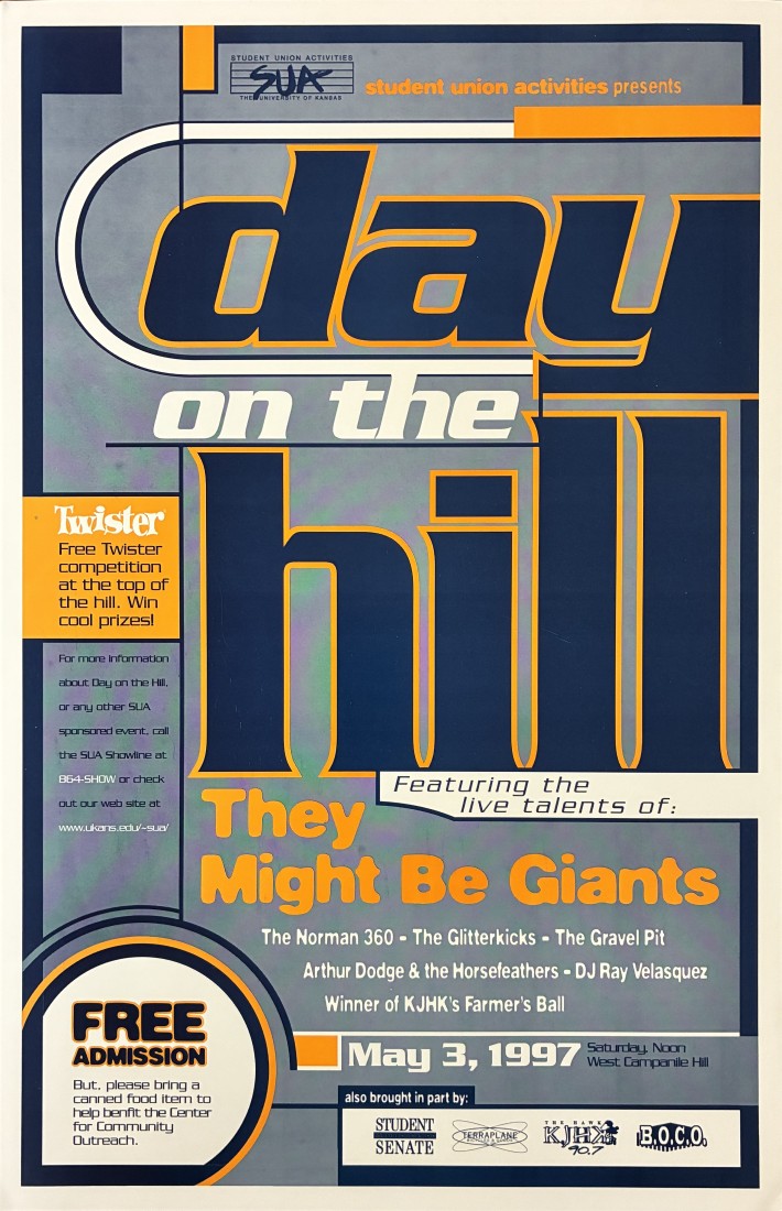
The promotional poster for the 1997 Day on the Hill concert. University Archives Records, Student Activities: Student Union Activities. Call Number: RG 71/23. Click image to enlarge.
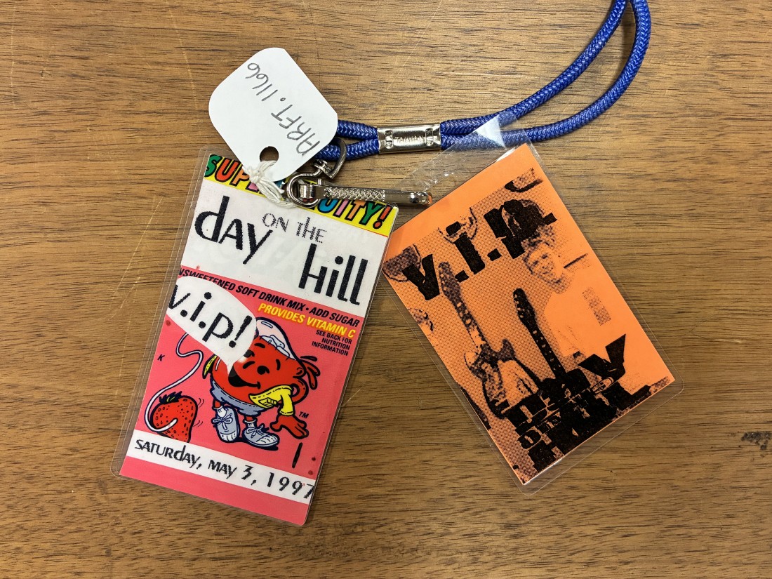
Day on the Hill badges, 1997. University Archives Records, Student Activities: Student Union Activities. Call Number: RG 71/23. Click image to enlarge.
In 2002, SUA decided to return to Day on the Hill’s roots as an event for local bands only. The show was also rescheduled a week later because of rain and moved to a parking lot near the football stadium. The low turnout that year prompted SUA to cancel Day on the Hill for the next three years.
With a new student activity fee in 2006, Day on the Hill returned with headliners Sharon Jones & the Dap-Kings and Spoon. In 2007, it was moved to the Leid Center’s lawn with G. Love & Special Sauce and the Faint. In the UDK, there are no reports about that last show or why SUA stopped it entirely.
Enjoy these lineups (compiled from the UDK) and links to some videos on YouTube. Many thanks to those who digitized their recordings and preserved these glimpses of what was possible on KU’s campus when determined, resourceful students were able to pull off ground-breaking, free shows that celebrated the very important role that music plays in young people’s lives.
1989: Pathetic Excuse, The Mahoots, The Works, The Moving Van Goghs, Love Tractor, Too Much Joy
1990: The Witch Doctors,2-Mile Death Plunge, Chris Beneke, Joe Worker, The Fluid, Sin City Disciples, Buffalo Tom, DJ Sir Light, Toad the Wet Sprocket
1991: Now See Hear, Two Guitars and a Short Guy, Zoom, Mutt Finicky, Az-One, DOPE (Disciples of Peace and Equality), Paris
Classic children’s books continue to connect generations through stories that inspire imagination, adventure, and wonder. In this fifth post in a series highlighting titles from Spencer Research Library’s vast children’s book collection, I’ll explore the classic series: Little Golden Books.
Little Golden Books in Spencer Research Library’s children’s book collection. Variations in spine color, condition, rebinding, and protective coverings reveal how these books were used and preserved over time. Click image to enlarge.
Children’s books offer more than stories. As physical objects, they preserve evidence of how young readers learned, collected, shared, and experienced books across generations. Few books reveal the history of childhood as vividly as Little Golden Books. Long before they entered library collections, they served as affordable companions in childhood, passing through the hands of generations of young readers.
Among the countless treasures preserved at Spencer Research Library, Little Golden Books stand out because they were never intended to be rare or exclusive. They were affordable, mass-produced books created for everyday childhood reading. Unlike finely bound volumes designed for collectors, these books were meant to be handled by small hands, carried from room to room, and read over and over again.
The Poky Little Puppy (1942) became one of the most enduring and recognizable titles in the Little Golden Books series. Call Number: Children B2889. Click image to enlarge.
Particularly notable among Spencer’s holdings are four of the twelve original Little Golden Books released in 1942: The Little Red Hen, Nursery Songs, The Poky Little Puppy, and The First Little Golden Book of Fairy Tales.
Little Golden Books are one of the oldest and likely the longest running continuously published children’s book series, still releasing new titles today. For more than eight decades, generations of children have recognized the distinctive gold spine on books ranging from classic stories to contemporary favorites. The series grew from a small collection of affordable children’s books into a publishing phenomenon that shaped generations of young readers.
When Little Golden Books first appeared in the early 1940s, they represented a significant shift in children’s publishing. Their creators sought to produce books that families could afford and children could enjoy independently. The result was a compact, durable format accompanied by engaging illustrations and a price point that made ownership possible for many families. They sold for just twenty-five cents, a fraction of the cost of most children’s books of the era. Their creators aimed to make books accessible to a much wider audience than traditional children’s publishing had previously reached. For most children, a Little Golden Book was one of the first books they could truly call their own. Their low cost placed ownership within reach of families who might not otherwise been able to purchase children’s books, allowing children to build personal collections one volume at a time.
An original price tag (Filene’s 25 cents) in The First Little Golden Book of Fairy Tales, 1946. Low prices helped make book ownership accessible to millions of American children. Affordability was central to the series’ mission and success. Call Number: Children 3681. Click image to enlarge.
The books themselves were designed with young readers in mind. Large type, uncluttered layouts, and abundant illustrations made them appealing to children who were just beginning to develop literacy skills. Even before a child could read independently, illustrations offered a way to engage with stories and follow their narratives. Illustrations played a significant role in the success of Little Golden Books. For many children, the pictures were as memorable as the stories themselves.
Full-color printing increased production costs, publishers often combined color and black-and-white illustrations within the same volume. This approach helped keep books affordable while maintaining visual appeal. A particularly striking example appears in The Taxi That Hurried, where a panoramic illustration stretches across facing pages printed in both color and black and white. The spread illustrates how publishers balanced engaging artwork with economical production methods.
An interior page from The Taxi That Hurried, 1946. Call Number: Children C863. Click image to enlarge.
Affordability alone, however, did not guarantee success. Publishers also expanded where children’s books could be found, placing Little Golden Books in department stores (like Filene’s), drug stores, supermarkets, and other everyday retail spaces rather than only in bookstores. The shiny gold spine made each book feel special like a treasure to cherish. The recognizable gold spines, bright covers, and low price worked together to make reading approachable and accessible.
Little Golden Books were marketed not simply as individual books, but as part of a larger series. Publishers encouraged readers to discover additional titles through lists printed on back covers. These lists transformed each book into a child’s wishlist.
Books preserved in Spencer’s collection reveal the remarkable growth of the series over time. An edition of The Poky Little Puppy advertises only a few dozen titles available, while later books list well over one hundred titles. The books themselves document the expansion of the publishing program and the increasing variety available to young readers.
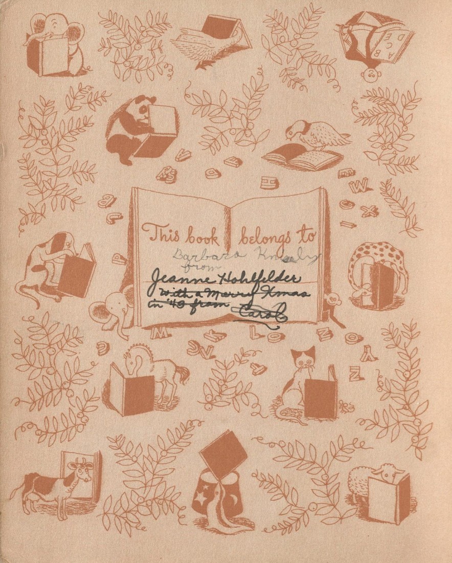
Although Little Golden Books were mass-produced, no two surviving copies necessarily share the same history. Gift inscriptions, ownership markings, and names written on endpapers transform standardized commercial products into individualized artifacts. These handwritten traces document the children and families who owned the books and remind us that Little Golden Books were frequently given as gifts for birthdays, holidays, book themed baby showers, and other special occasions.
Gift inscriptions and ownership marks document how Little Golden Books circulated among families and became part of everyday childhood experiences. Left: Chip Chip, 1947. Call Number: Children C947. Right: The First Little Golden Book of Fairy Tales, 1946. Call Number: Children 3681. Click images to enlarge.
After the stories themselves faded from memory, other things remained: the shine of a gold spine catching the light on a bedroom shelf, pages worn soft at the corners, a carefully written name inside the cover, a favorite and read again and again. The books were taken on long car rides, tucked beneath a pillow, buried in a toy box, or kicked across the living room floor before being gathered up with sticky fingers and read again. Others disappeared beneath couch cushions, were packed into Going to Grandma’s bags, or sat in a stack beside the bed waiting for bedtime. Covers became creased. Spines lost their shine. Yet those signs of wear are reminders that these books were doing exactly what they were meant to do: being loved.
Well-loved books rarely stayed in one place. Little Golden Books followed children becoming familiar companions in everyday childhood. Click image to enlarge.
Many Little Golden Books still survive in family collections, tucked away in boxes, resting on bookshelves, or passed from one generation to the next. Years later, they become reminders of a time when a child could still snuggle beside you for a story, when the day’s worries paused for a few pages, and when an inexpensive little book could feel like treasure.
Their gold spines made them feel important. Not because they were rare or valuable, but because they belonged to someone. They were the books children reached for at bedtime and lined up on shelves as a small collection grew one title at a time.
One day there are only a few books on the shelf. Then there are ten. Then twenty. Before long, a small row of shiny gold spines becomes a child’s first library, growing quietly alongside the child who treasures it. Without realizing it, parents measure the passing years in bedtime stories, favorite characters, and books that become worn through use and affection.
Little Golden Books in Spencer Research Library’s Children’s Collection. Variations in spine color, condition, rebinding, and protective coverings reveal how these books were used and preserved over time. Click image to enlarge.
Long after the gold spine has faded and the corners have softened, the memory remains: the sound of pages turning, a familiar voice reading aloud, and the quiet realization that the little library built one story at a time was never just a collection of books. It was a record of a childhood that passed far too quickly. The stories come to an end, the bookshelf fills up, and the years slip by. But what remains are the memories and the quiet magic of sharing a story together.
Copies of Little Golden Books (published by Simon and Schuster, New York) in Spencer’s holdings:
Little Red Hen, illustrated by Rudolf Freund, 1942 (Call Number: Children 3680).
Nursery Songs, arranged by Leah Gale and illustrated by Corinne Malvern, 1942 (Call Number: Children 3675).
Poky Little Puppy by Janette Sebring Lowrey, illustrated by Gustaf Tenggren, 1946 (Call Number: Children B2889).
The First Little Golden Book of Fairy Tales, illustrated by Gertrude Elliott, 1946 (Call Number: Children 3681).
Walt Disney’s Cinderella, adapted by Campbell Grant; illustrations from Walt Disney’s Studio, 1950 (Call Number: Children C873).
Walt Disney’s Alice in Wonderland: Finds the Garden of Live Flowers, told by Jane Werner; pictures by the Walt Disney Studio, 1951 (Call Number: Children 4479).
Chip Chip tumbling through the pages. Like childhood itself, the adventures of Little Golden Books rarely stand still. Chip Chip, 1947. Call Number: Children C947. Click image to enlarge.
As an elder millennial who loved history as a child and grew up with American Girl, I’ve been excited about the company’s 40th anniversary this year. As a result, I will be sharing a series of posts highlighting Spencer collection materials that connect to AG’s six original historical characters, in chronological order of when they “lived”: Felicity Merriman, Josefina Montoya, Kirsten Larson, Addy Walker, Samantha Parkington, and Molly McIntyre. Each post will focus on a different character and explore a selection of items that relate to the time and place in which she “lived” and topics or themes explored in her stories.
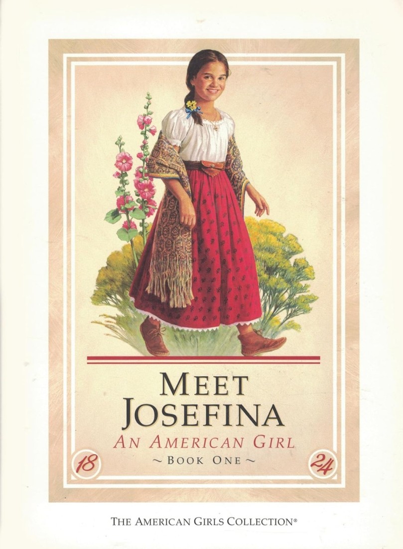
The front cover of the first book in Josefina’s series, first published in 1997. The book was also published in Spanish with the title Así es Josefina: Una Niña Americana. Click image to enlarge.
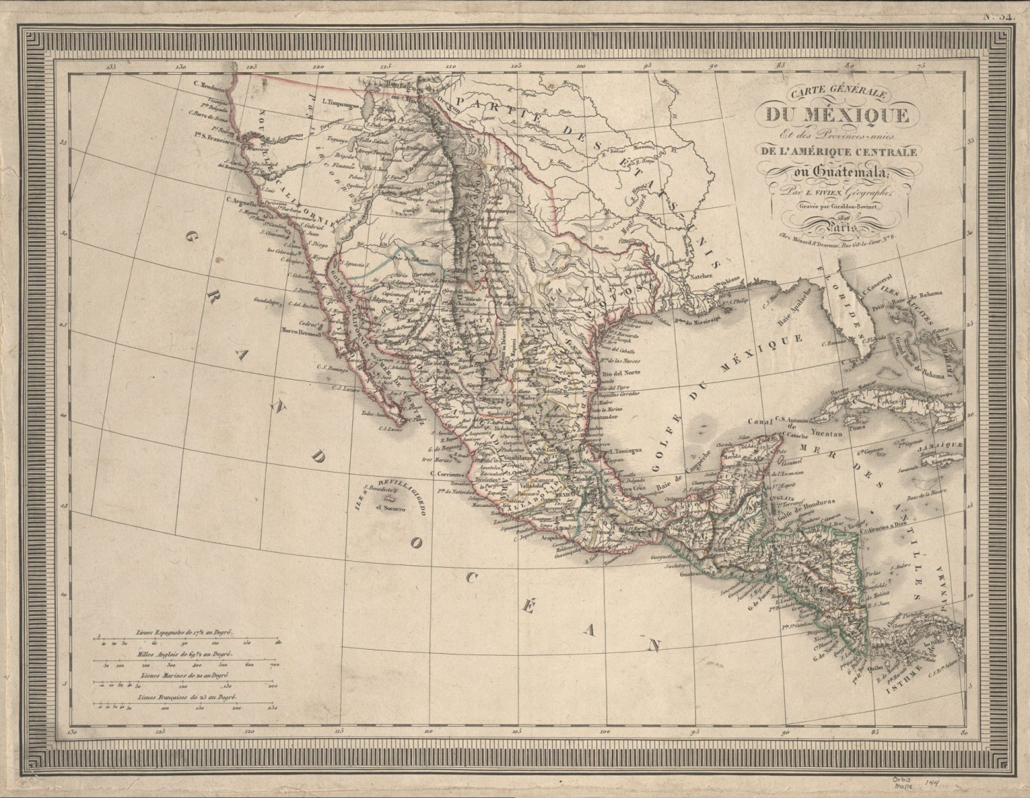
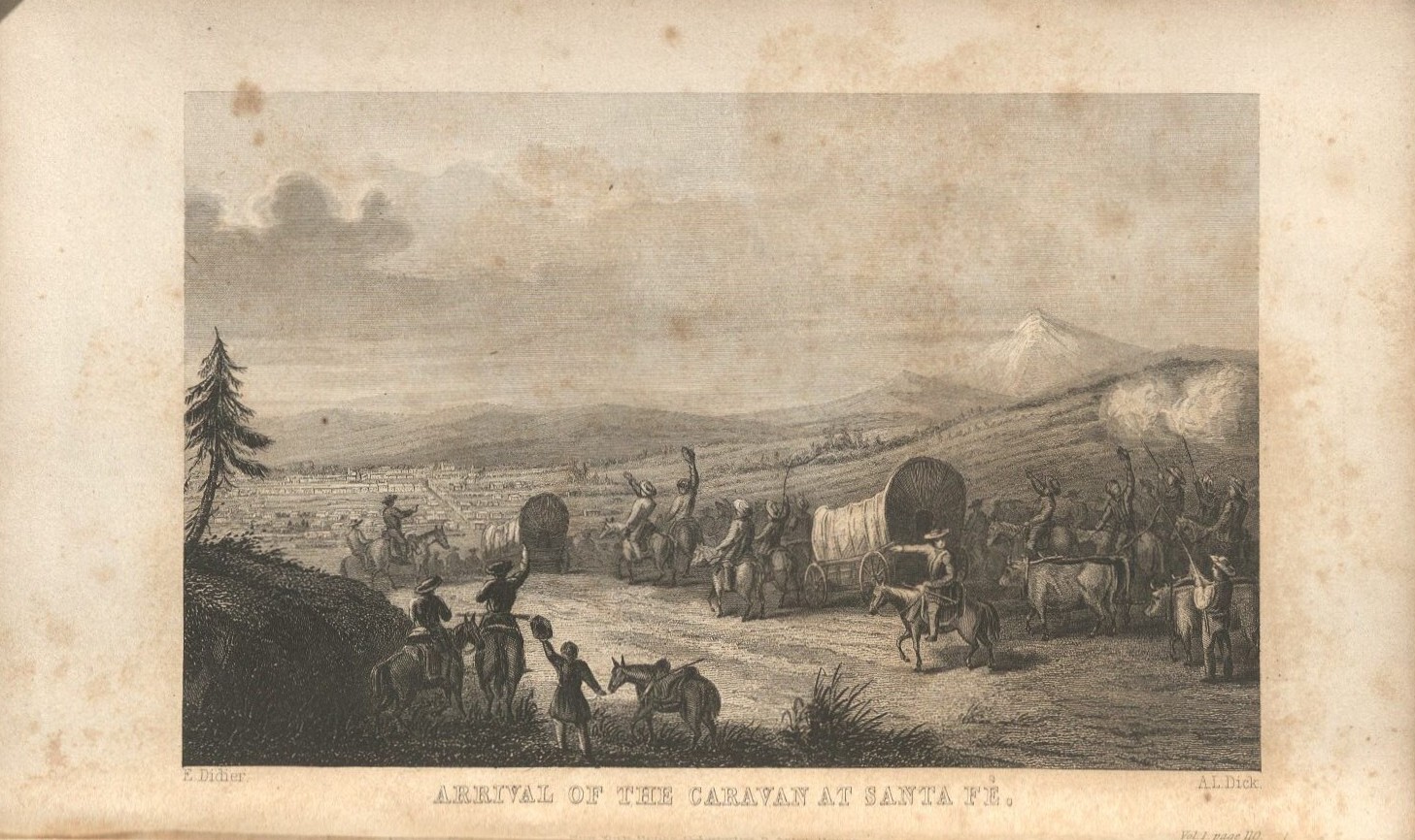
When readers meet Josefina Montoya, she is a nine-year girl described as having a big heart and big hopes. She lives with her father and sisters on a ranch outside Santa Fe, New Mexico – then part of Mexico – in 1824. Josefina’s stories are set against the backdrop of Mexico’s recent independence from Spain, and a significant plot point is the arrival of Americans via the Santa Fe Trail (which passed through Douglas County, Kansas, roughly fifteen miles south of Lawrence and KU). Throughout her stories, Josefina grieves and remembers her deceased mother; adjusts to changes at the ranch brought about her aunt, Tía Dolores; deals with goats, including her nemesis Florecita and the orphaned baby goat Sombrita; and starts the journey of becoming a curandera (healer).
A French map of Mexico and Central America [Carte générale du Méxique et des provinces-unies de l’Amérique centrale on Guatemala], 1826. Call Number: Orbis Maps 1:144. Click image to enlarge.
–
–
–
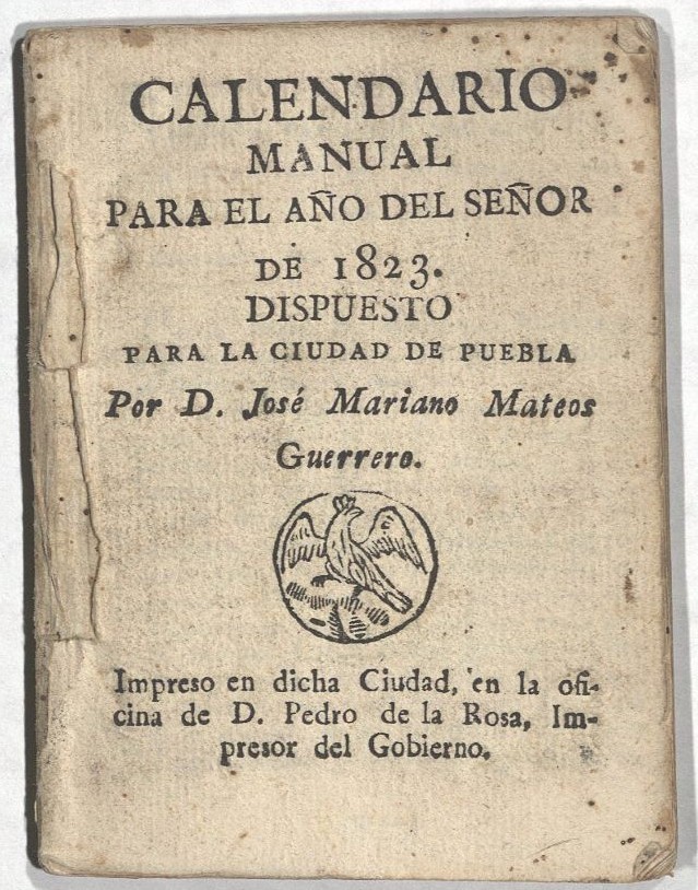
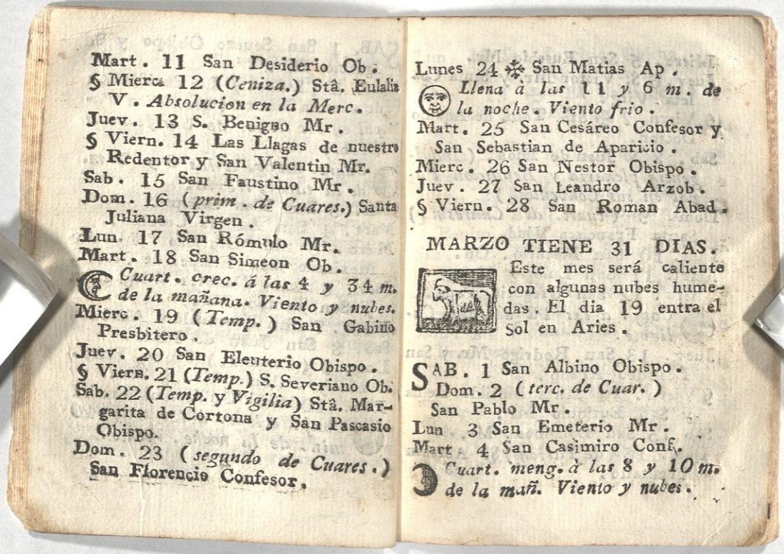
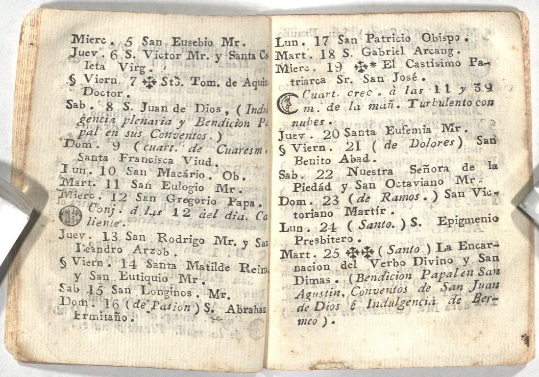
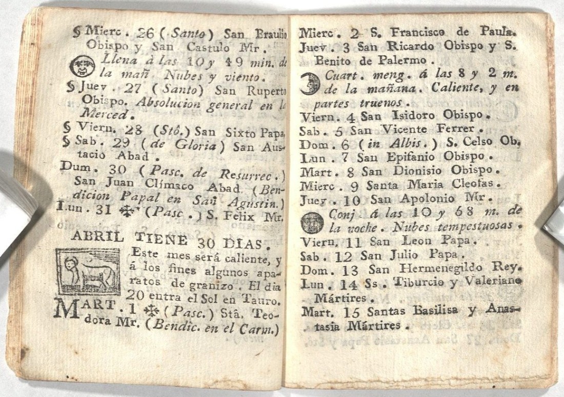
The title page and pages for the month of March in the pocket-sized Calendario manual para el año del señor de 1823. Dispuesto para la ciudad de Puebla [Manual Calendar for the Year of Our Lord 1823. Prepared for the City of Puebla]. Josefina’s birthday is March 19, the feast day of San José (St. Joseph). Call Number: t131. Click image to enlarge.
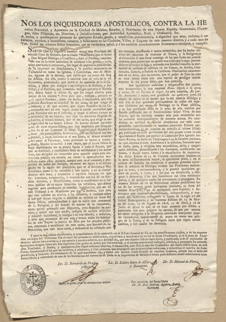
A broadside communicating an edict issued by the Inquisition of Mexico against the revolutionary proclamations of Miguel Hidalgo y Costilla, January 26, 1811. Hidalgo was a Catholic priest who led the first phase of the Mexican War of Independence beginning in 1810. Captured in March 1811, he was officially defrocked and excommunicated before being executed in July of that year. Call Number: Summerfield H121. Click image to enlarge.
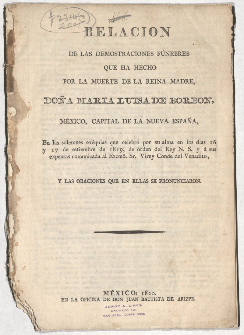
The title page of an account of the elaborate funeral ceremonies held for Maria Luisa of Parma, formerly the Queen Consort of Spain, in Mexico City, September 16-17, 1819. Josefina’s Tía Dolores would have been living in Mexico City at that time. Call Number: D3524. Click image to enlarge.
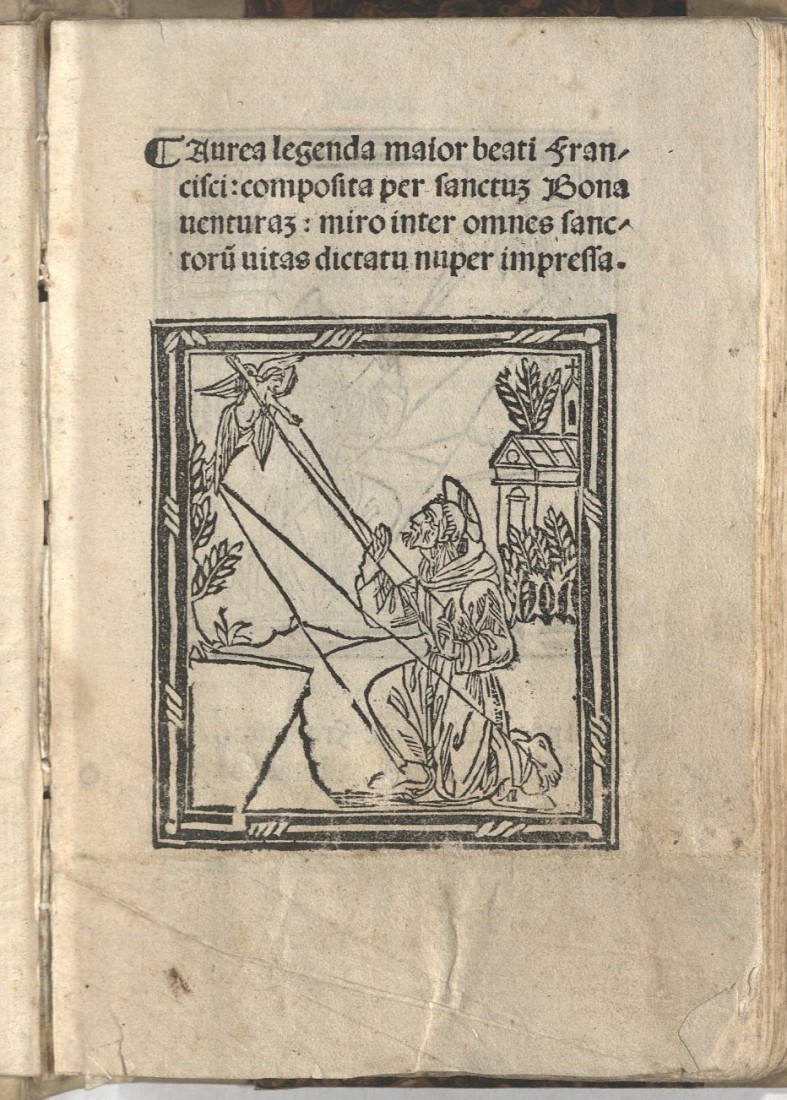
The title page of a 1509 copy of St. Bonaventure‘s biography of St. Francis of Assisi, who is the patron saint of Santa Fe. The city’s name – Spanish for “Holy Faith” – is the shortened form of its original name, La Villa Real de la Santa Fe de San Francisco de Asís (Royal Town of the Holy Faith of Saint Francis of Assisi). The image depicts St. Francis receiving the wounds of Christ. Call Number: Summerfield B584. Click image to enlarge.
“Arrival of the Caravan at Santa Fe,” the frontispiece illustration in Commerce of the Prairies, or, The Journal of a Santa Fé Trader (Volume 1) by Josiah Gregg, 1844. In this work, Gregg describes his travels along the Santa Fe Trail between 1831 and 1839. Call Number: RH C521. Click image to enlarge.
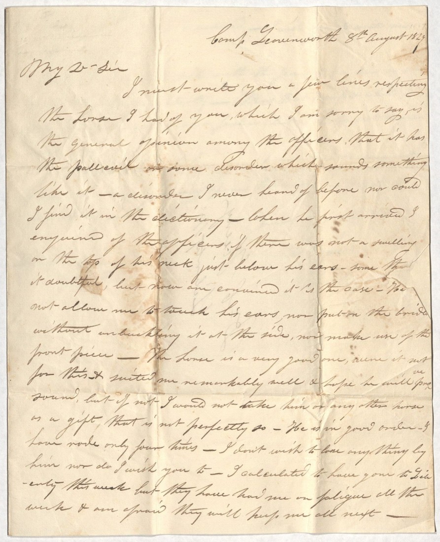
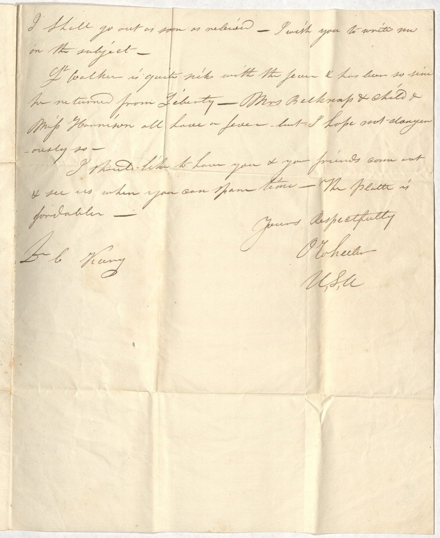
A letter from O. Wheeler, Camp Leavenworth, Kansas, to Dr. C. Keeny, Liberty, Missouri, August 8, 1827. Most of the letter concerns a “disorder” or illness affecting Wheeler’s horse. The U. S. Army established Camp (now Fort) Leavenworth in 1827, the same year this letter was written, to serve as a forward base protecting the Santa Fe Trail. Call Number: RH MS P174.
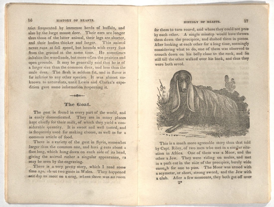
Information and commentary about goats in the children’s book The Natural History of Beasts: Illustrated with Cuts, 1843. The lesson the author draws from the two featured stories is that “surely the goats were wiser than the men – and let the young reader learn from this, that kindness and humanity are better calculated to remove difficulties than pride and obstinacy.” Call Number: Children 504B. Click image to enlarge.
Selected Additional Collection Items
Maps
Regni Mexicani seu Novæ Hispaniæ, Floridæ, Novæ Angliæ, Carolinæ, Virginiæ, et Pennsylvaniæ, nec non insvlarvm archipelagi Mexicani in America septentrionali [The Kingdom of Mexico, or New Spain, Florida, New England, the Carolinas, Virginia, and Pennsylvania, as Well as the Insular Archipelago of Mexico in North America] by Johann Baptist Homann, 1722. Call Number: Orbis Maps 1:60.
A Map of Louisiana and Mexico = Carte de la Louisiane et du Mexique, 1820. Call Number: Orbis Maps 1:134.
Map of the Western Territory of the United States by Lt. Enoch Steen. Coverage includes Indian lands from 80 miles east of Leavenworth to 50 miles west of Pikes Peak and Black Hill to Santa Fe. Call Number: RH Map S31.
A Map of the Indian Territory, Northern Texas and New Mexico: Showing the Great Western Prairies by Josiah Gregg, from Commerce of the Prairies, 1844. Call Number: RH Map Q57.
Mapa de los Estados Unidos de Méjico [Map of the United States of Mexico], 1847. Call Number: Orbis Maps 2:61.
Map of Santa Fe County, New Mexico, 1880s? Shows railroads and pre-European pueblos in and near Santa Fe County. Call Number: RH Map R529.
New Spain and Mexico
Exploratory Travels Through the Western Territories of North America by Zebulon Pike, 1811. During his 1806-1807 expedition to the region south and west of the Louisiana Purchase, Pike ended up in Spanish territory. His party was captured by Spanish soldiers, and their subsequent journey took them through Santa Fe. Call Number: D678.
Memoirs of the Mexican Revolution: Including a Narrative of the Expedition of General Xavier Mina by William Davis Robinson, 1820. Call Number: Howey C4191.
Six Months’ Residence and Travels in Mexico by William Bullock, 1824. Call Number: Ellis Aves C207.
A View of South-America and Mexico, Comprising Their History, the Political Condition, Geography, Agriculture, Commerce, &c. by John M. Niles, 1825. Call Number: B11232.
New Mexico, Santa Fe, and the Santa Fe Trail
The Daily New Mexican newspaper, published in Santa Fe, 1880-1881. Call Number: RH H24.
Santa Fe: Ancient and Modern, Including Its Resources and Industries edited by W.G. Ritch, 1885. Call Number: RH C1375.
Southwest on the Turquoise Trail: The First Diaries on the Road to Santa Fe edited by Archer Butler Hulbert, 1933. Call Number: RH C451.
Historic Santa Fe, Founded About 1525: Oldest Town in the United States: The End of the Old Santa Fe Trail, 1940s? Call Number: RH AK121.
Santa Fe Trail: First Reports, 1825 by Augustus Storrs and Alphonso Wetmore, 1960. Call Number: RH B1126.
Household Matters
Quatro libros de la naturaleza, y virtudes de las plantas, y animales que estan receuidos en el uso de medicina en la Nueua España [Four Books on the Nature and Virtues of Plants and Animals for Medicinal Purposes in New Spain] by Francisco Hernandez, 1615. Call Number: Summerfield B2225.
Mexican recipes, early 1800s. This is a collection of culinary recipes – written in various hands and mostly undated – that appear to be from central and southern Mexico. The collection was previously featured on Spencer’s blog. Call Number: MS 346.
A New Dictionary of the Spanish and English Languages compiled by by Henry Neuman, 1823. Call Number: C26852.
El cocinero mexicano, o Coleccion de las mejores recetas para guisar al estilo americano [The Mexican Cook, or Collection of the Best Recipes for Cooking in the American Style], volume 3 only, 1831. This work is one of two cookbooks from 1831 that are considered the first on Mexican cuisine published in Mexico. Call Number: B14945.
What is the role of a university regarding the needs and concerns of its students, staff, and faculty and members of the surrounding community? That is the central question posed by the 1968 student demonstrations at Columbia University in New York City.
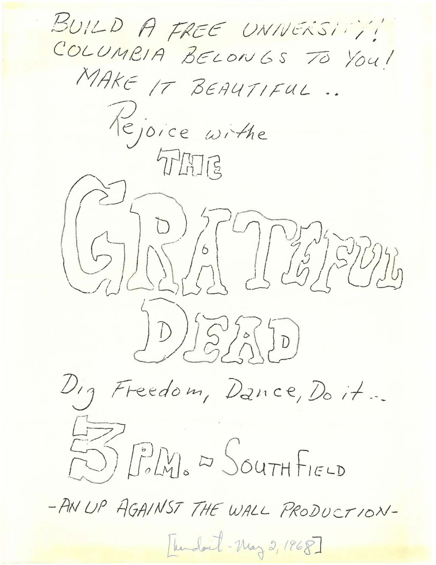
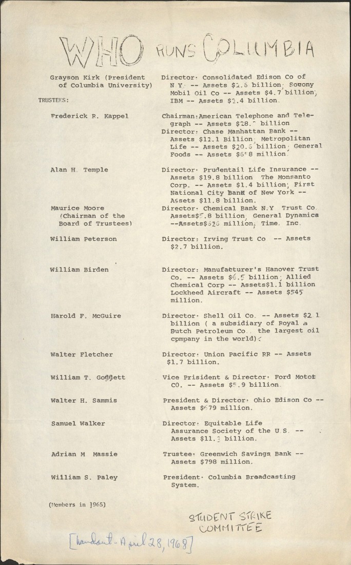
University of Kansas alum Scott Colby was a graduate fellow in the East Asian Studies Department at Columbia during the demonstrations. Appreciating the historical significance of the event, he preserved copies of the Columbia Daily Spectator student newspaper and news clippings about the demonstrations from The New York Times and other local papers. Colby also collected fliers, pamphlets, and various group statements from news boxes in campus buildings, stacks of papers around campus, and students. For example, some fliers announce performances by Phil Ochs and the Grateful Dead and other events held on or near the “liberated” campus. The document “Who Rules Columbia?” is an analysis of the university’s real-estate holdings, connections to the United States intelligence and defense agencies, and national corporations headed by Columbia trustees. It raises questions about taxpayer-funded research enriching private corporations.
A flier circulated by the Strike Committee lists Columbia’s trustees with their companies and financial worth, April 28, 1968. Scott Colby Collection. Call Number: RH WL MS 65, Box 1, Folder 5. Click image to enlarge.
Colby recently donated these materials to Spencer Research Library (Call Number: RH WL MS 65). The collection documents how a group of Columbia students began a protest inside of Hamilton Hall, on April 23, 1968, defying the recent university ban on sit-ins and blocking Dean Henry Coleman from leaving his office. The main organized groups involved were the Society for Afro-American Students (SAS) and Students for a Democratic Society (SDS). Columbia University had just broken ground on a gym in the publicly-owned Morningside Park, despite widespread opposition from student groups and the Harlem community. SAS dubbed it “Gym Crow” on account of the separate and much smaller facilities allocated for the mostly Black Harlem residents. In addition to supporting the SAS stance against the gym, SDS had demonstrated against military and CIA recruitment on campus and protested the university’s involvement with the Institute for Defense Analyses (IDA), which provided strategic military research.
The demonstrators issued a list of six demands (Box 1, Folders 6, 8, 11) of the university administration: give amnesty to demonstrators, halt construction of the gym, drop the charges against those who protested the gym construction, sever ties with the IDA, allow indoor demonstrations, and form a bipartite committee of students and faculty for judicial decisions. The students decided to stay in Hamilton Hall until the demands were met.
In his 2003 article on Black student activism at Columbia – part of Colby’s papers and available online – professor and author Stefan Bradley explains what happened next. The SAS rejected integrationist strategies of the nonviolent civil rights movement and focused on Black power, maintaining leadership of their demonstrations against the gym with the support of the surrounding Harlem community. For these reasons and others, SAS asked the white students to leave Hamilton Hall. Following the suggestion of the SAS, the leaders of SDS proceeded to occupy Low Library in solidarity. Over the course of the following week, SDS demonstrators (including students and community members) took over five campus buildings, causing classes to be cancelled. While the SAS activists focused on preventing the construction of the gym, SDS focused on ending Columbia’s support for the military, which they saw as a colonial power suppressing human rights in the region of Vietnam and elsewhere.
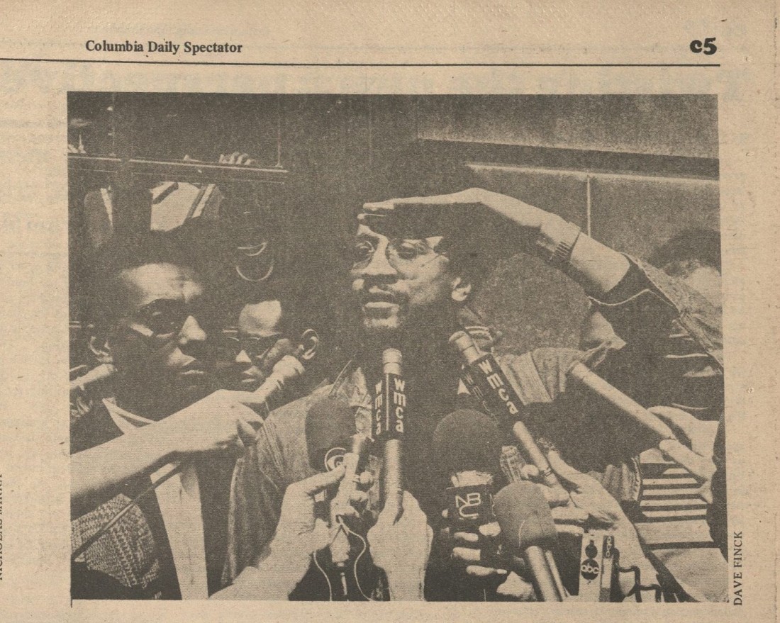
A Columbia Daily Spectator photo of H. Rap Brown (later Jamil Abdullah Al-Amin) standing beside Stokely Carmichael (later Kwame Ture) outside of Hamilton Hall, 1968. Carmichael and Brown arrived on campus on April 26. Author Stefan Bradley recounts that they predicted that “if the university doesn’t deal with our brothers in there [Hamilton], they’re going to have to deal with the brothers out on the streets.” Scott Colby Collection. Call Number: RH WL MS R20, Box 1, Folder 2. Click image to enlarge.
The recent unrest after the murder of Martin Luther King, Jr. was fresh in the minds of Columbia’s administrators, who feared the damage that the people of Harlem could do to the school.
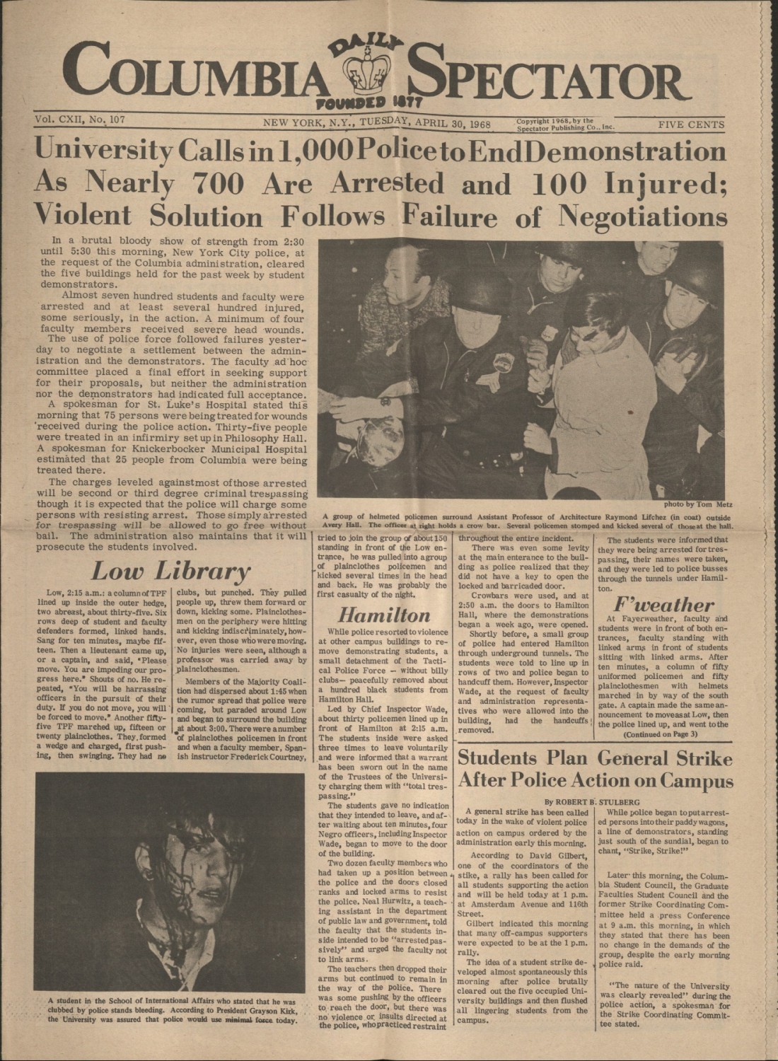
Then the administration called the police. The brutality of the NYPD violently removing students from campus buildings galvanized support for the protestors. Many, including faculty, called for a strike on the university. A strike coordinating committee was created to represent thousands of people who supported the demonstrators’ demands.
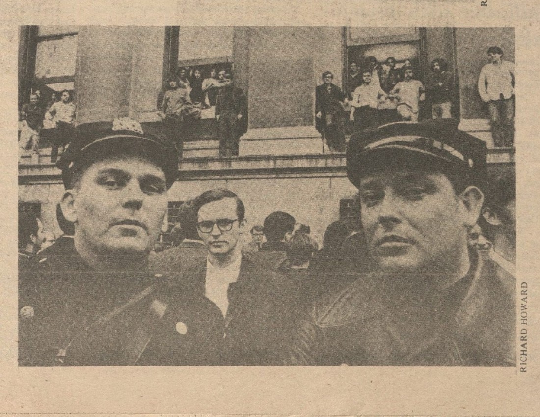
A photo from the Columbia Daily Spectator student newspaper showing a police officer and others in front of a university building that students have occupied, 1968. Scott Colby Collection. Call Number: RH WL MS R20, Box 1, Folder 1. Click image to enlarge.
The front page of Columbia’s student newspaper, reporting on the administration’s call to the New York Police Department and the NYPD’s subsequent raid of the campus early in the morning of Tuesday, April 30, 1968. Scott Colby Collection. Call Number: RH WL MS R20, Box 1, Folder 1. Click image to enlarge.
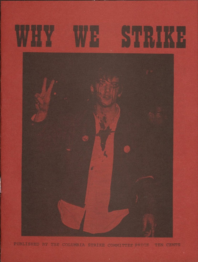
A pamphlet published by the Columbia Strike Committee, May 8, 1968. In addition to expanding on the original six demands, the pamphlet summarized the demonstrators’ perspective: “Columbia University has been governed undemocratically. An Administration responsible only to the Trustees has made decisions that deeply affect students, faculty, and the community. It has expropriated a neighborhood park to build a gym. It has participated, through IDA, in the suppression of self-determination throughout the world. It has formulated rules and disciplined students arbitrarily and for the purposes of suppressing justified protest. The actions of the Administration in the present crisis have exposed it to students and faculty as the anti-democratic and irresponsible body it has always been.” Scott Colby Collection. Call Number: RH WL MS 65, Box 1, Folder 11. Click image to enlarge.
The SAS was ultimately successful in stopping the construction of the gym. In response to the student demonstrations shutting down the school, Columbia University additionally cut ties with the IDA and restricted military recruitment on campus. The school’s Board of Trustees, which previously held all decision-making power, adopted the faculty recommendation to form a tripartite university senate that included representation for faculty and students.
Stefan Bradley explains how solidarity was key to achieving these goals:
It would be too simple to state that the black students of Columbia University achieved their goal of stopping the construction of the gym by their own protest efforts. The black protesters needed the support to the white students, just as the white radicals needed the black militants to advance their goals. While the black demonstrators had the ability to draw the attention of the university officials, the larger number of white radicals added manpower and momentum to the black students who protested on behalf of the community. The black student demonstrators’ insistence on separating themselves from the white protesters helped the radical white students to focus on their own agenda and goals as well. Because the white radicals now had a different focus, they, along with the black protestors, radicalized much of the general student body, and eventually shut Columbia University down for six weeks.
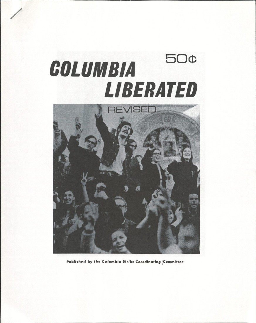
The Strike Coordinating Committee’s activities included organizing alternative classes and publishing Columbia Liberated, a history of the demonstrations, in September 1968. Scott Colby Collection. Call Number: RH WL MS 65, Box 1, Folder 23. Click image to enlarge.
The student protests at Columbia were part of a nationwide movement in which students demanded that universities end militarism, corporatism, and racist policies on campus. There was a widespread push for more democratic control of universities to ensure these values. For example, about a year after the Columbia demonstrations, the governance structure at KU expanded beyond only tenured faculty.
The issues raised by the demonstrators are still being grappled with today – at Columbia, the University of Kansas, and other institutions of higher learning. University responsiveness to the concerns of minoritized communities, diversity of perspectives in the history of domestic and international conflicts, the impact of physical expansion of universities on the surrounding communities, institutional support for the military, students’ rights to protest, and police enforcement on campus are all critical issues today. The Spencer Research Library is glad to make Scott Colby’s papers on the 1968 Columbia University demonstrations available to the public. Come explore the collection in our Reading Room and gain various perspectives from the past on the issues of today.