Welcome to the Kenneth Spencer Research Library blog! As the special collections and archives library at the University of Kansas, Spencer is home to remarkable and diverse collections of rare and unique items. Explore the blog to learn about the work we do and the materials we collect.
This blog may contain archived web content. This blog may link to catalog records which no longer exist as of a software change in 2026.
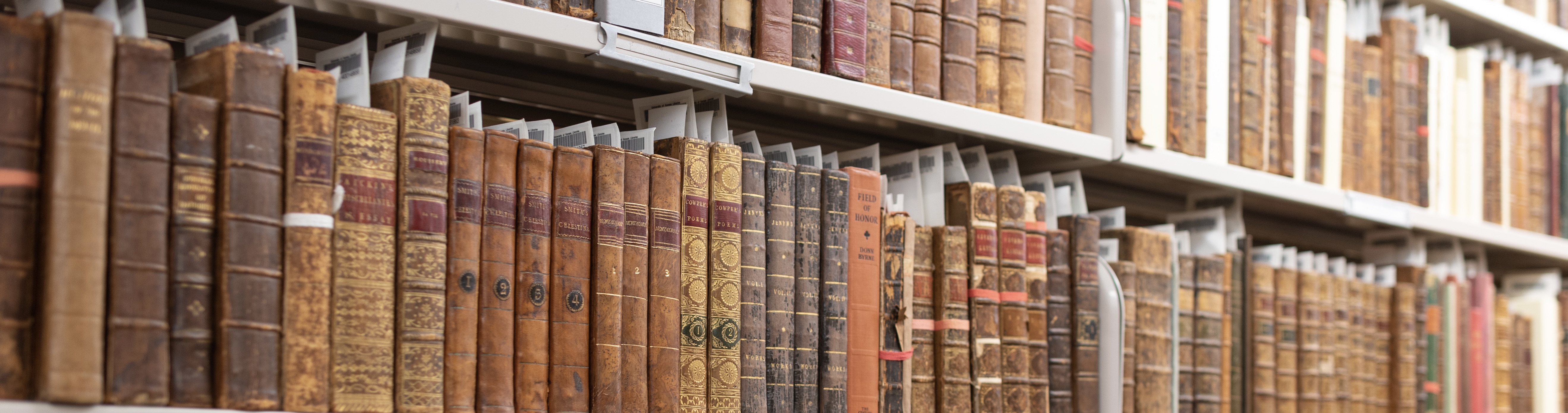
In the course of my work as a conservator at KU Libraries, one of my favorite bookbinding features to spot “in the wild” is paste paper. A book covered in paste paper might come to the lab for treatment, or I might catch sight of one while working in the stacks, and I always take a moment to look at them closely and enjoy the variety of colors, patterns, and styles that paste papers come in. It was no easy task to narrow down Spencer’s abundant selection of paste papers to just a few volumes that will be on view in a temporary exhibit in the North Gallery through August and September.
Paste paper is a style of decorative paper made by coating the surface of paper with a thick pigmented starch adhesive (usually wheat paste or methylcellulose) and then manipulating the wet paste mixture to create patterns. Combs, stamps, brushes, wadded paper or textiles, rollers, fingers and more could be used to create designs. Paste papers were an economical alternative to marbled papers, which required a high degree of skill and costly materials to produce. No special training or supplies were needed to make paste papers; bookbinders could create them right in their workshops with materials already at hand.
Paste papers were most often used for book covers and endpapers and were popular from the late 16th through the 18th century. Paste papers are often seen on books from Germany and Northern Europe, although there are many lovely examples of block-printed paste papers from Italy. There was renewed interest in paste papers during the Arts & Crafts movement of the late 19th and early 20th century. Today, paste papers are still created by book artists and hobbyists, and can be seen on some fine-press editions. The examples on view represent just a fraction of the many beautiful paste papers found in Spencer’s collections and available to view in the Reading Room.
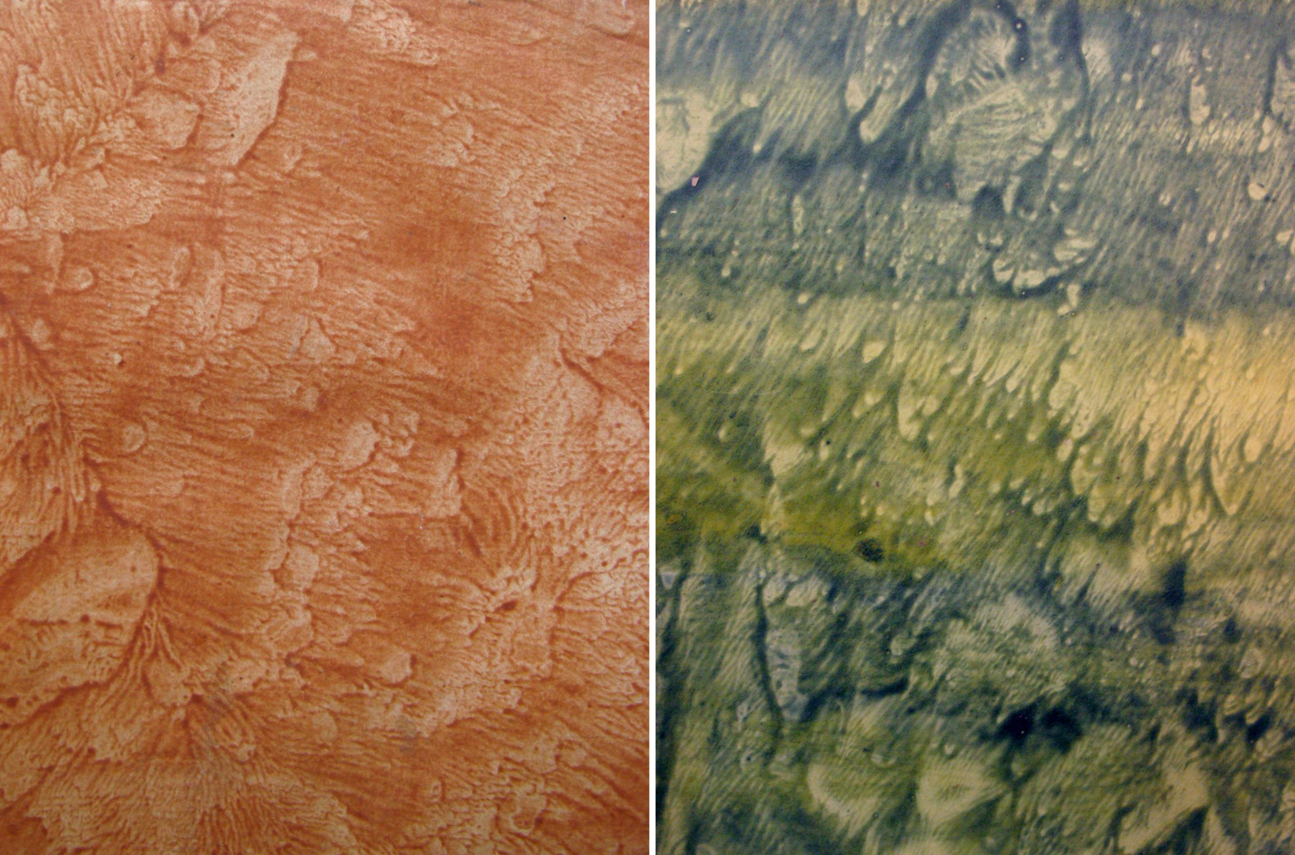
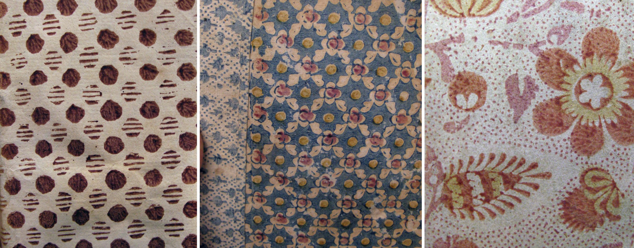
Pulled (or veined) paste papers were created by coating two sheets of paper with the colored paste, pressing the two pasted sides together, and then pulling the sheets apart, creating a unique wave-like pattern on each sheet.
Left: Cover of De Mentha piperitide commentatio botanico medica, 1780. Call Number: C9291. Right: Cover of Rules and orders of the Linnean Society of London,1788. Call Number: Linnaeana C112. Click collage image to enlarge.
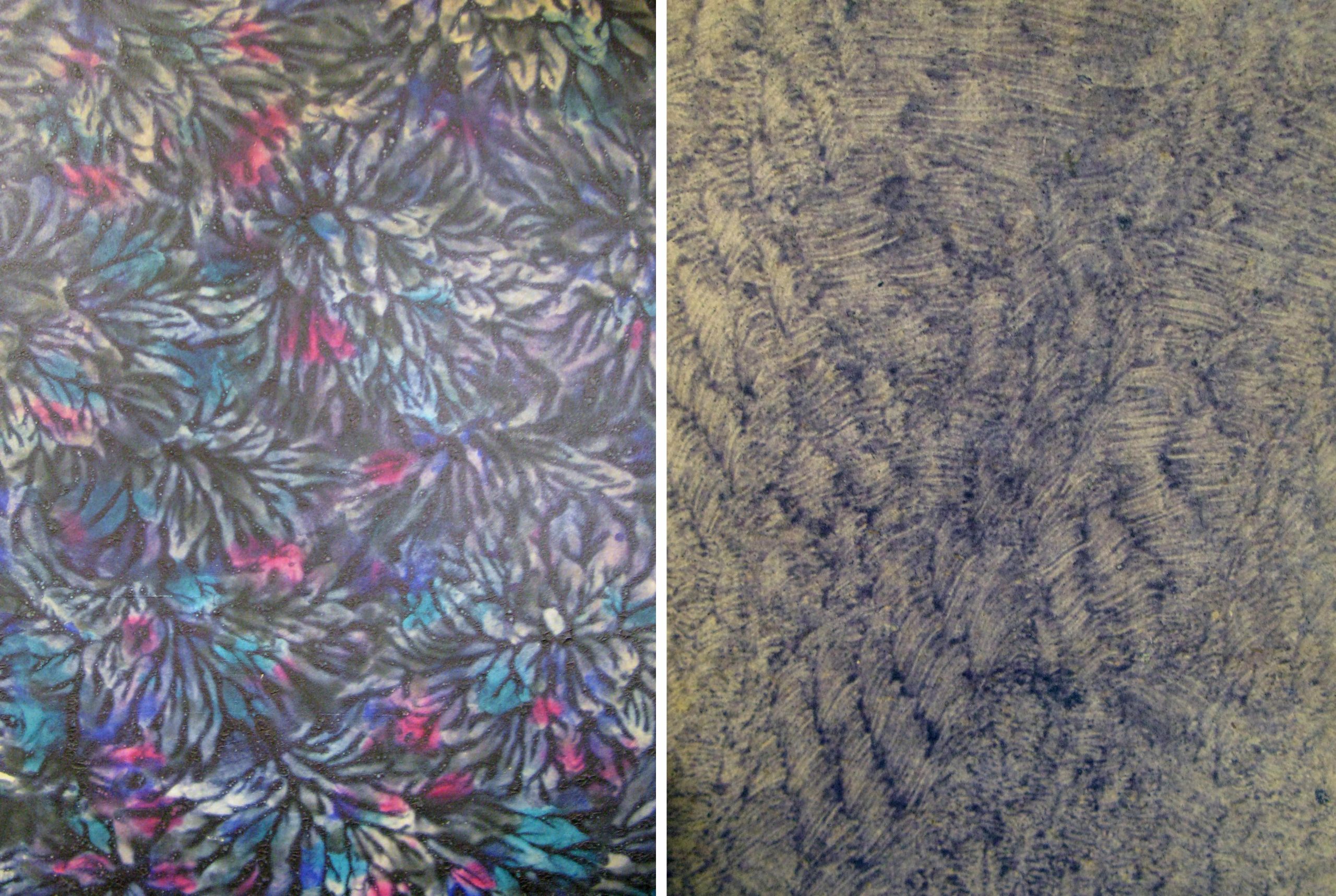
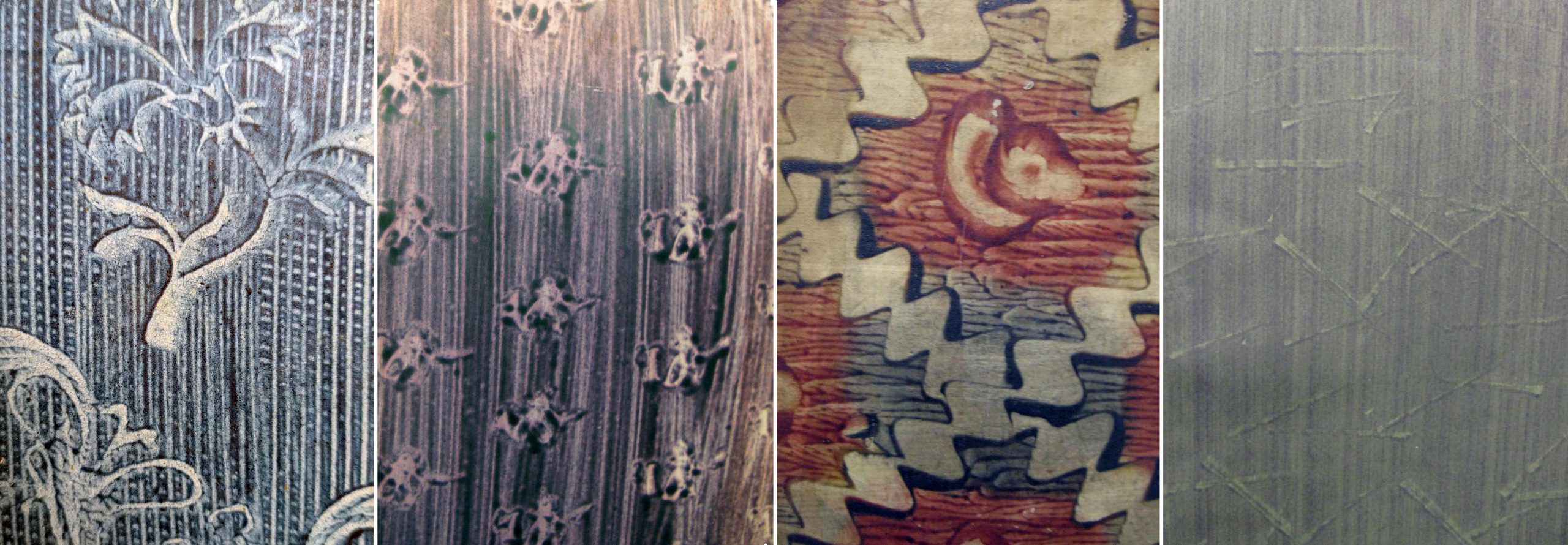
Drawn paste papers (also called scraped or combed) were made by “fingerpainting” in the wet paste or dragging various implements through the paste layer. The results can range from painterly and whimsical to clean and graphic. A faux wood graining tool was used to create the pattern on Summerfield E156 (second from left).
Left: Cover of Lectionary, incomplete. [Italy, between 1101-1200]. Call Number: MS E22. Second from left: Cover of De origine et amplitudine ciuitatis Veronae, 1540. Call Number: Summerfield E156. Center: Cover of [Notes on agriculture.] Fletcher of Saltoun collection Scotland, 17–. Call Number: MS 109:4. Second from right: Cover of De ponderibus et mensuris veterum Romanorum…, 1737. Call Number: B3981. Right: Cover of Bookplates and labels by Leo Wyatt, 1988. Call Number: D3245. Click collage image to enlarge.
These are two very different examples of daubed paste papers: a boldly colored design executed in a thick layer of paste, and a subtle pattern possibly created with stiff brush bristles.
Left: Back cover of Deutschlands Beruf in der Gegenwart und Zukunft, 1841. Call Number: Howey D126. Right: Cover of Det enda nödvändiga för et rikes financer, 1792. Howey B1083. Click collage image to enlarge.
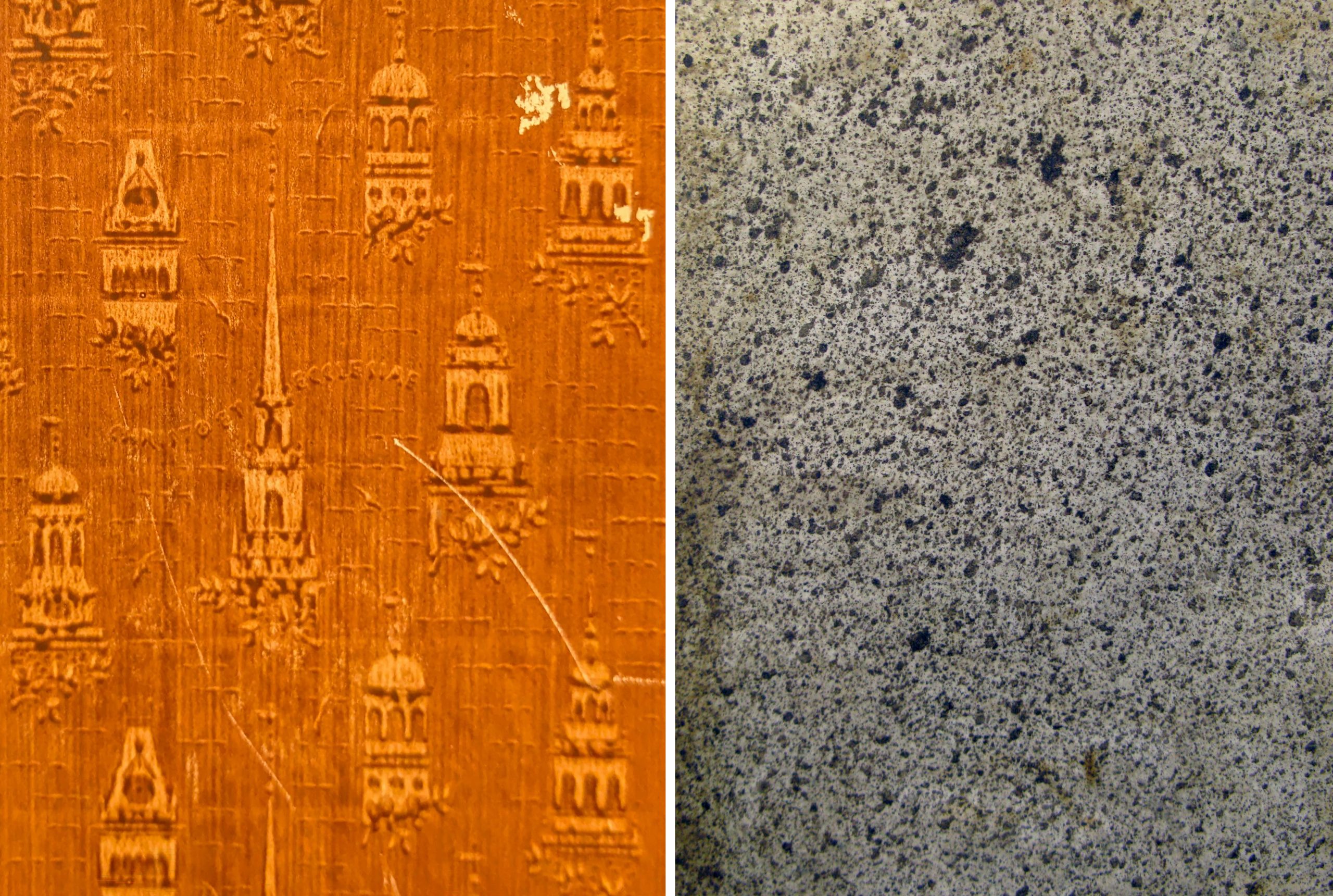
This charming stamped (or printed) design appears, appropriately, on the cover of a book about decorative papers used in bookbinding. An assortment of stamps in architectural shapes were pressed into the paste to create the pattern. Spattered (or sprinkled) papers were made by loading a brush with the colored paste mixture and striking the brush while holding it above the paper, creating a shower of drops.
Left: Cover of Decorated book papers, 1942. Call number: C6396. Right: Cover of Considerazioni sulle compagnie, 1769. Call Number: Howey B1116. Click collage image to enlarge.
Block printed paste papers used a matrix, probably carved as for a woodblock print, that was “inked” with the colored paste and stamped onto the paper. These designs can be simple or ornate and often use multiple colors. On Summerfield C1300 (at left) the binder used block printed papers in two different patterns.
Left: Cover of Anticamera di D. Pasquale, 1690. Call Number: Summerfield A866. Center: Cover of De iurisprudentia extemporali, 1628-1629. Call Number: Summerfield C1300. Right: Cover of Göttinger Taschen Calender für das Jahr 1790. Call Number: A274 1790. Click collage image to enlarge.
In these examples the makers have used a combination of techniques on a single sheet: stamped over drawn, drawn over pulled, and so on. D2763 (at right) is also an example of a paste paper created using a colored sheet of paper, instead of white or light paper, as the starting point.
Left: Endpaper of Göttinger Taschen Calender für das Jahr 1782. Call Number: A274 1782. Second from left: Cover of Hortus Celsianus i Uppsala, 1927. Call Number: Linnaeana C456. Second from right: Cover of Poems, 1768. Call Number: O’Hegarty C1129. Right: Cover of Poem to the memory of Lady Miller, 1782. Call Number: D2763. Click collage image to enlarge.
In Conservation Services we sometimes make paste papers to use in our own bookbinding models or in book making activities for colleagues or the public. Making paste papers is a fun and messy activity that invites exploration of colors, patterns, and mark-making tools. There are many online tutorials for making paste papers at home; bookbinder Erin Fletcher has a great video and written instructions on her blog. Tutorial // Paste Papers – Flash of the Hand
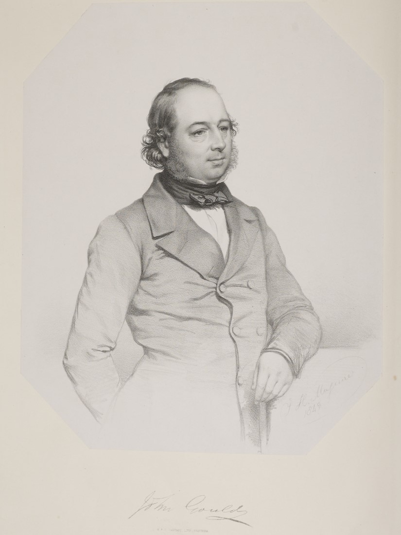
We are periodically sharing some of the materials that are featured in Spencer Research Library’s North Gallery permanent exhibit. We hope you’ll be able to visit the library and explore the full exhibit in person! This week’s post highlights materials by and information about English ornithologist John Gould.
John Gould, an English ornithologist based in London, published large, lavishly illustrated books about birds of the world from 1830 until his death in 1881. Kenneth Spencer Research Library at the University of Kansas holds 47 large-format volumes published by Gould, as well as nearly 2000 preliminary drawings, watercolors, tracings, lithographic stones, and proof prints from his artistic workshop. Digitized a decade ago, our Gould collection has recently migrated to new Islandora software that makes searching for bird images within the volumes as easy as finding the separate pieces of preliminary art. The digitized Gould collection is accessible at the University of Kansas Libraries website.
John Gould. Lithographic portrait by J. Maguire. Inserted as frontispiece in A Monograph of the Ramphastidae or Family of Toucans (London, 1834). Call Number: Ellis Aves H17, vol. 1. This volume has been digitized and is available online. Click image to enlarge (redirect to Spencer’s digital collections).
The son of a humble gardener, John Gould had spent his boyhood in rural England. His youthful interest in birds and taxidermy would later grow into a career as a publisher of bird books. Hired in 1827 by the recently founded Zoological Society of London, his work maintaining their collection of bird skins enabled him to learn from member ornithologists. Gould and his wife Elizabeth, an amateur artist, ventured into ornithological publishing in 1830 with a book about birds of the Himalaya Mountains.
High-quality digital images downloaded from University of Kansas Libraries website are included here to help explain how the beautiful lithographic prints of birds that illustrate Gould’s books were made. Lithography was a chemical printing process based on the antipathy between grease and water. It involved drawing with greasy ink or crayon on blocks of fine-grained limestone imported from Germany. Invented in Bavaria about 1798 by Aloys Senefelder, lithography soon spread throughout Europe and beyond. By the mid 1800s lithography had replaced copper engraving as the preferred method for quality book illustration, because it was easier and faster (and therefore cheaper) to execute.
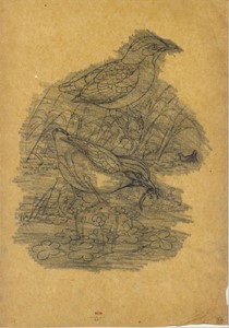
An initial rough sketch on paper, often drawn by John Gould himself, began the bird illustration process. The multiple lines and erasures on this sketch of two Asian ground thrushes (Pitta concinna) reflect Gould’s search for the best composition.
Rough pencil and chalk sketch of Pitta concinna by John Gould. Call Number: Gould Drawing 1114. Click image to enlarge (redirect to Spencer’s digital collections).
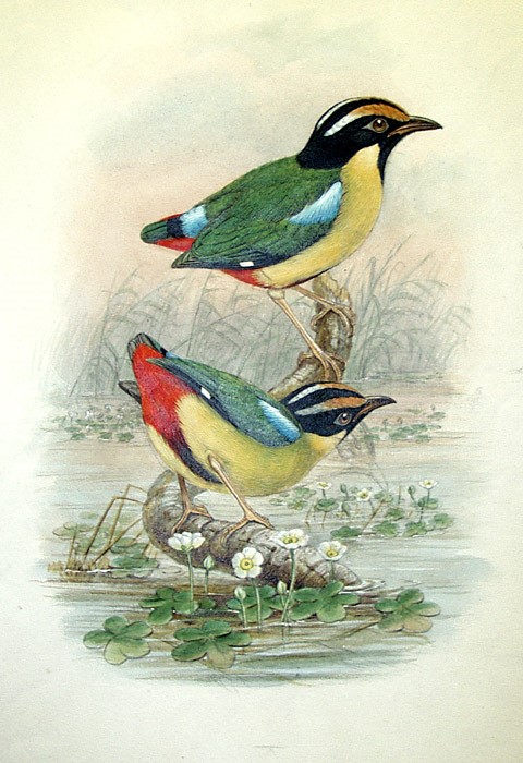
One of Gould’s artists, in this case William Hart, then developed the sketch into a detailed watercolor painting to be approved by Gould, who insisted on accurate proportions and coloring.
Finished watercolor of Pitta concinna by William Hart. Call Number: Gould Drawing 1167. Click image to enlarge (redirect to Spencer’s digital collections).
Next Hart copied the outlines onto tracing paper and blackened the reverse side with soft lead pencil. By laying the tracing paper on a block of limestone prepared for lithographic printing and re-tracing the outlines, he was able to transfer a non-printing guide image onto the printing surface.
Outline drawing in pencil on tracing paper of Pitta concinna. Call Number: Gould Drawing 1168.
Following the guide lines, Hart has used a greasy lithographic crayon to draw and shade the bird image on the lithographic stone. The stone had been rubbed with fine sand and water to give it a velvety texture or grain to which the crayon would adhere.
Lithographic crayon drawing on lithographic stone of Pitta coccinea. Call Number: Gould Drawing 2383.
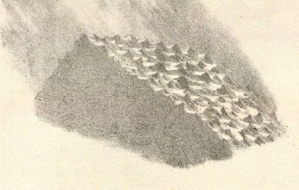
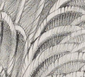
Close examination with a magnifier would show small irregular dots of crayon adhering to the grained surface of the stone. At normal reading distance, though, the viewer’s eye blends the tiny dots and perceives them as shades of gray.
Enlarged view of grained stone surface. Charles Hullmandel, The Art of Drawing on Stone (London, 1824). Call Number: D725. Click image to enlarge.
Enlarged detail of lithographic crayon shading of feathers of Greylag Wild Goose (Anser palasurus). Uncolored proof copy of John Gould, Birds of Europe (London, 1837), Volume 5, Plate 347. Call Number: Ellis Aves H132. This volume has been digitized and is available online. Click image to enlarge (redirect to Spencer’s digital collections).
Turning the drawing on stone into a printing image was a chemical process. First, the crayon drawing was lightly etched with a gum arabic solution, which adhered to the non-image areas and made the bare stone surface there more water receptive. The crayon image was then washed out with turpentine, which formed a thin coating on the image making it receptive to the greasy printing ink.
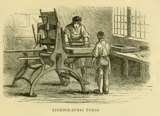
Next the printer placed the stone on the bed of a lithographic printing press. Before inking, the stone was wetted, so the greasy black ink would adhere only to the crayon image. A blank sheet of paper was then placed on the inked stone and pressed against it by a scraper bar to transfer the black ink onto the paper, forming the printed image.
A printer inking a lithographic stone on a printing press. Elisha Noyce, The Boys Book of Industrial Information (London, 1858), p. 129. Accessed via HathiTrust. Click image to enlarge.
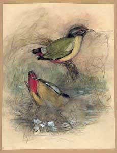
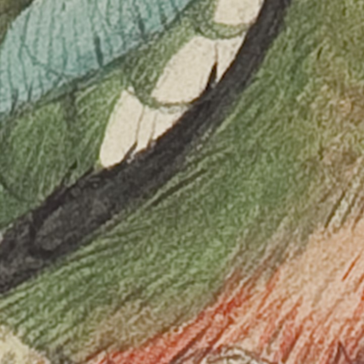
After the ink had dried, the print was hand colored with watercolors, copying a colored master print (called a pattern plate) that had been approved by Gould. Gould’s colorer was Henry Bayfield, who employed the female members of his family to help with adding watercolor washes by hand to uncolored prints. The washes not only tinted the black print but also blended visually with the lithographic shading to convey the shape, color and texture of the feathered bodies of the birds.
Watercolor box with brushes and dry cakes of paint. Collection of K.S. Cook. Click image to enlarge.
Uncolored lithographic proof print of Pitta concinna pair. Call Number: Gould Drawing 1134. Click image to enlarge (redirect to Spencer’s digital collections).
Detail of a hand-colored lithographic print of Melanopitta sordida. Call Number: Gould Drawing 1265. Click image to enlarge (redirect to Spencer’s digital collections).
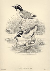
Above, in the middle, the print of a pair of ground thrushes (Pitta concinna) illustrates Gould’s book about the Birds of New Guinea. On the facing page is Gould’s scientific description of the bird, set in metal type and printed by the relief letterpress process. After being printed separately, the parts of the book were issued in installments to subscribers, who had them bound as volumes once complete.
Pitta concinna. John Gould, Birds of New Guinea (London, 1875), Volume 4, Plate 31. Call Number: Ellis Aves H129. This volume has been digitized and is available online. Click image to enlarge.
In vogue during the middle decades of the 19th century, such hand-colored lithographic prints of birds were superior in quality to the earlier hand-colored copper-engraved prints they had replaced. Although succeeded in the second half of the 19th century by color-printed chromolithographs, in the early 20th century by four-color process halftone photolithographs, and in the late 20th century by digital images, Gould’s hand-colored lithographic prints are still esteemed as quality bird images.
However, the Gould example is only one of the stories that could be told about lithography’s impact on the production of graphic images during the 19th century. This is because lithography’s versatility as a chemical process meant that it was not just one new technology but rather a cluster of image making technologies that could be used separately or combined in innovative ways. As well as drawing on grained stone with a crayon, early practitioners drew on polished stone with pen and ink, “engraved” (more accurately “scribed”) lines in a thin coating of gum arabic, or drew with lithographic ink on coated transfer paper. After the mid-19th century these were combined with new methods of transferring images to the printing surface and of printing in color (chromolithography) from multiple lithographic stones or (later) from metal plates. A ground-breaking example of chromolithography is Owen Jones’ book, Plans, elevations, sections, and details of the Alhambra (London, 1842-1845. Drawing flat areas of color on lithographic stones, one stone per color, he printed multi-colored illustrations in remarkably exact registration for his book, but this is a single example. The story of all the many technologies associated with chromolithography would fill a book, one which, in fact, has been well told by Michael Twyman in his 728-page book, A History of Chromolithography: Printed Colour for All (London: The British Library and New Castle, Delaware: Oak Knoll Press, 2013).
We are periodically sharing some of the materials that are featured in Spencer Research Library’s North Gallery permanent exhibit. We hope you’ll be able to visit the library and explore the full exhibit in person!This week’s post highlights materials documenting the history of Sumner High School in Kansas City, Kansas. The Sumner collection is part of the African American Experience Collections within the Kansas Collection.
The “old” Sumner High School building at 9th and Washington Boulevard in Kansas City, Kansas, 1905-1940. This image appeared in the 1922 Sumnerian yearbook. Call Number: RH Ser D1286 1922. Click image to enlarge.
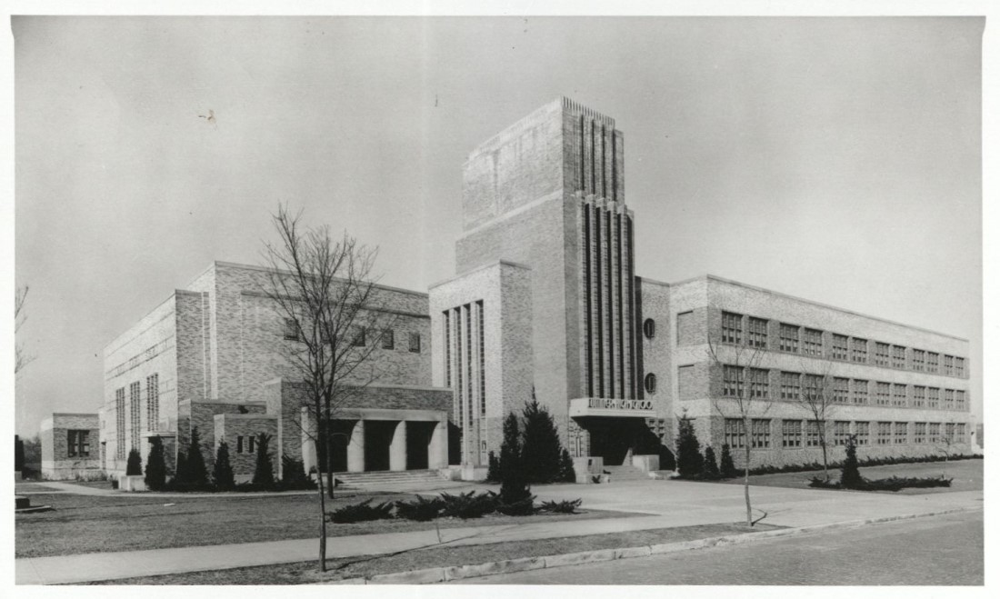
The “new” Sumner High School building at 8th and Oakland Avenue in Kansas City, Kansas, 1940-1978. Sumner High School Records. Call Number: RH MS-P 1137, Box 1. Click image to enlarge.
Established in 1905 in response to the threat of racial violence and a decades long effort to exclude African Americans from the city’s high school, Sumner High School was created by exempting Kansas City, Kansas, from the state law prohibiting racially segregated high schools. However, the local African American community resisted further efforts to further diminish their children’s opportunities to achieve academic excellence. Their relentless push for the school’s curriculum to emphasize college preparation earned Sumner High School’s membership in the prestigious North Central Association of Secondary Schools by 1914. Under a federally mandated plan for racial integration, Sumner closed in 1978.
Due to the Covid-19 pandemic, the 2020 national convention of the Sumner High School Alumni Association of Kansas City, Kansas, has been postponed until next year. In anticipation of the convention – and in honor of the new school year – here are a few highlights from the Sumner High School Alumni Association of Kansas City, Kansas, Collection, established in 1986. Additional donations of materials are welcomed.
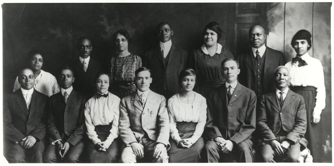
Sumner High School faculty, 1919. Before the late 1950s, Sumner was the only high school in Kansas comprised of an African American faculty and the only high school in Kansas that permitted African Americans to serve as teachers. Sumner High School Records. Call Number: RH MS-P 1137, Box 2. Click image to enlarge.
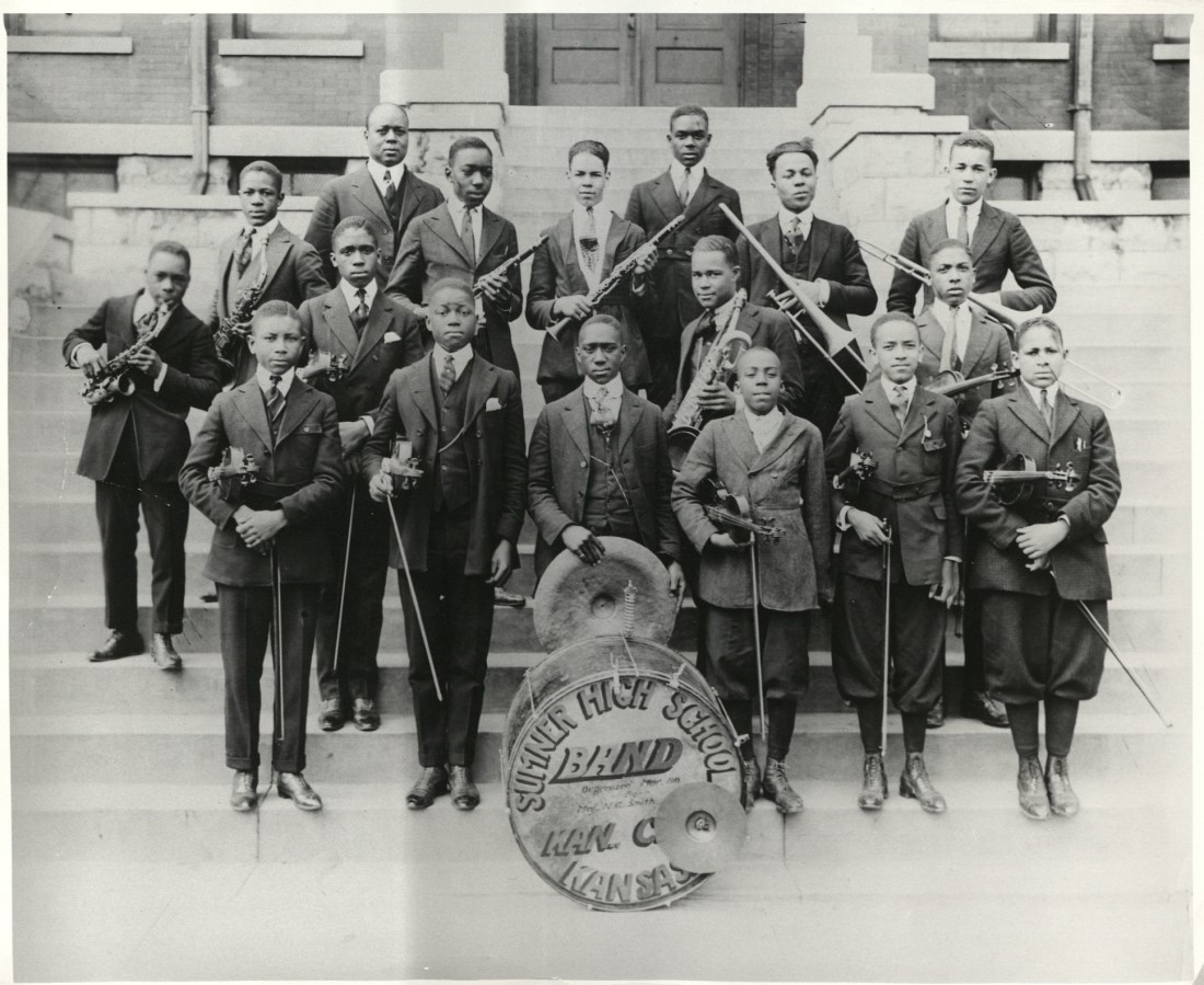
The Sumner High School orchestra, 1918. Sumner High School Records. Call Number: RH MS-P 1137, Box 1. Click image to enlarge.
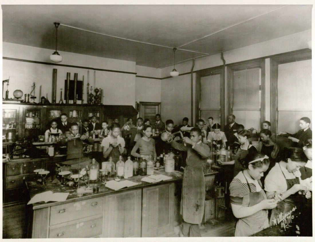
A chemistry class at Sumner High School, 1930s. Sumner High School Records. Call Number: RH MS-P 1137, Box 2. Click image to enlarge.
The film clips below show various aspects of Sumner High School. The first features scenes from a football game in 1931. The second clip, from the 1940s, introduces viewers to the new building, the principal, and staff members; it also shows students arriving for school. There’s no need to turn up the volume on your computer or phone; neither clip has any sound.
See Spencer’s online exhibit “Education: The Mightiest Weapon” to learn more about the active role African Americans in Kansas played in our nation’s past struggle with laws and practices of racial segregation in public schools.
Deborah Dandridge Field Archivist/Curator, African American Experience Collections Kansas Collection
Kenneth Spencer Research Library’s North Gallery houses a permanent exhibit highlighting materials from the library’s various collecting areas: the Wilcox Collection, the Kansas Collection, Special Collections, and University Archives. While the library is closed to the public, we hope you enjoy the periodic exhibit highlights we’ll be sharing on the blog. Once Spencer reopens, we hope you’ll be able to visit the library and explore the full exhibit in person!
The University Archives portion of the North Gallery exhibit showcases materials related to University Chancellors, faculty, athletics, and student life. In one interactive part of the exhibit, visitors can peruse a timeline of highlights from nearly 150 years of KU’s history.
Below are two videos from the timeline. The first (which has no sound) is a compilation of film clips and photographs showing snippets of student life at KU during the 1940s. The second video contains clips of Robert F. Kennedy’s speech at Allen Fieldhouse on March 18, 1968.
Molly Herring Associate Archivist, University Archives
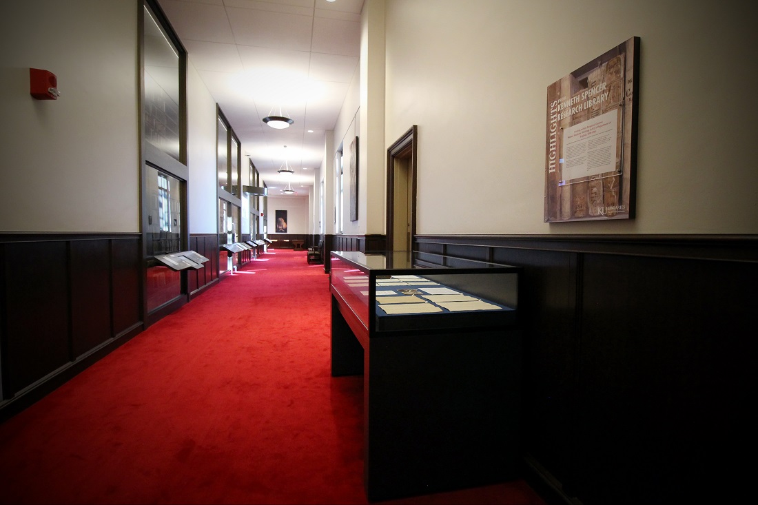
A new temporary exhibit is currently on display at the entrances to the North Gallery at Kenneth Spencer Research Library. This exhibit is titled “Writing within Required Genres: Women Students’ Writings in KU’s Department of English, 1899-1900” and showcases many of the materials that serve as the basis of my dissertation work in the Department of English’s Rhetoric and Composition Ph.D. program.
The temporary exhibit case on the east side of Spencer’s North Gallery.
Click images to enlarge.
Throughout its history, the Department of English at the University of Kansas has experienced many changes in its structure, policies, and approaches to the teaching of writing. In this exhibit, materials from KU’s University Archives at Kenneth Spencer Research Library help narrate a snapshot of time in that history—the turn from the nineteenth to the twentieth century, and a course titled “Advanced English Composition.”
This exhibit provides information about the Department of English, its teachers, and this particular course. Moreover, it showcases the importance of examining the writings of individual students and their unique responses to the writing instruction they received.
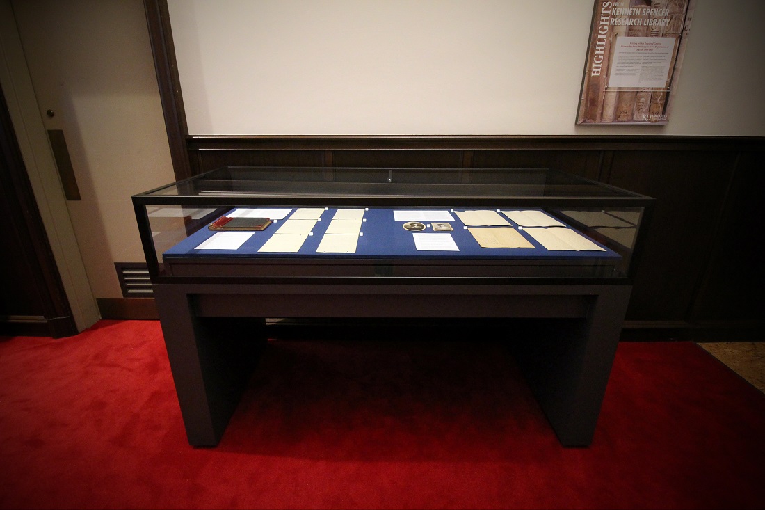
Exhibit Case 1 is located at the west entrance to the North Gallery. It contains materials that help contextualize “Advanced English Composition” and the student writings produced for it. Included are course catalogues, photographs, English Department publications, and more.
Exhibit Case 1 seeks to contextualize the writings of students
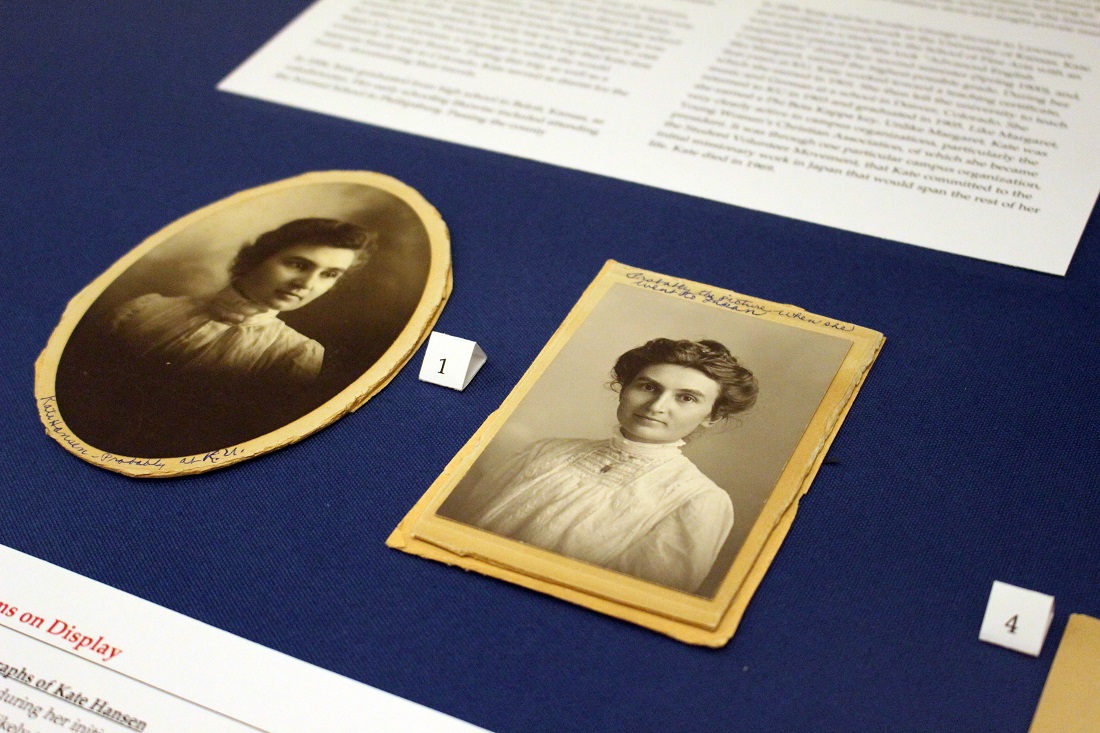
Margaret Kane and Kate Hansen. Click image to enlarge.
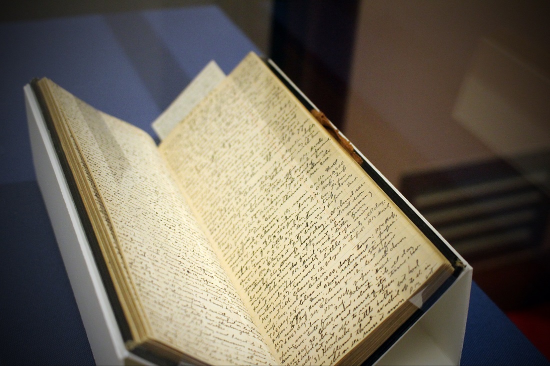
A sample item on display in Exhibit Case 1: a diary of KU English Professor Edwin M. Hopkins. Call Number: PP 73. Click image to enlarge.
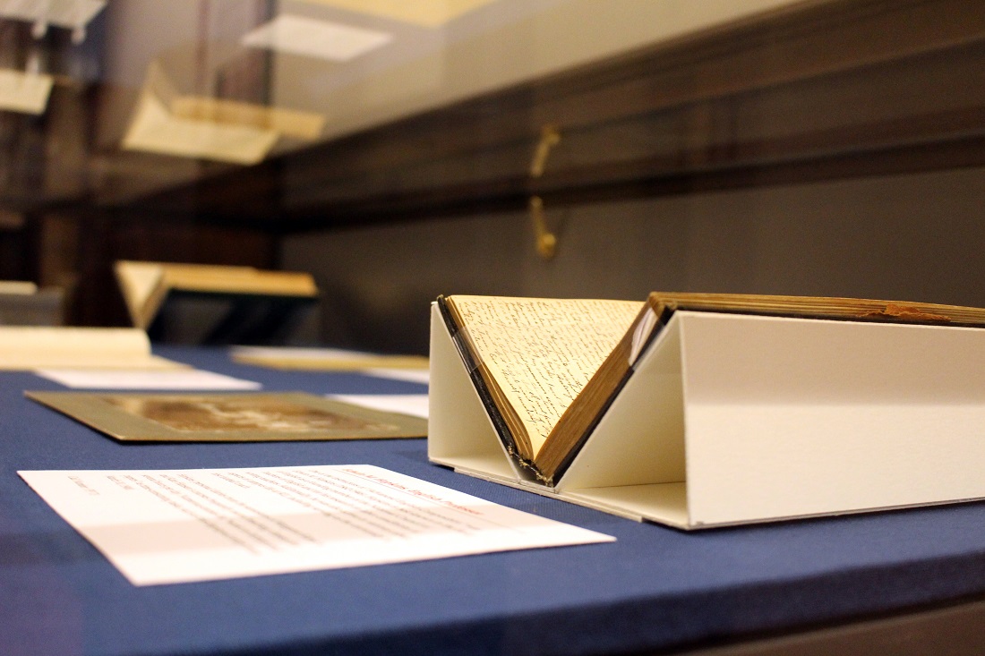
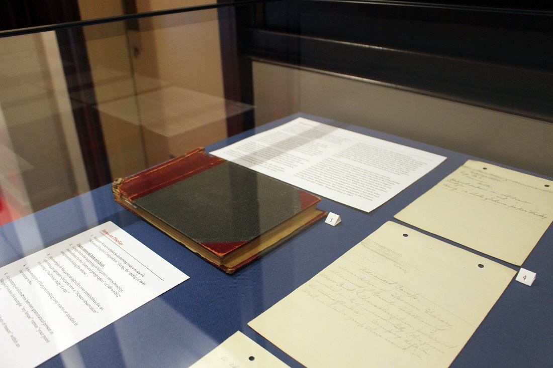
Exhibit Case 2 is located at the east entrance to the North Gallery. It contains the actual writings produced by two women students for “Advanced English Composition”: the 1899 course notes of Margaret Kane (PP 23) and the 1900 course papers of Kate Hansen (PP 19). These texts were required for the successful completion of their courses. They show instances of Margaret and Kate writing within, pushing against, and even occasionally even moving beyond the expectations of these genres. These writings stress the importance of viewing students—those in the past and in the present—as unique individuals, not a homogeneous group.
Exhibit Case 2 highlights information from life of student
Margaret Kane and features her notebook and course notes.
Call Number: PP 23. Click image to enlarge.
Exhibit Case 2 likewise highlights information about the life of student
Kate Hansen, including these two photographs taken during and
shortly after her time at KU. Call Number: PP 19. Click image to enlarge.
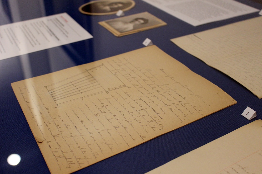
Among Kate Hansen’s featured papers is her essay providing a
“Description of a Library Chair.” Call Number: PP 19. Click image to enlarge.
Curating this exhibit has been a joy. It has provided an opportunity to share my research with a more public audience, a feature that dissertations and the academic publications that stem from them too often lack. I’m extremely grateful to the staff at Kenneth Spencer Research Library—particularly those in public services, conservation, and University Archives—for assisting me with this process.
Sarah E. Polo
KU Doctoral Candidate in Rhetoric and Composition
Public Services Student Assistant