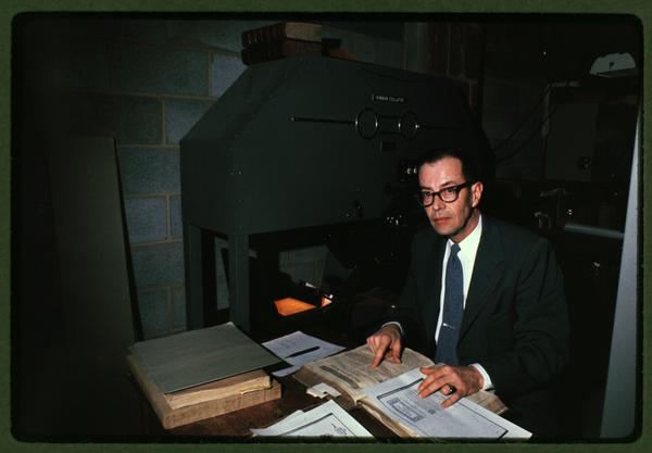
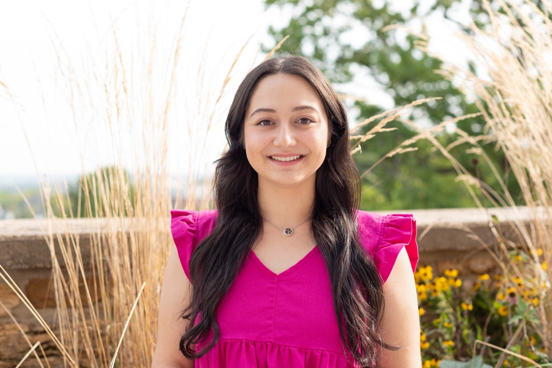
Meet the KSRL Staff: Rebekah Ramos
February 4th, 2026This is the latest installment in a recurring series of posts introducing readers to the staff of Kenneth Spencer Research Library. Today’s profile features Rebekah Ramos, who joined Spencer Research Library in August 2025 as the Curator of Latina/o Collections.
Where are you from?
I was born and raised in Puerto Vallarta, Jalisco, Mexico but I moved to Texas when I was sixteen. I jumped around the state quite a bit for school, living in cities like Frisco, Lubbock, Sherman, and most recently Austin.
What does your job at Spencer entail?
As curator of Latina/o Collections I’m in charge of collecting materials that document and preserve the history of Latina/o individuals, families, and organizations in Kansas. Latinos have been part of this state’s history for more than a hundred years, and I’m working to build a collection that reflects the many experiences and stories that exist within this community.
How did you come to work in libraries/archives/special collections?
During undergrad, in the midst of a new semester and trying to stay sane during Zoom classes, I applied for and was hired as a student assistant at the Vietnam Center and Sam Johnson Vietnam Archive’s Oral History Project. During my time there, I reviewed and cleaned up transcriptions of oral history interviews that were conducted with Vietnam War veterans. Then, while I was completing my degree in Information Studies at the University of Texas at Austin, I worked as a graduate student technician at the LLILAS Benson’s Digital Scholarship Lab, where I had the opportunity to work with Latin American and U.S. Latina/o archival materials.
What part of your job do you like best?
I love getting to meet new people! As someone who is not originally from here, it’s been interesting getting to learn about the variety of nationalities, backgrounds, and stories that make up the Latino community in Kansas.
What do you have on your desk?
I have a bunch of sticky notes with reminders of things I need to look up or do, and a huge pile of books I’m trying to read, like What Kansas Means to Me, Who Owns Native Culture?, and Catching Stories: A Practical Guide to Oral History. There are also a couple of trinkets to remind me of home, like a Mexican rag doll I keep under my monitor.
What is one of the most interesting items you’ve come across in Spencer’s collections?
Some of the most interesting items I’ve come across were two photographs I found in the Bourquin Family Collection. Photographs in this collection were taken by a Swiss family that moved to Horton, Kansas, in the late 1800s. The collection’s finding aid showed that there are a couple of photographs that include the name “Little Mexico” in their title.
I was really surprised to find these photographs, since I hadn’t seen any record or evidence of Mexican immigrants in Horton in any of our other collections or online sources. Digitized newspaper clippings confirmed that during the 1920s there was an area of the town that housed many of the Mexican immigrants that had come to work at the local railroad center.
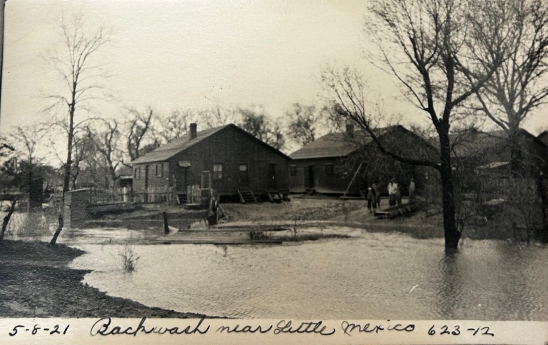
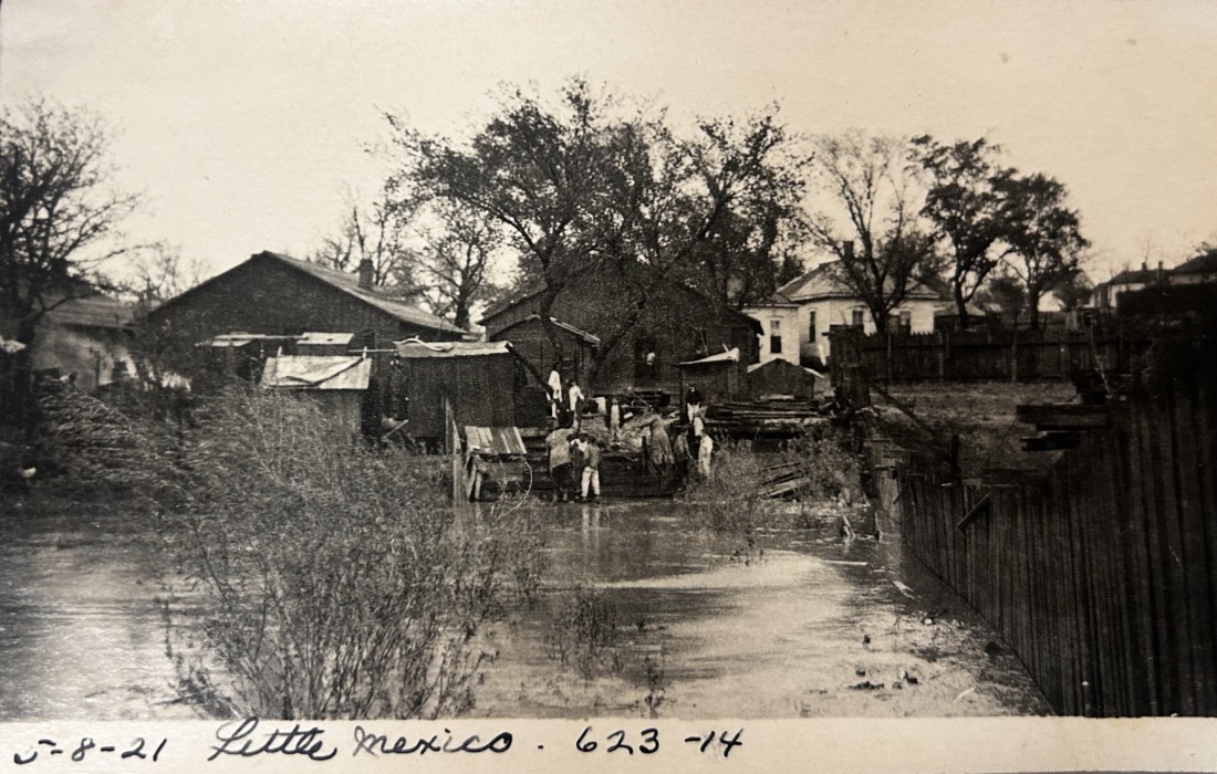
“High water at railroad dam and Little Mexico, May 8, 1921.” Bourquin Family Collection. Call Number: RH PH 30, Box 14, Folder 623. Click images to enlarge.
What are some of your favorite pastimes outside of work?
I am an avid reader and proud bookworm! But I also love going to the movie theater, getting food or coffee with friends, baking, and watching TV.
Rebekah Ramos
Curator of Latina/o Collections