This week’s post is by Dr. Whitney Sperrazza, Digital Humanities Postdoctoral Research Fellow at KU’s Hall Center for the Humanities.
Digital methods offer a new way to teach with and in the archives. I designed my Fall 2018 course, “Digital Feminist Archives,” around this conviction, aiming to build a class that worked at the intersection of archival and digital practices.
For sixteen weeks, twelve students from a wide range of KU departments (English, Women, Gender, and Sexuality Studies [WGSS], History, Humanities, Museum Studies, and Theater) met at the Spencer Research Library to study, transcribe, and develop projects on one object from the library’s holdings: Elizabeth Dyke’s Booke of Recaits (dated 1668).
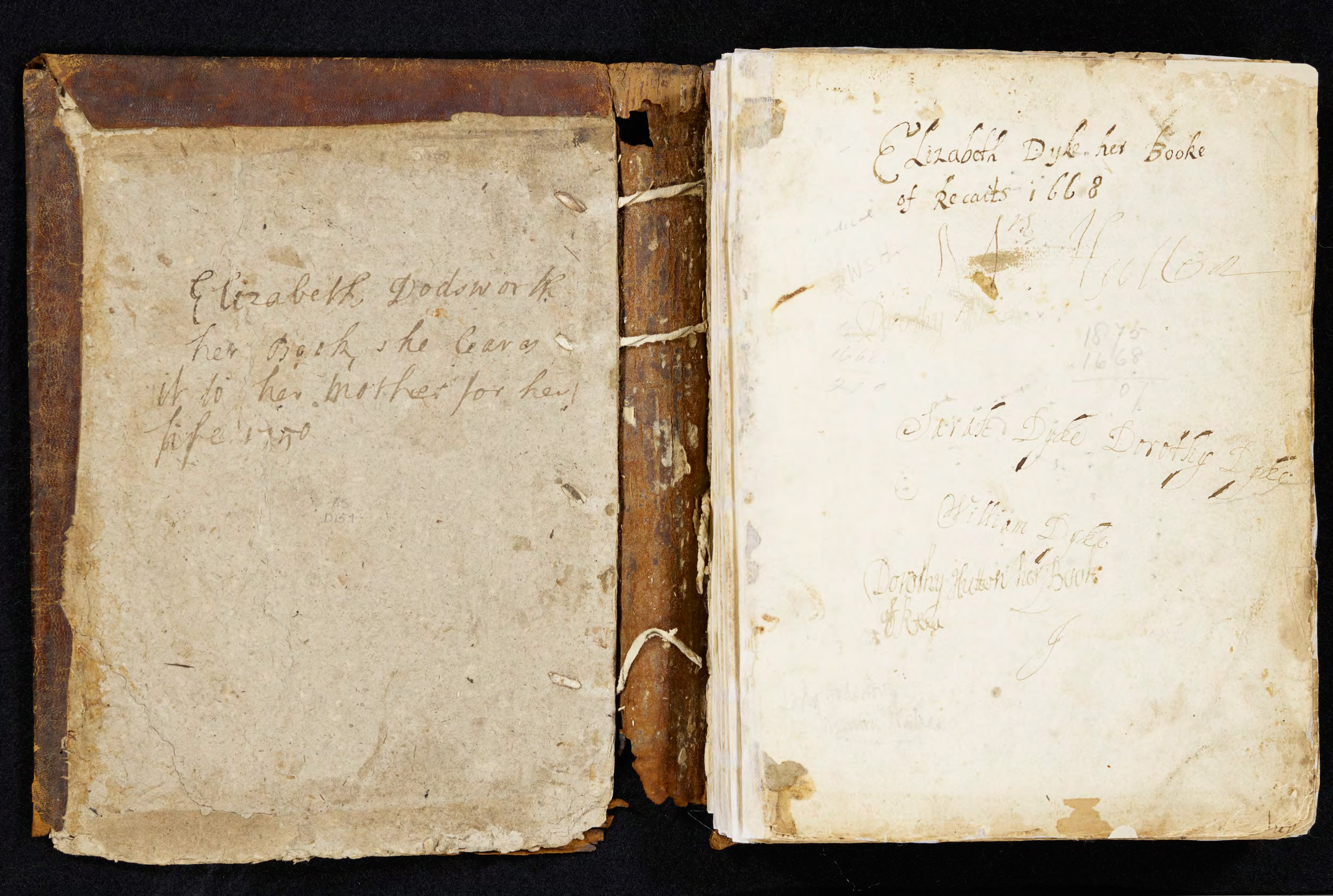
Family Ownership inscriptions in “Elizabeth Dyke, her Booke of Recaits 1668.” England, approximately 1668.
Call Number: MS D157, Opening 2. Click image to enlarge.
Early Women’s Recipes
Are you interested in learning more about early Western remedies for headaches? What about the effectiveness of rose water in preventing plague (56)? Did you know that pickled cucumbers were made frequently in seventeenth-century English households (86) and that powdered hazelnuts were used to stanch bleeding (43)? Or, as Elspeth Healey asks in her blog post on the manuscript, are you simply looking for some seventeenth-century dietary advice?
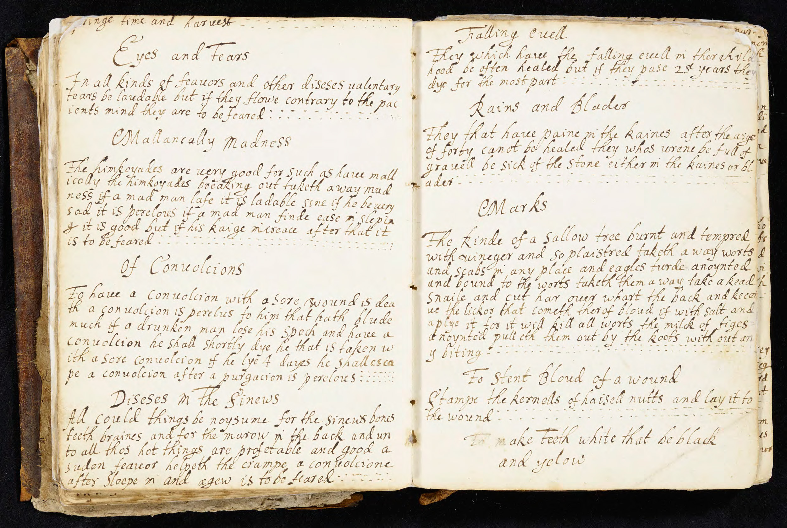
Hazelnuts to stanch bleeding? From “Elizabeth Dyke, her Booke of Recaits 1668.” England, approximately 1668.
Call Number: MS D157, Opening 43. Click image to enlarge.
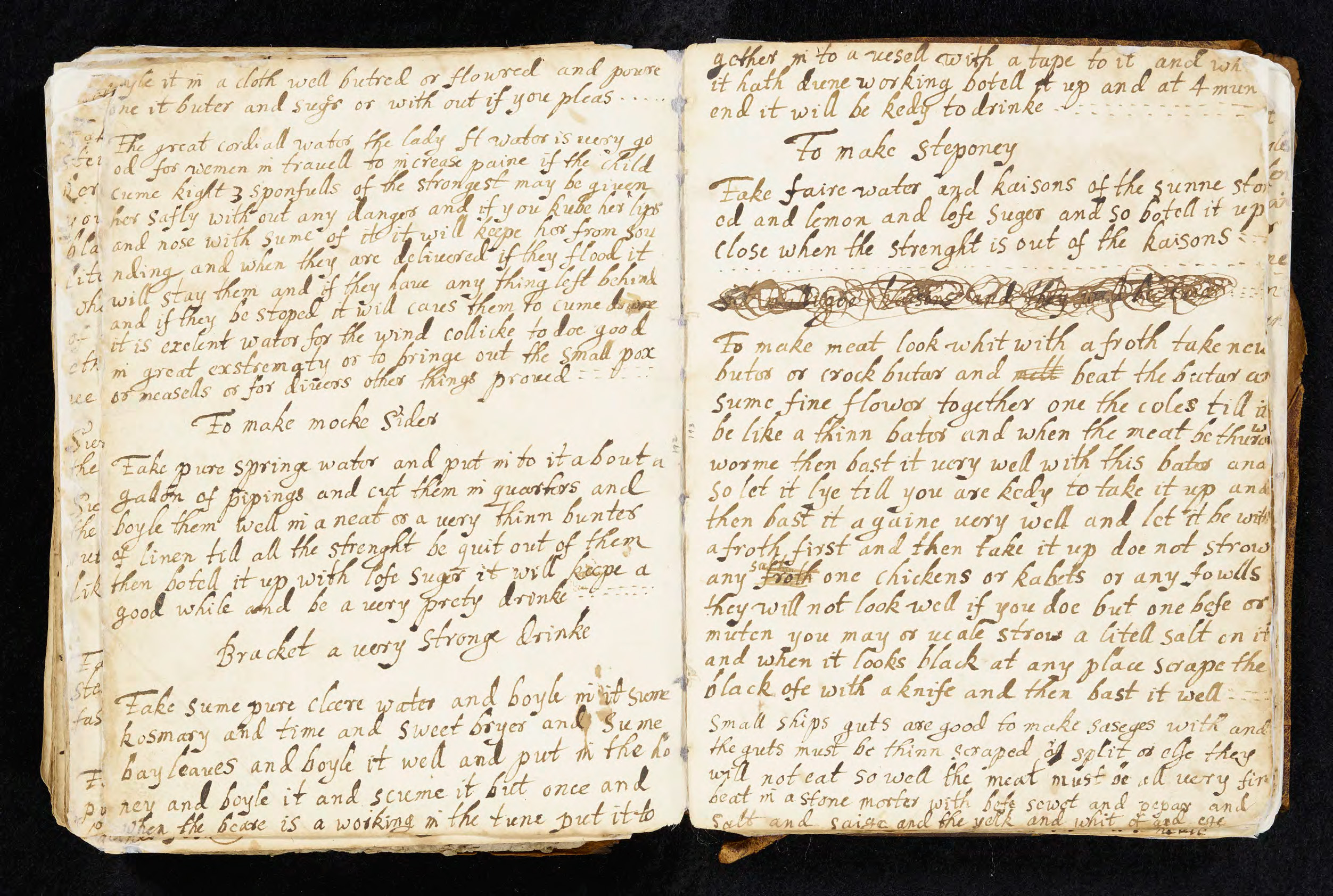
This is just a taste of the wealth of information we collected from Dyke’s Booke of Recaits, which contains over 700 culinary and medicinal recipes. But the manuscript is so much more than a recipe archive. It is a document of familial and social networks and a record of cultural practices.
On the manuscript’s opening page (see photo above), several women catalogued their ownership of the book—Sarah Dyke, Dorothy Dyke, Elizabeth Dodsworth—suggesting that the text was passed down through the family’s female line. Like many surviving recipe books from the period, the titles of the recipes themselves also include names of women and men, either to note the original creator of the recipe (“Lady Rivers’ recipe for orange or lemon cakes”) or to mark the recipe’s effectiveness (“A very good green salve and ointment proved often times by goodwife Wesens”).
The Spencer Library acquired the manuscript in 1977 from UK bookseller, Henry Bristow Ltd, and it was recently featured in an exhibition titled, “Histories of the English Language” (Summer 2017). While the manuscript has long been available for visitors to the Spencer, it is now available as part of the KU Libraries digital collections and as a fully searchable (original spelling only) transcription on the “Digital Feminist Archives” course site.
Collaborative Close Reading
I designed the course syllabus to build gradually toward the students’ final digital projects, so the first eight weeks were dedicated to close study and transcription of the manuscript’s content. The students became experts on this archival object through their transcription work and their conversations with each other on the manuscript’s content and structure.
The students each transcribed and encoded a section of manuscript pages and, one day per week, we structured the class as a large-scale text encoding project meeting. Students came to class with examples and questions from their assigned pages and we dedicated these class sessions to collective conversation about encoding standards and transcription problems. We started with basic observations—things like, “this is what Dyke’s r looks like”—but the conversations quickly became more complicated and critically rich: should we include content that’s been crossed out? how should we note text that’s been lost due to page damage?
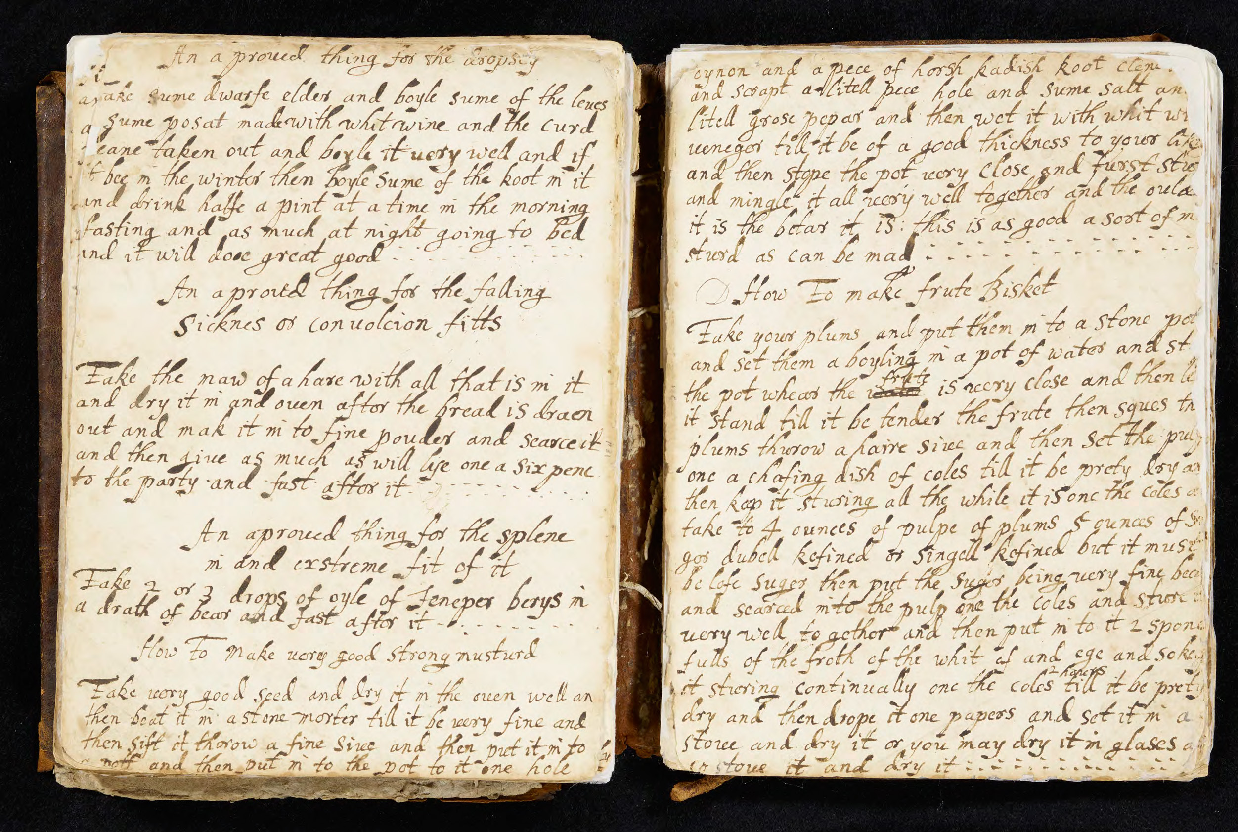
Example of lost text (top) and crossed out text (bottom) in “Elizabeth Dyke, her Booke of Recaits 1668.” England, approximately 1668.
Call Number: MS D157, Openings 95 and 99. Click images to enlarge.
As an instructor, it was thrilling to participate in these student-driven discussions and listen as the students grappled with the critical and methodological decisions that go into transforming a physical object into digital content. Our focus was on the process rather the product, and part of that process was working together to really know this archival object. In addition to giving students insight into the logistics of digital project development, these lab sessions became opportunities for collaborative reading of the manuscript’s content as students shared interesting passages, unexpected recipe titles, and common ingredients.
Interdisciplinary Networks
The students’ collective transcription work became the basis for their final project development. Through their projects, the students animated this archival material. One group transformed Dyke’s medicinal recipes into a crowd-sourced ailments and remedies platform modeled on WebMD (WebED).
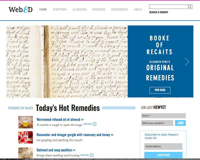
WebEd, a student project centered on Elizabeth Dyke’s Booke of Recaits for ENGL 590 | ENGL 790 | HUM 500 | WGSS 701: Digital Feminist Archives, Fall 2018. Click image to enlarge.
One group tried their hand at making some of the recipes, using Dyke’s directions to capture the historical experience (Cooking 17th-Century Recipes). Another group developed teaching resources and updated versions of the recipes to explore how Dyke’s recipes remain relevant for today’s audiences (Using Early Modern Recipes Today). Finally, one group mapped the availability of several of Dyke’s ingredients, tracking how the ingredients would have been traded across different parts of the world (Mapping Elizabeth Dyke’s Recipes).
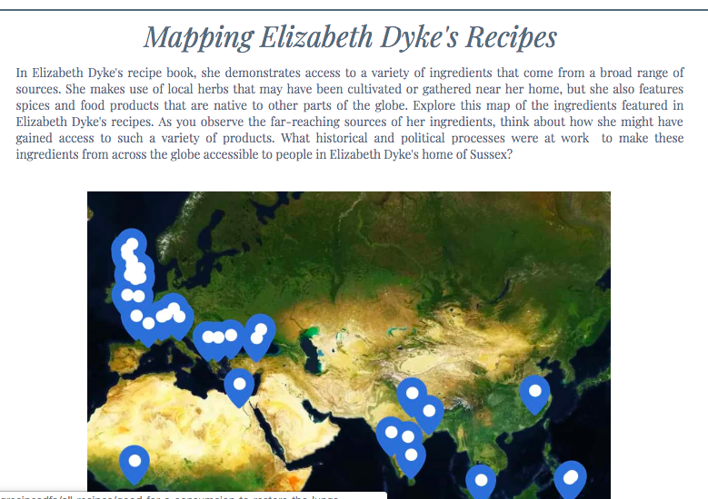
“Mapping Elizabeth Dyke’s Recipes,” a student project for ENGL 590 | ENGL 790 | HUM 500 | WGSS 701: Digital Feminist Archives, Fall 2018. Click image to enlarge.
The students’ transcription work and project development built on ongoing digital work on early modern recipes (for instance, the Early Modern Recipe Online Collective and The Recipes Project), connecting the students’ original research to wider networks across the country. Most crucial, though, were the lessons we gained from the interdisciplinary networks at work in the classroom. With this archival object as our focal point, we all found ways to draw on and expand our particular areas of interest and expertise.
Digital projects require significant time, labor, and resources. If I learned anything from designing and leading this course, it’s that one semester is not long enough for such an endeavor. We merely scratched the surface of what’s possible with such a rich archival object and, hopefully, our efforts will be a starting point for much more work to come.
Whitney Sperrazza
Digital Humanities Postdoctoral Research Fellow
Hall Center for the Humanities
[Thank you to everyone at KU who worked hard to make this class possible and offered support for the students’ work at various stages: Elspeth Healey, Brian Rosenblum, Whitney Baker, Jocelyn Wehr, Erin Wolfe, Jonathan Lamb, and Scott Hanrath. And, of course, my sincerest gratitude to the “Digital Feminist Archive” students, all of whom brought so much energy to this process: Brianna Blackwell, Gwyn Bourlakov, Mallory Harrell, Yee-Lum Mak, Jodi Moore, Sarah Polo, Elissa Rondeau, Kate Schroeder, Phoenix Schroeder, Suzanne Tanner, Rachel Trusty, and Chris Wright.]