To Remember World AIDS Day: The Rich Crank AIDS Poster Collection
December 5th, 2013To commemorate the 25th anniversary of World AIDS Day (on December 1, 2013), we speak with KU Libraries staff member Rich Crank, who recently donated about 175 posters and related materials about AIDS awareness to the Kansas Collection.
When, why and how did you start this collection?
I started actively collecting materials in the mid-1990s. Being gay, I’d learned about what we now know as HIV/AIDS when the first stories about a “gay cancer” started to circulate.
I knew better than to believe that cancer could distinguish people by sexual orientation and quickly found out it was an already-known cancer that had previously been found in older men whose immune systems had weakened as they aged. But these clusters of Kaposi’s sarcoma (KS) were among young gay men who had been healthy until the onset of KS. I also learned that Pneumocystis pneumonia was suddenly appearing in the gay community that also was a sign of a compromised immune-system.
In January of 1993, I learned that a very dear friend, Benet Hanlon, had died of AIDS months earlier. Benet had been a Catholic priest I met at KU. He left Lawrence and moved to Baltimore where he founded a soup kitchen named Beans and Bread that still exists. Though a priest, Benet knew and accepted that he was gay. He finally left the priesthood while in Baltimore. I decided to do something in his memory that would increase awareness of HIV and AIDS. My poster collection is the result and I exhibited them locally multiple times over the years. All the exhibitions, as well as the donation of the posters to Spencer Library, were in Benet’s memory.
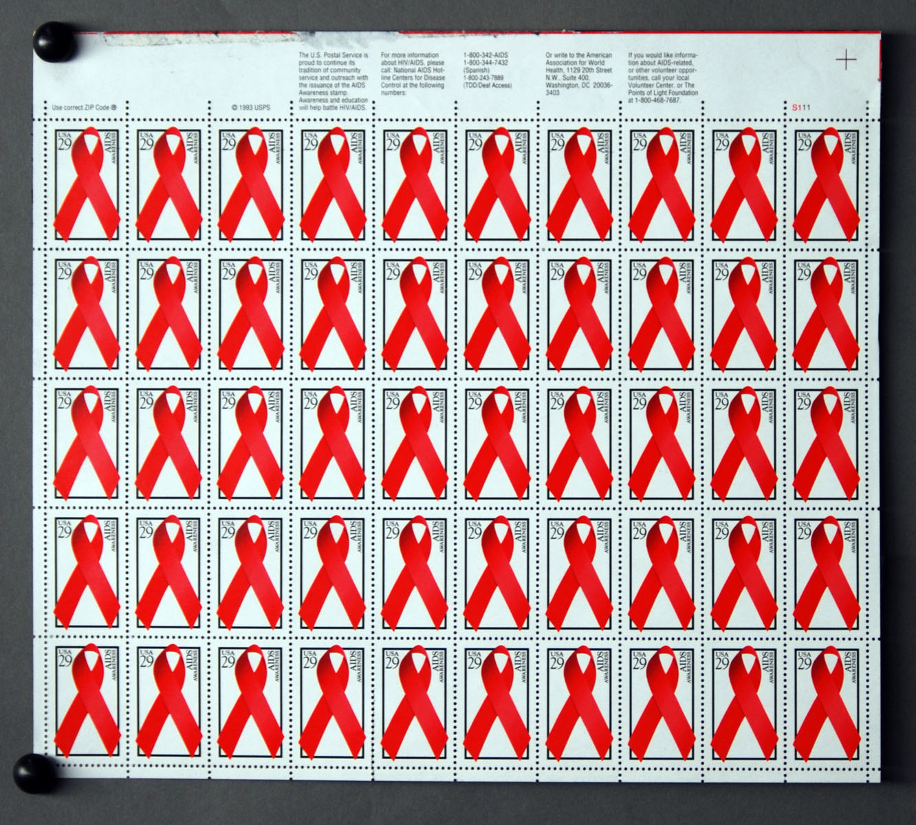
Commemorative AIDS awareness U.S. Stamp sheet. Kansas Collection, Call number RH Q247. Click image to enlarge.
How many posters and other items are there in it?
There are about 175 posters in the collection. I’ve used the internet to search some digitized collections and some of my posters seem to be pretty rare among U.S. libraries. There’s at least one from every continent except Antarctica. Along with the posters, I donated a number of books, magazines, and other material about HIV/AIDS.
What do you find most interesting about them?
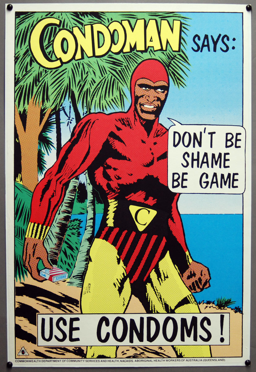
The range of presentation seems amazing to me. Obviously some target gay men but most don’t. Some use only words, others include both text and images. Many are black and white. Among my favorites are three from Boston’s AIDS Action Committee that are titled “Best time to talk with your partner about condoms is …”; they use text and typography alone to convey their messages in a novel – and humorous – way. “Condoman,” from Australia, and the Canadian “Look who can get AIDS” posters are also especially memorable.
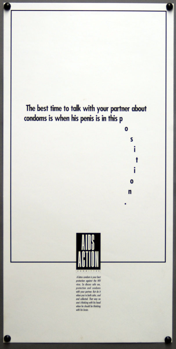
Left: “The best time to talk with your partner about condoms is . . .” Kansas Collection, Call number RH R307.
Right: “Condoman . . .” Kansas Collection, Call number RH R247. Click images to enlarge.
How can they be used in research and/or teaching?
I thought a lot about that as I considered whether to try to sell them as a collection or donate them so they could be freely available to anyone interested in them. Donating the collection to Spencer Research Library makes the latter possible. It occurred to me that they could be of value for students and researchers in visual arts and design, sociology, cultural anthropology, probably a number of other fields as well.
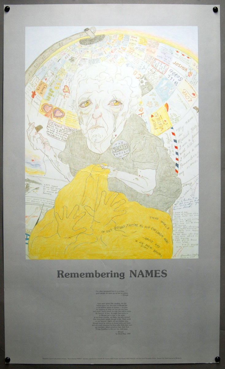
Left: “Remembering NAMES” poster, designed by Kansas artist Elizabeth “Grandma” Layton.
Kansas Collection, Call number RH R230.
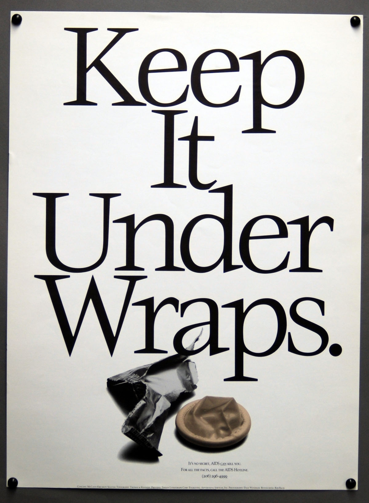
Right: “Keep it under wraps.” Kansas Collection, Call number RH R320. Click images to enlarge.
Rich Crank
Donor of AIDS Poster Collection and KU Libraries staff member
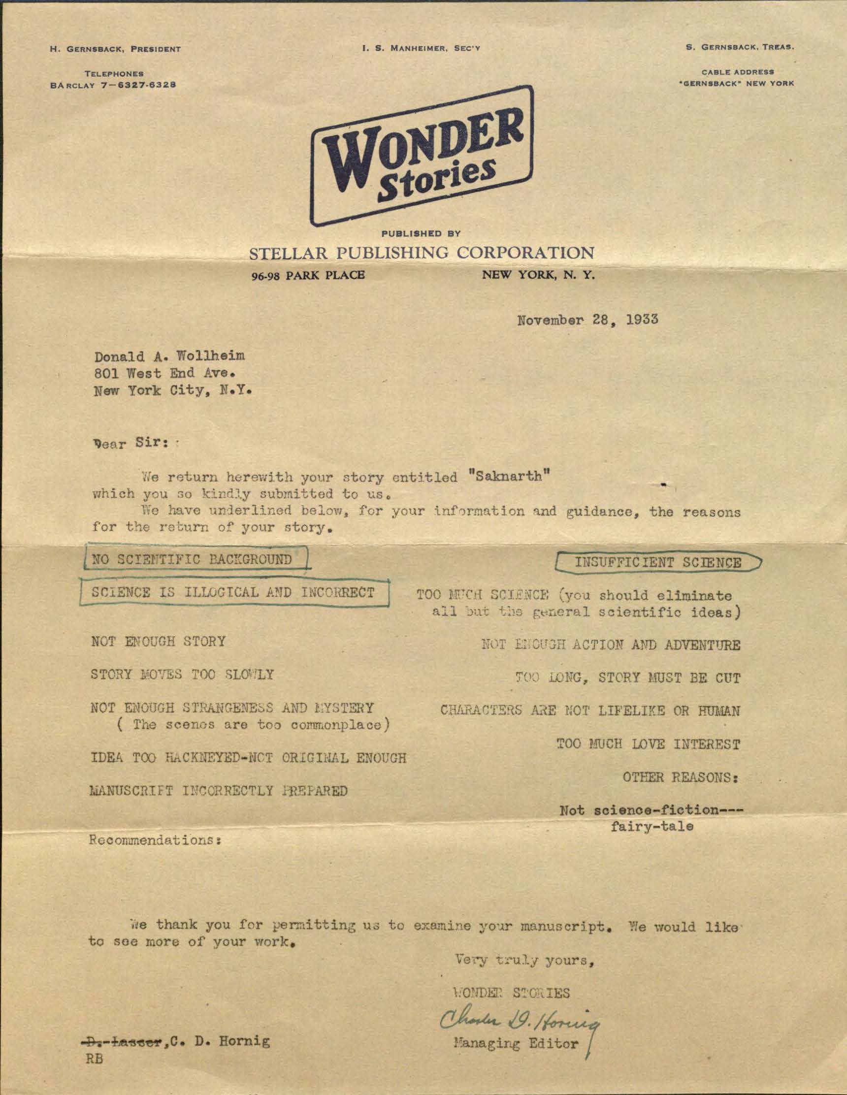
![Image of Wonder Stories' form rejection letter for Wollheim's "The Second Moon", [1933]](http://blogs.lib.ku.edu/spencer/wp-content/uploads/2013/11/MS_250_b4_f8_form1.jpg)
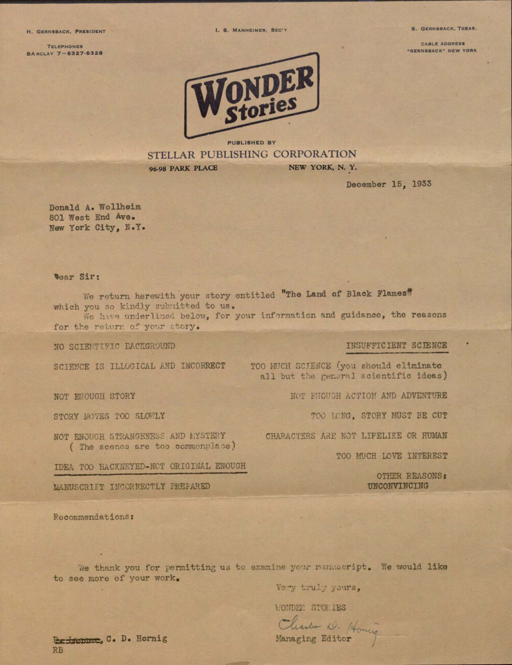
![Image of Wonder Stories' form rejection letter for Wollheim's "The Discovery of the Martians", [1933].](http://blogs.lib.ku.edu/spencer/wp-content/uploads/2013/11/MS_250_b4_f8_form2.jpg)
![Detail from Wonder Stories' form rejection letter for Donald A. Wollheim's Story "The Second Moon," [ca. 1933]](http://blogs.lib.ku.edu/spencer/wp-content/uploads/2013/11/MS_250_b4_f8_form1_detail.jpg)