Welcome to the Kenneth Spencer Research Library blog! As the special collections and archives library at the University of Kansas, Spencer is home to remarkable and diverse collections of rare and unique items. Explore the blog to learn about the work we do and the materials we collect.
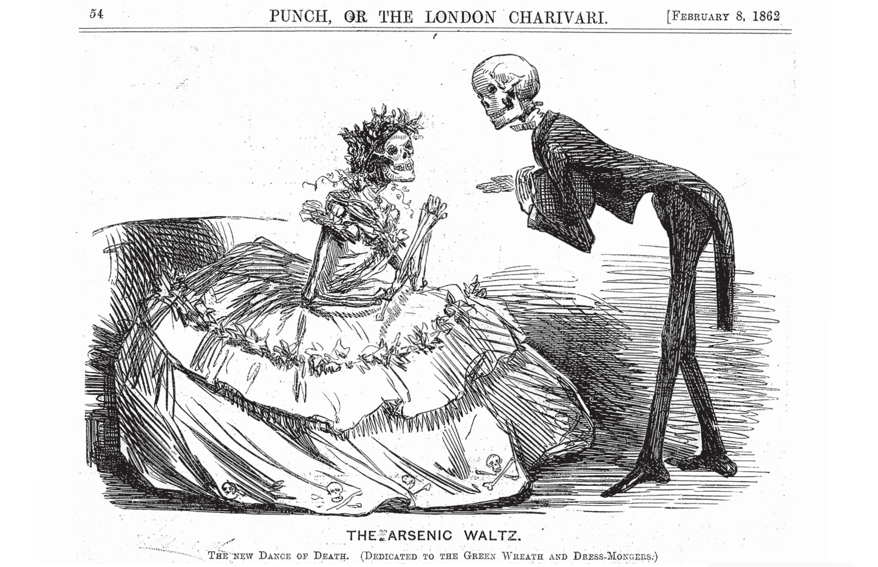
“The Arsenic Waltz. The New Dance of Death. (Dedicated to the Green Wreath and Dress-Mongers.)” Punch, or The London Charivari, February 8, 1862. Call Number: AP 101. P8. Click image to enlarge.
In 1775, the chemist Carl Wilhelm Scheele developed a striking shade of green that proliferated in the Western markets, creating a cultural phenomenon that could be — and in some cases was — deadly. Scheele’s green, a brighter and cheaper pigment to produce than previously popular shades, was one of many arsenical compounds that was used in soap, clothing, wallpaper, and even food for much of the nineteenth century. But the arsenic present in Scheele’s green (and pigments like it) can still be unsafe when handled for extended periods, which means a book that contains this Victorian Era pigment could pose its own risks today.
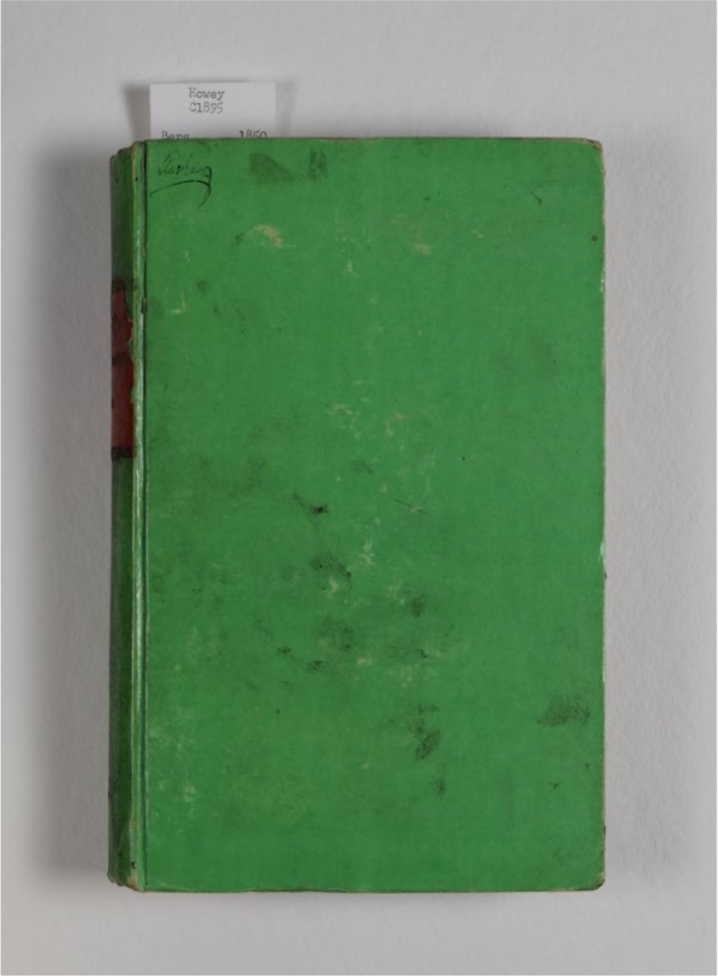
A book covered in vibrant green, arsenic-positive paper. Die Staatsforstwirthschaftslehre. Berg, Karl. Leipzig, 1850. Call Number: Howey C1895. Click image to enlarge.
Step One: Publication Date
At the beginning of the nineteenth century, bookbinders began constructing their own covers separately from the main textblock of each book. This, along with the introduction of a new cover material called bookcloth, allowed Victorian Era book covers to be elaborately dyed and decorated with an array of pigments; Scheele’s green and Paris green (or emerald green, or copper acetoarsenite) being the most arsenic-rich among them. Tracking these new developments, arsenical bookbindings are most likely to be found between the years 1820 and 1880, when the pigments began to be phased out slowly and irregularly across different regions. Because of this, any green book published in the nineteenth century could be a contender.
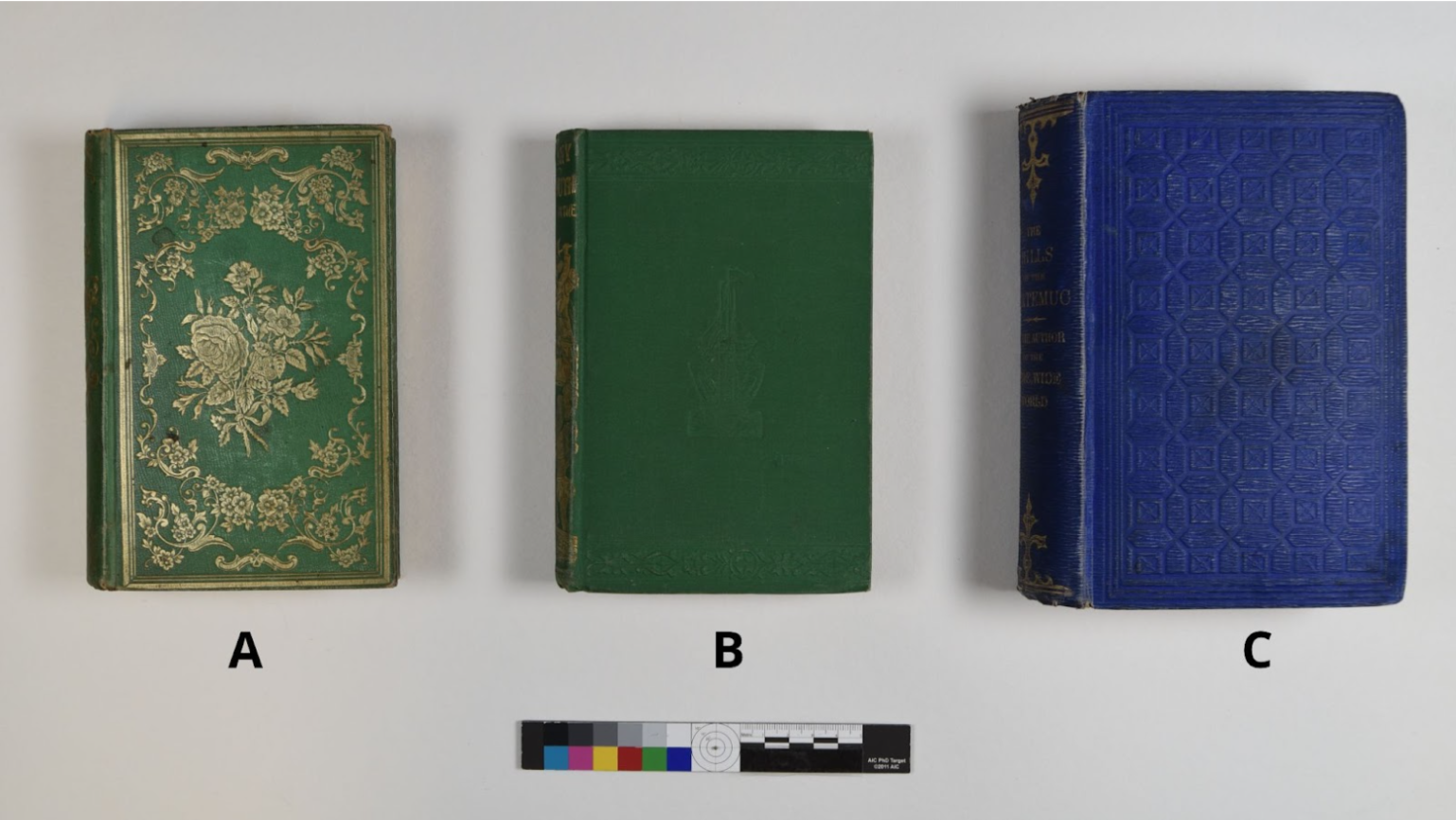
Three volumes from various Spencer collections. Books A and C tested positive for arsenic; book B did not. Call Numbers: Book A, Children 1256. Book B, Children 1599. Book C, B12009. Click image to enlarge.
Step Two: Pigment
Arsenical pigmentscan take many forms, but they are most associated with the vibrant, almost neon shade of green that is shown in the first image, of Die Staatsforstwirthschaftslehre. In some cases, arsenical green stands out like a poison dart frog, but in other cases it’s not so clear. Many of the arsenical titles we’ve identified in KU’s collections align with this typical green pigment, but there have also been some surprises, such as the bright blue book in the image above, or greens that appear to be Scheele’s or emerald but chemically are not. This is where X-Ray Fluorescence (XRF) technology comes in.
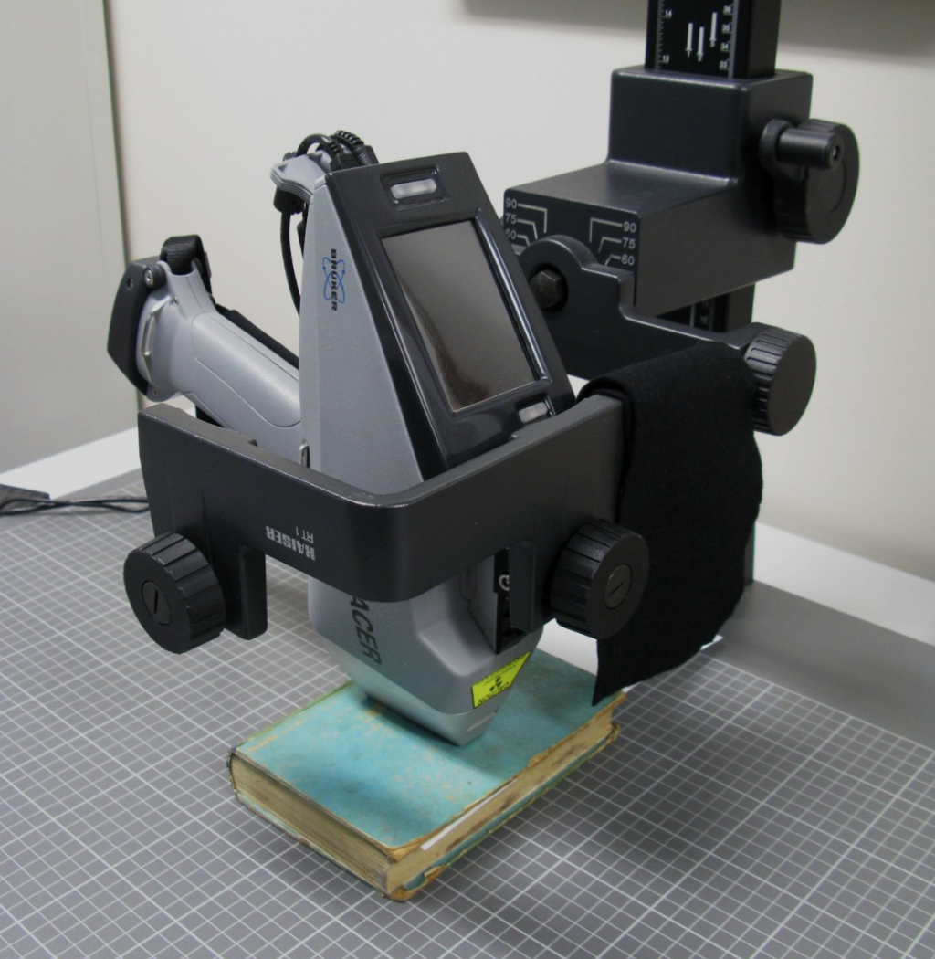
The conservation lab’s XRF machine set up to test a 19th-century book for the presence of heavy metals. Click image to enlarge.
An arsenic-positive spectrum produced from an XRF test. Click image to enlarge.
Step Three: XRF Technology
Due to all these variables, the only sure way to identify a poison book is to test it. In the Spencer Research Library’s conservation lab, we’ve been using XRF technology to test KU’s 19th-century books as part of a larger effort protecting patrons against potentially toxic heavy metals. This machine produces a spectrum graph that allows us to identify which elements are present in an item. Through this process, we’ve identified a number of “poison books” which can now be properly labeled, contained, and served in the reading room with appropriate precautions assuring that the information in a potentially harmful book remains accessible while the patron handling it remains safe.
By Reece Wohlford, Heavy Metals in Bookbinding Project Student Assistant
In the course of my work as a conservator at KU Libraries, one of my favorite bookbinding features to spot “in the wild” is paste paper. A book covered in paste paper might come to the lab for treatment, or I might catch sight of one while working in the stacks, and I always take a moment to look at them closely and enjoy the variety of colors, patterns, and styles that paste papers come in. It was no easy task to narrow down Spencer’s abundant selection of paste papers to just a few volumes that will be on view in a temporary exhibit in the North Gallery through August and September.
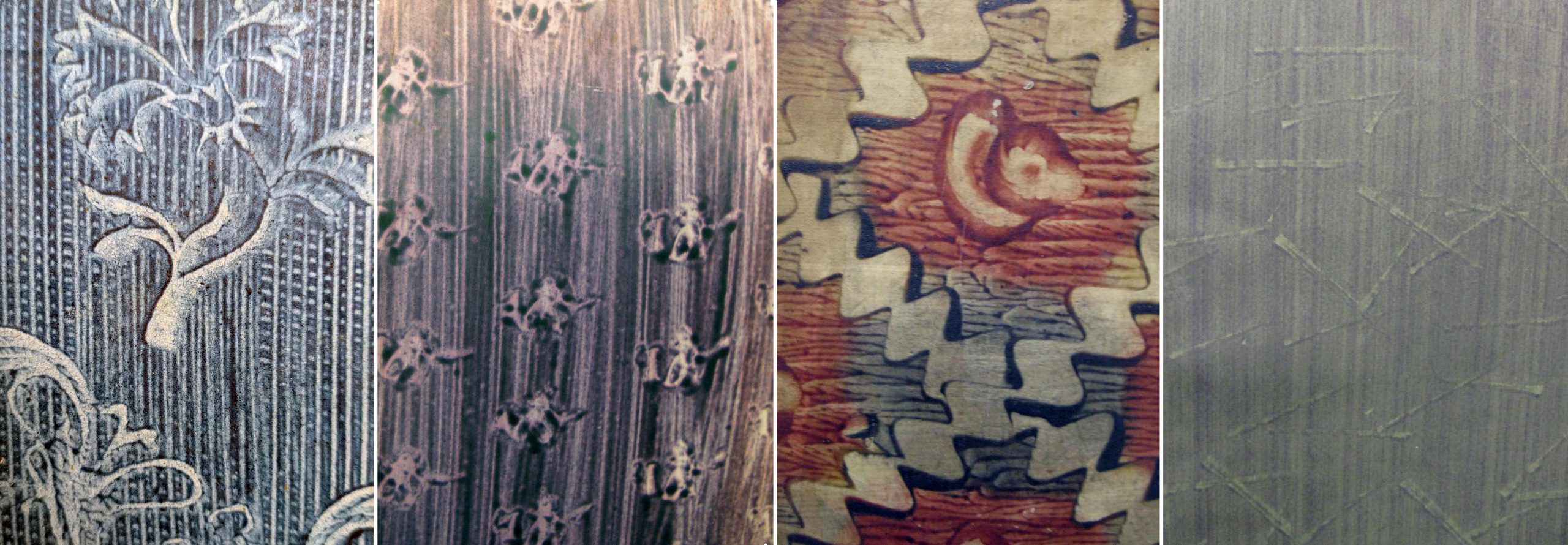
Paste paper is a style of decorative paper made by coating the surface of paper with a thick pigmented starch adhesive (usually wheat paste or methylcellulose) and then manipulating the wet paste mixture to create patterns. Combs, stamps, brushes, wadded paper or textiles, rollers, fingers and more could be used to create designs. Paste papers were an economical alternative to marbled papers, which required a high degree of skill and costly materials to produce. No special training or supplies were needed to make paste papers; bookbinders could create them right in their workshops with materials already at hand.
Paste papers were most often used for book covers and endpapers and were popular from the late 16th through the 18th century. Paste papers are often seen on books from Germany and Northern Europe, although there are many lovely examples of block-printed paste papers from Italy. There was renewed interest in paste papers during the Arts & Crafts movement of the late 19th and early 20th century. Today, paste papers are still created by book artists and hobbyists, and can be seen on some fine-press editions. The examples on view represent just a fraction of the many beautiful paste papers found in Spencer’s collections and available to view in the Reading Room.
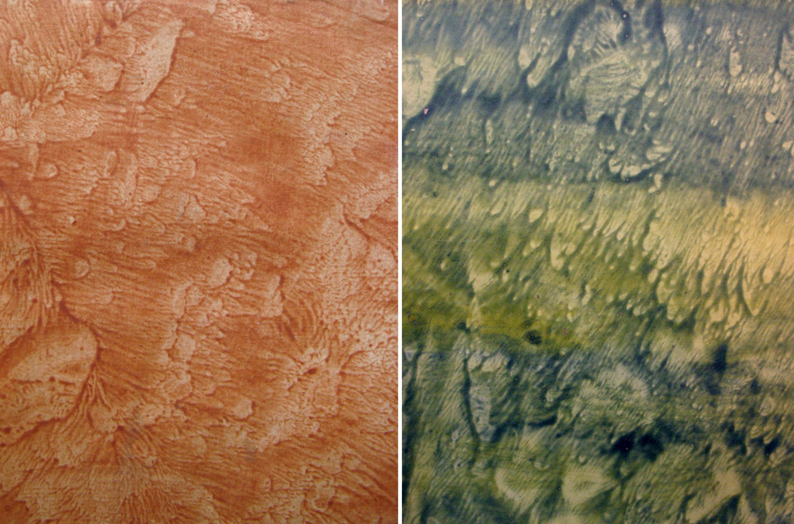
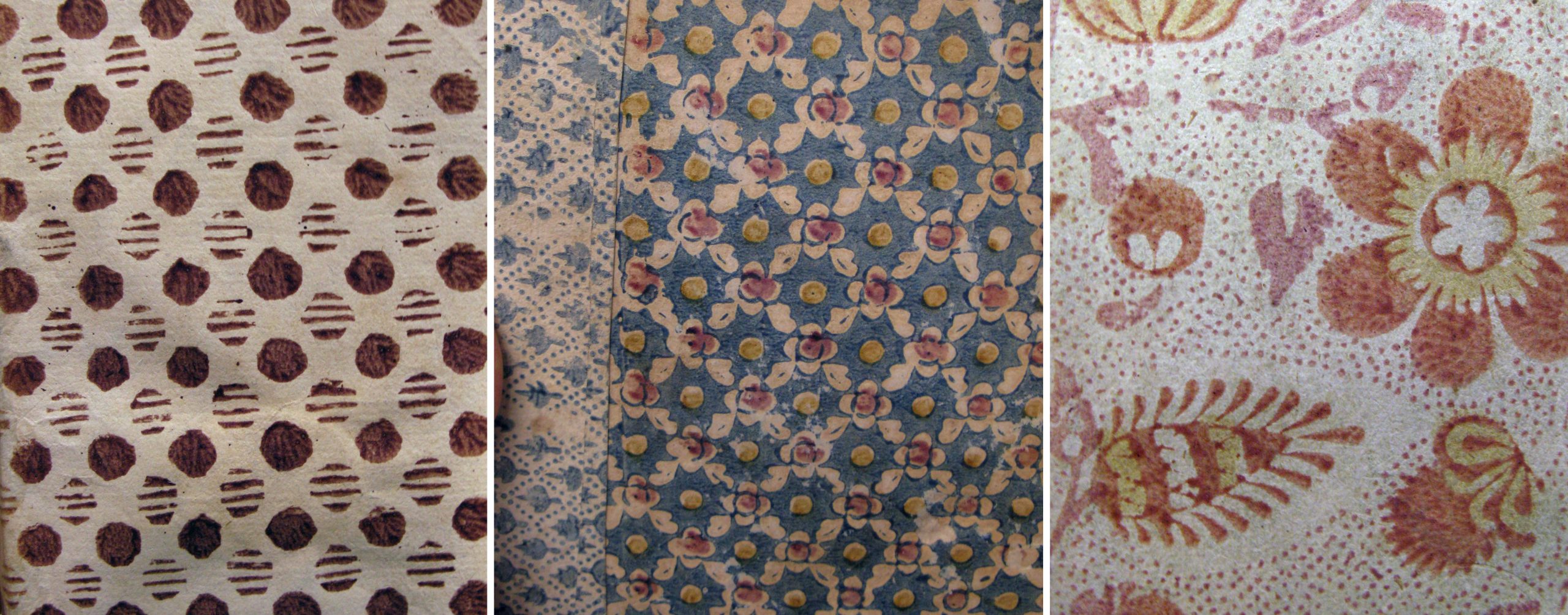
Pulled (or veined) paste papers were created by coating two sheets of paper with the colored paste, pressing the two pasted sides together, and then pulling the sheets apart, creating a unique wave-like pattern on each sheet.
Left: Cover of De Mentha piperitide commentatio botanico medica, 1780. Call Number: C9291. Right: Cover of Rules and orders of the Linnean Society of London,1788. Call Number: Linnaeana C112. Click collage image to enlarge.
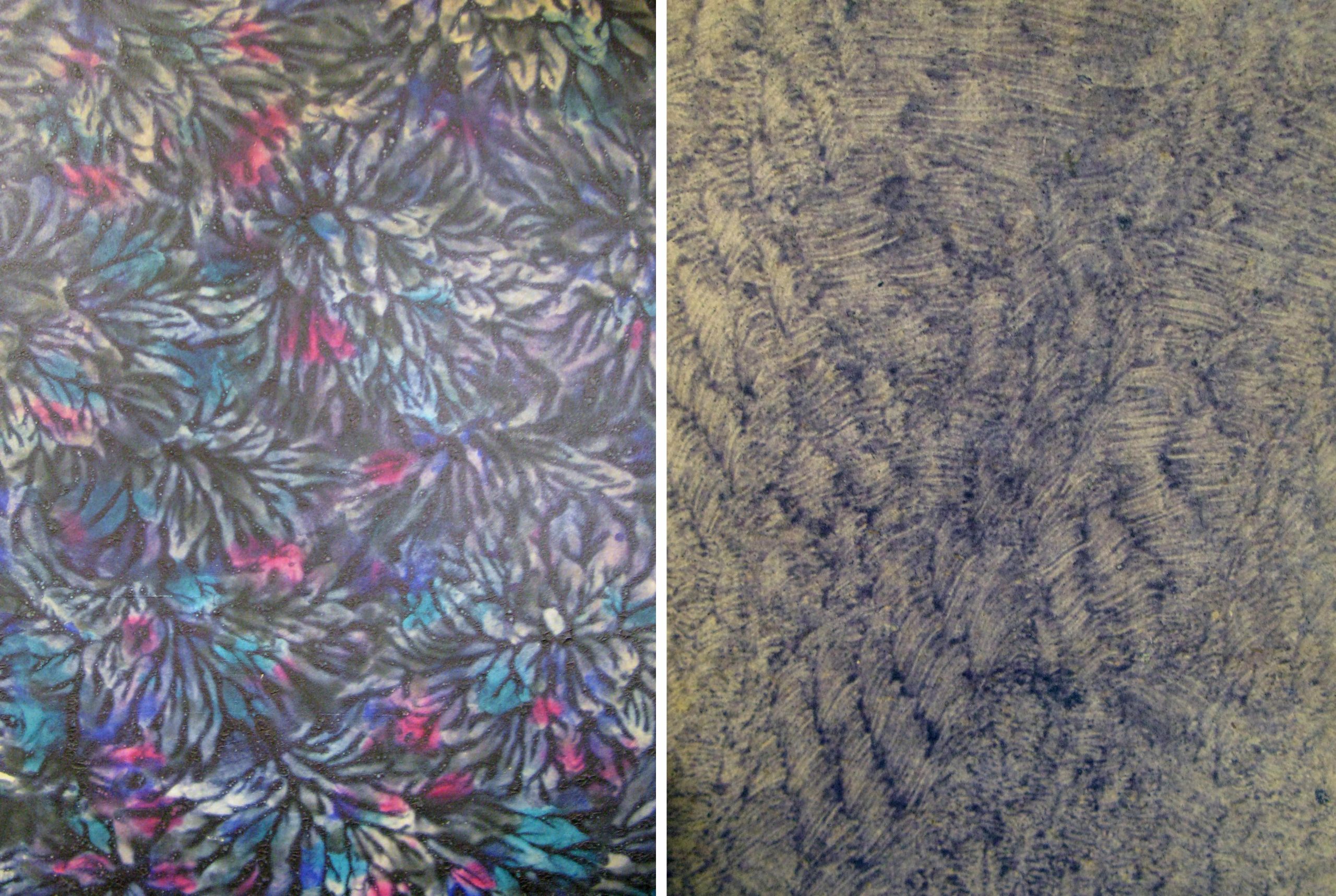
Drawn paste papers (also called scraped or combed) were made by “fingerpainting” in the wet paste or dragging various implements through the paste layer. The results can range from painterly and whimsical to clean and graphic. A faux wood graining tool was used to create the pattern on Summerfield E156 (second from left).
Left: Cover of Lectionary, incomplete. [Italy, between 1101-1200]. Call Number: MS E22. Second from left: Cover of De origine et amplitudine ciuitatis Veronae, 1540. Call Number: Summerfield E156. Center: Cover of [Notes on agriculture.] Fletcher of Saltoun collection Scotland, 17–. Call Number: MS 109:4. Second from right: Cover of De ponderibus et mensuris veterum Romanorum…, 1737. Call Number: B3981. Right: Cover of Bookplates and labels by Leo Wyatt, 1988. Call Number: D3245. Click collage image to enlarge.
These are two very different examples of daubed paste papers: a boldly colored design executed in a thick layer of paste, and a subtle pattern possibly created with stiff brush bristles.
Left: Back cover of Deutschlands Beruf in der Gegenwart und Zukunft, 1841. Call Number: Howey D126. Right: Cover of Det enda nödvändiga för et rikes financer, 1792. Howey B1083. Click collage image to enlarge.
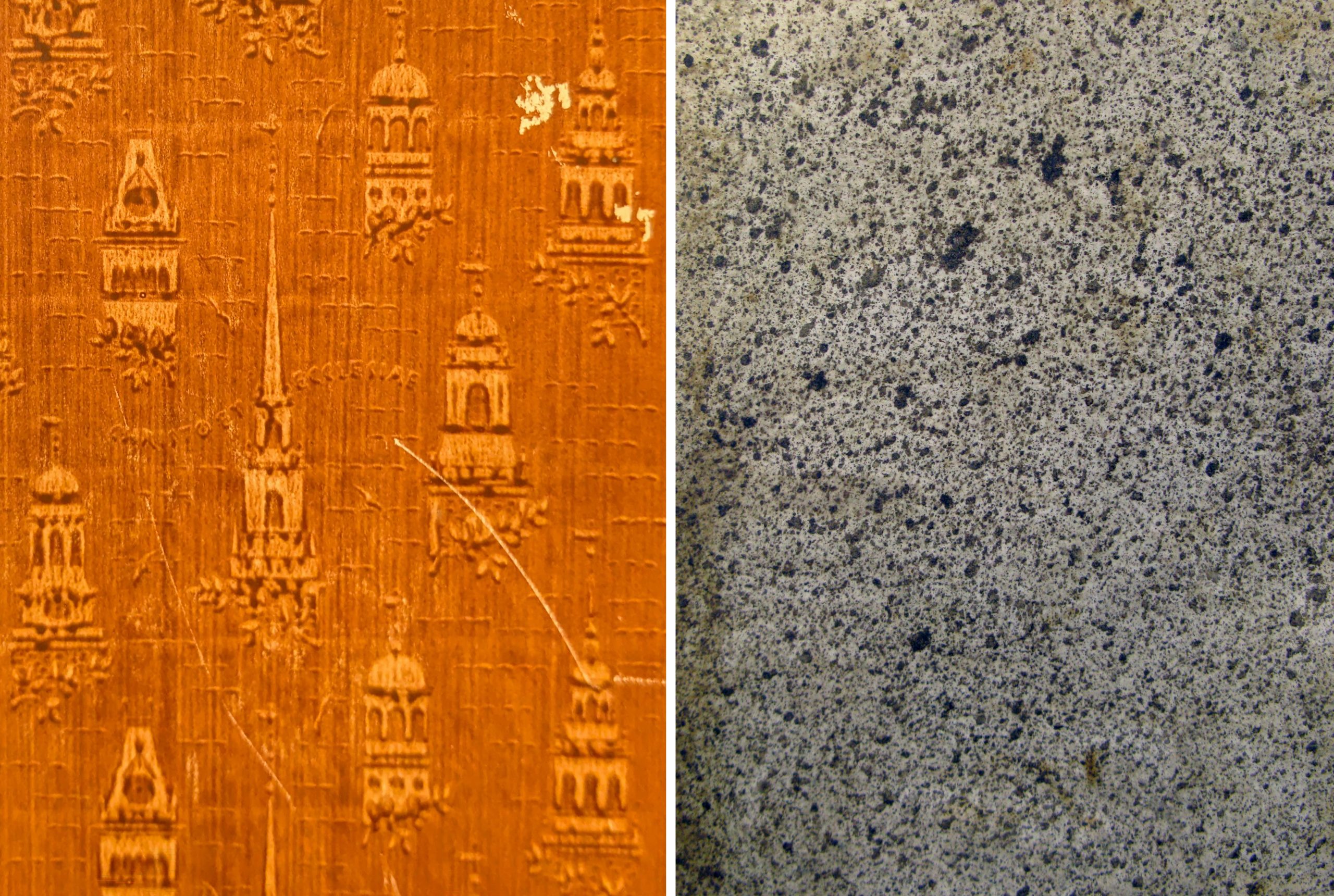
This charming stamped (or printed) design appears, appropriately, on the cover of a book about decorative papers used in bookbinding. An assortment of stamps in architectural shapes were pressed into the paste to create the pattern. Spattered (or sprinkled) papers were made by loading a brush with the colored paste mixture and striking the brush while holding it above the paper, creating a shower of drops.
Left: Cover of Decorated book papers, 1942. Call number: C6396. Right: Cover of Considerazioni sulle compagnie, 1769. Call Number: Howey B1116. Click collage image to enlarge.
Block printed paste papers used a matrix, probably carved as for a woodblock print, that was “inked” with the colored paste and stamped onto the paper. These designs can be simple or ornate and often use multiple colors. On Summerfield C1300 (at left) the binder used block printed papers in two different patterns.
Left: Cover of Anticamera di D. Pasquale, 1690. Call Number: Summerfield A866. Center: Cover of De iurisprudentia extemporali, 1628-1629. Call Number: Summerfield C1300. Right: Cover of Göttinger Taschen Calender für das Jahr 1790. Call Number: A274 1790. Click collage image to enlarge.
In these examples the makers have used a combination of techniques on a single sheet: stamped over drawn, drawn over pulled, and so on. D2763 (at right) is also an example of a paste paper created using a colored sheet of paper, instead of white or light paper, as the starting point.
Left: Endpaper of Göttinger Taschen Calender für das Jahr 1782. Call Number: A274 1782. Second from left: Cover of Hortus Celsianus i Uppsala, 1927. Call Number: Linnaeana C456. Second from right: Cover of Poems, 1768. Call Number: O’Hegarty C1129. Right: Cover of Poem to the memory of Lady Miller, 1782. Call Number: D2763. Click collage image to enlarge.
In Conservation Services we sometimes make paste papers to use in our own bookbinding models or in book making activities for colleagues or the public. Making paste papers is a fun and messy activity that invites exploration of colors, patterns, and mark-making tools. There are many online tutorials for making paste papers at home; bookbinder Erin Fletcher has a great video and written instructions on her blog. Tutorial // Paste Papers – Flash of the Hand
Bookbinding models are something of a theme for us this spring; in February, we installed our exhibitObject Lessons: Selections from the Conservation Services Historic Bookbinding Models Collection in Spencer Research Library’s main gallery. Creating and studying bookbinding models helps us to hone our hand skills and to better understand how books are made, which in turn improves the level of care we can provide for materials in KU Libraries’ collections
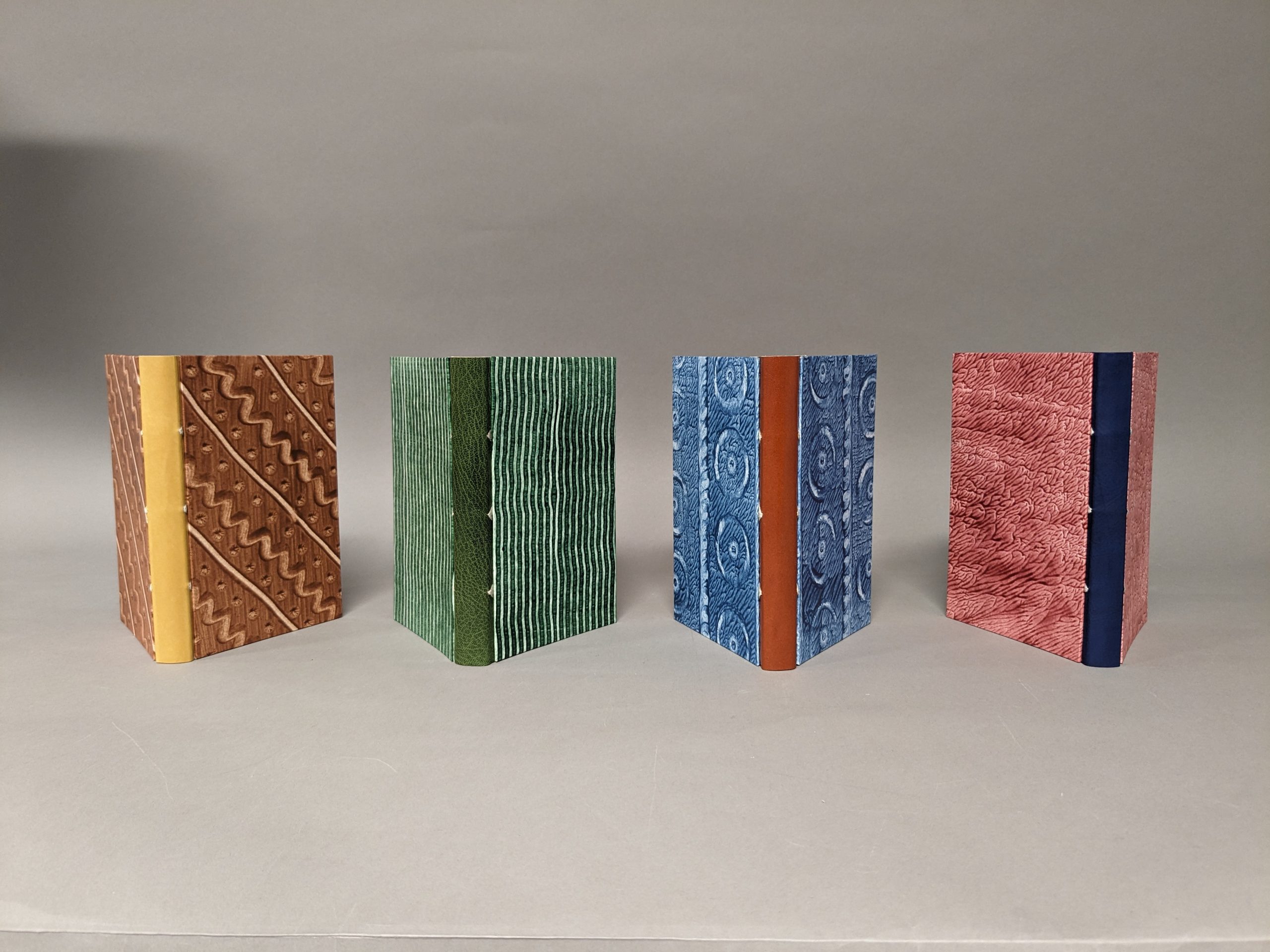
Four finished Even More Simplified bindings created in our workshop with Karen Hanmer.
Then in March, Conservation Services hosted book artist, fine binder, and bookbinding teacher Karen Hanmer for a two-day workshop to learn a new (to us) binding structure. Karen’s “Even More Simplified Binding” offered us – that is, Whitney, Angela, and Kaitlin, the three book and paper conservators here at KU – an opportunity to brush up on techniques and to learn some new approaches to bookbinding that we can apply to our work.
Conservators watch as Karen Hanmer demonstrates backing – shaping the spine of a book – on a job backer.
Checking sewn text blocks to see how well they open.
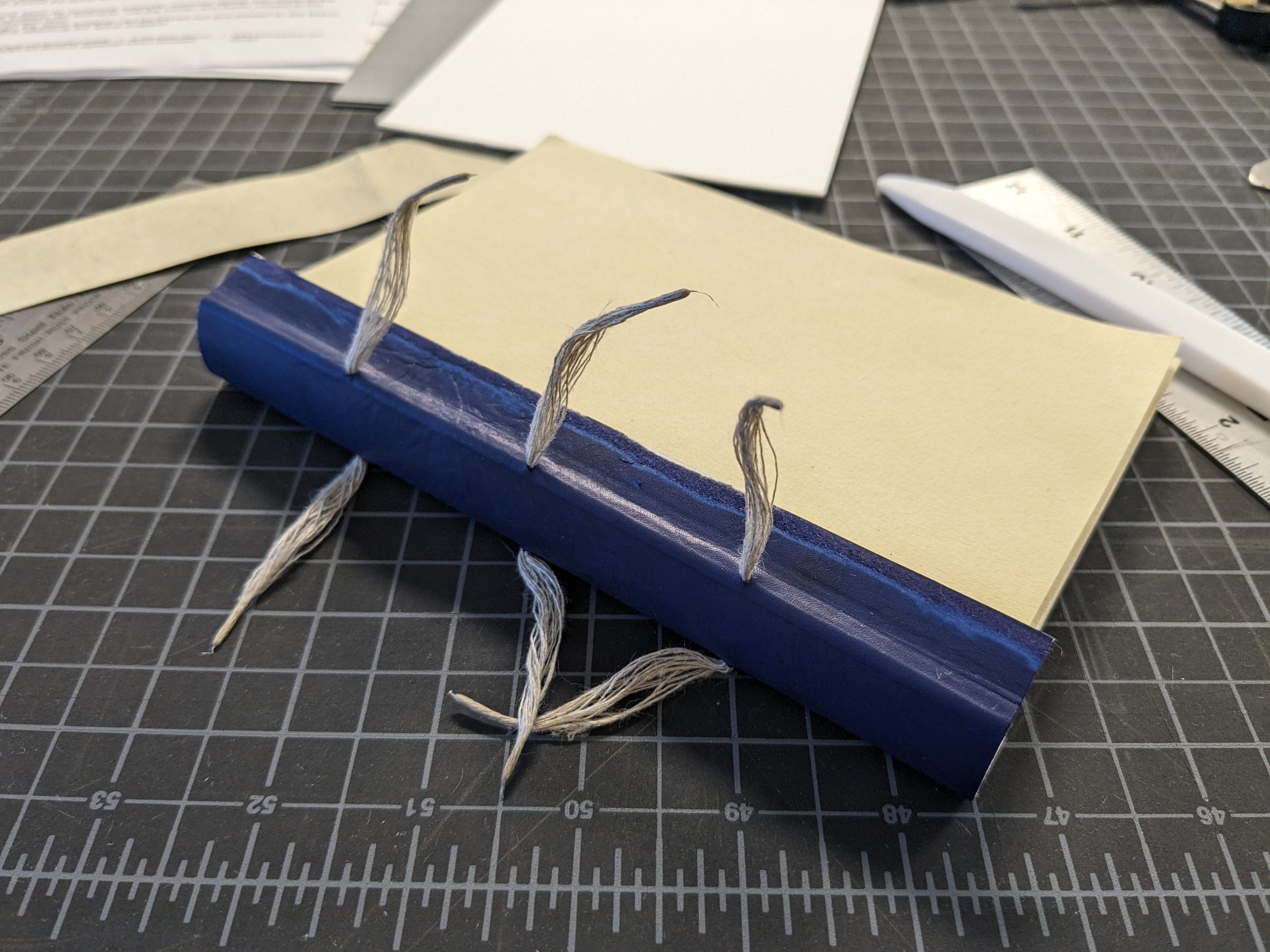
Karen describes the Even More Simplified Binding as “stripped down to only the essential elements;” it is elegant and minimal in appearance. But because the structure of the binding is easily discernible, great care must be taken at each step to ensure a pleasing result. This structure was a good choice for our group of conservators with a range of bookbinding experience; we all found something to hold our interest, and we all came away with new skills. Karen came prepared with lots of examples of other bindings, so in addition to the fun we had making our books, we also had lots of great discussions and digressions along the way.
Conservators gather around to watch as Karen shows how to mark the spine wrapper before attaching it to the book.
Detail of the Even More Simplified binding with spine wrapper laced on, before attaching boards.
Speaking for myself, I know that my approach to re-binding a book – on the rare occasions that it happens – has become much more conservative over the years. I’m interested in doing the most possible good for a book with the least possible intervention, and studying this binding has got me thinking about how I can apply its bare-bones-yet-structurally-sound engineering to projects that may come my way in the future.
Kaitlin, Karen, Whitney, and Angela with their finished books.
Conservators often say that what draws them to this work is the variety – every day is different! Always something new to learn! Never a dull moment! In my role as special collections conservator at KU Libraries, I am fortunate to work on interesting items from all of the collecting areas within the Kenneth Spencer Research Library, and my day-to-day experience bears out the truth of those clichés. Each book, document, and object I work with wears evidence of its own unique history. Physical condition, materials, marks or repairs made by persons past – sometimes these features tell a clear story about the life an object has lived, and sometimes the picture is murky, fragmented, or confusing. In the new short-term exhibit on view in Spencer Library’s North Gallery, I returned to the subject of a 2016 blog post to explore the ways that a book’s binding might provide information about who owned the book and how it was used.
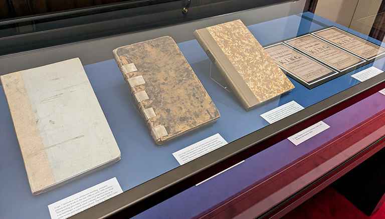
Spencer Library’s three copies of Thomas Sprat’s A true account and declaration of the horrid conspiracy against the late king, His present Majesty, and the government: as it was order’d to be published by His late Majesty are displayed in the first exhibit case. This book relates Sprat’s official account, as Bishop of Rochester, of the failed 1683 Rye House Plot to assassinate King Charles II of England and his brother (and successor) James, Duke of York. The horrid conspiracy, as we’ll call it, was printed in London in 1685 by Thomas Newcombe, “One of His Majesties printers; and … sold by Sam. Lowndes over against Exeter-Change in the Strand.”
Three copies of The Horrid Conspiracy on display in Spencer Research Library’s North Gallery.
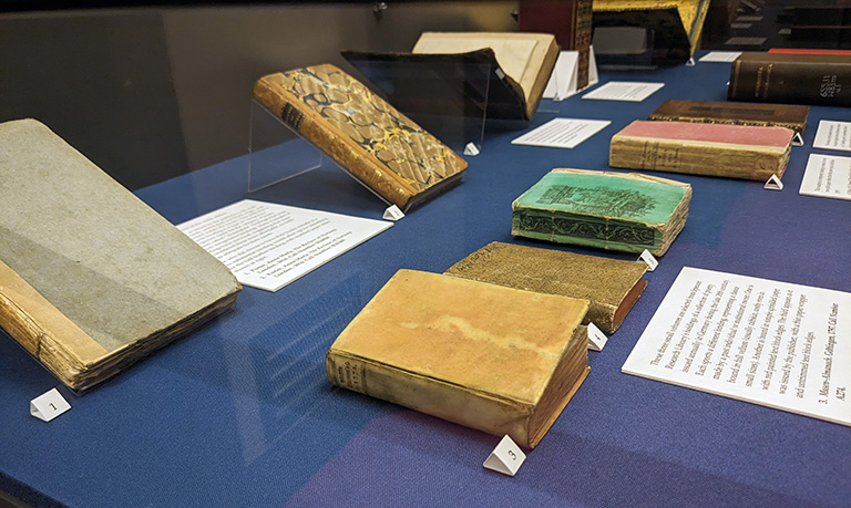
After leaving Lowndes’ shop these three edition-mates embarked on separate journeys, only to arrive back together again in our stacks over three hundred years later. The books’ differing conditions and binding styles invite speculation about their adventures (and misadventures!) in the intervening years. The exhibit compares the physical characteristics and evidence of use seen on the three volumes and considers what these features might tell us about who owned them and how they were used. We cannot know for sure, but it is so fun to wonder!
A selection of books from the exhibit From Shop to Shelf on display in Spencer Research Library’s North Gallery.
A selection of books from the exhibit From Shop to Shelf on display in Spencer Research Library’s North Gallery.
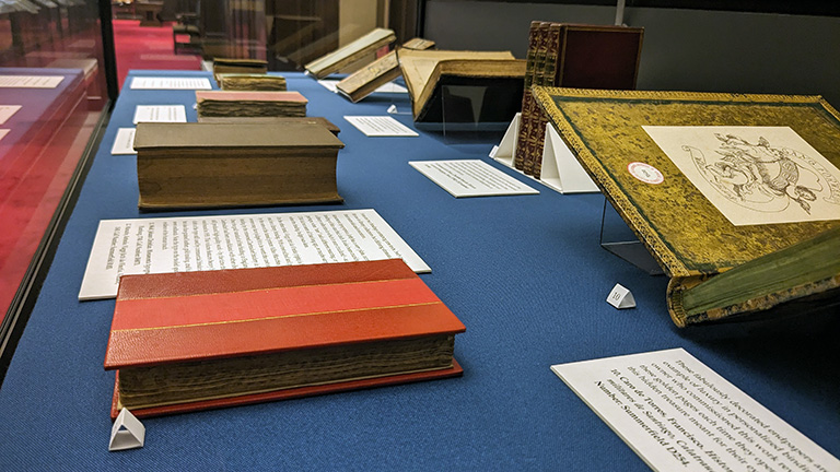
In case two, we expand our examination of different binding styles to include a small selection of bindings from Spencer Library’s rare books collections. The display includes books in original paper bindings or wrappers from the publisher, books custom-bound for private owners in either a plain or a fine style, and others bound simply and sturdily for use in a lending library. Spencer Library’s collections are rich with examples of bookbinding styles across the centuries; this assortment of volumes represents just a fraction of the many ways that a book might have been bound either by bookseller, buyer, or library.
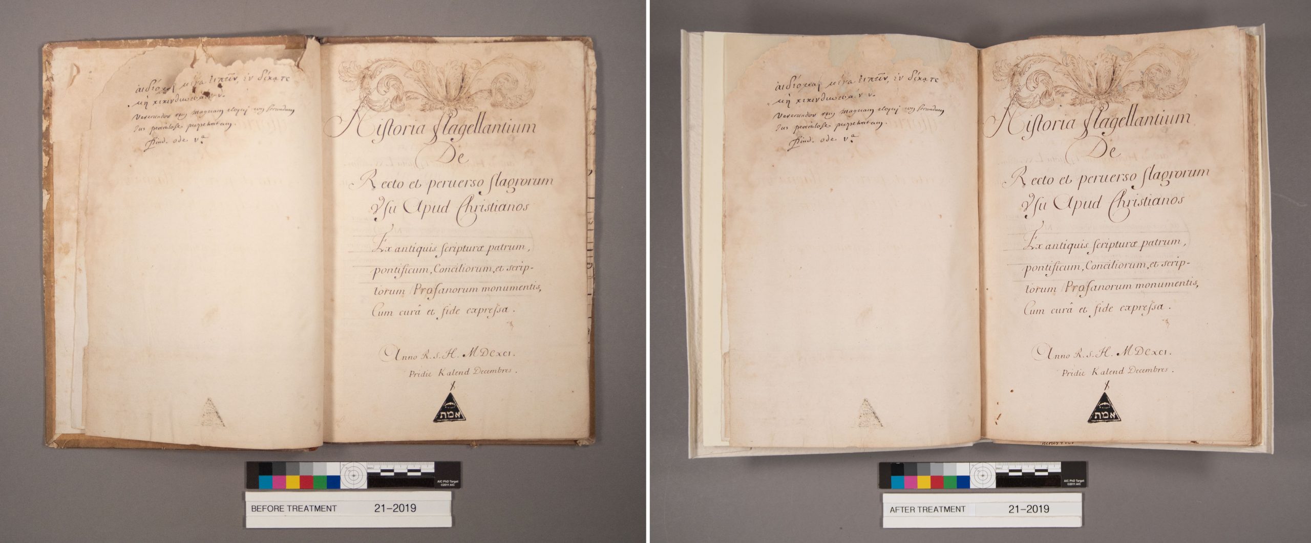
All the way back in October 2019, I wrote about starting on the treatment of MS E279, Historia flagellantium…De recto et perverso flagrorum usu apud Christianos…Ex antiquis Scripturæ, patrum, pontificum, conciliorum, & scriptorum profanorum monumentis cum curâ & fide expressa, by Jacques Boileau. This volume is the manuscript, dated 1691 and with annotations believed to be in the author’s own hand, for the printed version of the same title published in 1700. Spencer also holds a copy of the printed edition at Summerfield B2655.
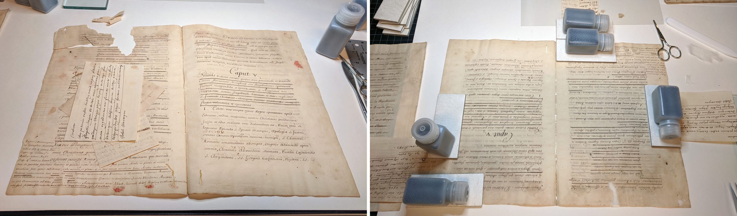
The volume was weakened by past water and mold damage and so required especially careful handling throughout the treatment process. After photographing the volume in its pre-treatment condition, I first cleaned the residual mold using soft brushes and low-suction HEPA vacuum, working in our bio-safety cabinet to reduce my exposure to the mold (and prevent contamination of other collection material). After the volume was cleaned, I removed the damaged binding and took apart the sewing.
A damaged folio from MS E279 before treatment, at left, and being mended during treatment, at right. Click image to enlarge.
The most time-consuming part of the treatment involved mending tears, filling losses, and guarding the sections (adding a reinforcing strip of thin Japanese tissue along the fold to strengthen it prior to sewing). The manuscript also has numerous notes and additions pasted in which needed reinforcement or reattaching. Once all the mending was complete, the volume was ready to be sewn and bound. In discussions with Special Collections curator Karen Cook, we considered different options for rebinding the book and settled on a conservation paper case binding, which would provide gentle support for the fragile text.
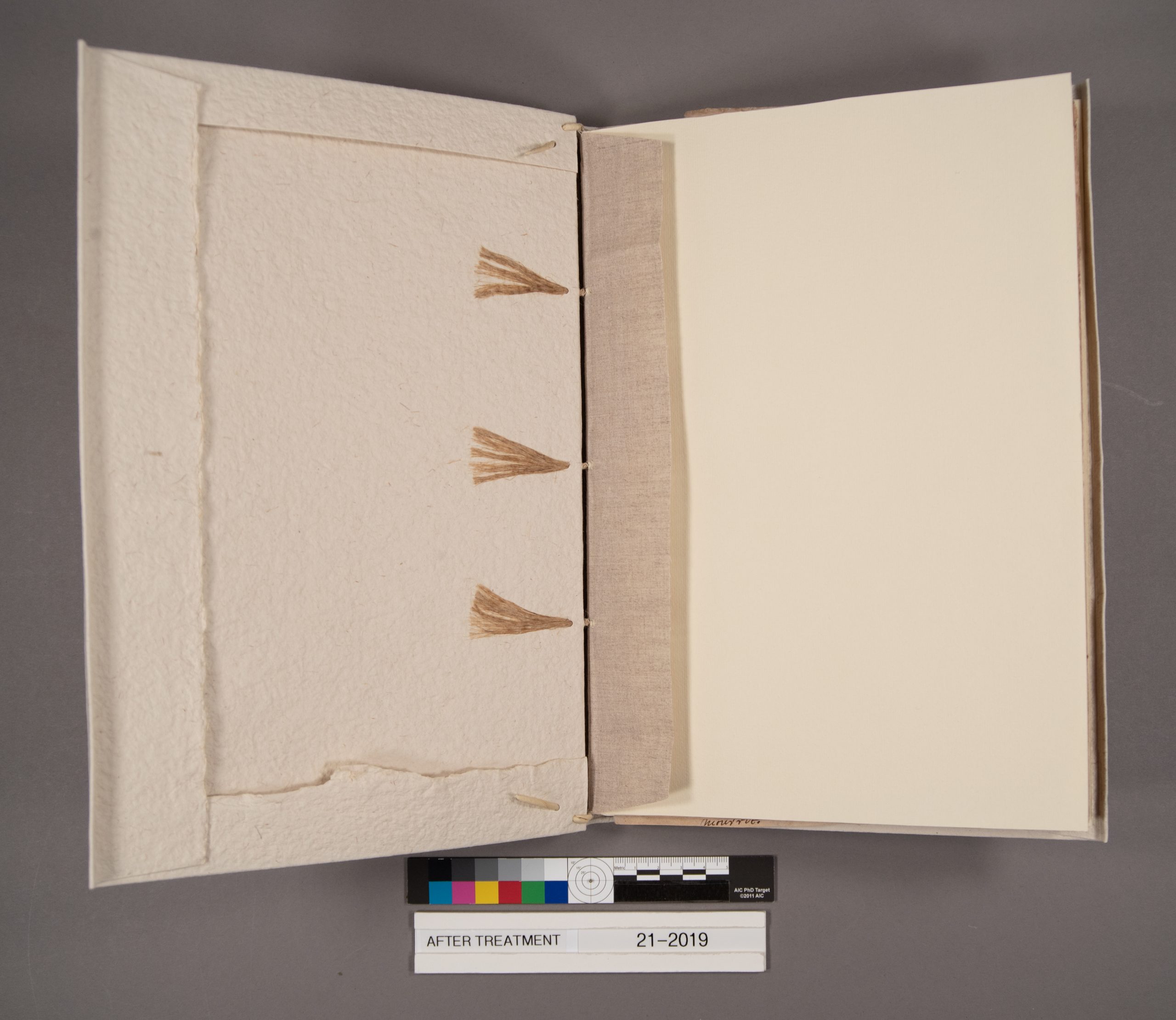
I sewed the volume with fine linen thread over three cords, adding new endpapers, and added sewn endbands of the same linen thread around rolled paper cores. After lining the spine with Japanese paper, Western laid paper, and linen, I attached a new case of medium-weight handmade paper. The case is attached only by the linen spine linings and by the sewing and endband supports which are laced through the case. The result has an appearance that is similar to and visually compatible with historic limp bindings. This structure has the added benefit of being easily removed if future caretakers of this volume wish to rebind it in a different fashion.
MS E279 after treatment in its new paper case binding, with linen spine lining and laced sewing supports. Click image to enlarge.
The title page of MS E279 shown before treatment, at left, and after treatment, at right. Click image to enlarge.
The newly-bound volume is housed in a clamshell box along with the old boards. While this manuscript is still fragile, the repairs and new binding will allow it to be consulted by researchers in the reading room, which was not possible in its prior condition. To view this manuscript or any of Spencer’s collections, you may make an appointment to visit the reading room during our updated hours.