The University of Kansas

Inside Spencer: The KSRL Blog

Books on a shelf

Welcome to the Kenneth Spencer Research Library blog! As the special collections and archives library at the University of Kansas, Spencer is home to remarkable and diverse collections of rare and unique items. Explore the blog to learn about the work we do and the materials we collect.

July Exhibit: Sigillum: Seals and the Making of Medieval Authority

July 17th, 2025

Kenneth Spencer Research Library’s current short-term exhibit explores some choice items from the library’s collection of medieval seals. This is a collaborative project put together by myself – Kaya Taylor – and my collaborator Eli Kumin, both of us long-time student workers here at the library.

Photograph of documents and labels in a glass enclosed exhibit case.
A view of the exhibit. Click image to enlarge.

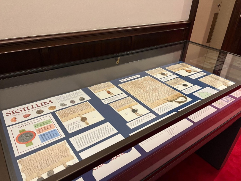
Eli and I have cultivated a particular interest in medieval wax seals, spurred on by our work on a Sanders Scholar research project under the supervision of Dr. John McEwan. Beginning in September 2024, we spent the project exploring the Abbey Dore collection (Call Number: MS Q80) at Spencer, given the remarkably well-preserved seals and documents dating back from the 12th and 13th centuries. As the project came to a close in May 2025, Eli and I realized that we could memorialize our work and interests in the form of an exhibit case. Titled Sigillum, it is our way of giving others a look into these fascinating and unique pieces of history, here to be enjoyed roughly 4,000 miles away from where they originated.

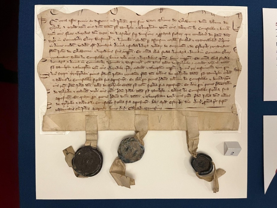
The overarching narrative of the Abbey Dore collection is one of property and the interplay between royal and religious power in the medieval period. The language used in the documents points to the exchange of land for the salvation of the donors and their loved ones, e.g. “for her soul and the soul of Madoc [her husband]” (Call Number: MS Q80:13).

Visitors may notice there is one document unlike the others in the exhibit case, labeled “land conveyance of Sir Roger Lasceles to his four daughters” (Call Number: MS C150). Although separate from the Abbey Dore collection, this document is included because it’s a particular favorite of ours and it boasts several unique qualities: a chirograph edge and three intact seals with very clear impressions. We chose to include it at the starting point of the exhibit because of its eye-catching quality, pulling visitors into the discussion of further seals and documents within the case.

Large handwritten document with wavy edges and three seals attached at the bottom.
A legal agreement, dated 1301-1302, whereby the lands of Sir Roger Lasceles are divided amongst his four daughters. Call Number: MS C150. Click image to enlarge.

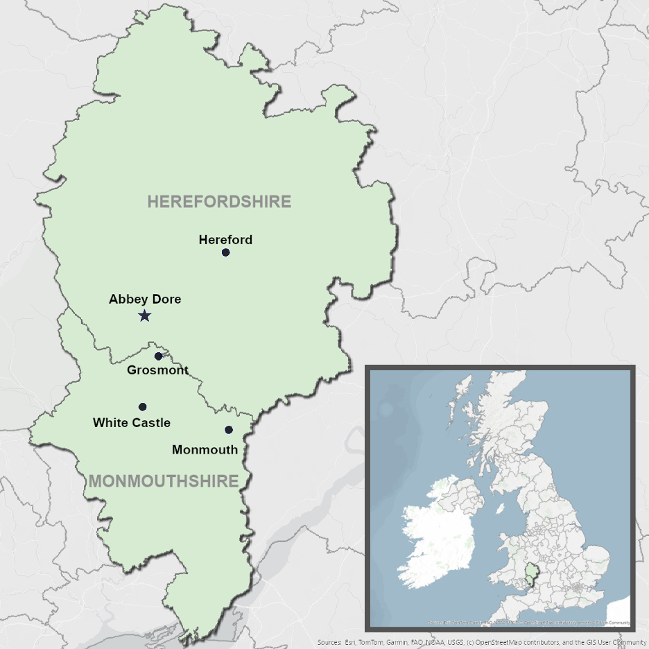
Although Eli and I came to know the Abbey Dore collection very well over time, we still felt a bit confused as to the relative geography of the Welsh Marches and the locations mentioned in the collection. We felt that visitors could benefit from seeing a map of the region, and so we resolved to make one that centered the relevant places and landmarks stretching across the Welsh-English border. Ultimately, we used ArcGIS software to put together the map seen in the exhibit.

Simple map showing Dore Abbey and some nearby towns in Herefordshire and Monmouthshire.
Our ArcGIS map of the Welsh-English border. Click image to enlarge.

We hope that Sigillum gives visitors a chance to appreciate not just the wax seals themselves, but the real human stories that stand behind them. We are excited to offer this glimpse into the medieval past, and grateful for the opportunity to bring these objects to light at Kenneth Spencer Research Library.

Sigillum: Seals and the Making of Medieval Authority is free and open to the public in Spencer’s North Gallery through July 31st.

Kaya Taylor and Eli Kumin
Public Services student assistants
KU Libraries Sanders Scholars 2024-2025

Creating Authority: Printing with Anglo-Saxon Type

July 17th, 2014

This week’s post comes from Amanda Luke, a recent KU graduate and a Reference Specialist at Watson Library.  Amanda is currently working toward her Master of Library Science (MLS) degree at Emporia State University.

There is a special connection between Anglo-Saxon typeface and the religious controversy that defined late sixteenth-century England. With the Church of England only decades old and tensions between Catholics and Protestants higher than ever, church officials sought to establish ties between the new Church and earlier English history. One connection manifested itself through church manuscripts from the Middle Ages. Some of these religious texts appeared in Old English, the “vulgar” or common tongue of the Anglo-Saxons, who occupied England before the Norman conquests in the eleventh century. Matthew Parker (1504-1575), Archbishop of Canterbury, was the one of the earliest proponents of Anglo-Saxon scholarship. Parker hoped that having these Anglo-Saxon manuscripts translated and printed would lend legitimacy to the new Church through ties to early English religious doctrine.

Parker’s chief interest lay in a series of Latin and Old English texts by Ælfric, an abbot who lived circa 950 – 1010. Copies of these documents had been found at the Worcester and Canterbury cathedrals (Evenden 81). These texts, which Parker’s secretary John Joscelyn likely translated, touched on the subject of the Eucharist and seemed to challenge the Catholic belief in transubstantiation, or the literal transformation of bread and wine into the body and blood of Christ (Evenden 81). This rejection of Catholic doctrine was vital for Parker because it provided evidence that the current Catholic thinking was not always present in England.

Image of the title page of A Testimonie of Antiquitie (1566) Legend discussing Old English Characters in John Joscelyn's edition of AElfric's A Testimonie of Antiquitie (1566)

Left: Title page; Right: Old English characters explained.  From: Aelfric, Abbot of Eynsham. A Testimonie of Antiquitie
ſhewing the auncient fayth in the Church of England touching the ſacrament of the body and bloude of the Lord
[…].
London: Iohn Day, [1566?]. Call Number: Clubb A1566.1 Click images to enlarge.

To disseminate this claim he employed a London-based Protestant printer named John Day for an unprecedented task: the development of a typeface which included all of the special characters present in the Anglo-Saxon manuscripts. The development of this Anglo-Saxon type, often just called Saxon type, was an enormous financial risk for Parker. It was estimated by modern scholar Peter Lucas that the typeface would have cost the vast sum of £200 to create (Evenden 82). The typeface which Day cast was 16 point, or slightly smaller than a great primer, a 17 point type (Clement 209). It contained fourteen lower and ten upper case Old English characters not found in the Latin alphabet (see above). It is fascinating to note the several forms of the diphthong “th” in the alphabet (eth ð and thorn þ), as well as the presence of a symbol for the word “and.”

The earliest book containing the Anglo-Saxon typeface was printed by John Day in 1566 at Parker’s request. The volume was titled A Testimonie of Antiquitie ſhewing the auncient fayth in the Church of England touching the ſacrament of the body and bloude of the Lord here publikely preached, and alſo receaued in the Saxons tyme, aboue 600. yeares agoe, and was attributed to Ælfric, the author of the text that influenced Parker. As its long title suggests, this text is a translation of an Easter sermon which touches on the communion. It was especially important to Parker because it supported his mission to legitimize the doctrines of the Church of England. The creation of the Saxon typeface to accompany the translation was, according to scholar Richard Clement, a means of further legitimizing obscure texts. He writes, “Parker’s men began to examine the manuscripts and were impressed by the visual impact of the Anglo-Saxon texts which almost jumped off the page and proclaimed their antiquity and authority to the reader” (Clement 206). Use of the Saxon typeface also helped to differentiate the Old English text from the Latin and English used in the book.

Clubb_A1566_1_f35_withred

Passage on the transubstantiation (with red underlinings added). Aelfric, Abbot of Eynsham. A Testimonie of Antiquitie …].
London: Iohn Day, [1566?]. Call Number: Clubb A1566.1  Click image to enlarge.

In the image above, the volume is opened to folio 35, which contains a central moment in the Easter sermon. A printed note in the margin reads “No transubstantiation,” highlighting one of the major doctrinal connections Parker was trying to make between the historical church and the Church of England. The text in Saxon type appears on the left, and the translation appears on the right. Even if you cannot read Old English, words such as “blode” and “Christ” can be made out (see the words underlined in red).   Thus the facing page format supported the preface’s claim that everything in the translation was true and accurate.

The use of the Saxon typeface in A Testimonie of Antiquitie opened the door for the expansion of Anglo-Saxon scholarship.  To explore the subject further, visit Spencer and use its Clubb Collection of Books Printed with Anglo-Saxon Type.

Amanda Luke
KU Alumna and Reference Specialist, Watson Library

Works Cited

Clement, Richard W. “The Beginnings of Printing in Anglo-Saxon, 1565-1630.” Papers of the Bibliographical Society of America.91.2 (1997): 192-244. Print.

Evenden, Elizabeth. Patents, Pictures, and Patronage: John Day and the Tudor Book Trade. Burlington: Ashgate, 2008. Print.