The University of Kansas

Inside Spencer: The KSRL Blog

Books on a shelf

Welcome to the Kenneth Spencer Research Library blog! As the special collections and archives library at the University of Kansas, Spencer is home to remarkable and diverse collections of rare and unique items. Explore the blog to learn about the work we do and the materials we collect.

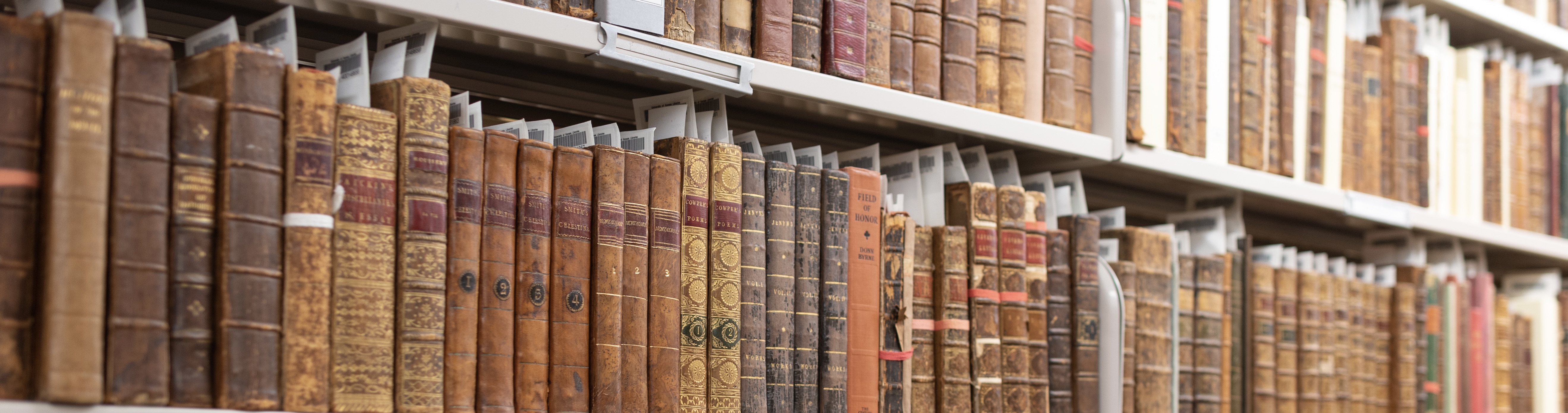
Manuscript Monday: Four from the 1400s

November 24th, 2014

Earlier this month Mitch Fraas at the University of Pennsylvania wrote a fascinating blog post in which he mapped data from Melissa Conway and Lisa Fagin Davis’s Directory of Institutions in the United States and Canada with Pre-1600 Manuscript Holdings (2014). Though, as Fraas notes, that the highest institutional concentrations of medieval and early modern manuscripts are found on the East and West Coasts, KU is responsible for one of the largest dots on the map in the middle of the country. In fact, the Kenneth Spencer Research Library ranks among the top fifteen institutions for holdings of pre-1600 manuscript codices (volumes), with its approximately 220 manuscript books, and fares even better when our over 2100 pre-1600 manuscript leaves, documents, and rolls are taken into account.

In light of these numbers, this week we’re highlighting four fifteenth-century manuscripts, each from a different country. Medievalists and early modern scholars take note; it’s worth making a stop in Lawrence, KS!

1. Vosper Book of Hours

Detail from the miniature of David in prayer (f. 83r) from the Vosper Book of Hours, France, ca. 1470.

Detail from the miniature of David in prayer (f. 83r) from the Vosper Book of Hours, France, ca. 1470.
Call #: MS Pryce C1. Click image to view full page.

Spencer’s most ornately decorated manuscript is a late-fifteenth-century book of hours from Eastern France. Named in honor of Robert Vosper (1913-1994), a former director of KU Libraries, this devotional volume includes seventeen large miniatures (or paintings), as well as stunning foliate borders, featuring birds and insects. In the image above, the darkish, opaque wings of the dragonfly are actually silver which has tarnished with time.

2. Minden Codex

Historiated initial detail (St. George and the dragon) from the Minden Codex.

Detail from: Gallus’s Malogranatum (folio 2r), one of several texts in the Minden Codex. Germany, mid-to-late 15th century.
Call #: MS C164. Click Image to view full page.

The Minden Codex received its name from our catalogers because it once belonged to a Benedictine monastery in Minden, a city in the Westphalia region of Germany. It is a collection of more than fifteen religious texts that appear to have been copied out by different scribes in the mid-to-late 1400s and then bound together alongside a fragment of printed text. The codex begins with a portion of the first book of the Malogranatum, a dialogue intended as guidance for monks striving toward the perfection of their souls. This text is sometimes attributed to Gallus, an abbot of Königssaal (near Prague). The historiated initial in the detail above depicts Saint George slaying the dragon. Look closely and you’ll see that their entwined bodies form the letter “S” of the Latin word Sancta.

3. A Collection of Italian lyric poetry; primarily Petrarch’s Canzoniere

Opening of Petrarch's Canzoniere, featuring an illuminated initial containing white vine on a blue background, from A manuscript collection of Italian lyric poetry; primarily Petrarch’s Canzoniere. Italy, 15th century.

Opening of Petrarch’s Canzoniere in a collection of Italian lyric poetry. Italy, 15th century.
Call Number: MS C24. Click image to enlarge.

Though many of Spencer’s pre-1600 codices are religious in nature, the library also holds a wide range of secular texts, including classical and scientific works, legal and estate records, histories, and works of literature. The main text in this 15th century miscellany of Italian verse is Petrarch’s Canzoniere (Songbook), a sequence of poems that tells the story of the poet’s love for “Laura.” The text begins with Petrarch’s famous sonnet, “Voi ch’ascoltate in rime sparse il sono […],”  whose initial “V” is here illuminated and decorated with a white vine design.  Subsequent poems in the Canzoniere receive a simpler treatment: their smaller initials appear in alternating blue and red.  The manuscript book also includes poems by Jacopo Sanguinacci, Giusto de’ Conti, and others, as well as Latin sayings with Italian translations.

4. English Medicinal Recipe

Medicinal Recipe in Middle English, England, ca. 1400s

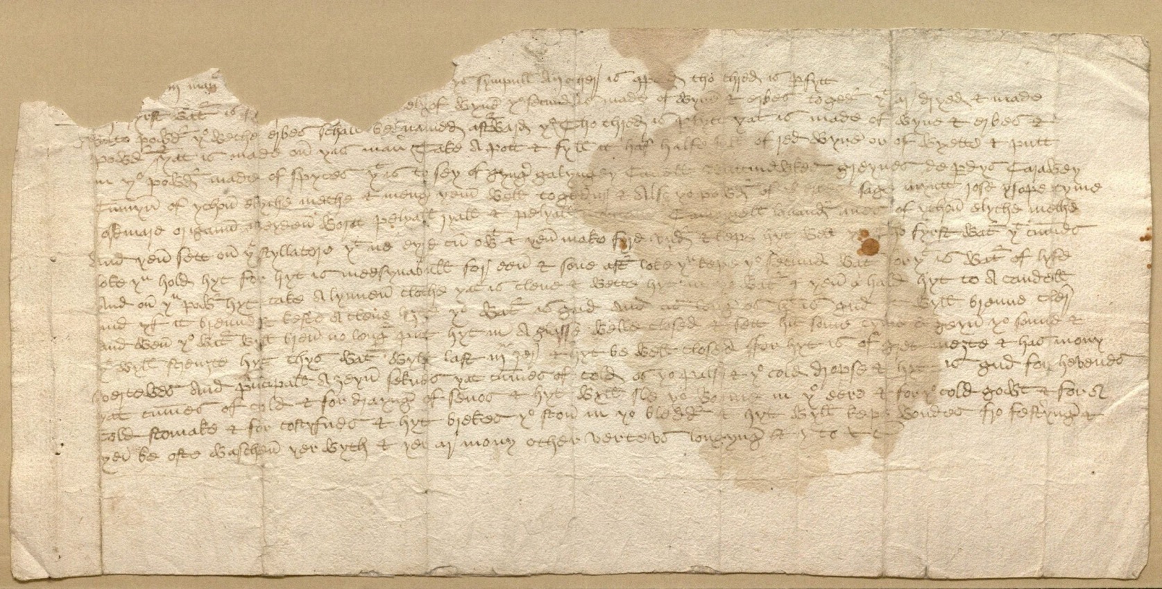
Medicinal Recipe. England, ca. 1400s. (Phillipps 40717). Call #: MS P541  Click image to enlarge.

Feeling under the weather now that the temperature has dropped? This medicinal recipe dating form the 1400s provides directions for distilling a mixture of spices, herbs, and wine to treat a variety of illnesses and wounds. This single leaf, with its top three lines partly torn away, is notable in that it is one of the library’s comparatively few pre-1500 manuscripts in English (or Middle English, as the case may be). Though Spencer holds several thousand English estate documents (circa 1200-1900), including papers from the prominent North and Kaye families, those that date from before 1500 tend to be in Latin.  This recipe or “receipt” stands as an instructive example of unornamented, vernacular writing.  However, despite being in English, its script presents a challenge for modern eyes.  Try to read a line or two and you may soon find yourself yearning for the more familiar humanist letterforms of the Canzoniere above (MS C24). Finally, this modest leaf also boasts an interesting provenance: it was once a part of the library of Sir Thomas Phillipps (1792–1872), an obsessive nineteenth-century collector who built one of the largest private collections of manuscripts.

For those who may have caught a little of Phillipps’s manuscript-mania, Spencer has plenty more to explore. You will find records (and images) for many of our medieval and early modern manuscripts in the Digital Scriptorium, an online database with holdings from a variety of institutions. To browse Spencer’s contributions, simply click on “Advanced Search,” select Lawrence, University of Kansas, Kenneth Spencer Research Library, Special Collection from the “Current Location” field and hit “Search.” Or, for a another short narrative tour, take a peek at Lisa Fagin Davis’s great post on Kansas in her Manuscript Road Trip Blog.

Elspeth Healey
Special Collections Librarian

Collection Snapshot(s): Victorian Fashion Edition

November 4th, 2014

One of the wonderful things about class visits is that they often send you hunting through the far reaches of the library’s collections in search of interesting and relevant holdings.  A recent visit from ENGL 572: Women and Literature: Women in Victorian England led me to happen upon two very rare Victorian fashion periodicals among Spencer’s collections. These British weeklies offered up the latest styles (hint: full skirts are in) alongside commentaries and entertainments that the editors thought might interest their nineteenth-century female readership.

The Ladies’ Penny Gazette (published 1832-1834) dates from the period just before Queen Victoria’s  ascent to the throne in 1837. Subtitled the Mirror of Fashion, and Miscellany of Instruction and Amusement, this weekly combined fashion with articles on subjects of interest to women, theater reviews, sheet music, and literary pieces. Subscribers were treated each month to a bonus sheet of “Coloured Fashions of the Lady’s Penny Gazette,” in which the dresses were hand-colored, even if somewhat hastily so.  For those interested in literature, the Gazette offers some finds as well.  Next to a discussion of lace and caps on one side and an article on “Bengal Marriages” on the other is “A Fragment”  by the poet L. E. L.  (Letitia Elizabeth Landon).

Image of coloured fashion sheet and first page of The Ladies’ Penny Gazette (1833)

Image of coloured fashion sheet and first page of The Ladies’ Penny Gazette (June 8, 1833)

Opening from the February 2nd, 1833 issue of The Ladies' Penny Gazette, featuring L. E. L.'s "A Fragment"

Top and middle:  the “Coloured Fashions” supplements and first pages of issues No. 16 (1833 February 9) and No. 33 (1833 June 8) of The Ladies’ Penny Gazette; or, Mirror of Fashion, and Miscellany of Instruction and Amusement. Call #: D4551.  Bottom: an opening from issue No. 15 (1833 February 2) featuring L.E.L’s poem “A Fragment.”  Click images to enlarge.

Though brief by modern standards–at a lean eight pages an issue–The Ladies’ Penny Gazette made the most of its allotted space, presenting pithy, sometimes biting, commentary between its longer pieces.  One such quip, titled “Small Talk,” gives a sense of how the magazine’s conceptions of womanhood are more complicated than a label like “Victorian fashion magazine” might immediately suggest:

Small Talk — Small talk is administered to women as porridge and potatoes are to peasants–not because they can’t discuss better food, but because no better is allowed them to discuss. (No. 42,  August 10,  1833, page 30)

Young Ladies of Great Britain (also known by the longer title, Illustrated Treasury for Young Ladies of Great Britain) ran between 1869 and 1871 before continuing on until 1874 under slightly different titles and formats.  Though each issue touched on the newest fashions (in England and in Paris), the first page of the weekly was usually reserved for one of the pieces of fiction serialized in its sixteen pages, accompanied by an attention-grabbing  (and often melodramatic) illustration.  Priced also at a penny, the magazine targeted a  younger readership than The Ladies’ Penny Gazette, and in its mission to divert and educate, lacks the edge at times found in the earlier magazine.  A piece simply titled “Characters; A Wife”  (see the middle image below) offers a discussion of three “types” of wives: the tawdry, careless wife; the domineering matron; and “the good wife,” whose character “cannot be delineated, she possesses so many minute, undeniable excellencies.”  Men aren’t entirely spared from this typology; the husband who is drawn to the “domineering matron” is described as an “easy-tempered simpleton, who lets her rule as she lists.”

Cover illustration for Vol. 1, No. 4 (March 13, 1869)

Opening from Young Ladies of Great Britain featuring a discussion of wife "types" and (on the verso) fashion design

Opening from Young Ladies of Great Britain, featuring New Shapes in Costume and Designs for Fancy Needlework

Fashion for Victorian Brits: Illustrated Treasury for Young Ladies of Great Britain. 1.4 (1869 March 13) and 1.5 (1869 March 20). Call Number: O’Hegarty D390. Click Images to enlarge.

Whatever their circulation might have been in their day, these magazines are now quite scarce.  KU appears to hold the only library copy of The Ladies’ Penny Gazette in North America, (with copies also recorded at the British Library, Oxford, and the Koninklijke Bibliotheek in the Netherlands), and KU, New York Public Library and the British Library are the only places listed in WorldCat as holding physical copies of Young Ladies of Great Britain.  These weeklies are “rare birds” indeed, but the fascinating cultural texts they offer make them worth seeking out.

Elspeth Healey
Special Collections Librarian

Here’s My Book. It’s Sort of Terrible!

October 13th, 2014

It takes at least a little bit of ego to write and publish a book.  Publication is, after all, a means of saying, “Attention, world; I have something to share!”  But it is not unusual, especially with the passage of time, to see a writer exhibit (or at least feign) a little shame at the product of his or her own mind.  For today’s post, we share three self-deprecating presentation inscriptions by three different writers: William Butler Yeats, Max Douglas, and William Rose Benét.  Recorded on the pages of copies of their works held at the Spencer Research Library, these inscriptions, with their varying degrees of chagrin, offer a change of pace from the more pedestrian, “with compliments of the author.”

1. Ignorant Boy: William Butler Yeats

The poet William Butler Yeats, later in life, famously revised the poems of his youth, so it’s probably safe to take him at his word when, in inscribing this copy of The Works of William Blake (1893),  he expresses a wish to “correct every page.”  Spencer’s copy comes from the library of P. S. O’Hegarty, an Irish nationalist and civil servant, whose daughter, Gráinne, was married to Yeats’s son, Michael.  As O’Hegarty’s penciled-in note indicates, the “Dear P. I. A. L.”  to whom Yeats inscribes the volume  is none other than Maud Gonne, the actress and activist for Irish independence who captivated Yeats for decades. (Click on the image below for a full page view of the inscription, including O’Hegarty’s note). Yeats was in his late twenties when he co-edited with the poet and illustrator Edwin John Ellis this three volume collection of Blake’s works.  His inscription to Gonne, however, seems to have been added much later.   Following some initial remarks about the scarcity of the edition and the circumstances under which it was published, Yeats warns Gonne,

Keep the book out of my sight. Ellis was a wild man & I a most ignorant boy & I long to correct every page. We did however persuade people that Blake knew what he was talking about if we did not. Something we did know however, though, I shall die without discovering why “The number of Outhoon is 2002”.

W. B. Yeats inscription to P. I. A. L. (Maud Gonne) in The Works of William Blake (1893)

Title page and frontispiece of The Works of William Blake, edited by Edwin John Ellis and William Butler Yeats

Blame it on youth: W. B. Yeats’s inscription to Maud Gonne (P. I. A. L.) in the first volume of Edwin John Ellis and William Butler Yeats’s edition of The Works of William Blake; Poetic, Symbolic, and Critical. 3. Vols [Large paper edition]. London: B. Quaritch, 1893. Call #: Yeats Y149. Click images to enlarge.

One wonders if Yeats knew that the errors he wished to correct had spilled over into his inscription:  he tells Gonne that 50 copies of the larger paper edition were produced, but in actuality it was 150.  At least this error works in his favor: the rarer the book, the truer the love?

2. The Standards of Youth:  Max Douglas

During his short life, the promising young, Kansas poet Max Douglas published only one chapbook, Bottom Land: Poems (1968). However, John Martin, editor and publisher of the Black Sparrow Press, had been contemplating publishing a collection by Douglas when the poet died unexpectedly at the age of twenty-one. This presentation copy addressed to Martin, resides alongside the books of Max Douglas’s library, which were donated to the Spencer Research Library by the poet’s father in 1982. In his typed presentation note, Douglas writes,

For John Martin: in response to his interest & kind encouragement, & wth the understanding that this is a book i hv now chosen all but to disown.

Image of typed inscription to John Martin, with Max Douglas's signature, dated '69

Max Douglas’s typed inscription and signature in his chapbook, Bottom Land: Poems. [Saint Joseph, Mo.: St. Joe Press, c1968]. Call #: Douglas C14. Click image to enlarge.

One hopes that Douglas’s dismissal of his Bottom Land was simply the impatience of a poet whose attention was trained on the future.  Though a Black Sparrow Press edition of Douglas’s work never materialized, his later poems did see publication in book form.  Edited by Christopher Wienert and Andrea Wyatt, Douglas’s Collected Poems appeared posthumously in 1978.

3. Dueling Self-Deprecations: William Rose Benét and George Hartmann

There are, of course, many reasons why one might belittle his or her own book.  As the case of the critic and poet William Rose Benét (1886-1950) shows, a self-deprecating note might serve to elevate the work of another.  In inscribing a copy of his collection of essays Wild Goslings (1927) for the designer of the volume’s dust jacket, Benét writes:

To George Hartmann who has contributed the only really interesting and entertaining integer to this book, and I really can’t tell you how profoundly I mean that. To George Hartmann, hell, he’s a real artist! William Rose Benét, January 1927.

Hartmann, clearly not one to take a compliment lying down, responds with a self-effacing quip of his own.  Writing on the back of the dust jacket that is tipped-in to Spencer’s copy, he offers a brief explanatory rejoinder: “Bill [i.e. William Rose Benét]  means this jacket – it’s a lie! GH.”

Dust jacket designed by George Hartmann for Benet's Wild Goslings (1927) Inscriptions by Hartmann (left) and Benet (right)  in William Rose Benet's Wild Goslings (1927)

 Tipped in dust jacket (left) and Benét and Hartmann’s inscriptions (right) in Spencer’s copy of William Rose Benét’s Wild Goslings: A Selection of Fugitive Pieces. New York: George H. Doran, [1927]. Call Number: B11618. Click images to enlarge.

Fear not, though, some writers manage to remain untouched by even the pretense of modesty, as critic and editor H. L. Mencken demonstrates.  His inscription in one of Spencer’s copies of his In Defense of Women pithily proclaims: “Dear George: Read this and you will learn. HLM.”

Elspeth Healey
Special Collections Librarian

Imagination; Or, the Herp is in the Eye of the Beholder

September 29th, 2014

When it comes to creating an exhibition of illustrated books with a biological theme, a fabulous sea monster can be almost anything in the eye of the creator, and by power of suggestion, in the eye of the beholder. Some historians of biology have suggested that the basis-in-fact for the Scandinavian sea monster, Bishop Pontoppidan’s kraaken in this case, was a whale, so the image was used in a past show of whaling books in the Spencer Library. But Moby Dick‘s author, Herman Melville, as well as marine biologist Jacques-Yves Cousteau, thought it more likely that the real basis for the legends was the giant squid. For purposes of this post, it’s a sea serpent, but we intend to keep it in mind for our up-and-coming Squid Exhibit.

Erik Pontoppidan (1698-1764). The natural history of Norway. London: 1755. (Ellis Aves E333)

Image from Erik Pontoppidan (1698-1764). The natural history of Norway. London: 1755.
Call number: Ellis Aves E333, Special Collections.

The Danish original of this natural history was published in Copenhagen (1752-1754), and is of interest chiefly for its accounts of the myths connected with whales and other natural curiosities such as the fabeled kraaken.

Sally Haines
Rare Books Cataloger
Adapted from her Spencer Research Library exhibit and catalog, Slithy Toves: Illustrated Classic Herpetological Books at the University of Kansas in Pictures and Conservations

‘Dead Coloring’ Revived Again: John Gould’s Hand-Colored Bird Lithographs

September 22nd, 2014

Over the centuries a number of techniques for creating graphic images have outlived their original technology, successfully migrating to new imaging technologies. I was recently reminded of this while planning Kenneth Spencer Research Library’s exhibition, “Ornithological Illustration in the Age of Darwin: The Making of John Gould’s Bird Books” (open September 11-November 15, 2014 on weekdays 9-5 and Saturdays 9-1, except October 11).

John Gould, an English ornithologist, published illustrated books about birds from 1830 until his death in 1881. The Library has recently digitized its holdings of Gould’s 47 large-format volumes, as well as nearly 2000 preliminary drawings, watercolor paintings, tracings, lithographic stones, and proofs.

When searching the new digital John Gould Ornithological Collection (accessible at the University of Kansas Libraries website at http://lib.ku.edu/gould), I happened to compare the published hand-colored print of the Horned Lark or Otocoris alpestris with the black printing image on lithographic stone. “What a great example of dead coloring!” I exclaimed.

Image of Otocoris alpestris / Horned lark

Otocoris alpestris / Horned lark. Lithographic crayon on stone by
John Gould and Henry Constantine Richter.
Reference: ksrl_sc_gould_2387.tif.
Call number: Gould Drawing 2387. Click image to enlarge.

Image of Otocoris alpestris / Horned lark

Otocoris alpestris / Horned lark. Lithograph and watercolor by
John Gould and Henry Constantine Richter.
Reference: ksrl_sc_gould_gb_1_3 (n77).
Birds of Great Britain, 1st edition, volume 3, plate 18.
Call number: Ellis Aves H131. Click image to enlarge.

So what is dead coloring? It involves underpainting shapes in a neutral hue, then finishing the oil painting with transparent colored glazes, and was often used by late-18th-century English painters. Early painters in watercolor, a medium gaining popularity in England during the late 18th century, employed a similar approach.

However, dead coloring also had a place in European printmaking. Mezzotint and aquatint, new methods of intaglio printmaking capable of the tonal gradations necessary for dead coloring, were invented in the mid-17th century and increased in use thereafter. John James Audubon’s hand-colored aquatints of American birds published in the early 19th century were outstanding examples.

During the early 19th century yet another new printing technology, lithography, spread from Germany, where it had been invented in 1798, across Europe to England. Working with a waxy crayon on a block of lithographic limestone with a fine-textured surface was similar to drawing on rough-textured paper. The lithographic crayon caught on the tips of the grained stone surface, creating a random pattern of irregular dots. Viewed with the naked eye, the tiny dots merge into shades of gray.

Lithographic drawing was much easier to learn than mezzotint and aquatint and was the obvious choice for illustrating John Gould’s ornithological books. Elizabeth Gould (his wife), an amateur artist, rapidly mastered crayon lithography under the tutelage of Edward Lear, a younger but more experienced artist employed by Gould. She illustrated Gould’s books until her death in 1841, after which he employed a succession of professional artists.

Image of Melanopitta sordida

Melanopitta sordida. Watercolor and lithographic crayon drawing by
William Hart. Reference: ksrl_sc_gould_1264.tif.
Call number: Gould Drawing 1264. Click image to enlarge.

Image of Melanopitta sordida

Melanopitta sordida. Colored lithographic proof by
William Hart. Reference: ksrl_sc_gould_1265.tif.
Call number: Gould Drawing 1265. Click image to enlarge.

Artist William Hart executed his drawing of Melanopitta sordida in lithographic crayon and watercolor, thus rehearsing his final drawing on lithographic stone for printing and hand coloring. Colored by hand using watercolors, Gould’s lithographic prints are successful examples of dead coloring. By the time of Gould’s death in 1881, color printing was taking over the reproduction of graphic images, bringing the hand-colored lithographic revival of dead coloring to a close.

Karen S. Cook
Special Collections Librarian