The University of Kansas

Inside Spencer: The KSRL Blog

Books on a shelf

Welcome to the Kenneth Spencer Research Library blog! As the special collections and archives library at the University of Kansas, Spencer is home to remarkable and diverse collections of rare and unique items. Explore the blog to learn about the work we do and the materials we collect.

That’s Distinctive!: Typefaces

August 4th, 2023

Check the blog each Friday for a new “That’s Distinctive!” post. I created the series because I genuinely believe there is something in our collections for everyone, whether you’re writing a paper or just want to have a look. “That’s Distinctive!” will provide a more lighthearted glimpse into the diverse and unique materials at Spencer – including items that many people may not realize the library holds. If you have suggested topics for a future item feature or questions about the collections, feel free to leave a comment at the bottom of this page.

This week on That’s Distinctive! we share The Encylopaedeia of Type Faces. Written by W. Turner Berry, A. F. Johnson, and W. Pincus Jaspert, the 358-page book was first published in 1953 and reissued in this revised and expanded edition in 1958. The book shares examples (or specimens) of typefaces.

According to Wikipedia, “A typeface (or font family) is a design of letters, numbers and other symbols, to be used in printing or for electronic display.” Many typefaces come with variations of size, weight, slope, and width. Each variation of a typeface (roman, italic, bold, etc.) might be considered a font, within the larger font family. A more in-depth discussion of typefaces and fonts can be found on Wikipedia.

The introduction of the volume explains its purpose:

“This selection of type faces has been compiled to provide a reference book for all those who use type — typographers, printers, publishers, advertisement designers and the business man who takes some interest in the choice of type for his stationery and publicity. It may also be of value to the lettering artist, the signwriter, and the engraver, who in consequence of the limitations of their own books of alphabets, often turn–we trust with a little uneasiness of conscience–to printers’ type for inspiration.”

I found this book simply by walking through the stacks, and I stopped because the title sounded interesting. Come to find out, the book is exactly what the title says. It shares hundreds of typefaces – organized into categories – throughout its pages, which is super fascinating. I’m sharing just a few pages this week, but the entire book can be viewed at the library.

This image has text.
|
This image has text.
|
This image has text.
|
This image has text.
Selected pages from The Encyclopaedia of Type Faces by W. Turner Berry, A. F. Johnson, and W. Pincus Jaspert, 1958. Call Number: D6048. Click images to enlarge.

Tiffany McIntosh
Public Services

Authors’ Rights and the Relativity of Luckombe’s Plagiarism

January 23rd, 2017

Public Services Student Assistant Megan Fox considers printing history and changing notions of authorship in a favorite volume from the stacks.

Philip Luckombe, an eighteenth-century English printer and author, compiled the information in his book The History and Art of Printing with the express intention for it to be a reference to the general public about the history of printing from 1400 to roughly 1660 and the basic processes of historic printing. As he states in the introduction, “The entire motive which induces the Editor to this publication, is to promote the Theory and Practice of the Art of Printing… books on this subject are extremely scarce.”  Luckombe’s book contains many interesting features beyond its content, including an ornamental border on all the pages and numerous examples of typefaces. Additionally, Luckcombe includes illustrations printed by letterpress, rather than metal engravings, which were common at the time but which use a different printing technique. Luckcombe observes, “As this work treats of the Letter-Press only, we think it needless to apologize for not decorating it with Copper-Plates [engravings], judging it not pertinent in work of this kind to make use of the workmanship of any other authors than compositors.” However, a previous owner of the Spencer Research Library’s copy of The History and Art of Printing may have wished Luckombe had included more illustrations; he or she has pasted an extra illustration of printers in the printshop the end of the text.

Title page of Luckcombe's The History and Art of Printing (1771) To the public from Luckcombe's History and Art of Printing (1771)

Left: The title page of Philip Luckombe’s The History and Art of Printing. London: printed by W. Adlardand J. Browne for J. Johnson, 1771. Clubb C1771.1 Right: The beginning of Luckombe’s “To the Public” preface. Click images to enlarge.

Luckombe describes all of this in his introductory “To The Public” note before the body of the text. In doing so, he also explains that the majority of the content is not actually his own, but rather “from whole works we have made copious extracts, several of which are in the author’s own words, though not pointed out as such.” As a college student, this line in the introduction struck me as ridiculous. If I tried to copy huge sections of others’ work in one of my papers with only a short note in the introduction stating I am doing so – and without even naming all of the authors from whom I am borrowing – plagiarism identification software such as SafeAssign would flag it immediately.  I would get a zero on the assignment and perhaps fail the class; I might even face university sanctions. In the twenty-first century a huge emphasis is placed on the value of authorship, and citing your work is paramount to good writing and scholarship. However, as Luckombe demonstrates, this was not always the case. Plagiarism, it seems, used to be acceptable.

Caslon's Specimen of Printing Types from Luckombe's The History and Art of Printing (1771)

Section title to Luckombe’s reproduction of William Caslon’s typefaces. Caslon is one of the few people Luckombe credits in his compilation of information about the history of printing.

Luckcombe’s use of others’ work brings to the forefront the interesting question of authorship and copyright in the eighteenth century. The idea that authors “own” their words after publication and distribution was developed through European print culture, which separated the idea of owning a physical copy of a book and owning said book’s intellectual or artistic content in order to establish author’s “rights” (Feather 520-21). It was only in the eighteenth century that the idea of an ‘author’ as a career became feasible in Britain – periodicals and novels began to be produced for the general literate public, and writers no longer necessarily needed a patron to live off their writing (Hammerschmidt 1). As authorship became a plausible career, copyright protections began to be codified into law, making it harder for contemporary works to be copied the way Luckcombe copies large sections of historical texts. One example is the Statute of Anne in 1710, which allowed authors to sell their copyright to publishers for a 14 year term, with the option of renewal. These laws were also enacted to protect publishers and their arrangements to sell artistic and intellectual content, but as a result of this a greater appreciation of authorship developed.

Luckombe was capitalizing on the fact that the works he was borrowing from, mostly published between 1440 and 1600, fell outside of copyright. Luckombe does not detail how he gained access to these works and was able to reprint them, but the mere fact of their inclusion, largely without attribution, demonstrates the difference between eighteenth-century and modern-day understandings of authorship and plagiarism. Some of Luckcombe’s contemporaries may have disapproved of this, but his compilation of other authors’ original writings still indicates how the general mindset of the culture viewed it as acceptable.

In addition to their fascinating content, older books such as The History and Art of Printing also can offer us a powerful reminder that nothing in society is static. The mindsets we regard as unalterable now may be perceived as simply a twenty-first century oddity by future generations. Concepts of plagiarism and authorial property were not the same in Luckombe’s time as they are today, and they will continue to evolve in the future.

Megan Fox
Public Services Student Assistant

Works Cited

Feather, John. “Copyright and the Creation of Literary Property.” Companion to the History of the Book. Eds. Simon Eliot and Jonathan Rose. Hoboken, NJ: Wiley-Blackwell, 2009. 520-530. Print.

Hammerschmidt, Soren. “Introduction: Between Geniuses and Brain-Suckers. Problematic Professionalism in Eighteenth-Century Authorship.” Authorship Vol 4.1 (2015) p 1-4.

Luckombe, Philip. The History and Art of Printing. London: printed by W. Adlard and J. Browne for J. Johnson, 1771. Clubb C1771.1

Separated at Birth: The lives of three copies of the True Account of the Horrid Conspiracy

April 18th, 2016

A true account and declaration of the horrid conspiracy against the late king, His present Majesty, and the government: as it was order’d to be published by His late Majesty – Thomas Sprat’s official account of the failed 1683 Rye House Plot to assassinate King Charles II of England and his brother (and successor) James, Duke of York – is no doubt a fascinating and dramatic tale of intrigue. As a conservator, however, I’m interested in the stories that Spencer Research Library’s three different first-edition copies of this title tell through their physical condition and bindings.

Two of the three copies recently crossed my bench in need of treatment, and when I looked up their catalog record I noticed that there was a third copy at Spencer, so I pulled that one from the stacks in order to examine them one next to the other. It was so much fun to compare the three volumes and to imagine how they’d begun their lives all together in the same place – Thomas Newcomb’s print shop – before being sold and going out into the world on their various journeys, only to arrive back together again in our stacks over three hundred years later, each bearing the distinct marks of its own life of use. I’ll refer to them as Copy 1 (E242), Copy 2 (E242a) and Copy 3 (E3324). Let’s do some wild comparatively tame speculation about the life stories of these books.

E242, E242a and E3324 pic 1

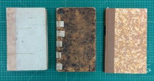
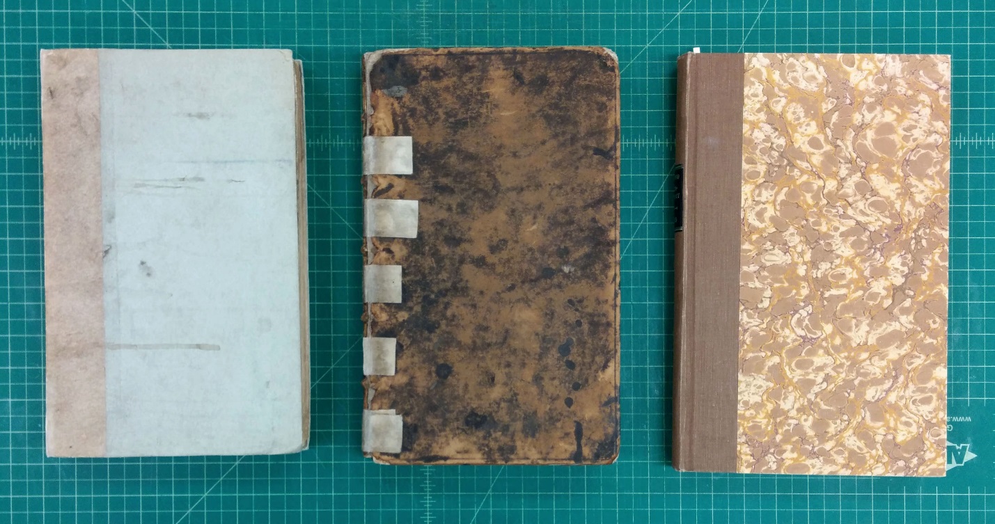
Spencer Research Library’s three copies of the True account of the horrid conspiracy: E242 (left), E242a (center), and E3324 (right). Click image to enlarge.

E242, E242a and E3324 pic 2

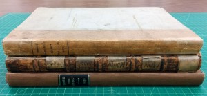
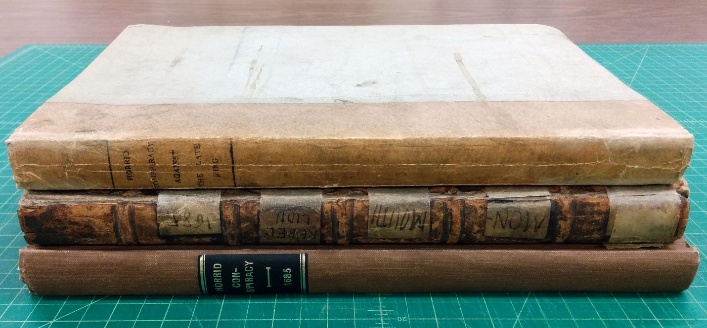
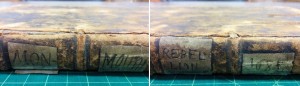
View of the spines of the three volumes: E242 (top), E242a (middle), and E3324 (bottom). Click image to enlarge.

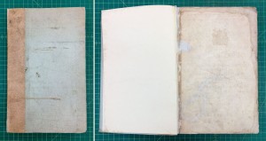
According to the practice common at the time, it is likely that all three of these copies left the printer, and maybe even the bookseller, in an unbound or partially-bound state, or possibly in temporary bindings; the buyer would then take the book to a bindery to be properly bound in his preferred style. Of Spencer’s three copies, only Copy 2 is in a binding roughly contemporary to the time of the book’s printing, though it’s hard to say if it truly is its original binding. It is a full leather binding with minimal decoration – a single tooled line along the edges of the boards – and it has obviously been heavily used; there is a good deal of general wear and tear to the text block and leather, and the front board was detached, held in place with gummed cloth tape. On the inside, the absence of pastedowns allows us to see the irregular turn-ins, the texture of the board, and the laced-in cords that all indicate the binding’s age.

E242a pic 3
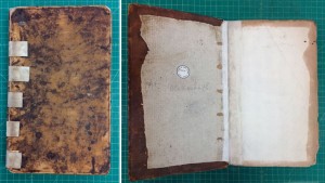
Front board and front inside cover of E242a after treatment. Click image to enlarge.

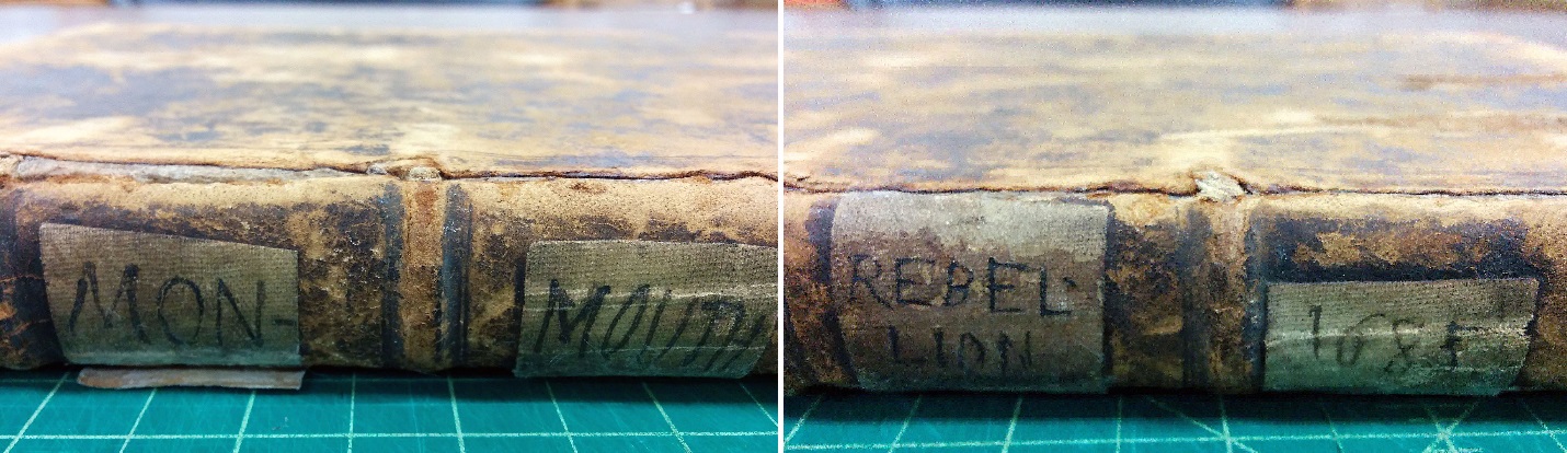
The historic repair on this volume is cringe-inducing, in the way that all tape is offensive to conservators, but I admit to finding it somewhat charming as well, with its hand-scrawled title and date. This volume also had gummed cloth tape along the inner hinge; that tape was removed because it was causing damage to the paper, but the tape across the spine was left in place primarily because of the character that this oddly appealing feature lends to the volume. In addition to removing the tape from the inside of the book, I reattached the front board, reinforced the back board, and surface cleaned the text block where it was needed.

E242a pic 4

Handwritten labels on gummed cloth tape on the spine of E242a. Click image to enlarge.

Copies 1 and 3, having been rebound, may lack some of the old-book charm displayed by their edition-mate, but their bindings still tell (or at least suggest) something about the lives they have lived. We can only guess as to exactly when these volumes were rebound; my guess would be that Copy 1’s current binding is from the late 19th or early 20th century, while Copy 3 was bound somewhere in the first half of the 20th century (and I welcome thoughts and comments to corroborate or refute these estimates!).

When Copy 1 arrived in the lab for treatment, its paper spine was torn in several places and the case, which had been attached to the text block by just the flyleaves along a narrow strip down each shoulder, was nearly detached. The title page was torn and the text block was quite dirty, showing a great deal more wear than its newer case. This binding provides some measure of protection for what was seemingly a much-used volume, but the binder didn’t take extra steps to clean or mend the text block; this is a very utilitarian case binding. As part of its treatment, I mended the case, reinforced the case attachment to the text block, surface cleaned the most soiled parts of the volume (text block edges and the first and last several pages), and mended the tears with Japanese tissue and wheat starch paste.

E242 pic5

Front cover and front inside cover of E242 after treatment. Click image to enlarge.

Copy 3, by contrast to the other two, is in very good condition; its text block is significantly cleaner and its binding is sound, probably the work of a commercial bindery or workshop. While any traces of a historic binding are lost, the information contained in the volume has been preserved, which some would argue is ultimately the most important thing. Still others might assert that its current binding can still tell us a lot about what readers, institutions, and book collectors value in the books they use/collect and how those values inform decisions such as how and whether to rebind a volume. Copy 3 does not appear to have been nearly as well-used as its mates, or perhaps it is just that it was not as ill-used – the good condition of its text block may be a sign that its owner(s) simply took very good care of it. Its modern library-style binding is not especially attractive, but it does its job well: it protects the text block and doesn’t cause it any harm.

E3324 pic 6

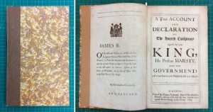
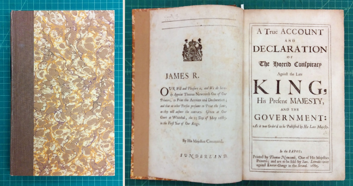
Front cover, dedication, and title page of E3324. Click image to enlarge.

I have focused so far primarily on the bindings of these volumes, but before I conclude I want to point out an interesting printing detail on the title pages. Here are the three title pages side by side:

E242, E242a and E3324 pic 7

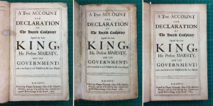
Title pages of True account of the horrid conspiracy: E242 (left), E242a (center), and E3324 (right). Click image to enlarge.

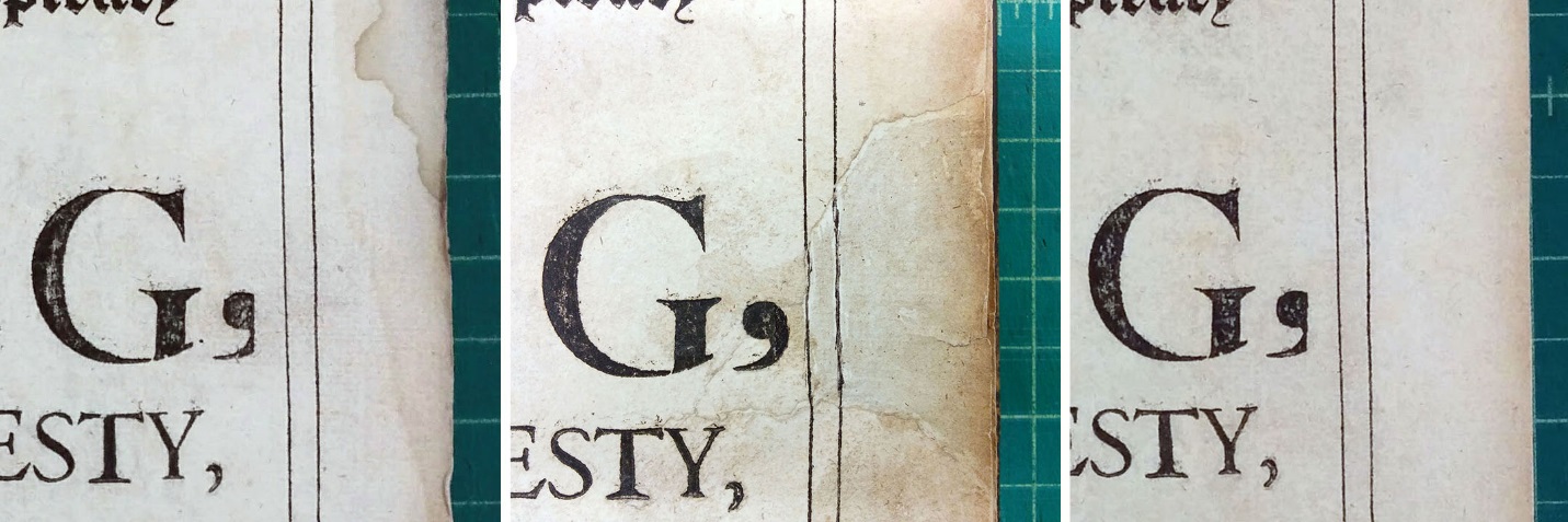
If you look closely, you can see that there’s a printing error on the large comma following the word “KING,” except on the title page of Copy 2, in the middle. Here’s a closer look (click image to enlarge):

E242, E242a and E3324 pic 8

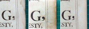
At some time in the past, Copy 2’s title page sustained a small loss at the fore-edge, including part of the comma and the double border lines, and someone had filled the loss by lining the entire page with a piece of plain paper. This person (or perhaps some other, later person?) then drew in the missing lines and filled out the comma with ink. Was this the same person who applied the tape and handwritten labels on the spine of Copy 2? We shall never know, but it certainly is fun to wonder.

Angela Andres
Special Collections Conservator
Conservation Services

First Impressions

November 9th, 2013

Setting type may not be as easy as it looks, but it is good fun! Throughout October intrepid students in the History of the Book (English 520 / History 500) made several trips to the press room in Spencer’s basement to execute a printing project using the library’s historic presses. Reading about printing during the hand press era offers some insight, but it is easy for the process to remain shrouded in mystery until you try it out yourself. As you stand in front of a case of type, the logistical considerations involved in producing a book–such as format, imposition, line length, and style and size of type–quickly take on a new reality.

Students hand-inking the type using a brayer. Photograph of student lowering the frisket, October 2013

Photograph of printing on a hand press, Kenneth Spencer Research Library

Image of the History of the Book class printing in the Spencer Research Library's basement, October 2013.

Students from The History of the Book  (ENGL 520 / HIST 500) operate the press with
the assistance of printer Tim O’Brien (in the blue apron and striped shirt).

Since Spencer houses wonderful Irish Collections, we elected to print W. B. Yeats’s poem “The Wild Swans at Coole,” which has an appropriately autumnal theme. Each student set two lines of the poem, picking type, letter by letter, from the case and depositing it in a composing stick held in the opposite hand. (If you are right-handed, you would hold the composing stick in your left hand and pick with the right.) The set lines were then transferred to a tray called a “galley” for assembly as a page.  Wooden furniture and metal quoins were used to lock the composed pages into a metal chase, which was then positioned in the press.

As an early proof of the poem quickly revealed, setting type is a skill that requires practice and concentration.  Some speculate that the caution to “mind one’s p’s and q’s” originates in printing, since these two pieces of type are easily confused.  In examining our proof, it seems it was our b’s and d’s that needed minding.  Though excessive errors could lead to docked wages in an eighteenth-century print shop, for us, making (and correcting) mistakes was an instructive part of the process.

Image of an initial proof of the poem lying on a case of type.

“If at first you don’t succeed…”:  proofing and correcting our mistakes.

The project was printed in “folio” format, each printed sheet folded once to create two leaves (or four pages). First, the class printed the “outer forme” (containing the title page and the colophon). Then, after some drying time, we “perfected” the sheets by printing the “inner forme” (containing the poem’s text) on the verso.

Title page and colophon locked in the chase

Outer Forme: the title page and colophon locked in the chase.  Wooden “furniture” and
metal “quoins” provide the pressure needed to keep everything wedged tightly in place.

In the early days, printing usually involved two pressman–one to insert the paper and work the press, and the second to ink the type. Under the guidance of printer Tim O’Brien, the students each took a turn at both roles.  As the class discovered, there is definitely a genuine satisfaction that comes from operating a hand press.  Of course, the best part is that it produces such wonderfully tangible mementos!

Image of the completed leaflet (copies folded and unfolded): The Wild Swans at Coole Image of the printed text of the poem "The Image of the printed text of Yeats's poem, "The Wild Swans at Coole."

Ta-dah! The finished product. To read the full text of “The Wild Swans at Coole” click the image on the right to enlarge.

Elspeth Healey
Special Collections Librarian